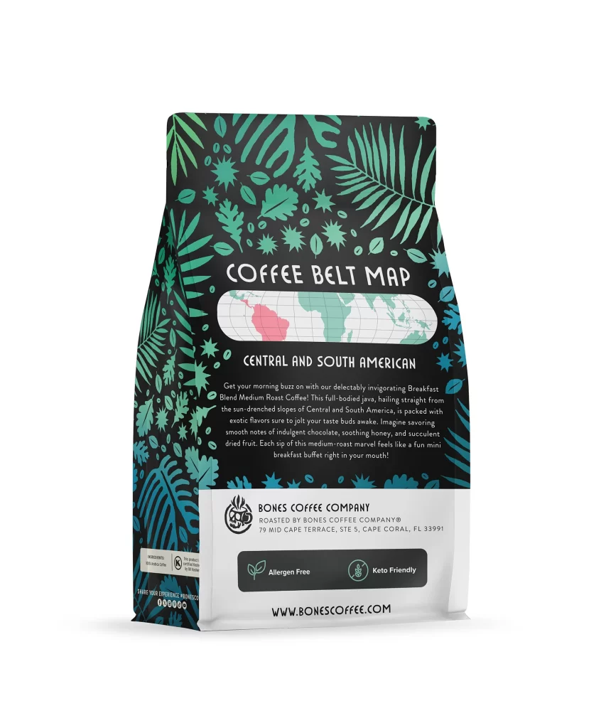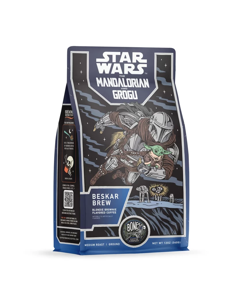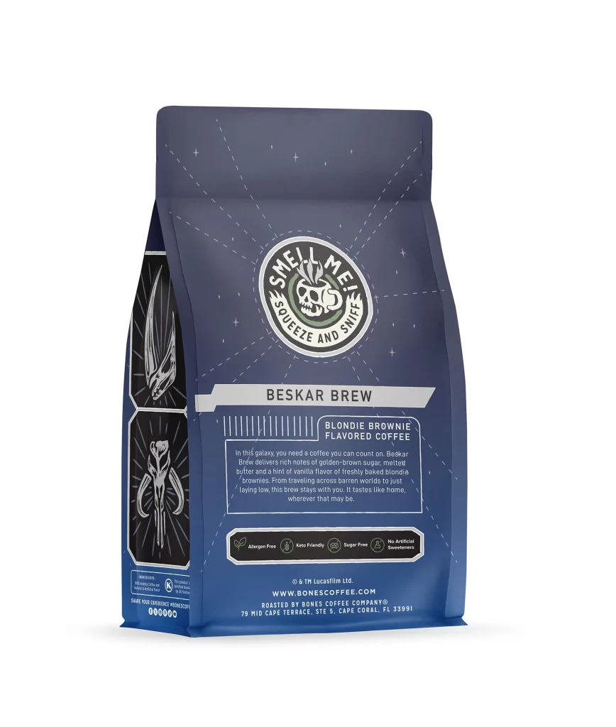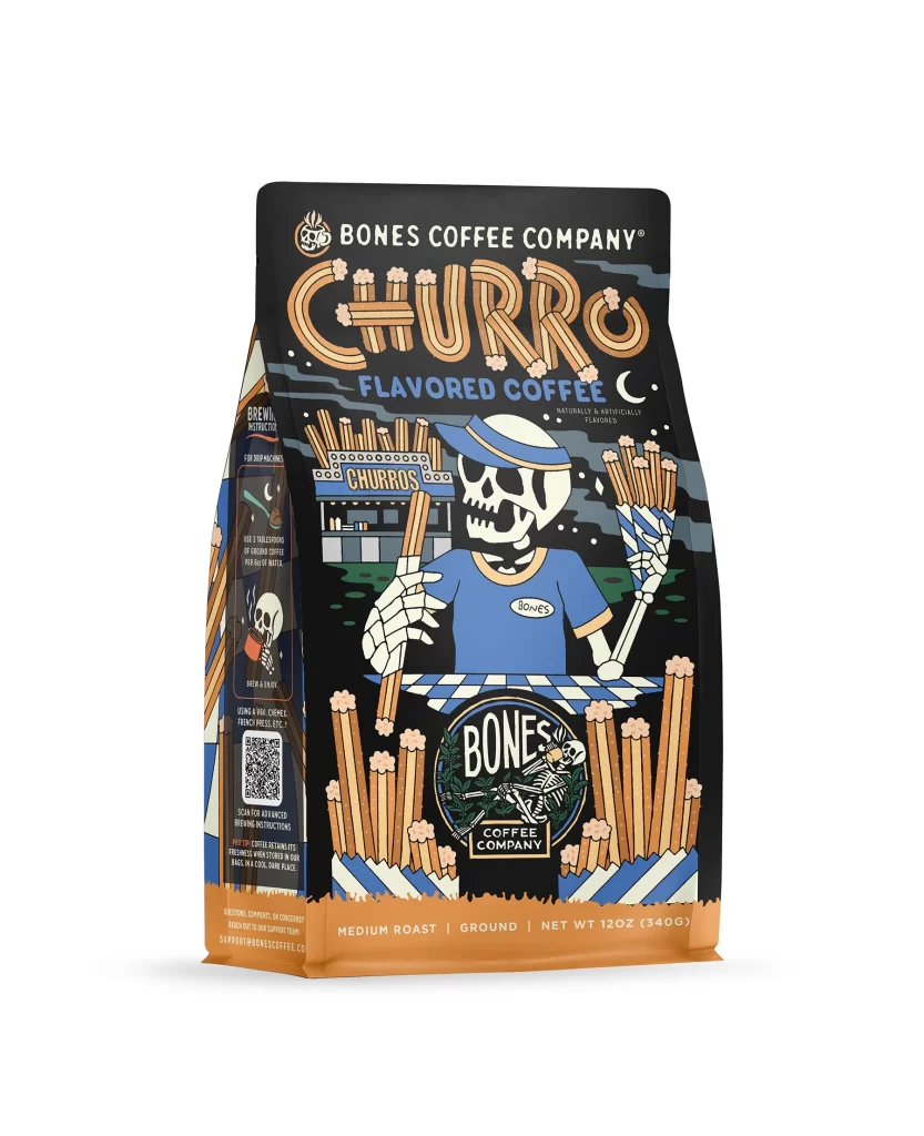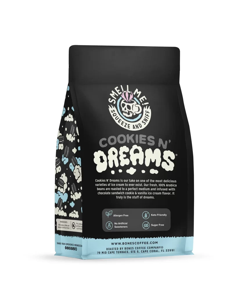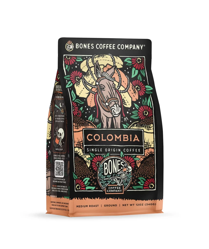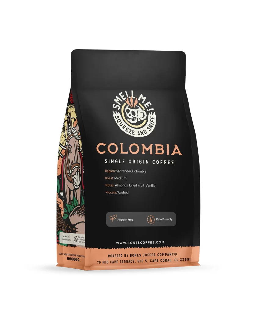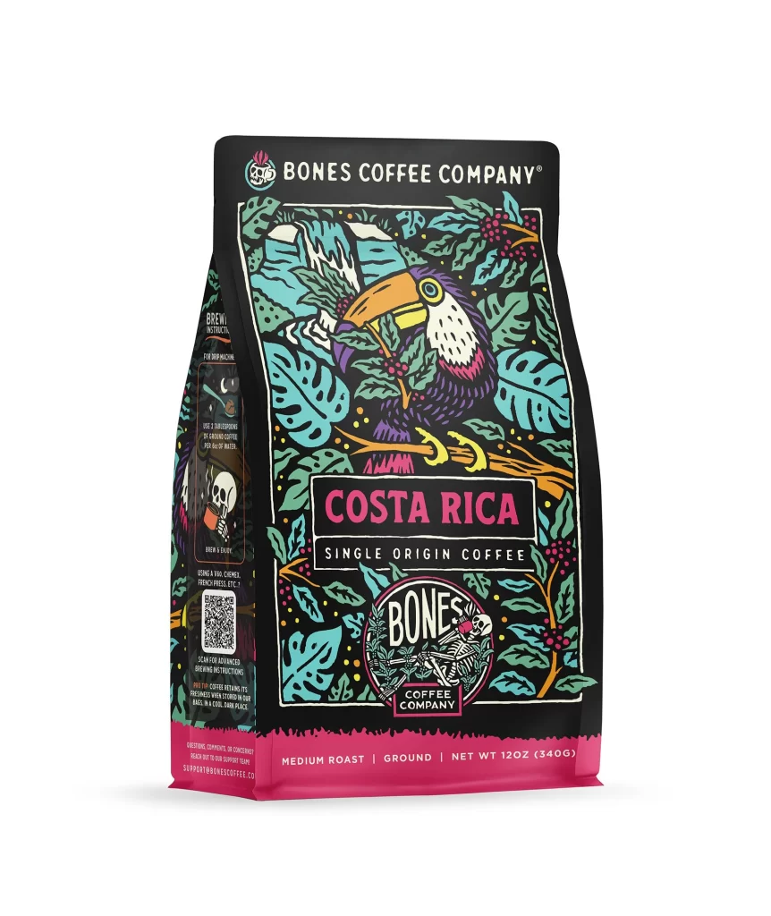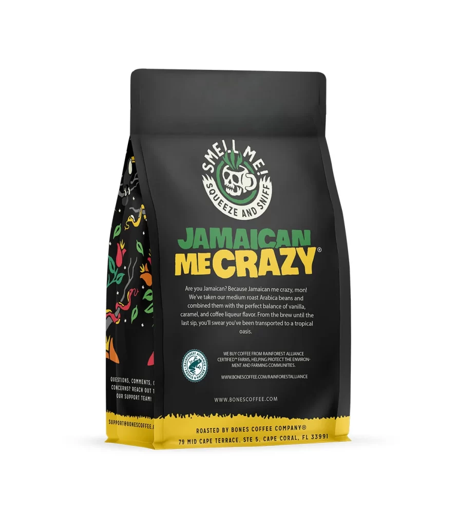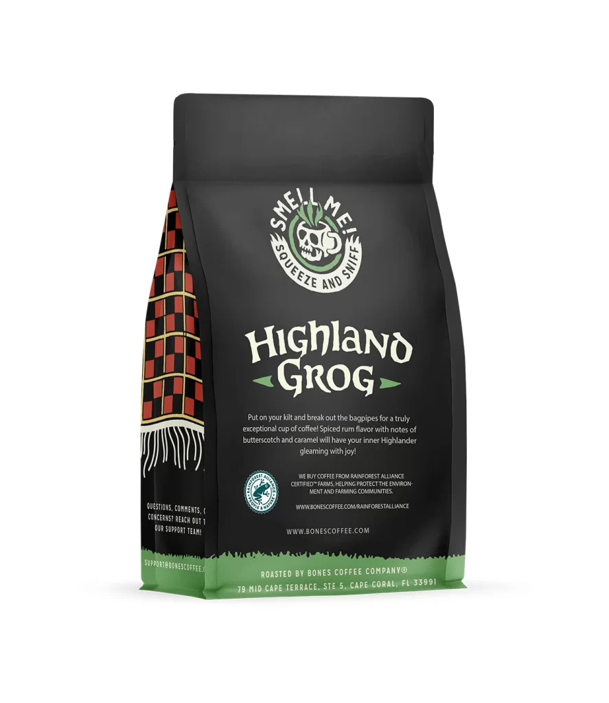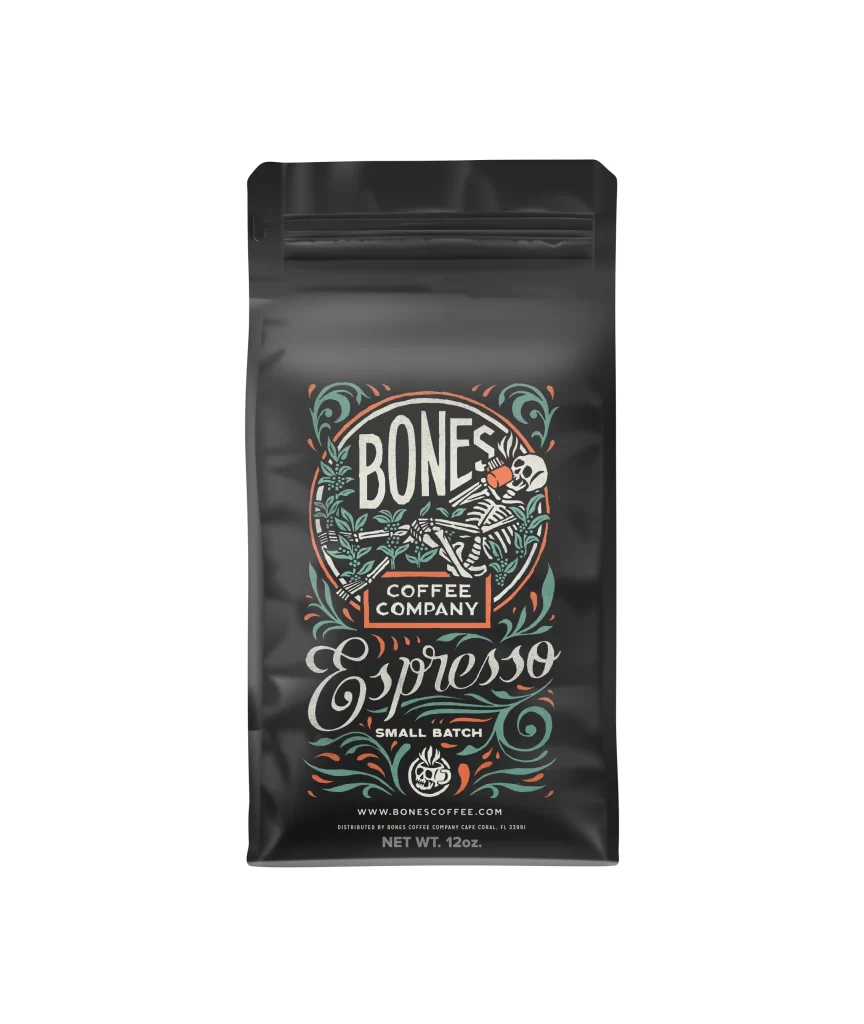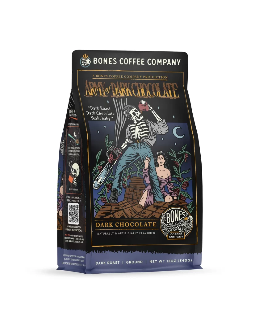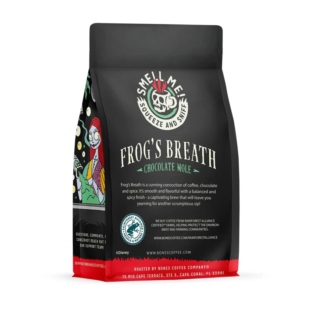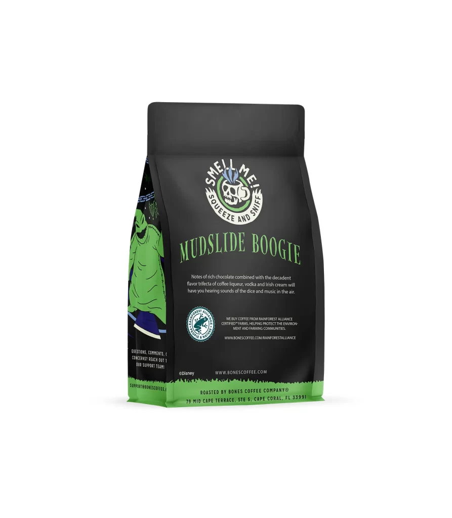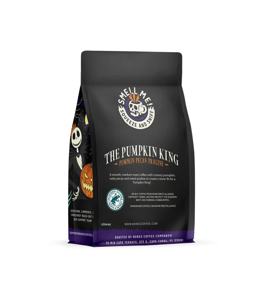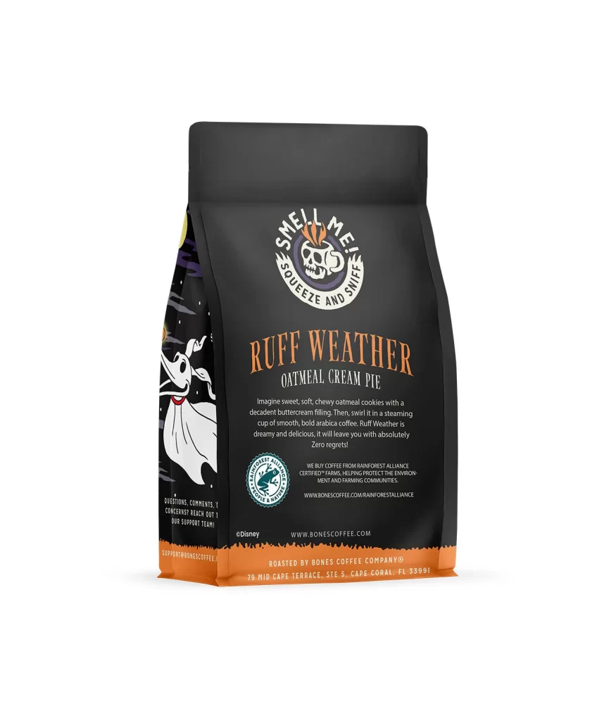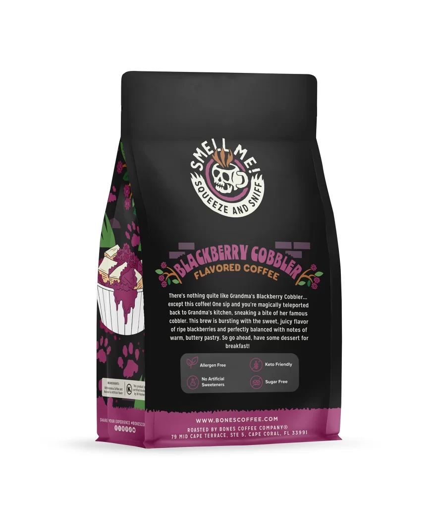
Bones Coffee Blackberry Cobbler Coffee Bag Back Packaging
Topics
Details
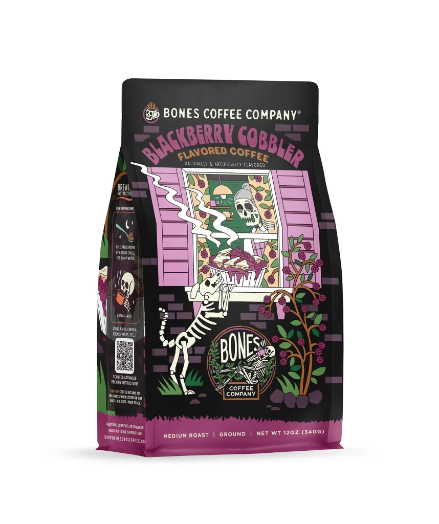
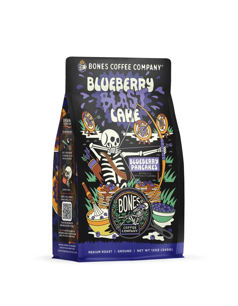
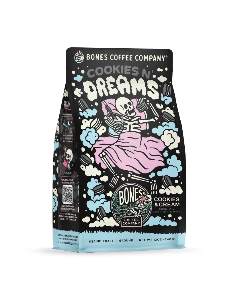
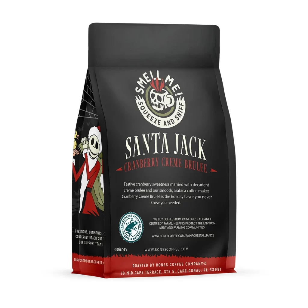
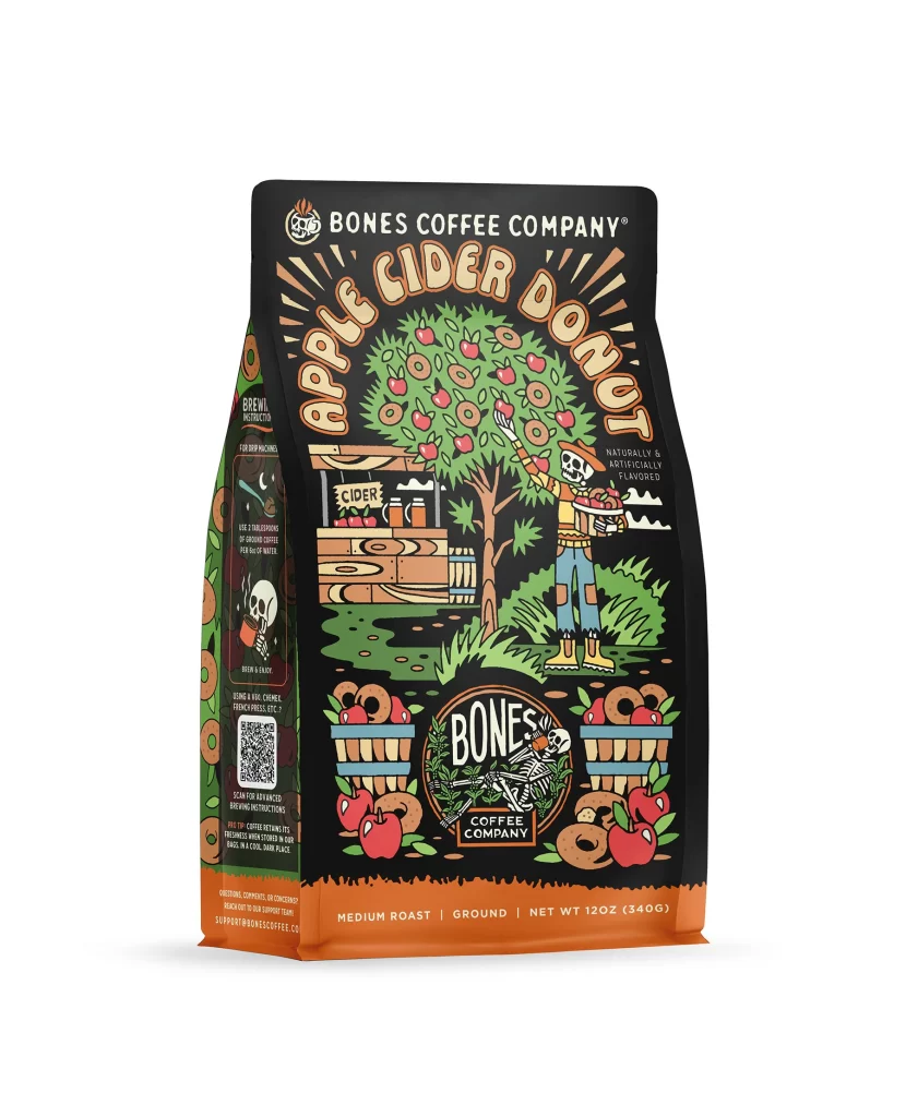
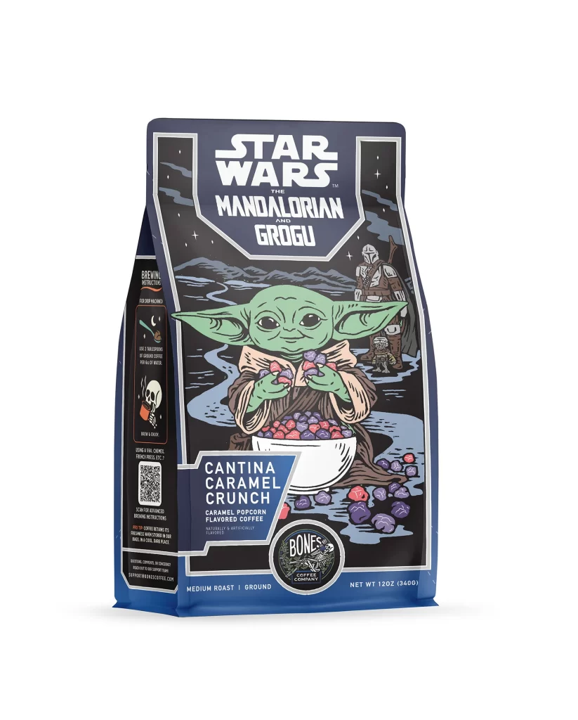
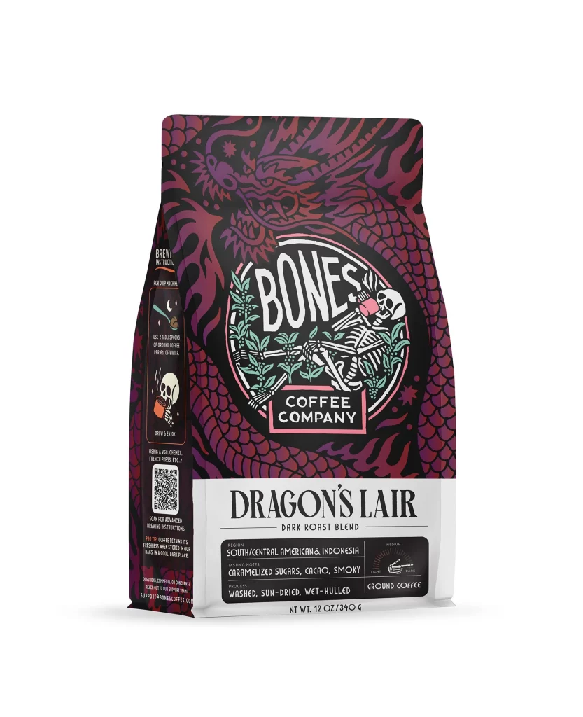
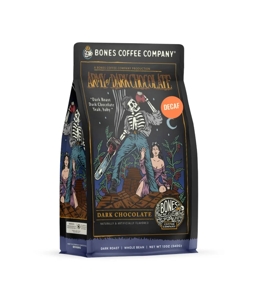
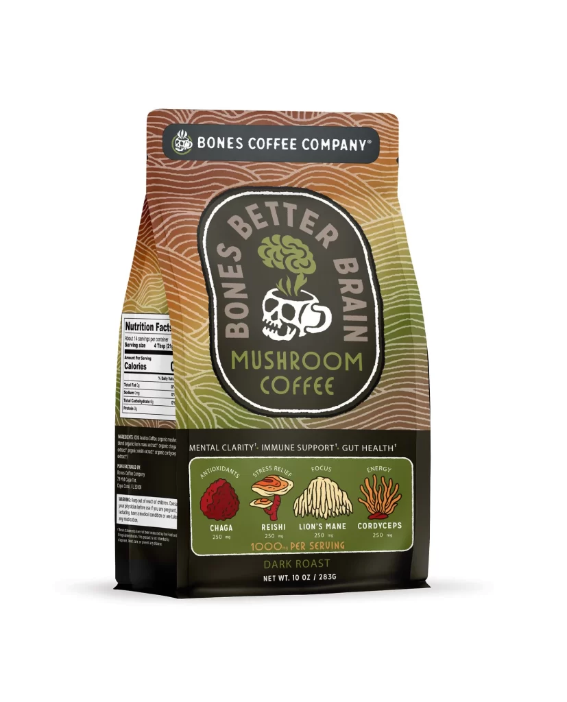
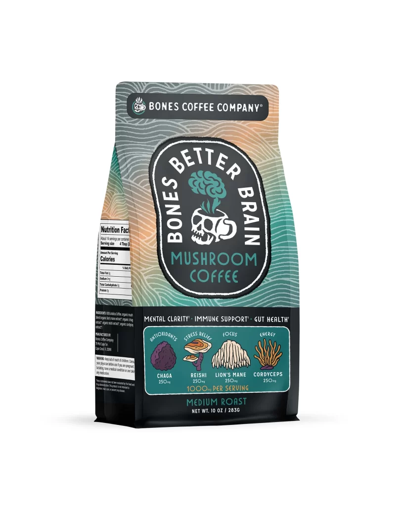
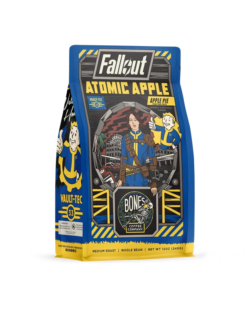
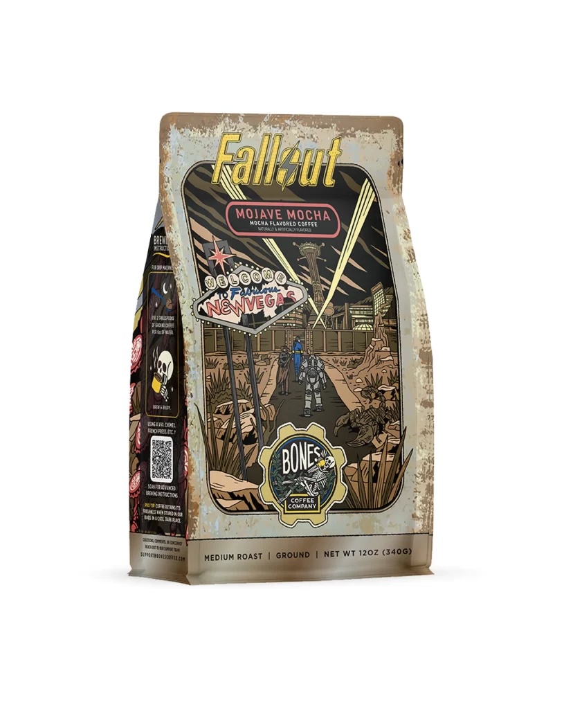
The front design layout features a central logo above a bold flavor name. Below this, appetizing flavor art shows ripe blackberries and a golden cobbler crust. The art sits on a clean background, letting the purple fruit tones pop. A white studio product photo of the physical package captures the matte finish and the crisp illustrations perfectly, giving the bag a premium look.
Typography uses a clean sans serif font in dark purple and white. The color palette pairs deep berry hues with warm crust tones, creating strong appetite appeal. This visual contrast helps the bag stand out on retail shelves. The overall aesthetic feels modern and inviting, drawing consumers in with a sweet dessert theme without looking overly busy or cluttered.
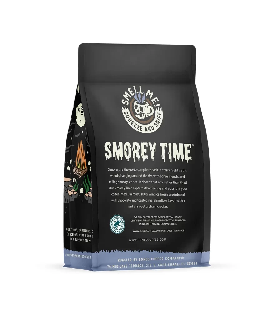
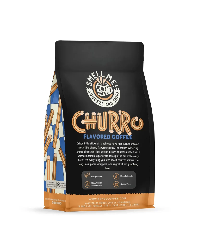
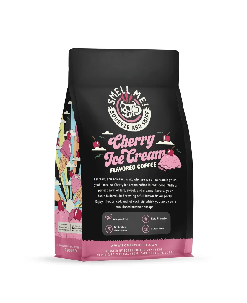
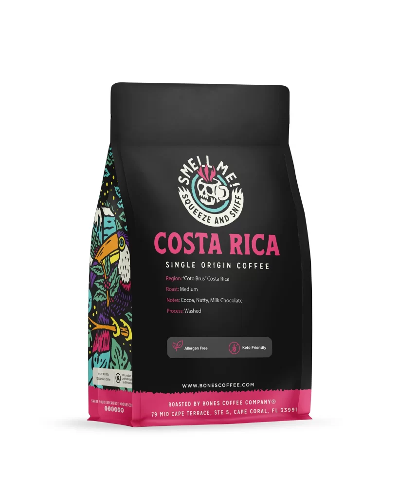
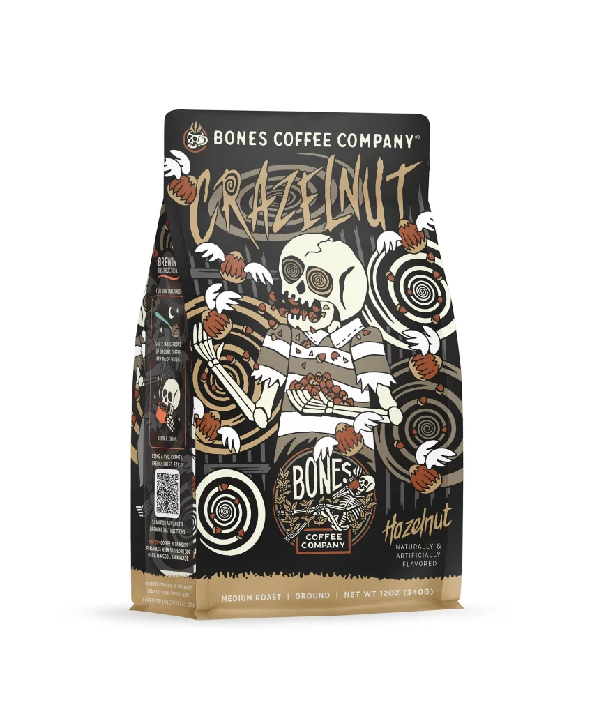
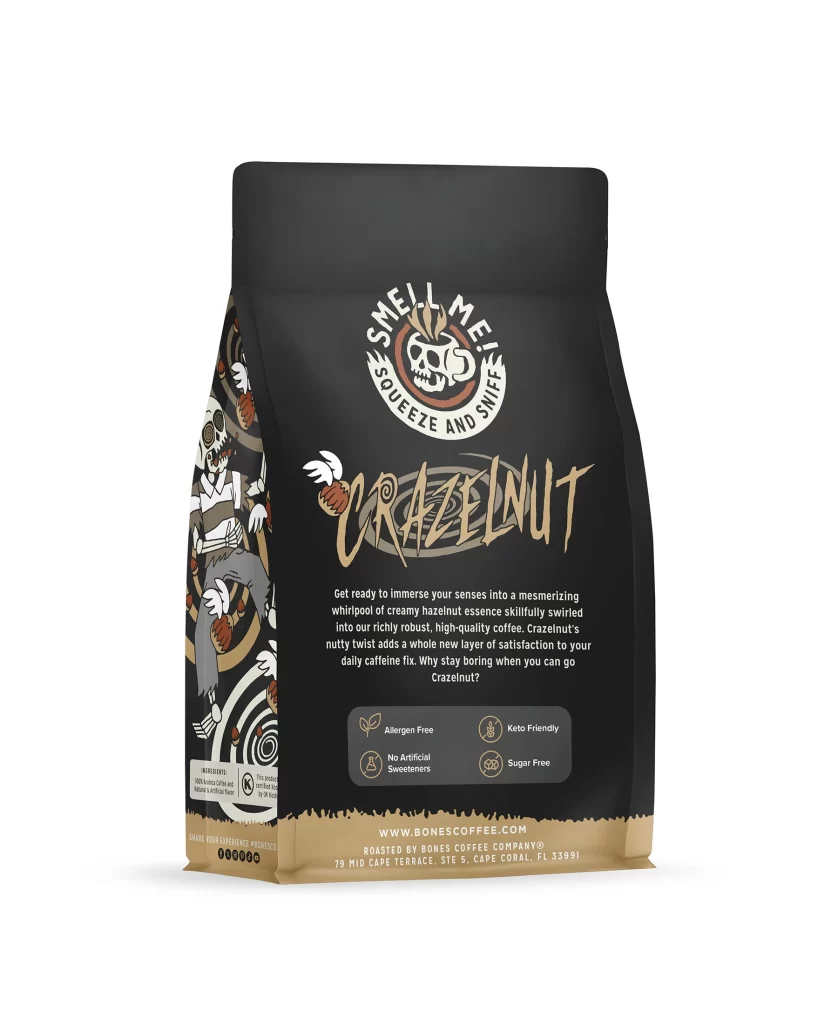
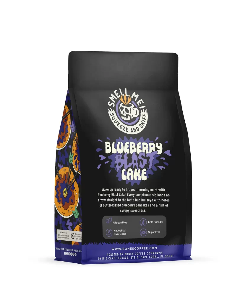
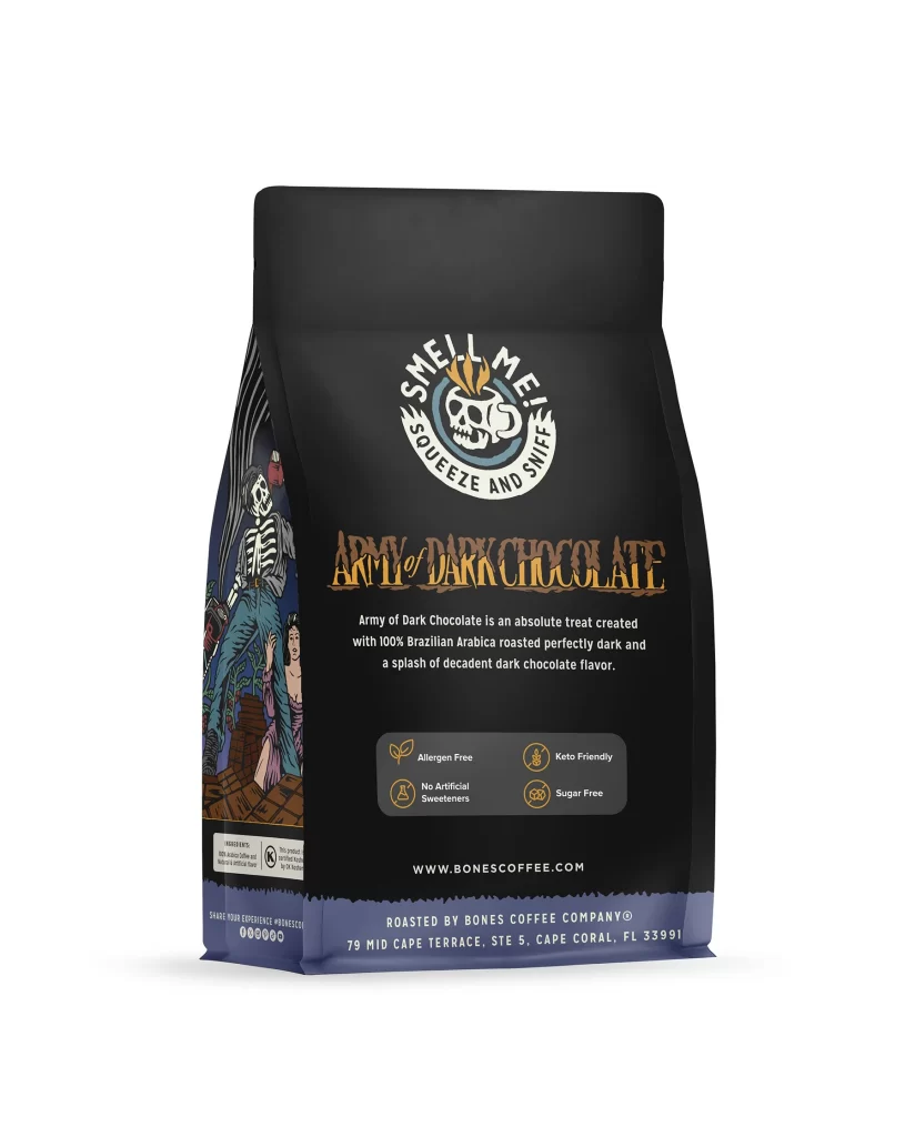
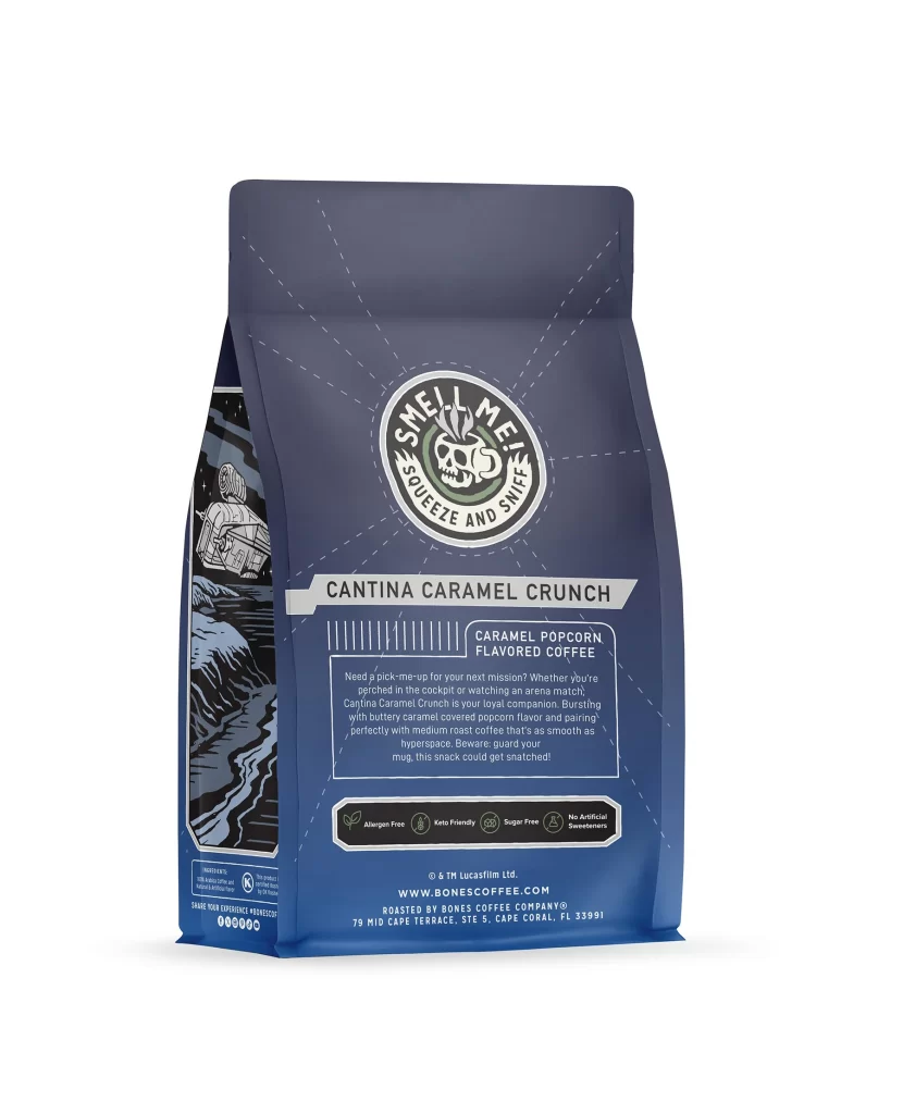
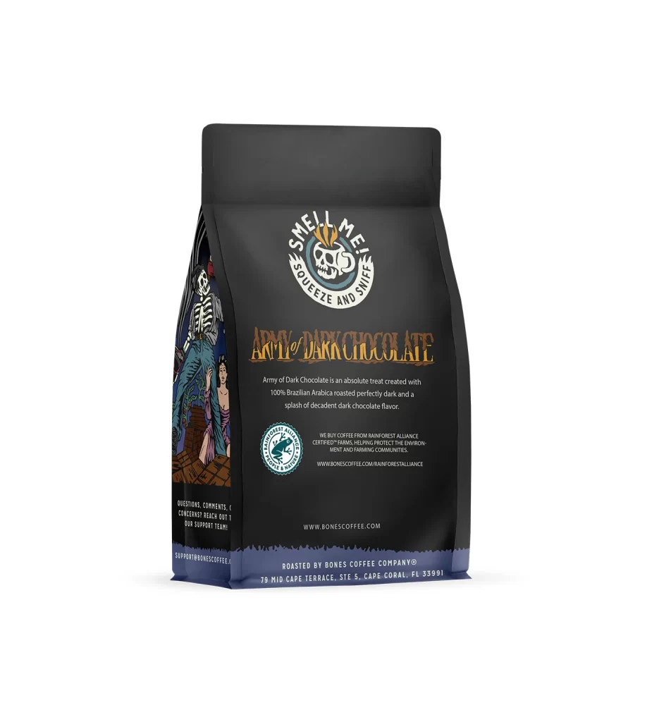
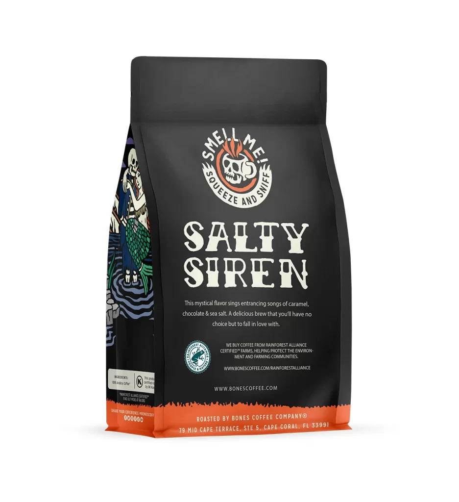
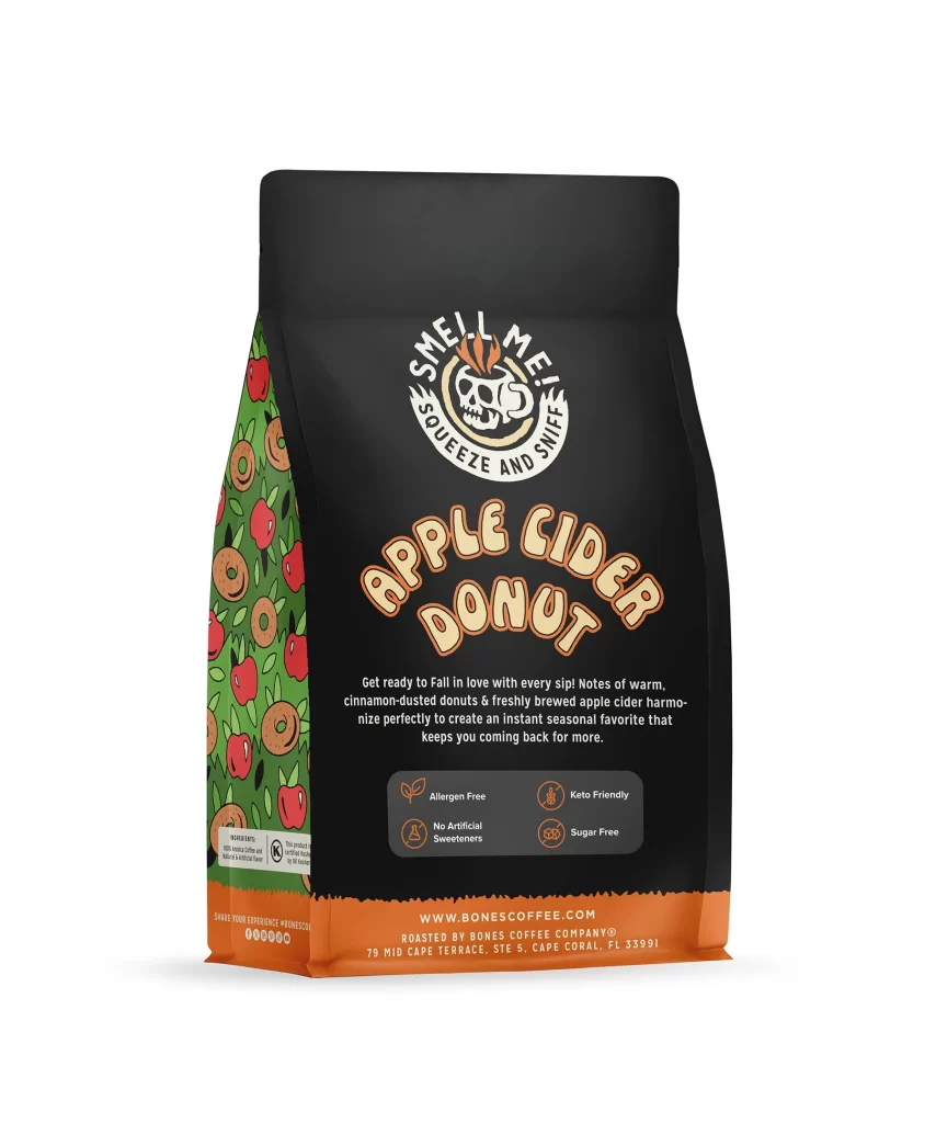
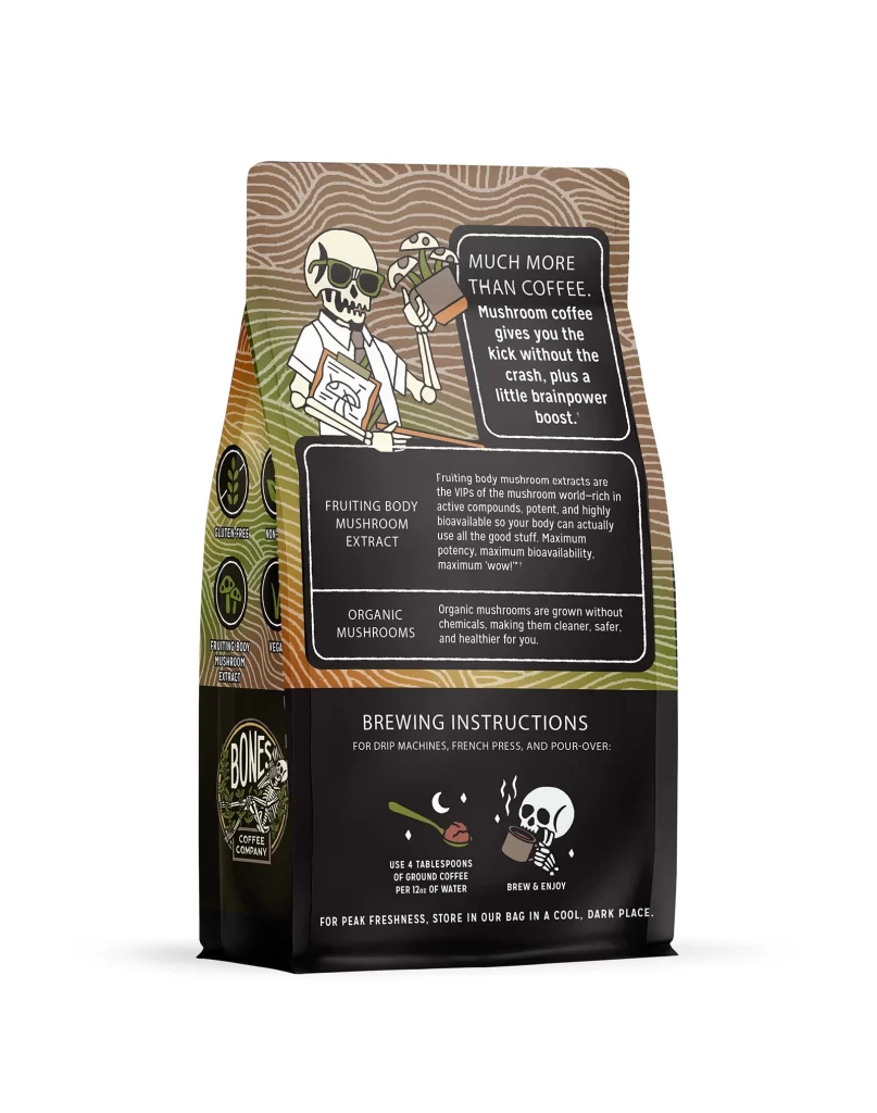
Designers should note how the back panel balances required information with brand identity. The back panel includes Allergen Free, Keto Friendly, and Sugar Free icons alongside brewing text and the 12 oz 340 g weight. Using clear icons and simple text creates a trustworthy feel. This layout shows how to communicate health benefits effectively while maintaining a cohesive and attractive brand design.