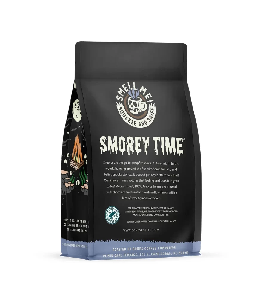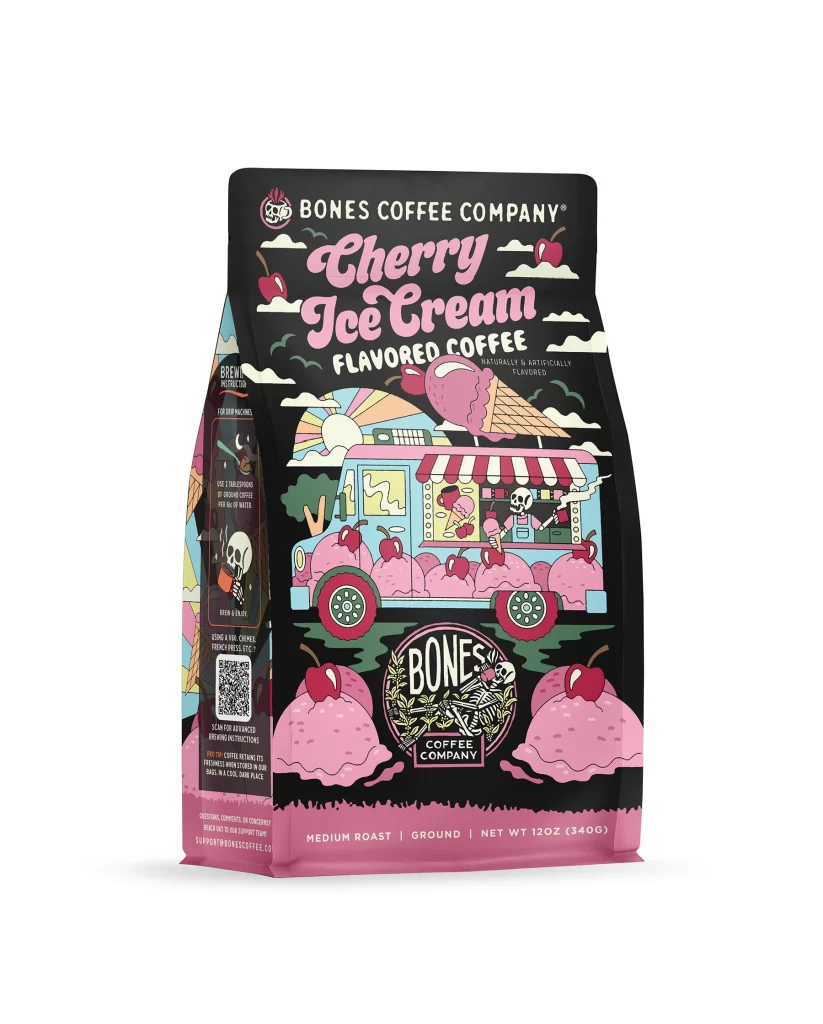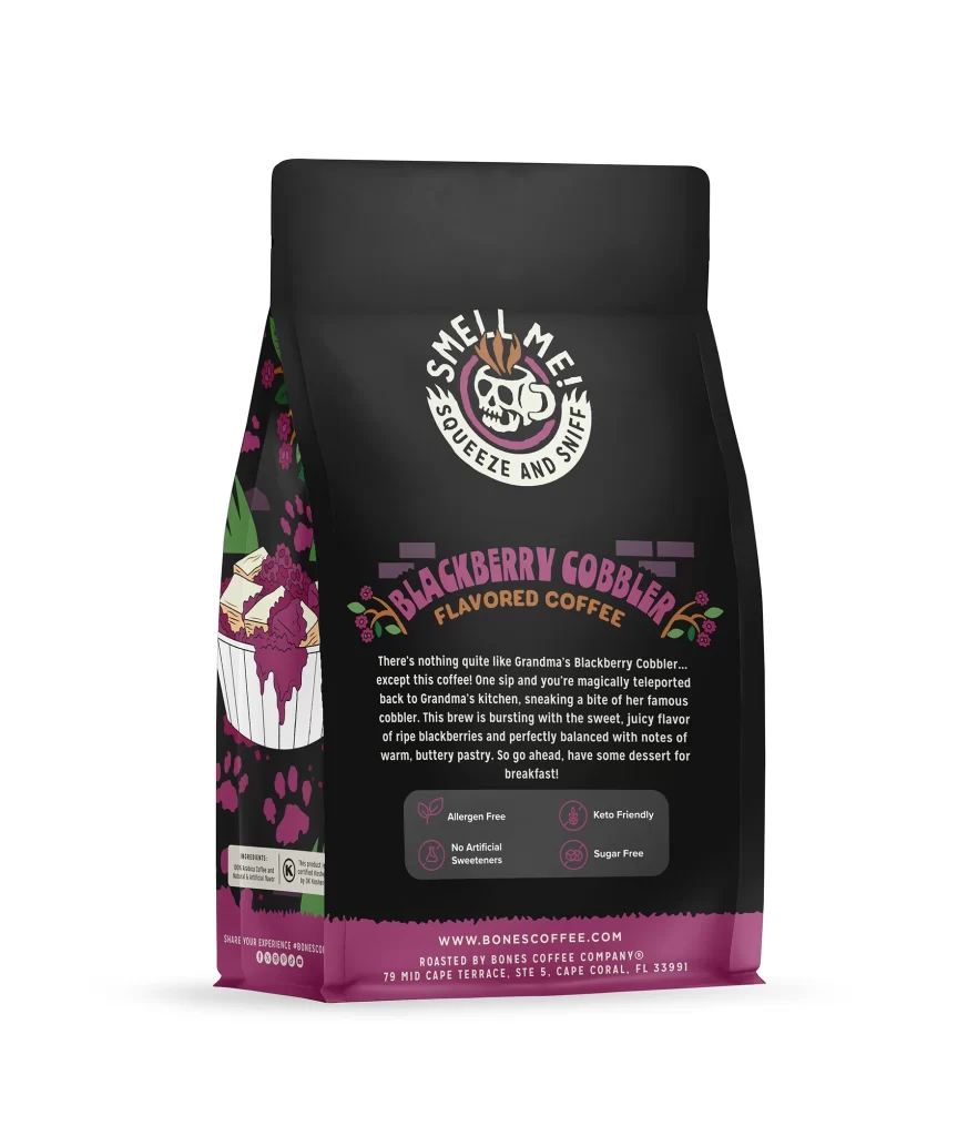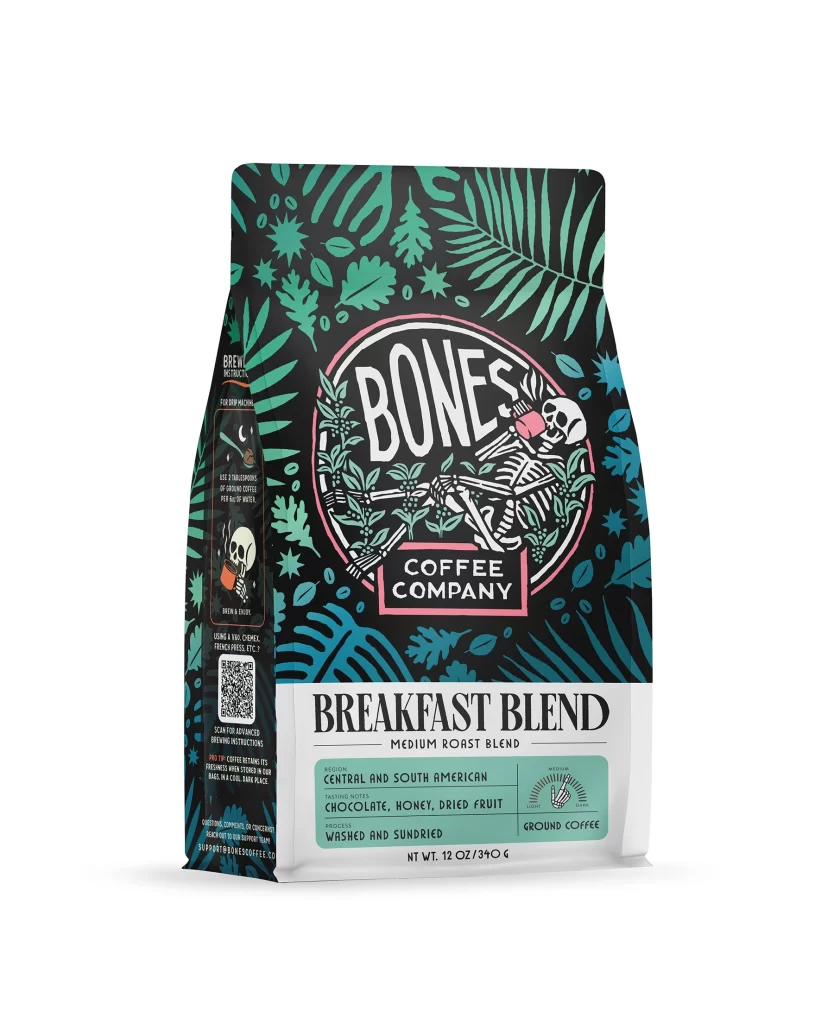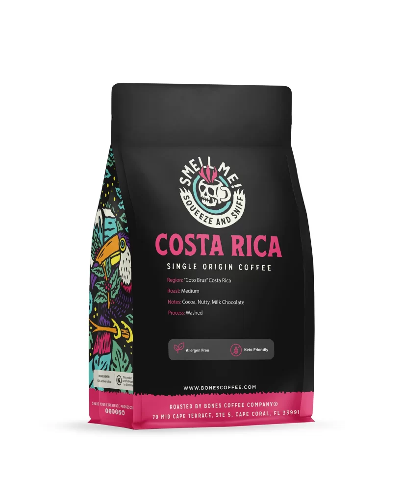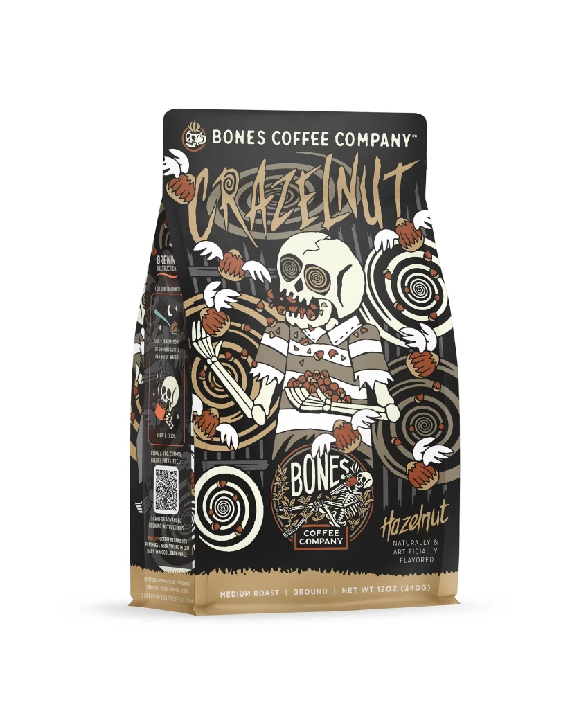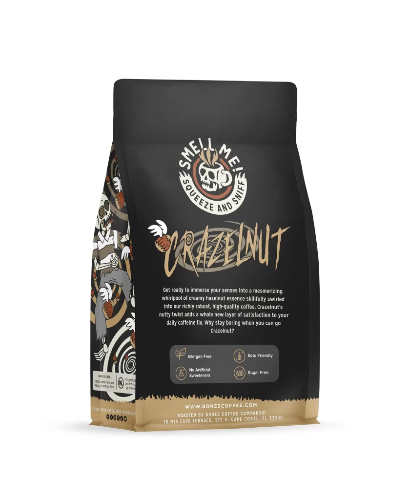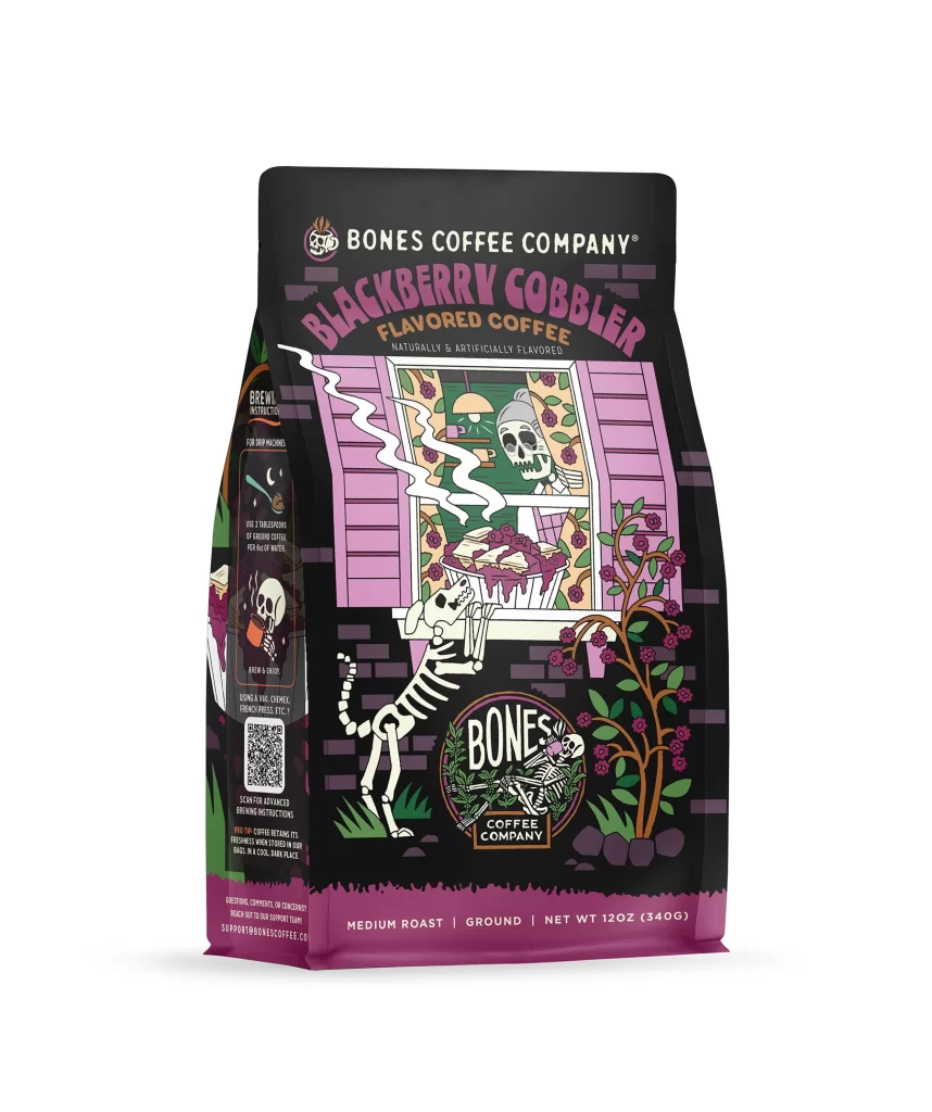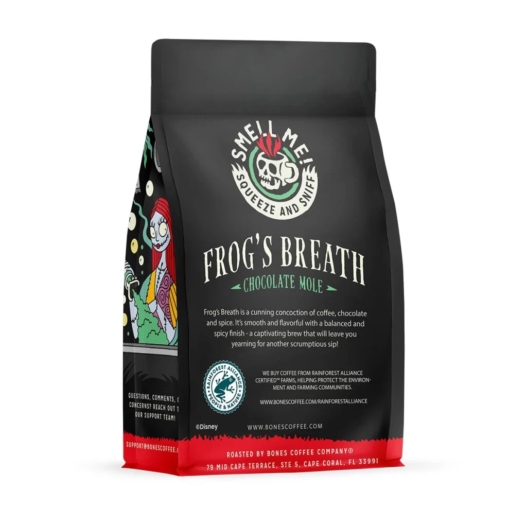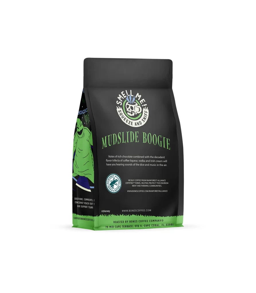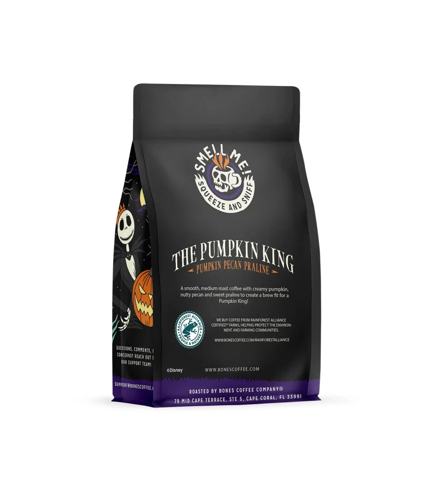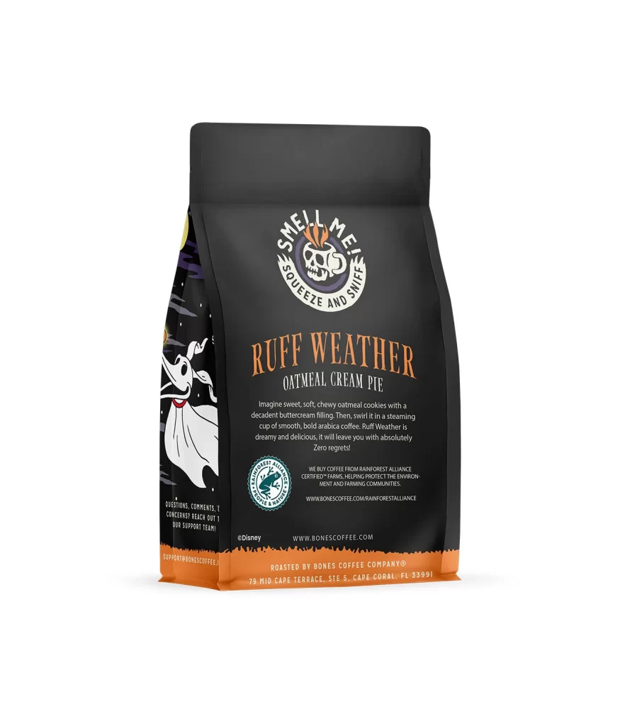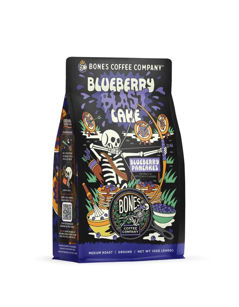
Bones Coffee Blueberry Blast Cake Coffee Bag Front Packaging
Topics
Details
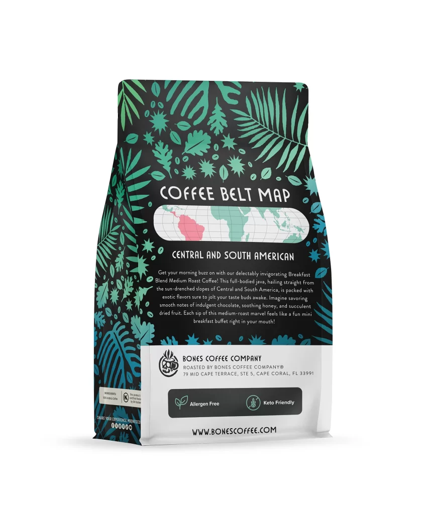
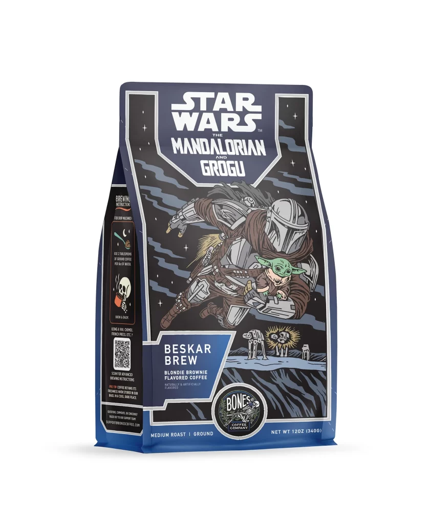
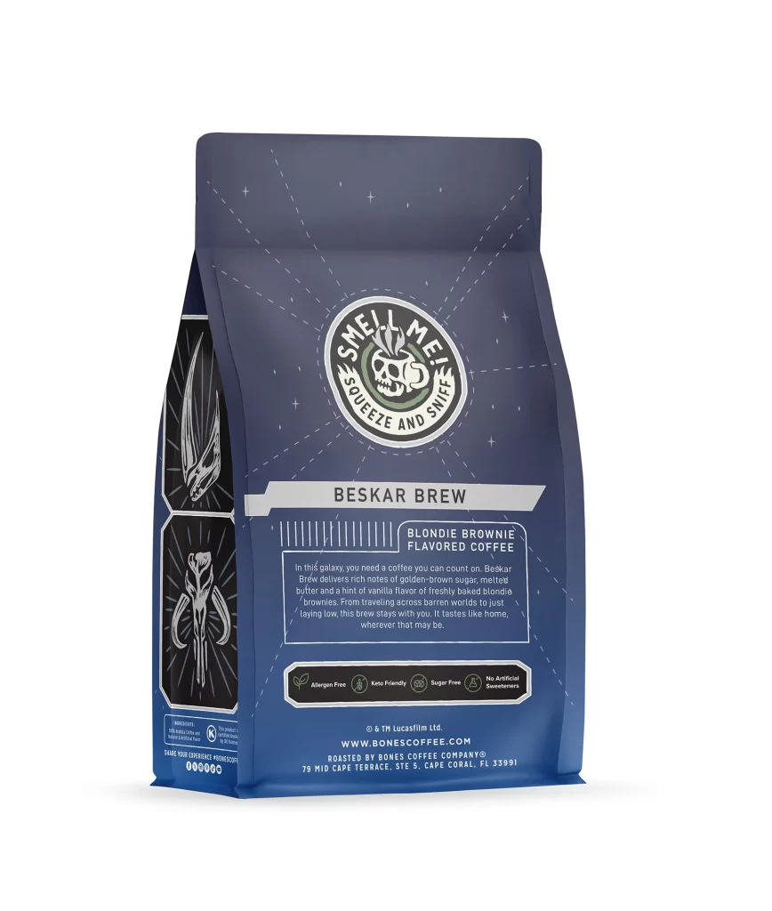
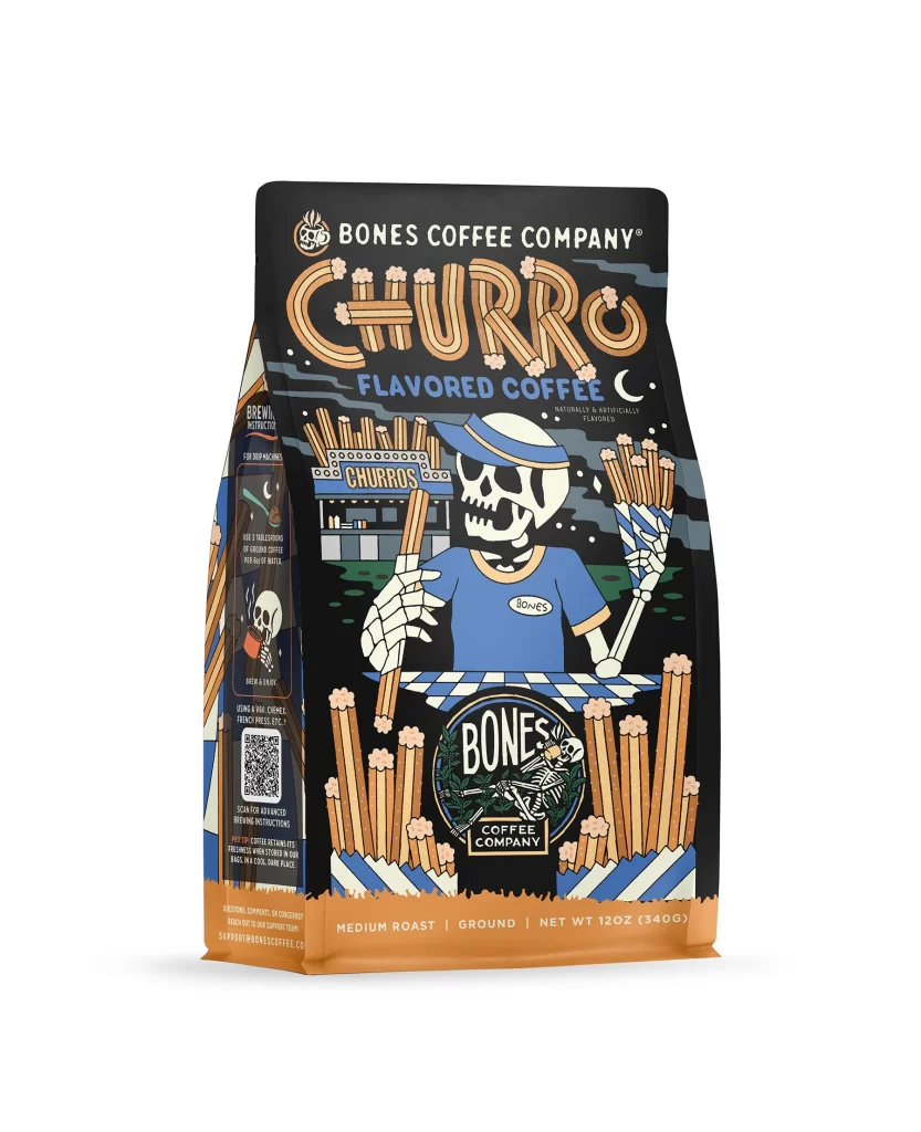
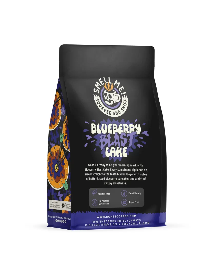
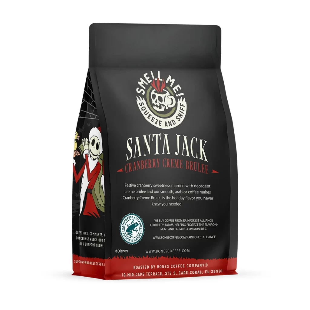
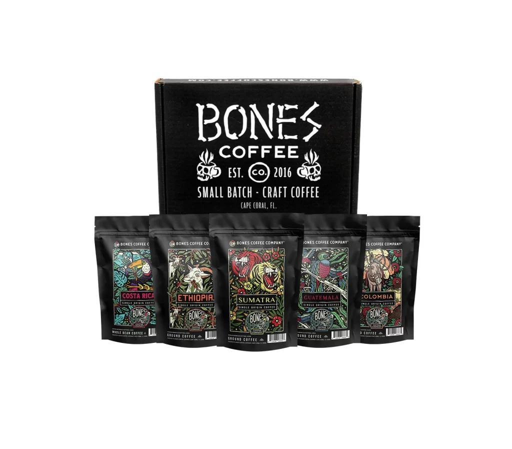
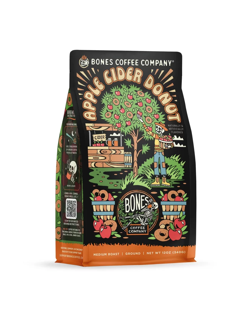
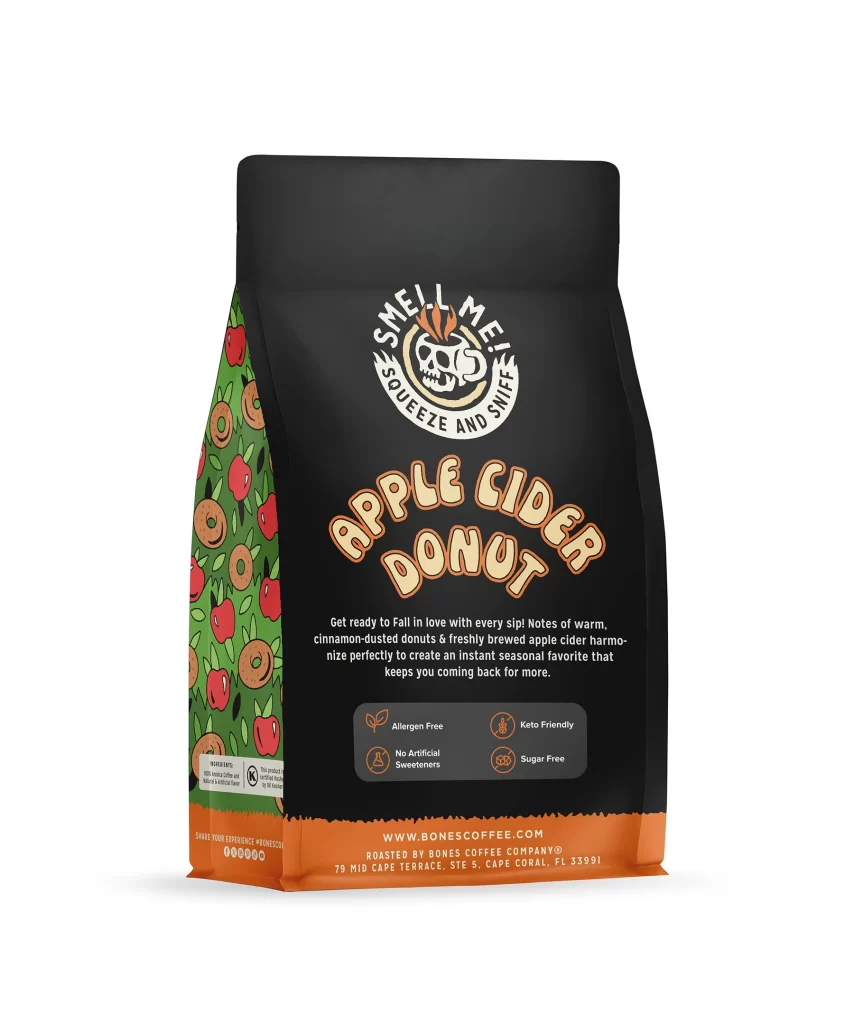
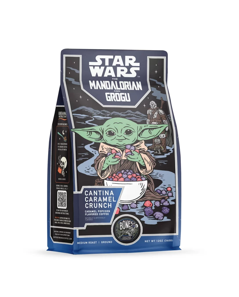
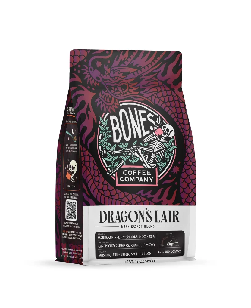
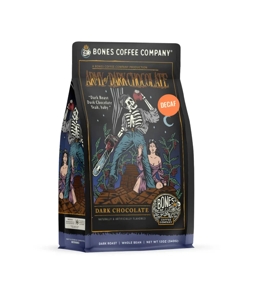
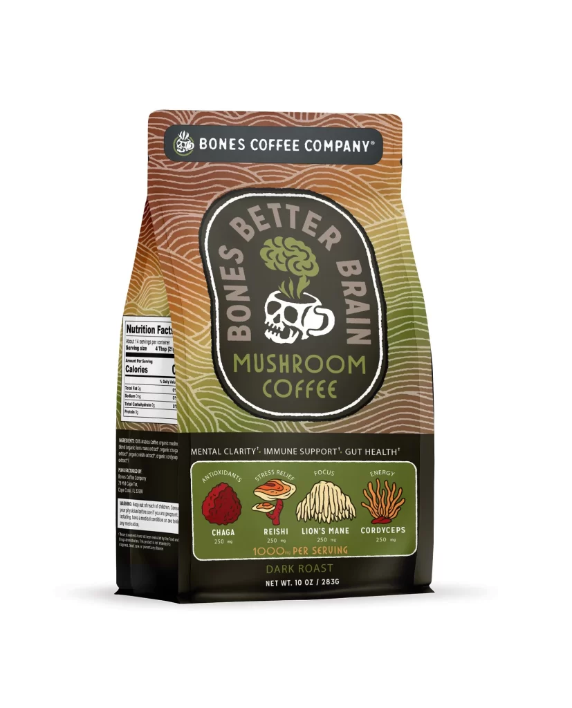
The front design layout centers on a matte bag featuring bold flavor art. A vivid blueberry blast cake graphic dominates the upper half, showing a sliced dessert with rich purple berries and white frosting. The lower half balances the composition with clean negative space, allowing the illustrated treat to stand out as the primary visual focus on the packaging.
Typography uses a clean sans serif font in deep navy and bright white, ensuring high contrast against the colorful background. The color palette of indigo, violet, and cream creates strong shelf appeal while stimulating appetite through dessert associations. This bright visual hierarchy catches the eye instantly, making the product easy to identify among competing coffee brands on retail shelves.
Designers should note how the layout uses playful flavor art to communicate taste without cluttering the bag. The strategic balance of bold illustration and minimal text creates a premium yet approachable aesthetic. This reference demonstrates how to effectively combine rich food imagery with simple typography to achieve maximum visual impact and strong brand recognition in a crowded market.