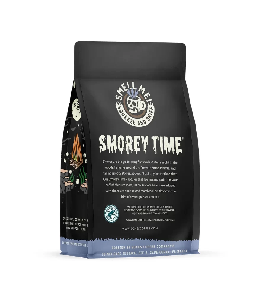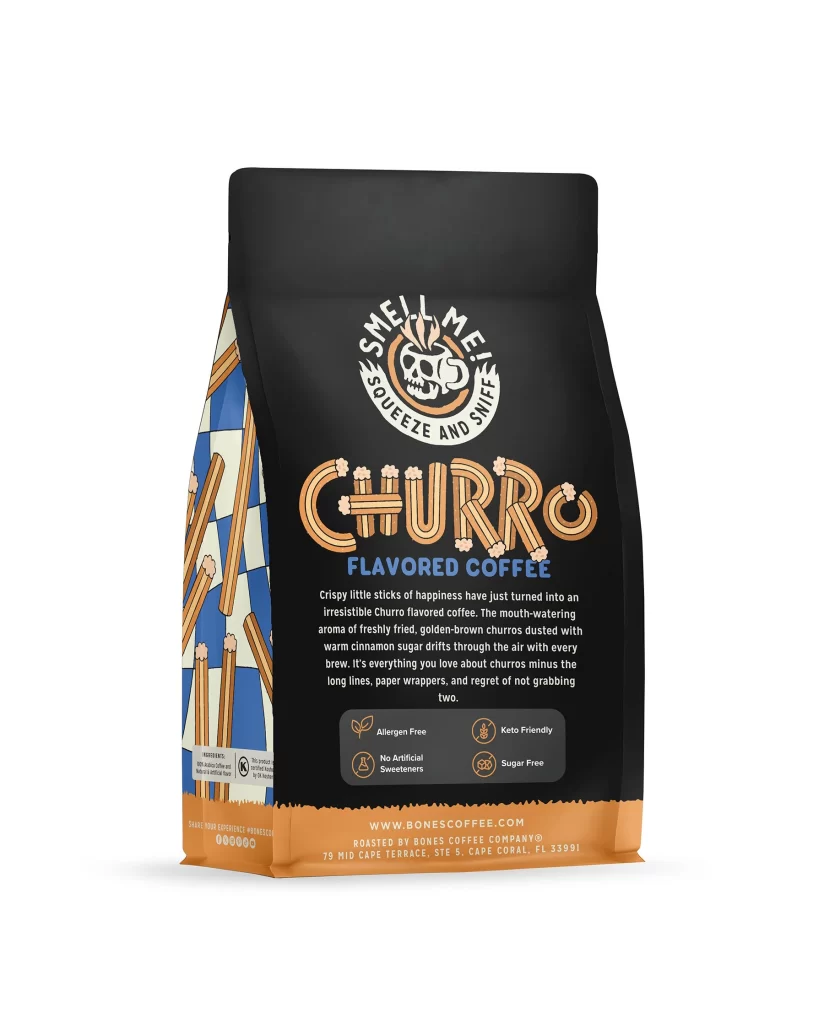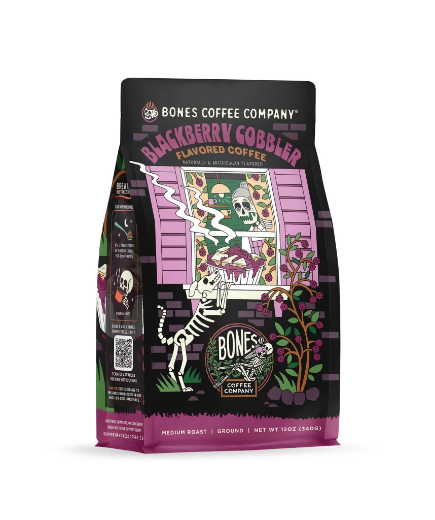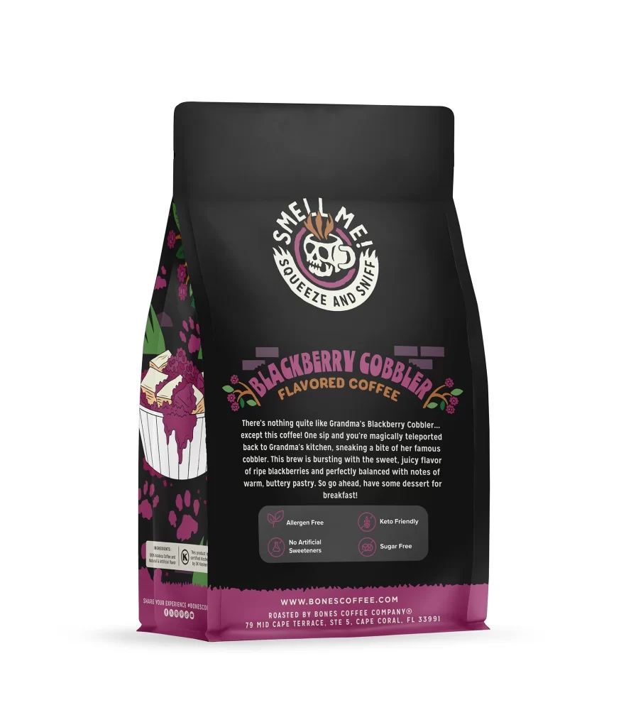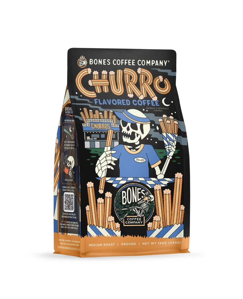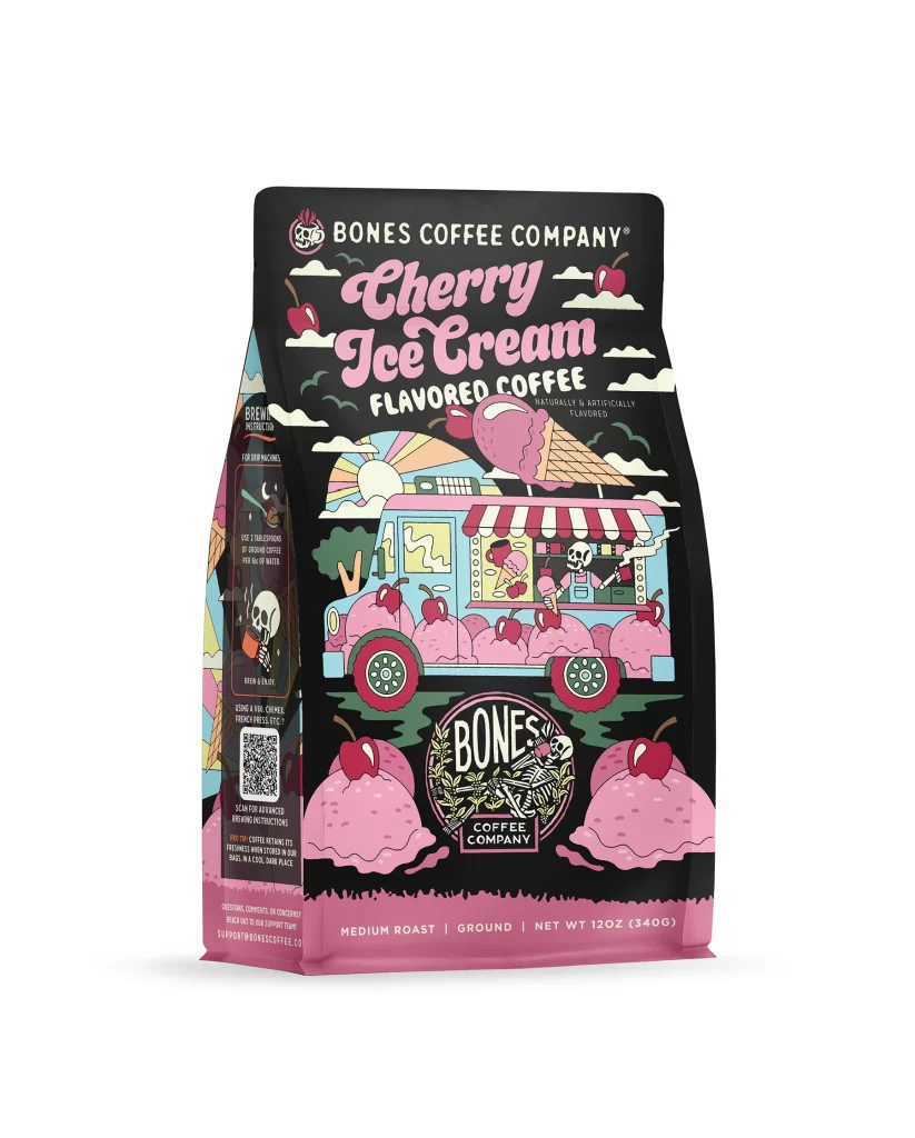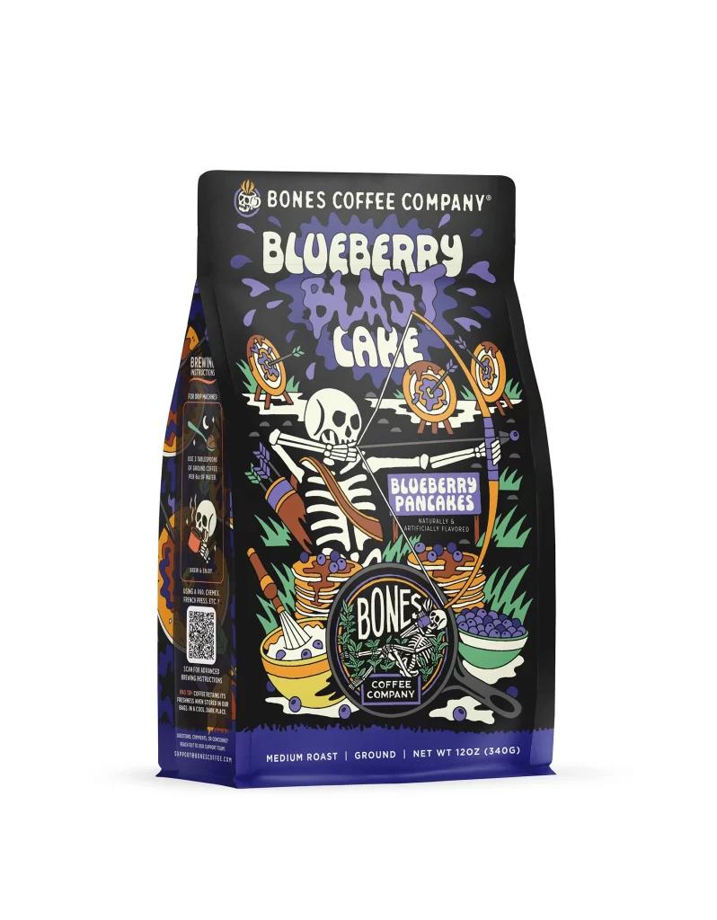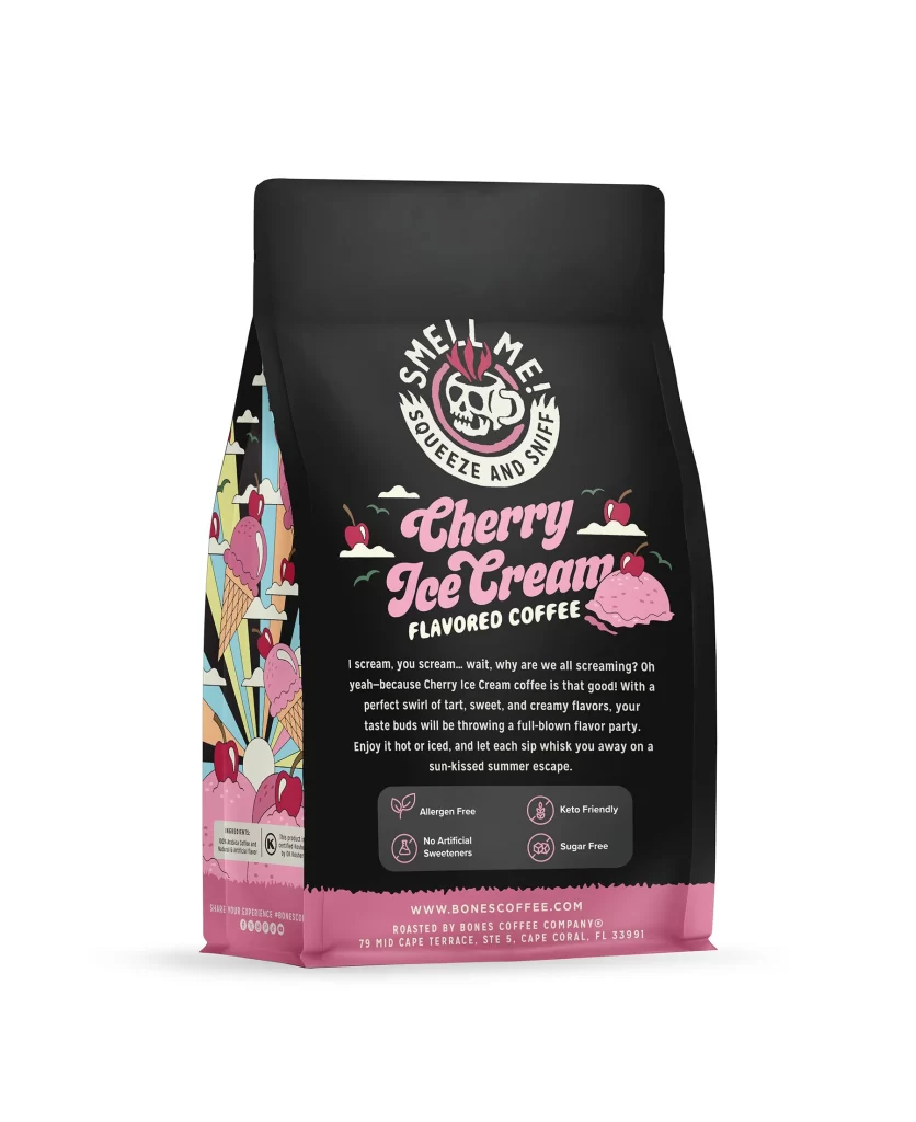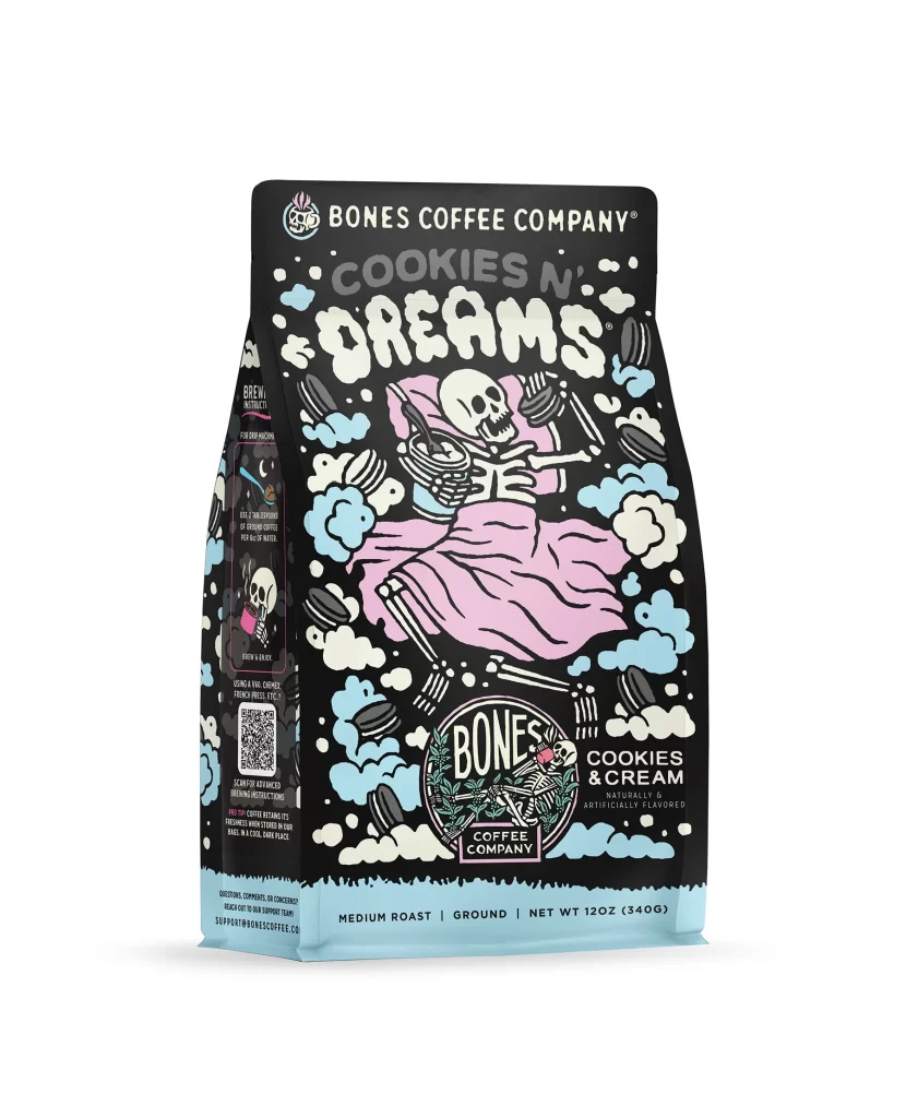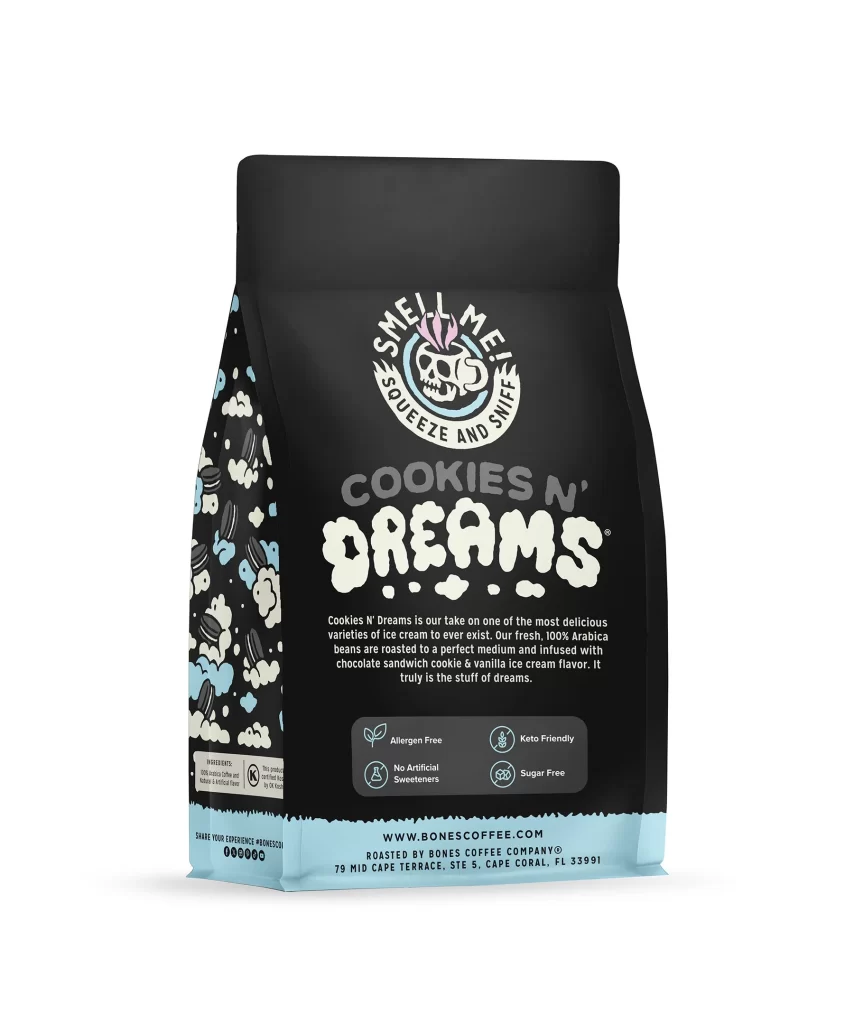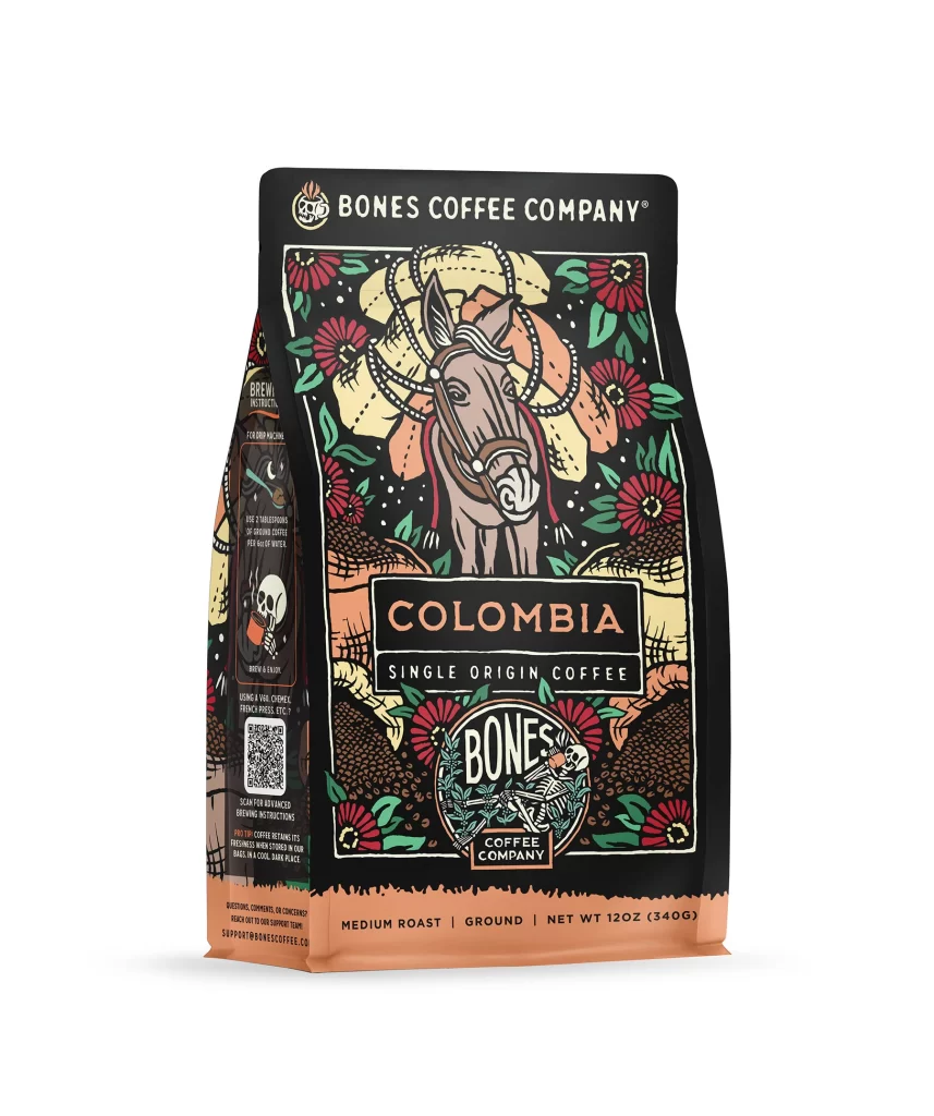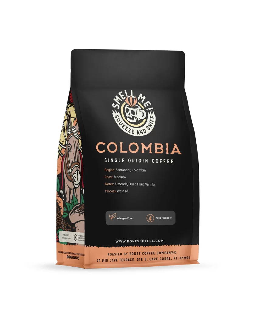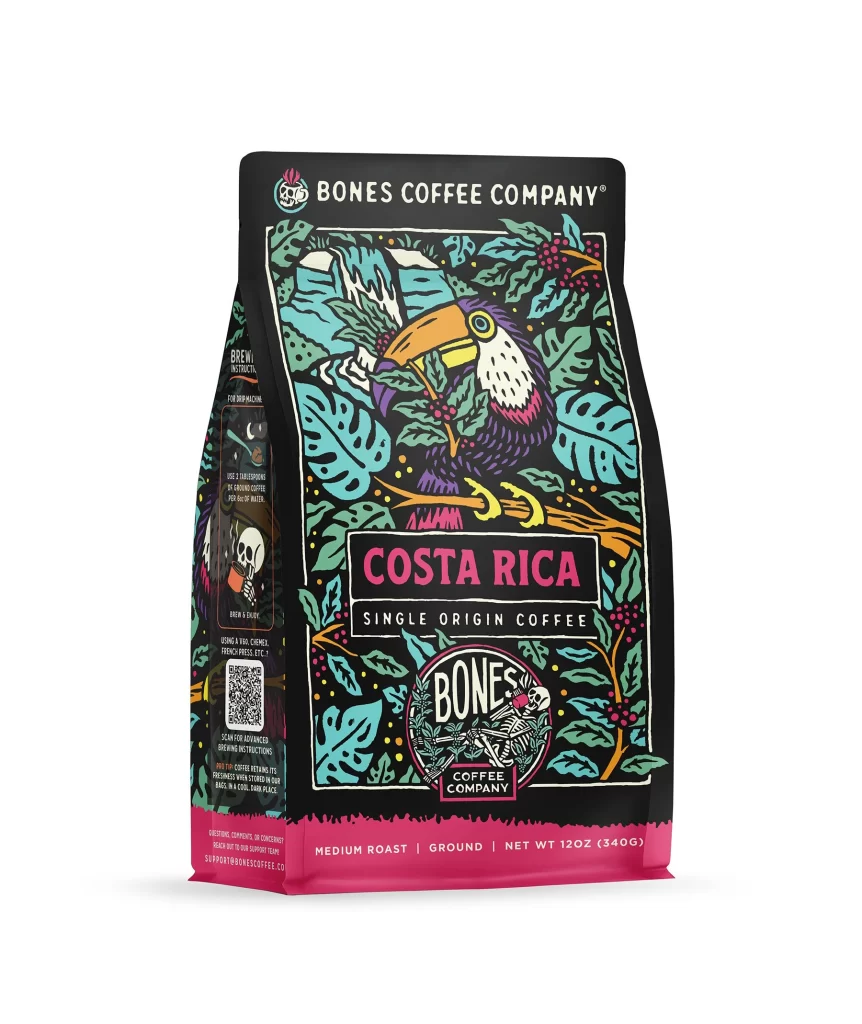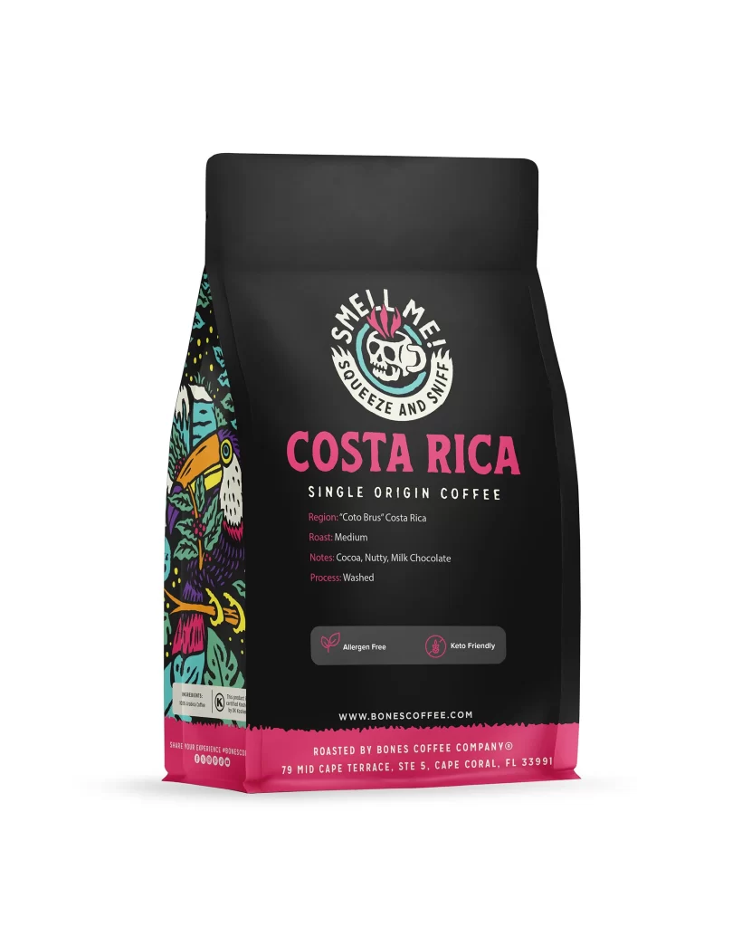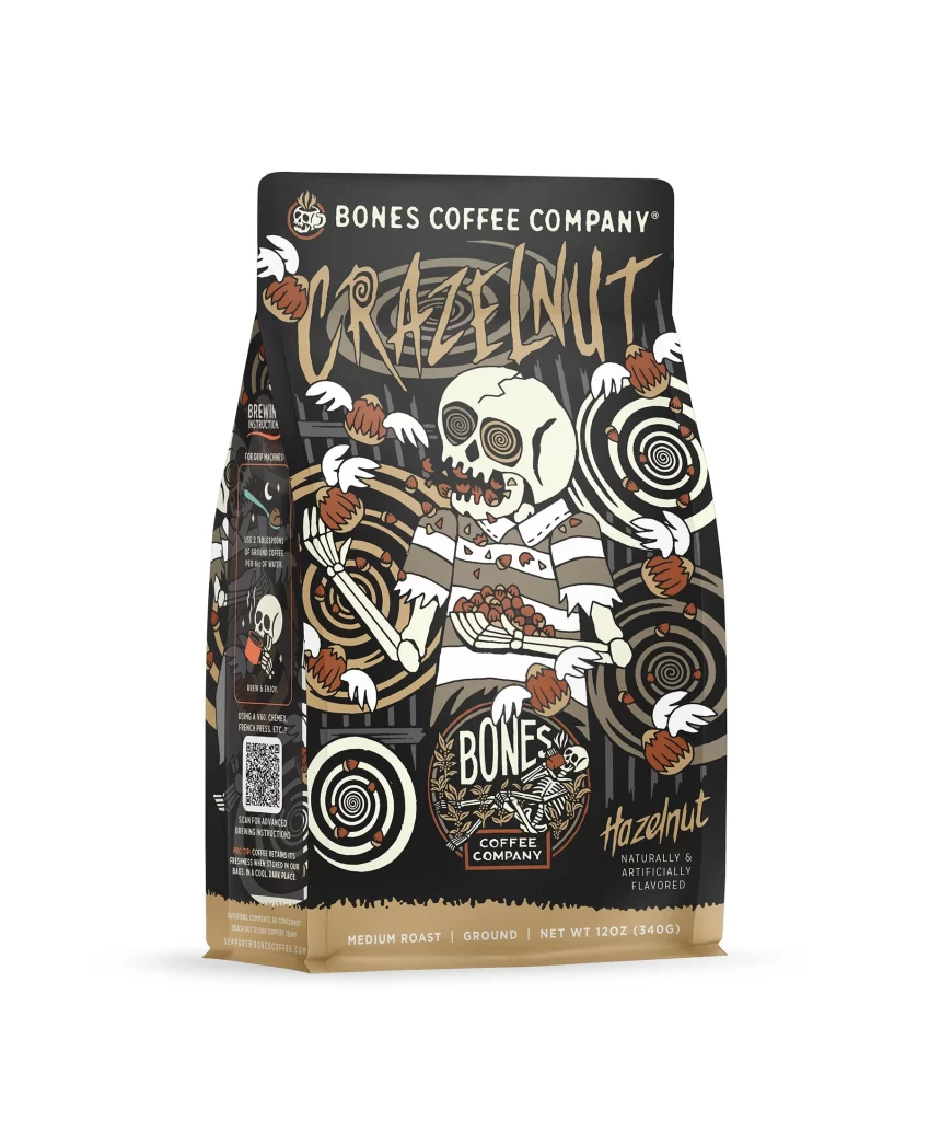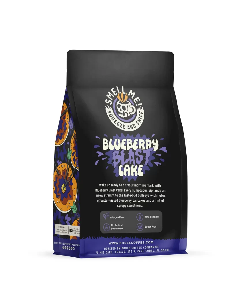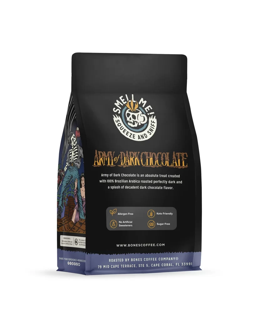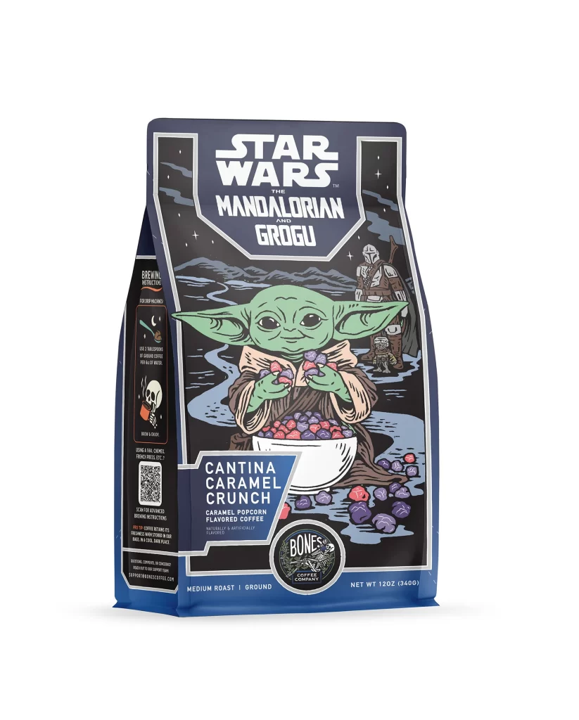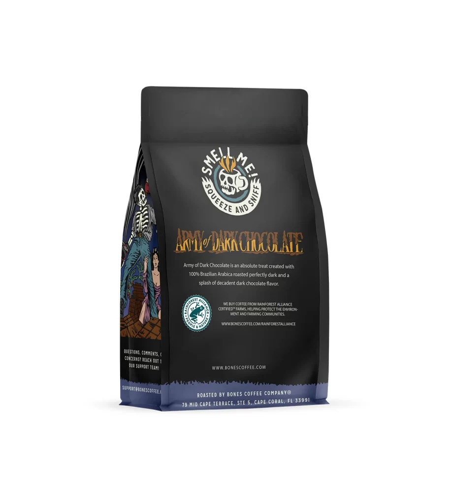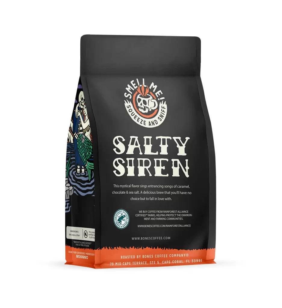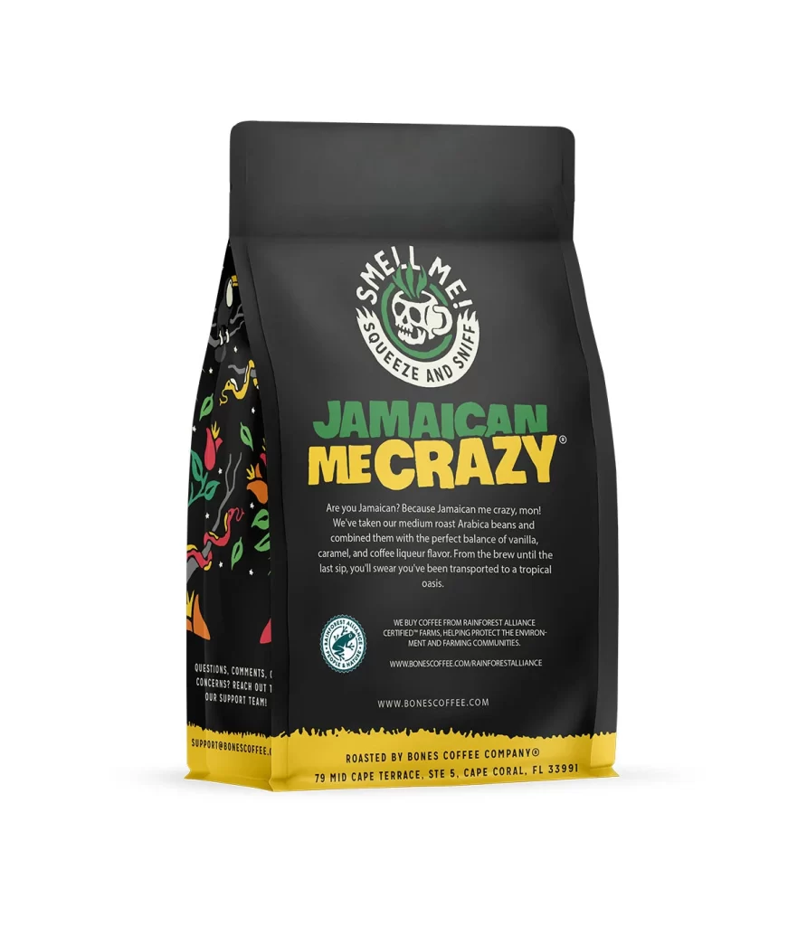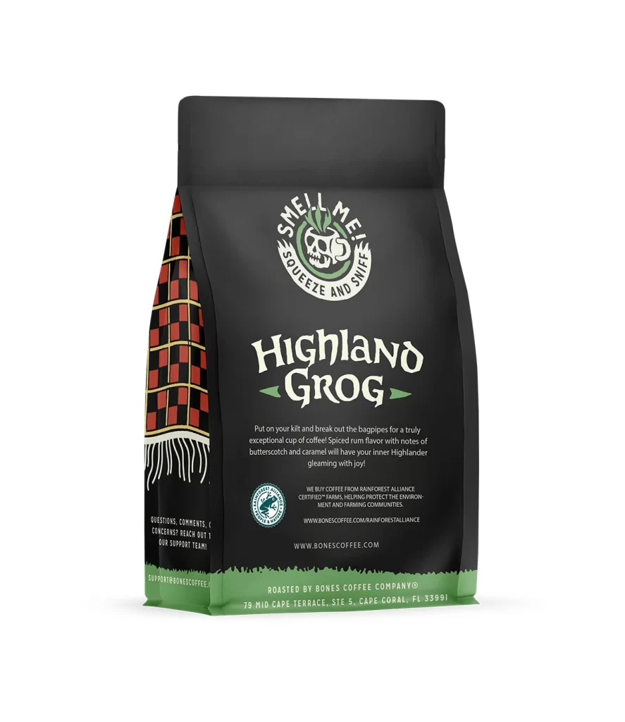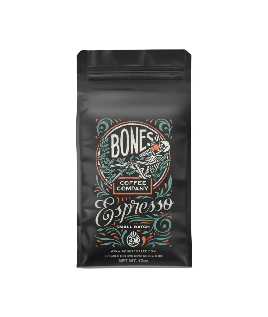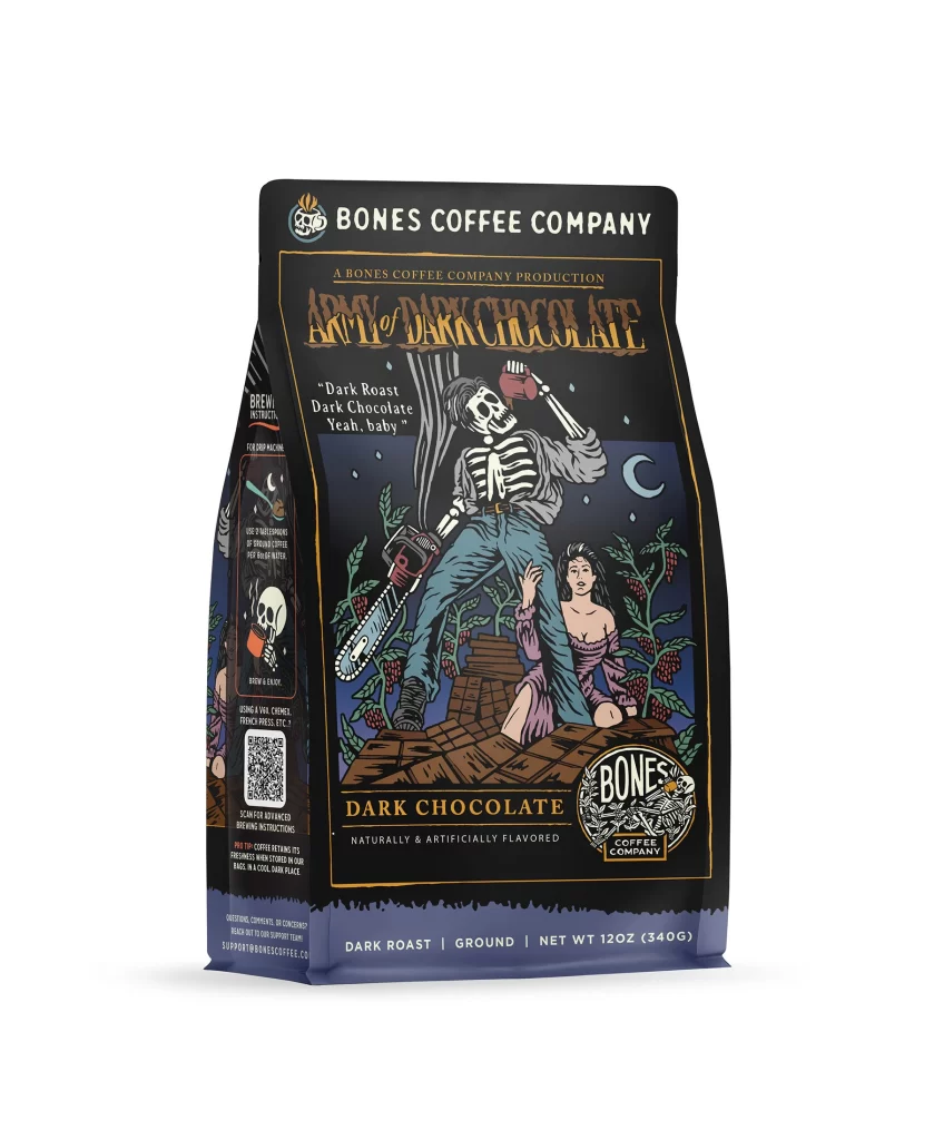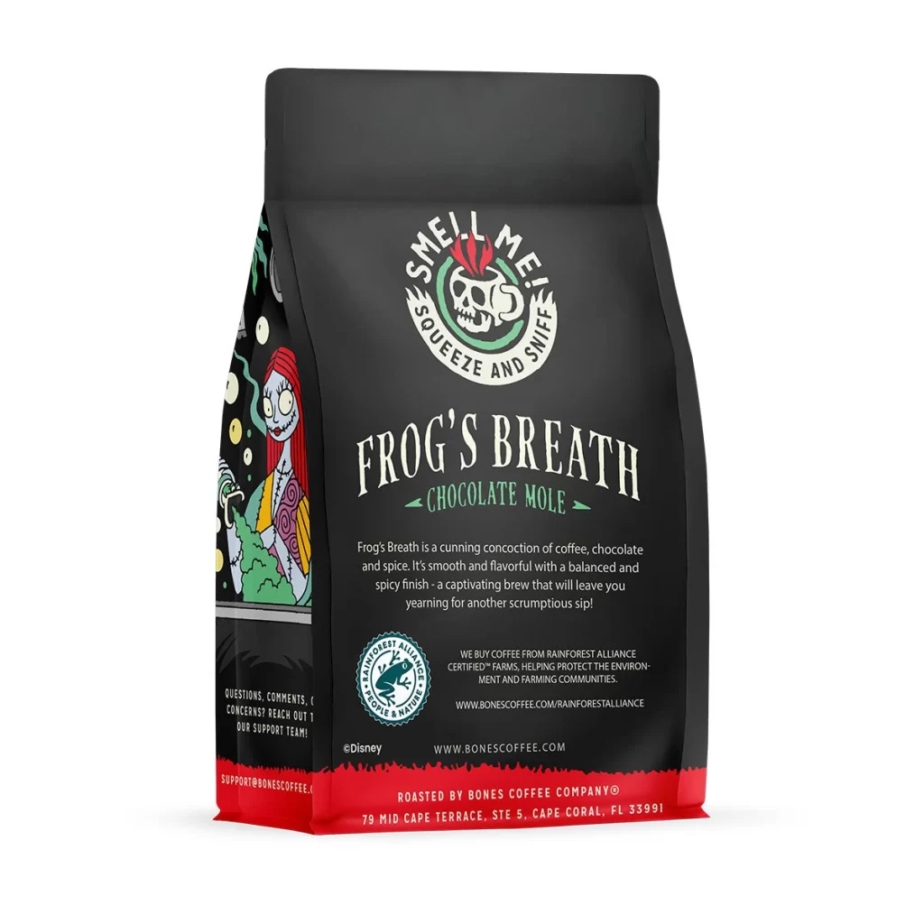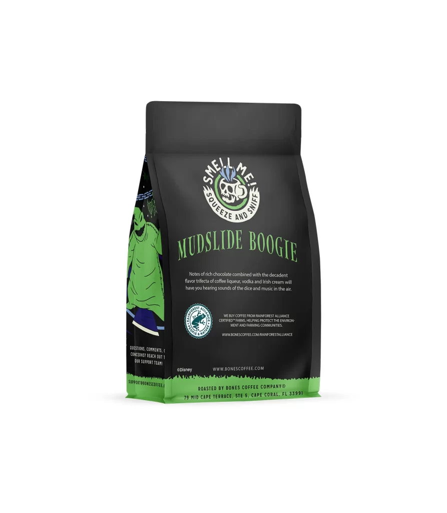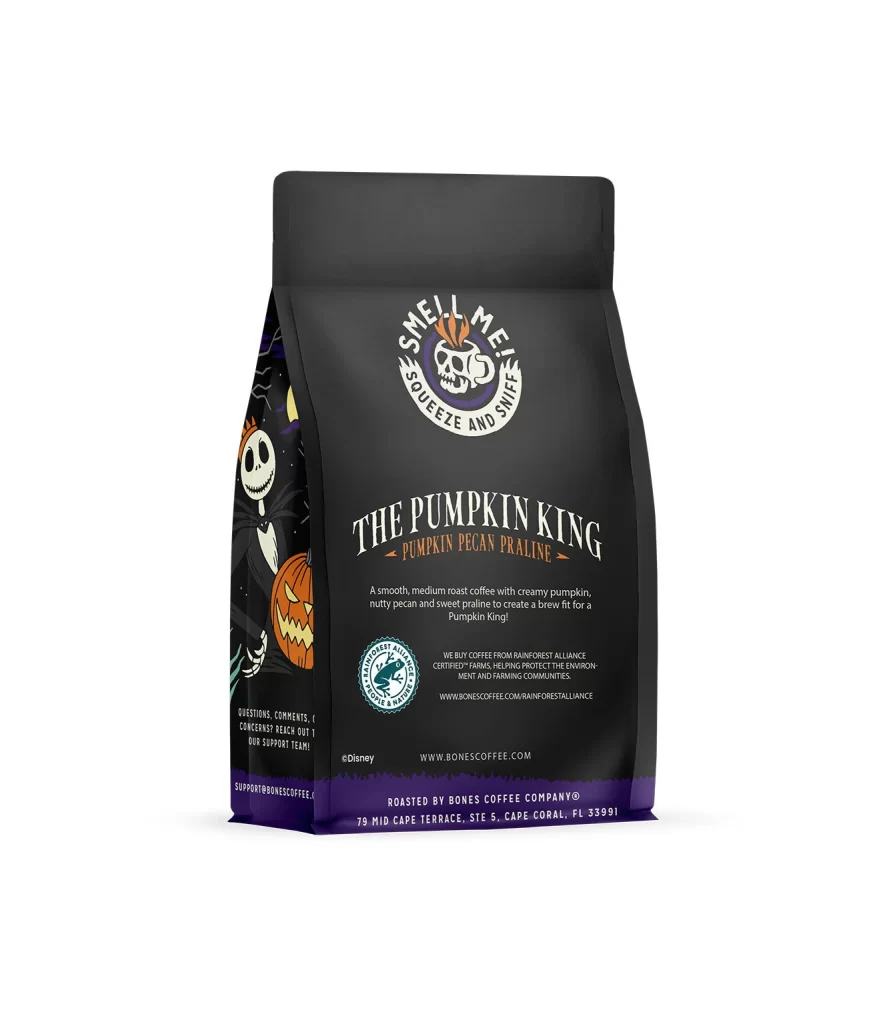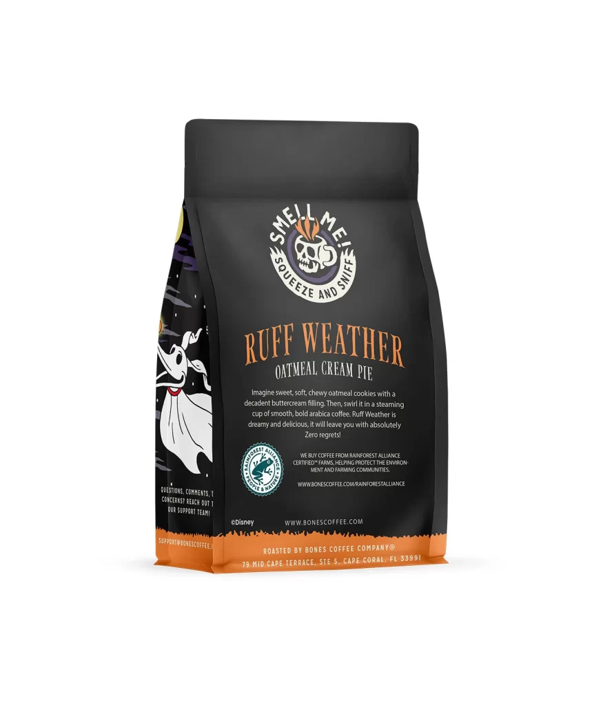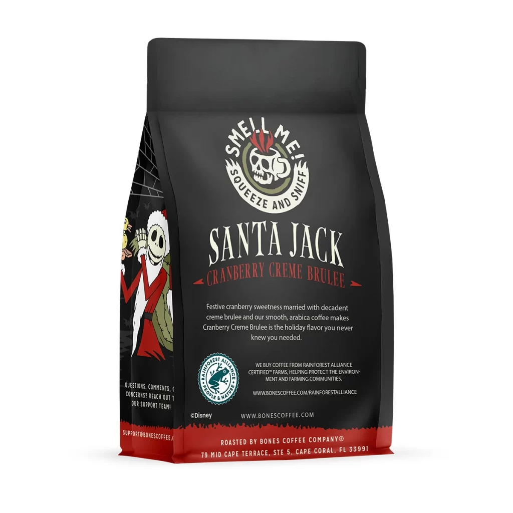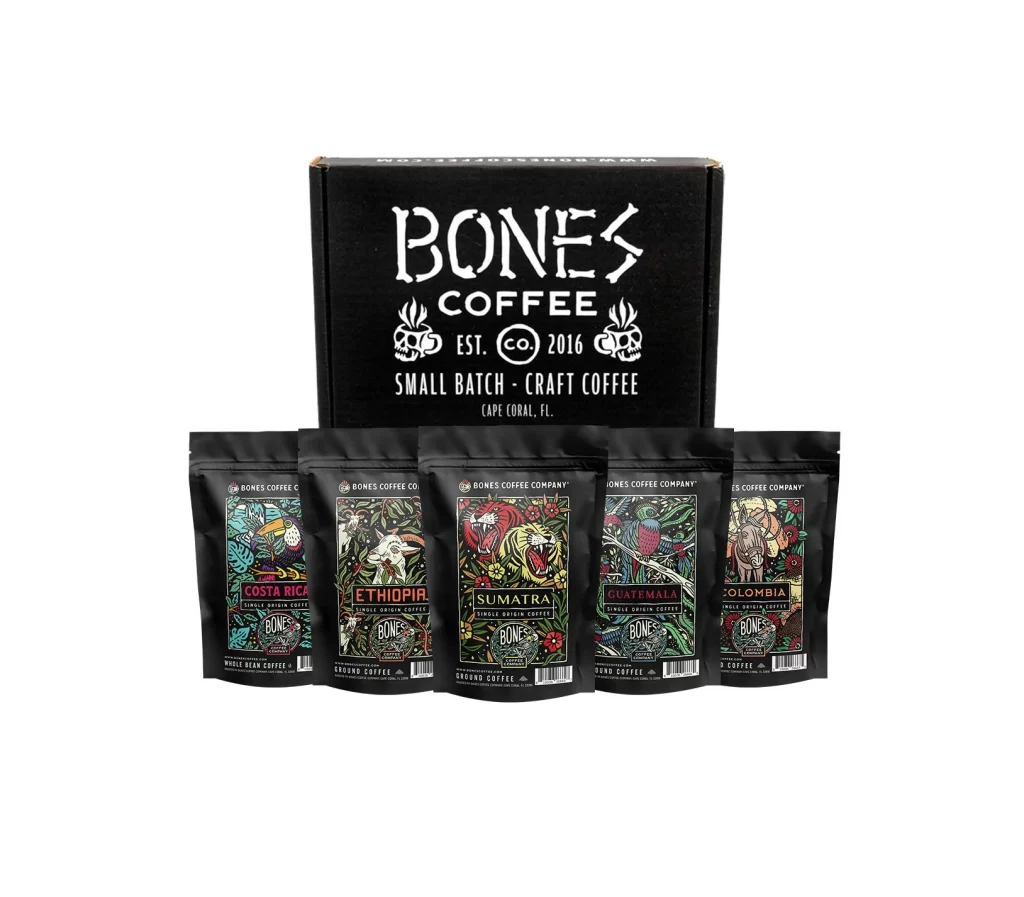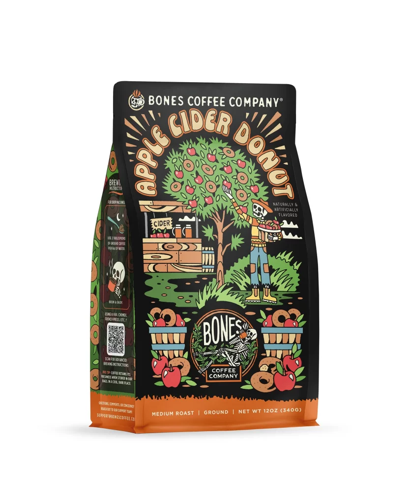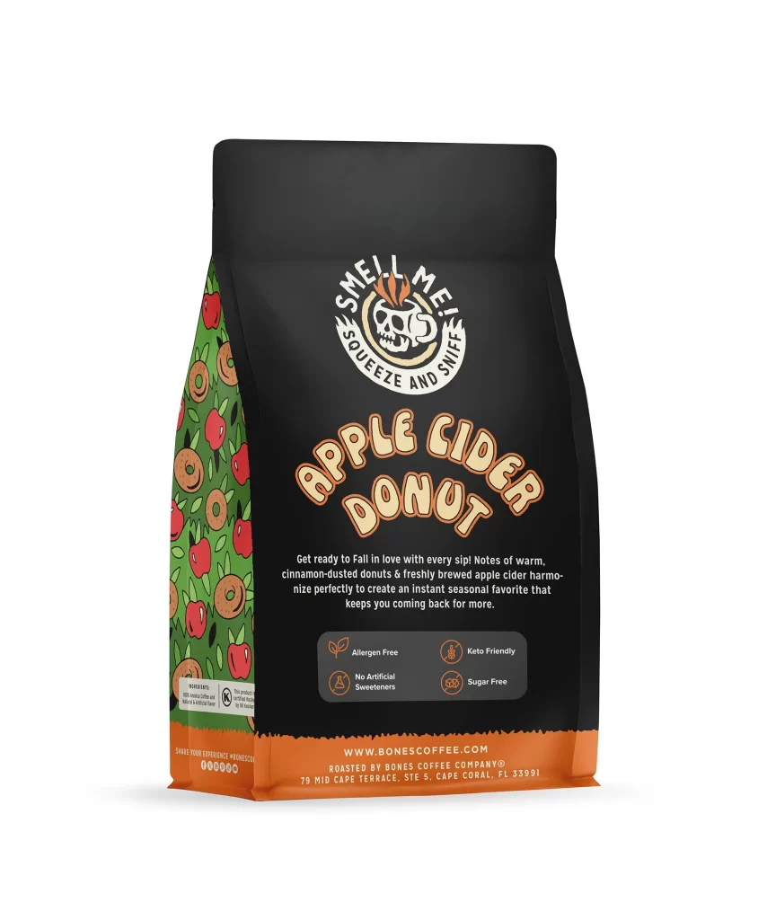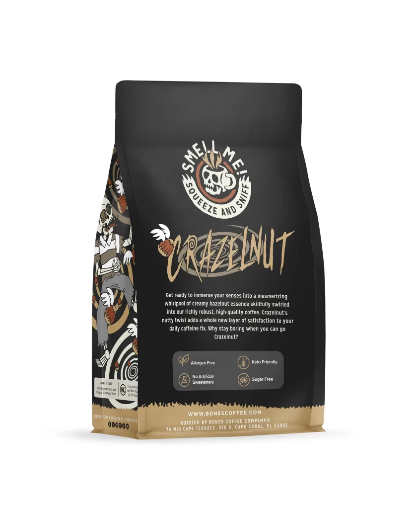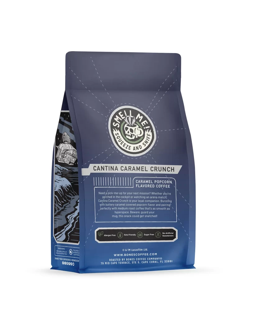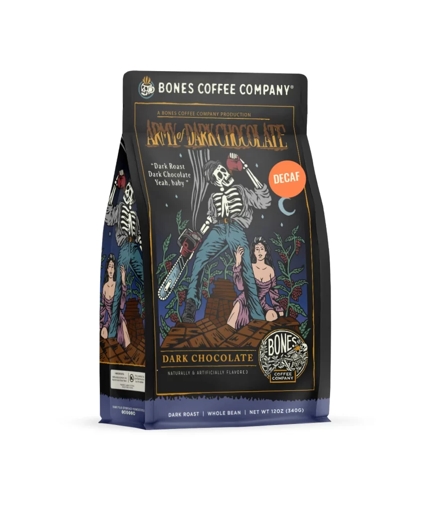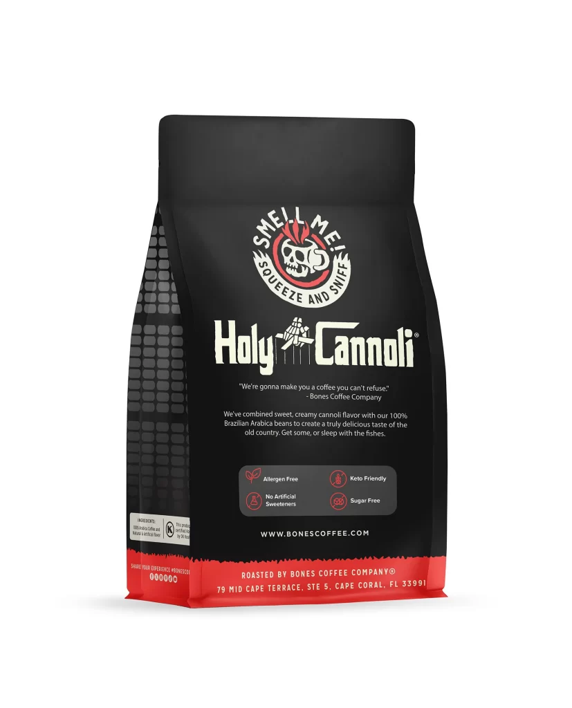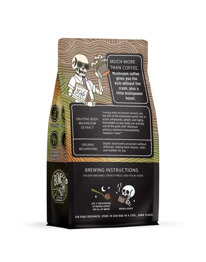
Bones Coffee Better Brain Mushroom Coffee Dark Roast Coffee Bag Back Packaging
Topics
Details
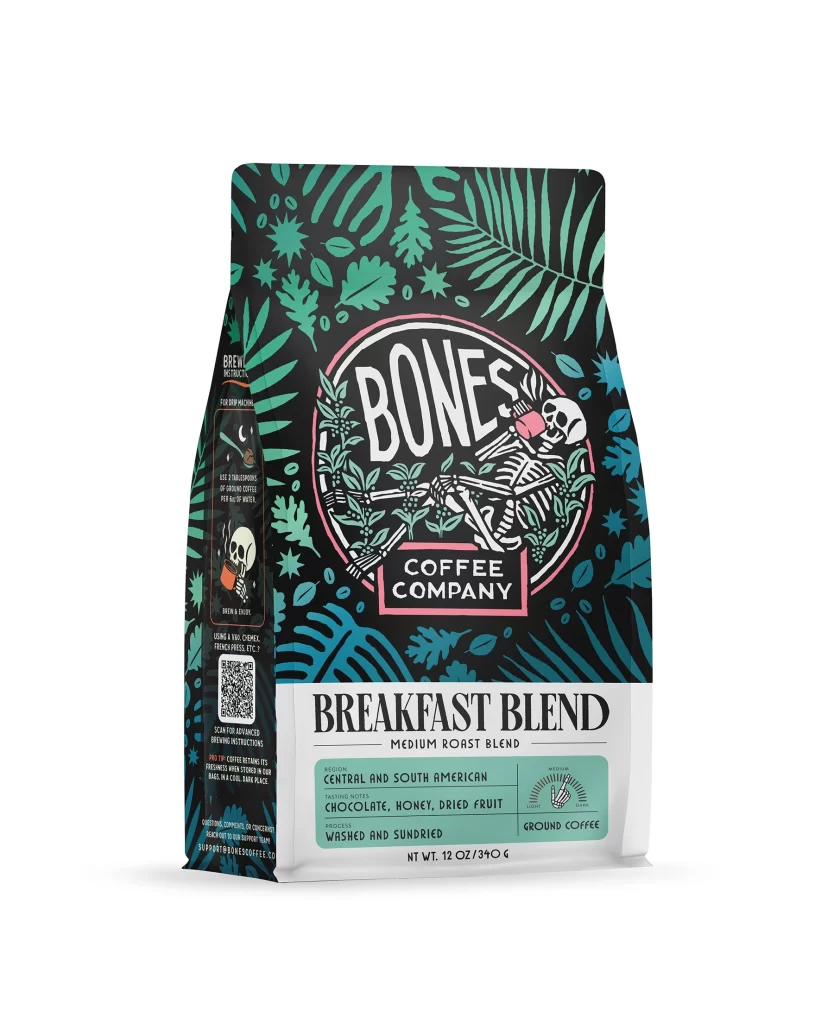
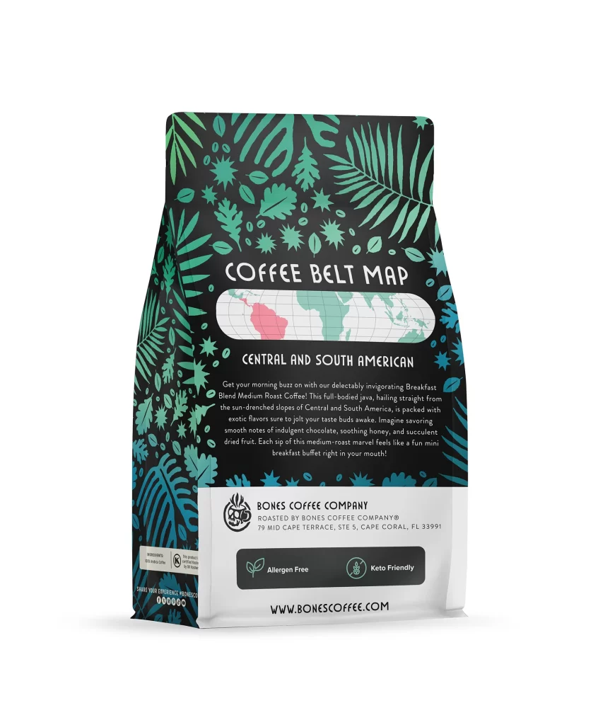
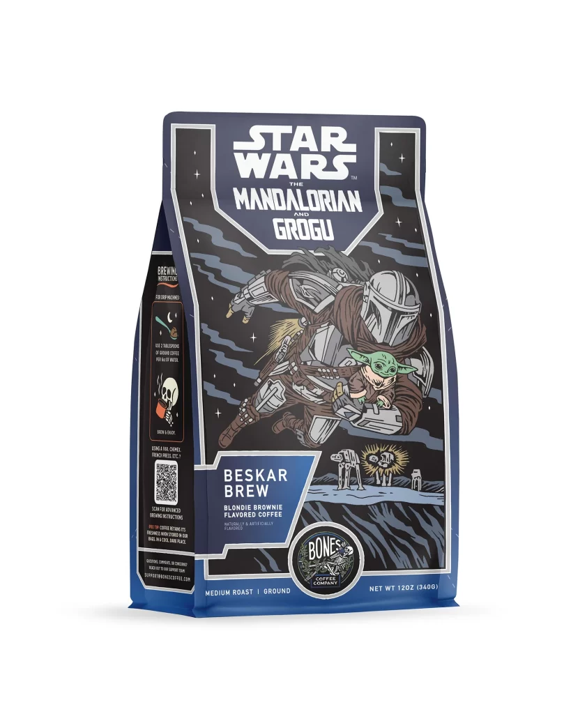
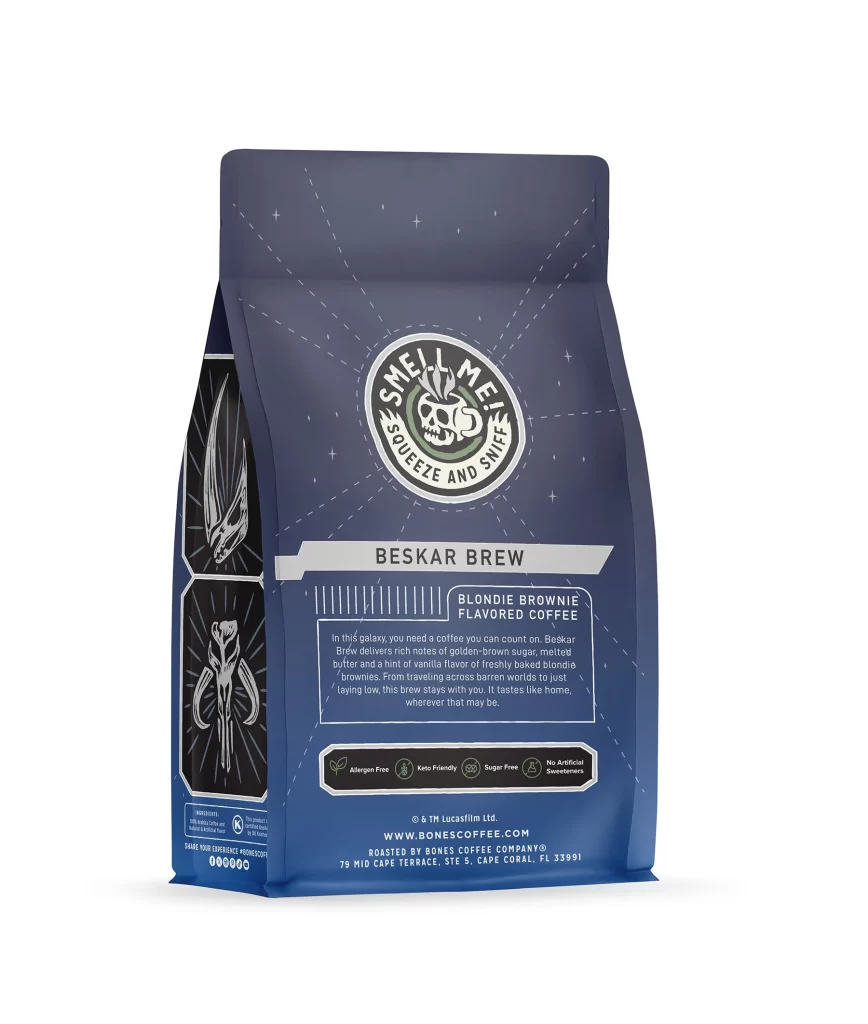
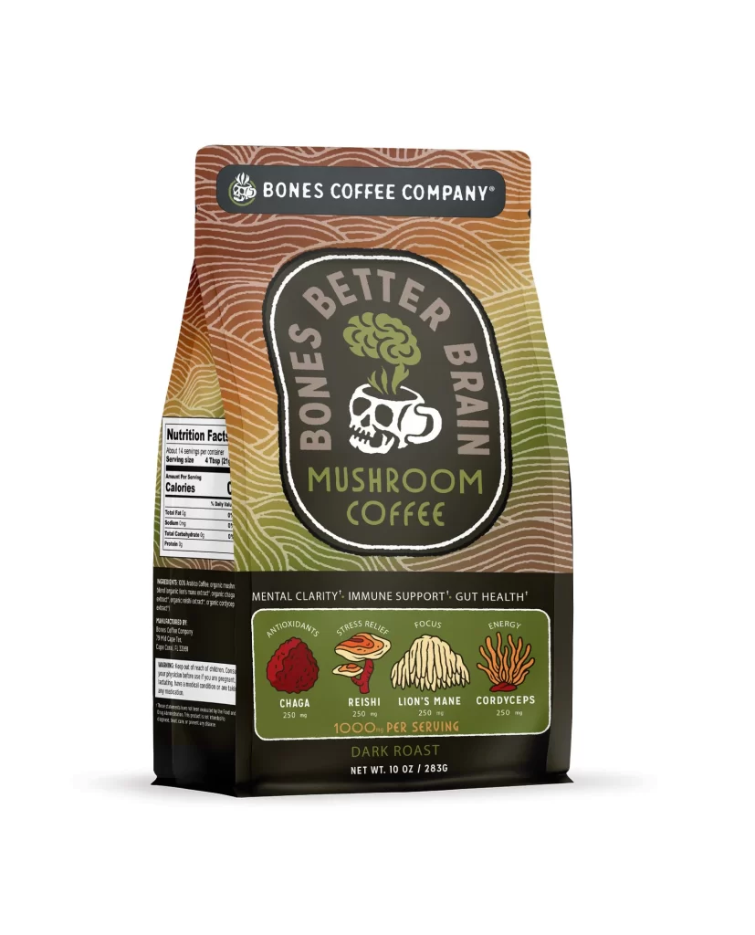
The front design layout centers on a bold brand logo at the top. Below it, a vivid flavor art illustration depicts a human brain blending into a forest of stylized mushrooms. The central graphic sits against a dark background, creating a striking visual focus. This clean composition effectively highlights the unique mushroom coffee theme and the dark roast identity.
Typography uses bright white sans serif fonts to ensure high contrast against the deep dark roast background. This color choice maximizes shelf appeal by making the text highly legible from a distance. The earthy mushroom art paired with dark tones creates a sophisticated appetite appeal. It attracts health conscious shoppers looking for a premium gluten free and non GMO beverage option.
Designers should note how this packaging balances medical imagery with gourmet food aesthetics. The white studio product photo of the physical package shows a matte finish that elevates the 10 oz 283 g bag. Key takeaways include using high contrast typography for ingredient communication and leveraging surreal illustrations to differentiate niche flavors in a crowded coffee market.