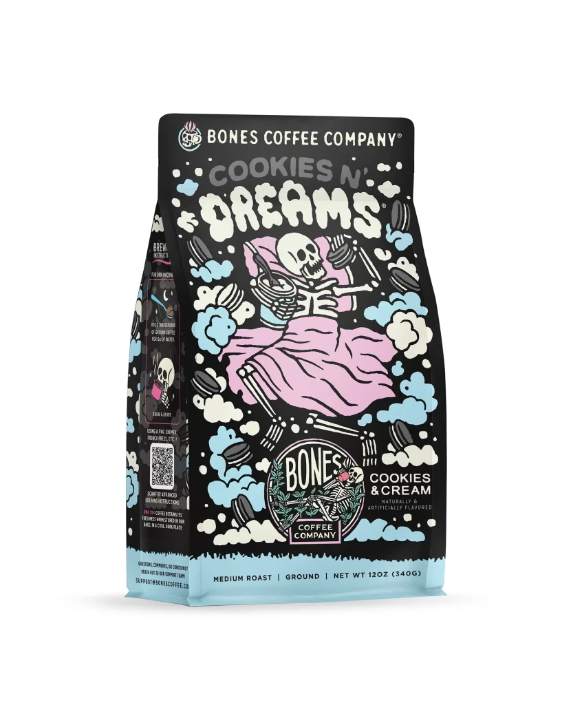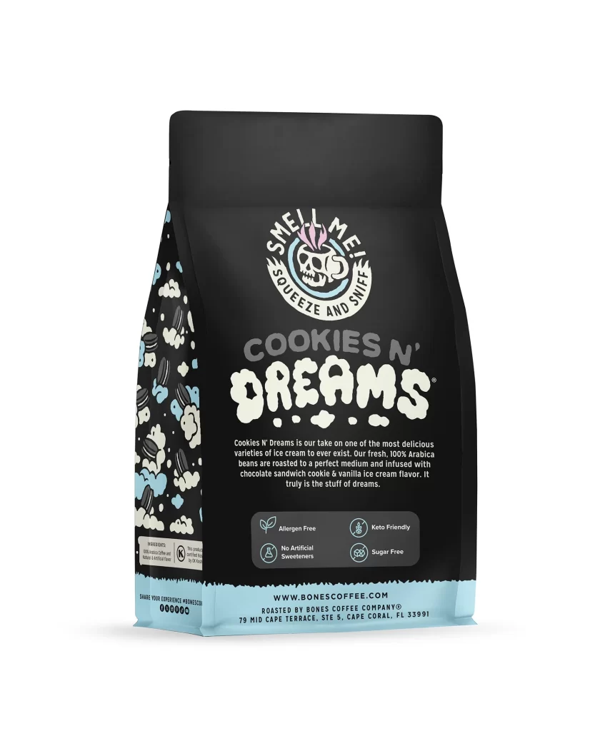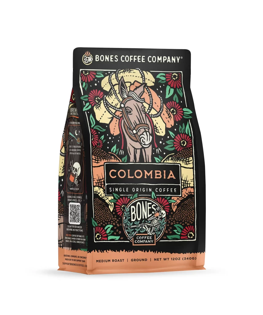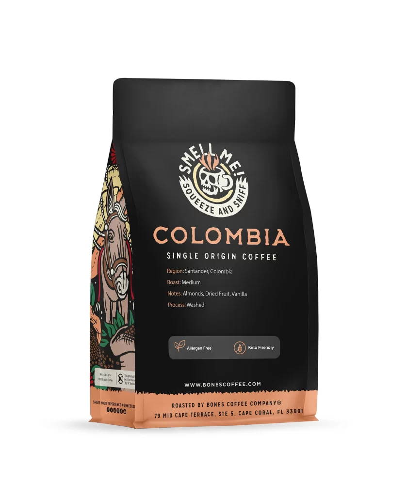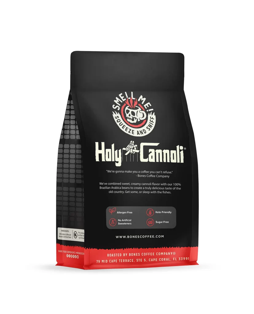
Bones Coffee Holy Cannoli Coffee Bag Back Packaging
Topics
Details
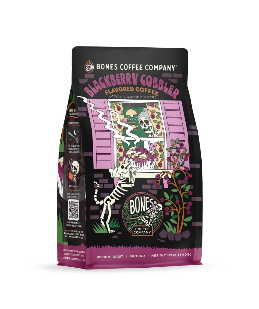
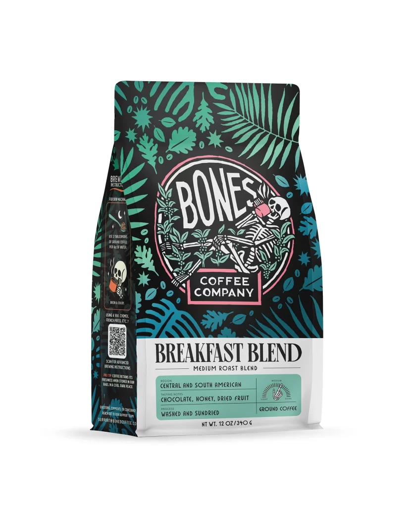
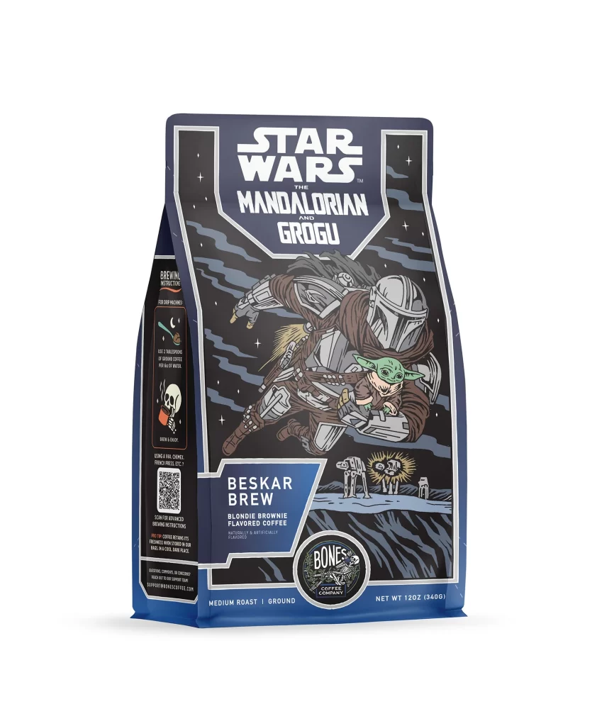
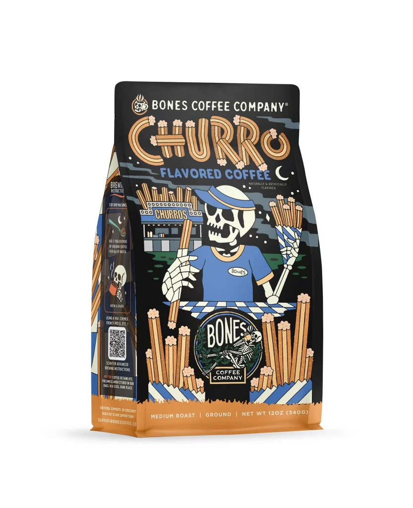
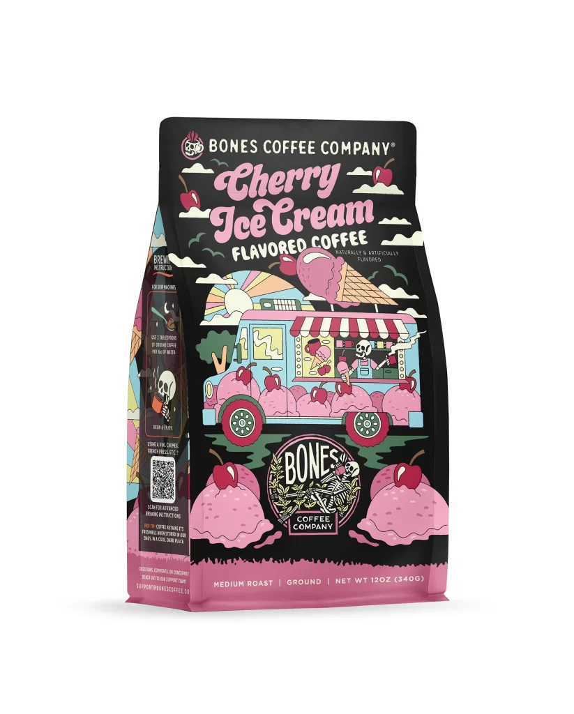
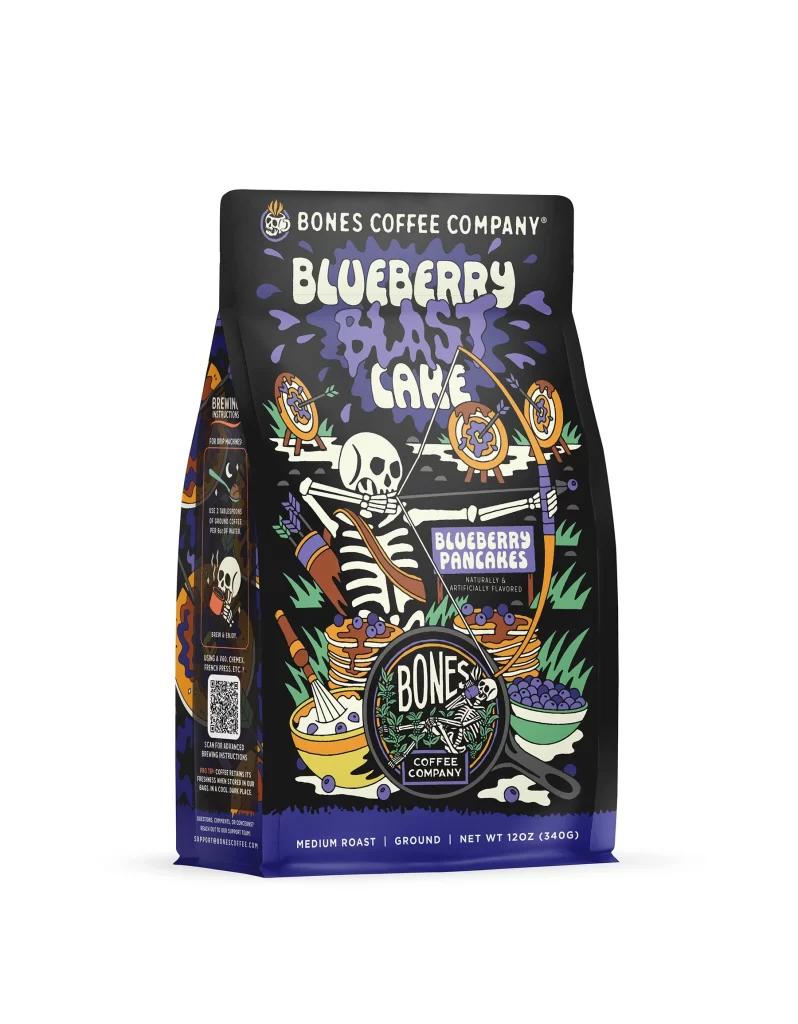
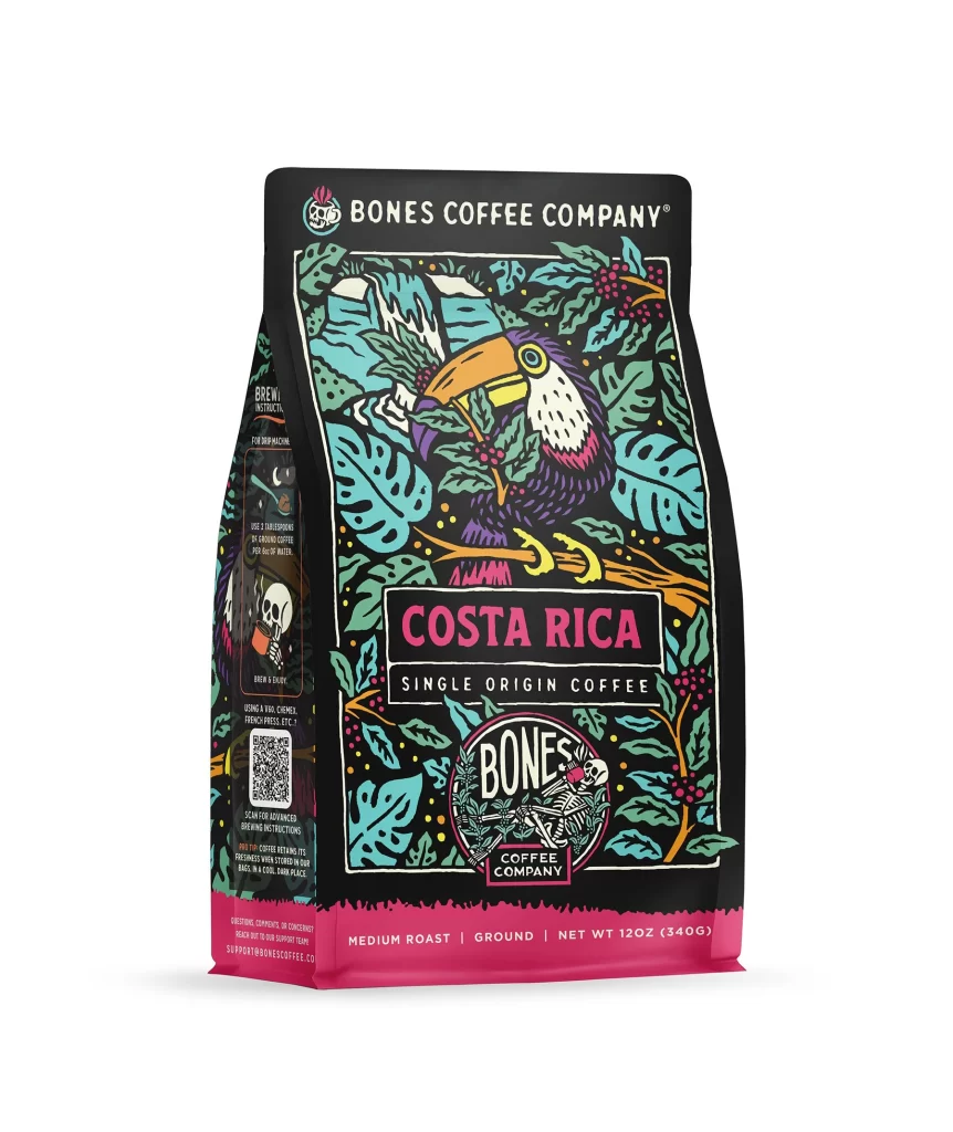
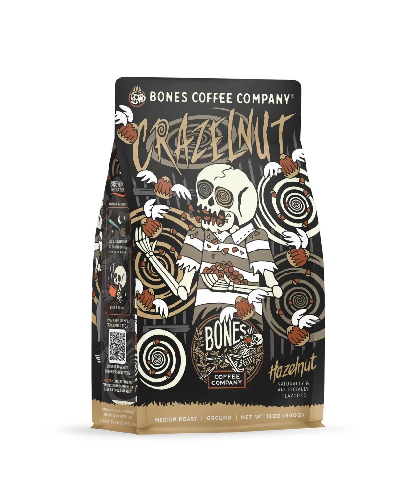
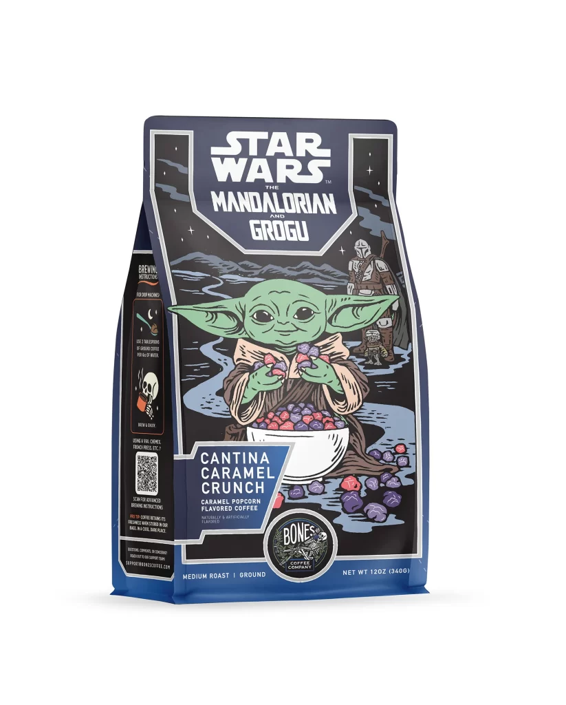
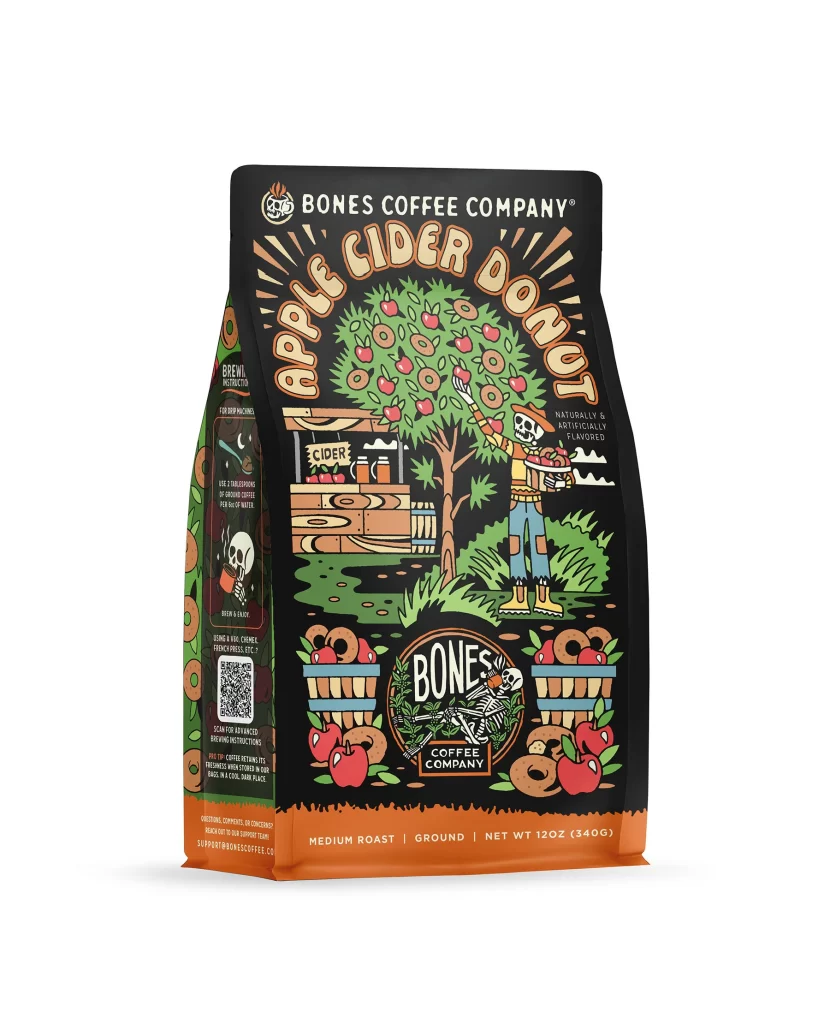
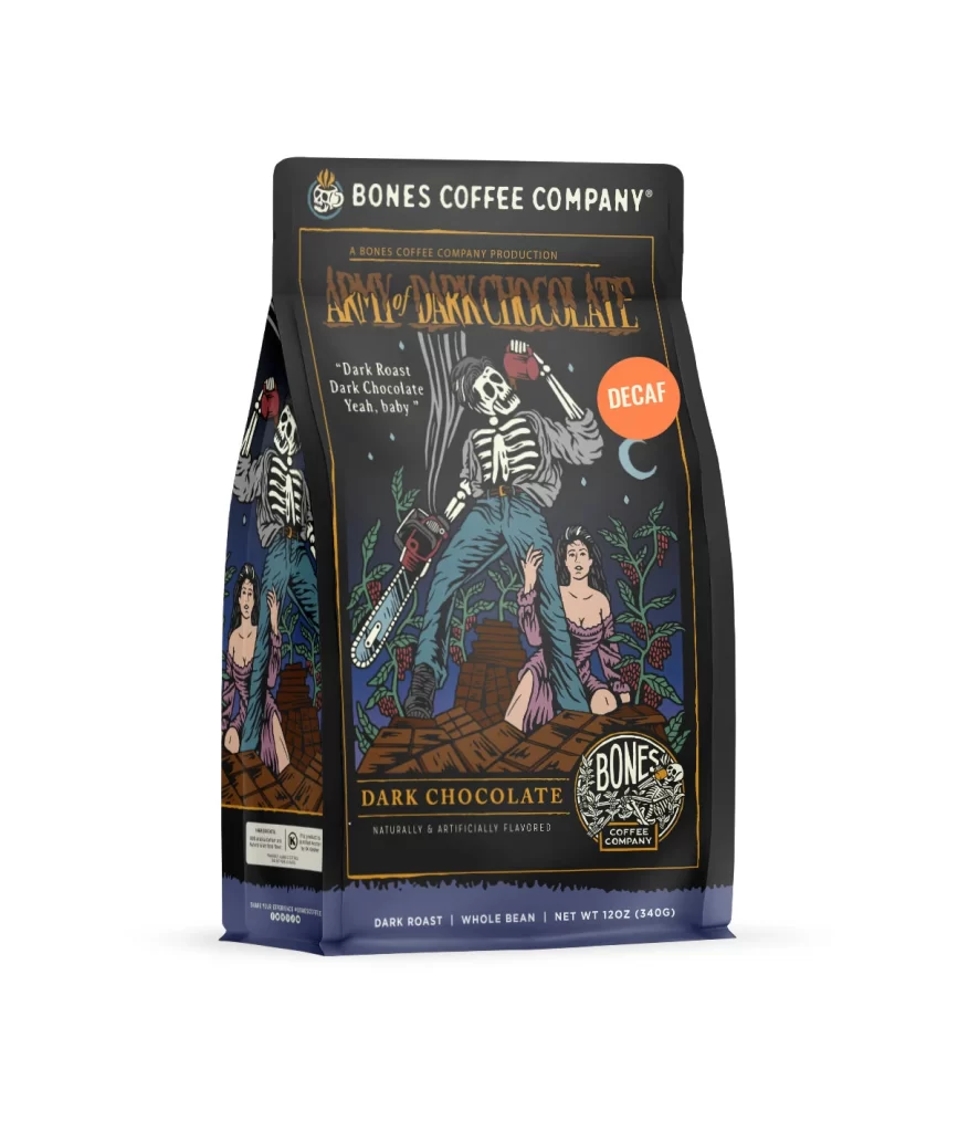
The front design layout features a clean structure with the Bones Coffee Company logo at the top. Below it, bold lettering introduces the Holy Cannoli flavor. The central flavor art showcases a detailed illustration of a cannoli pastry, reinforcing the theme. This visual focus immediately communicates the product identity to the viewer browsing the store shelf.
Typography uses a rich brown hue that complements the roasted coffee theme while evoking a sweet appetite appeal. The high contrast against the light background boosts shelf visibility. This color strategy pairs well with the premium feel of the bag. It creates a bold visual impact that attracts consumers looking for specialty coffee options.
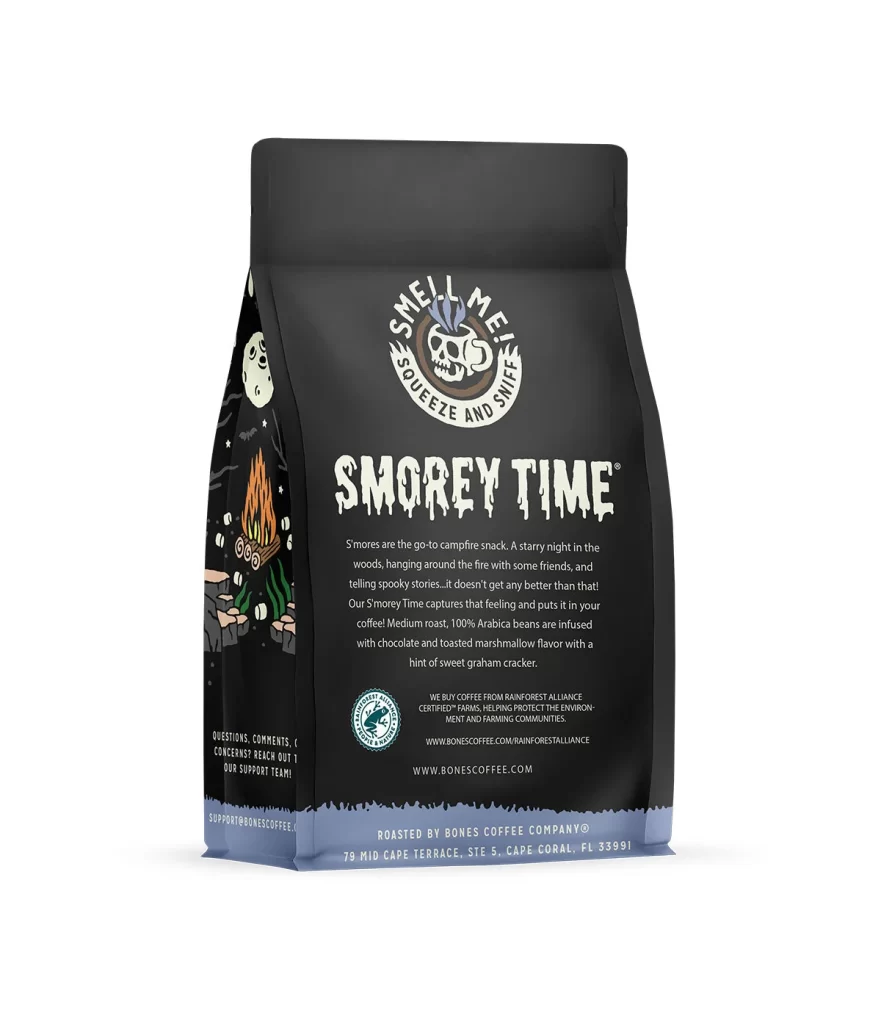
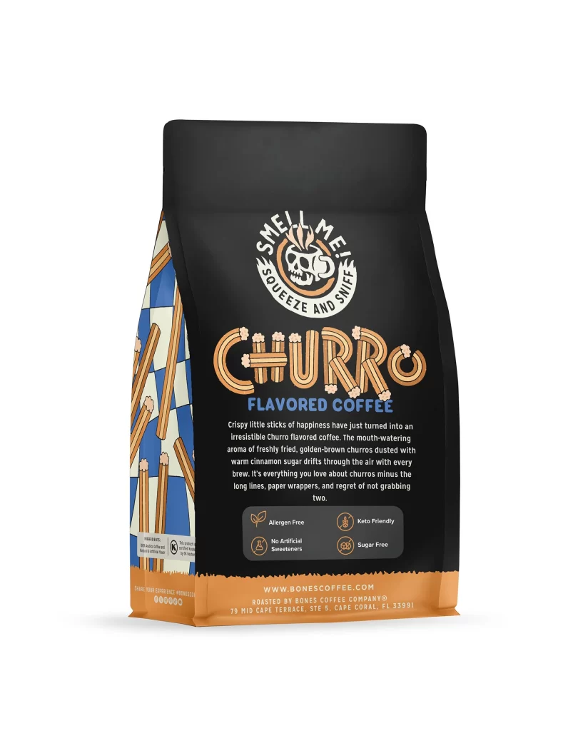
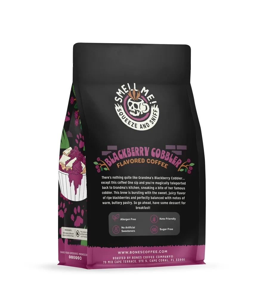
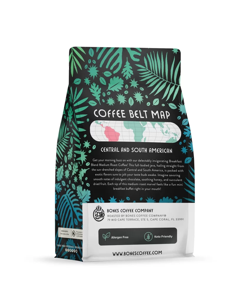
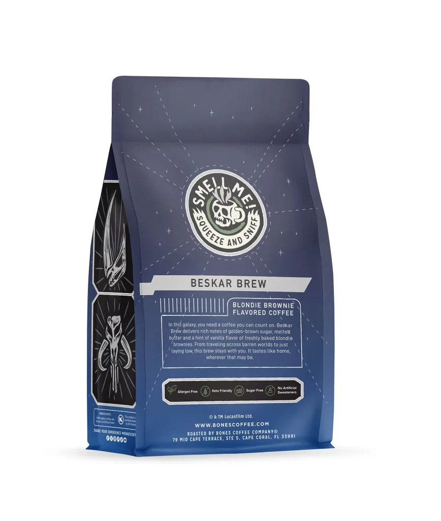
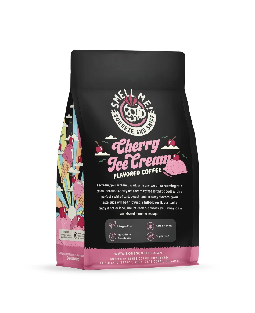
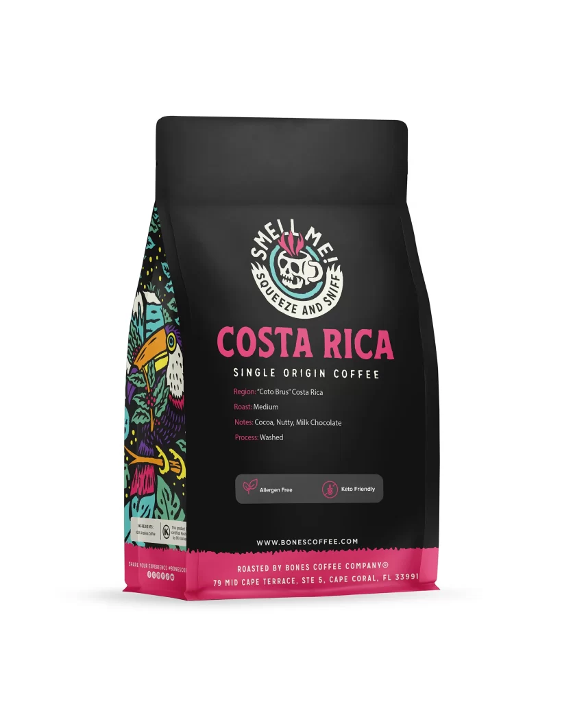
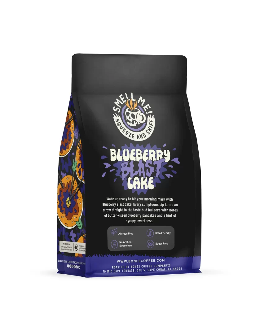
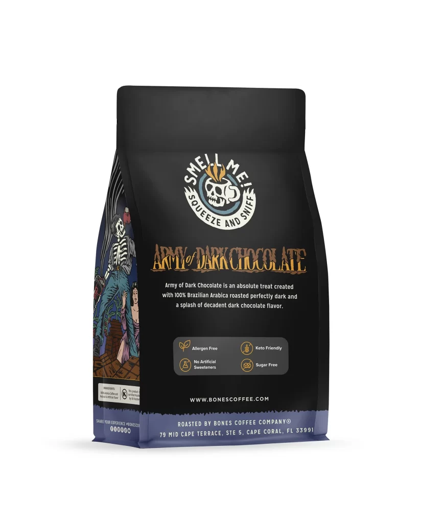
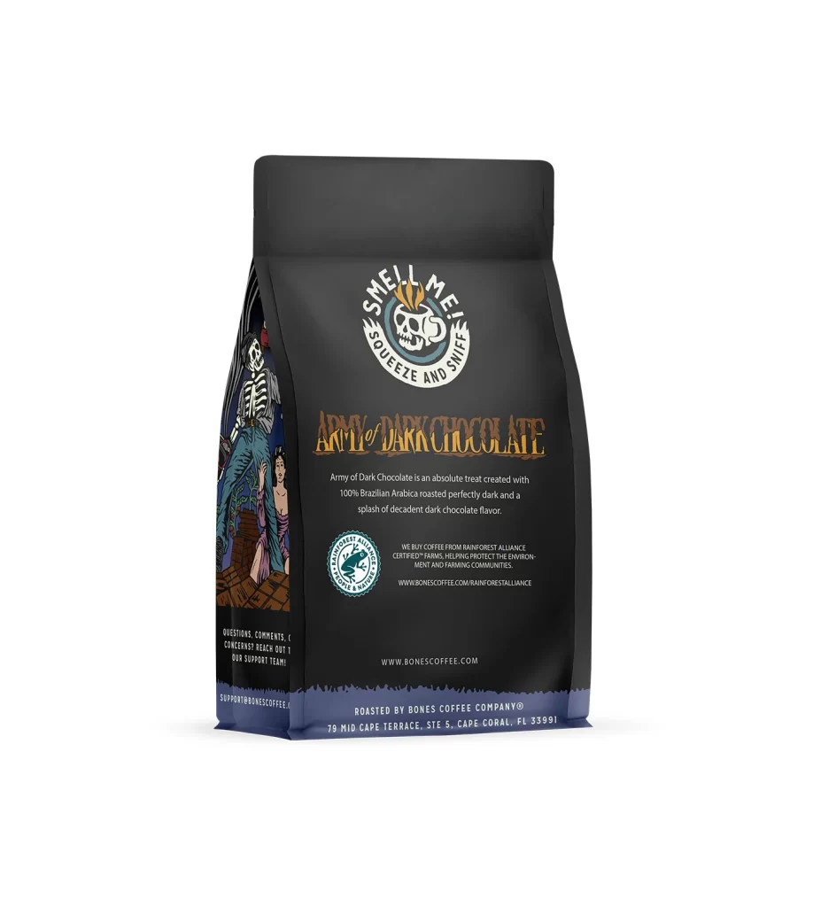
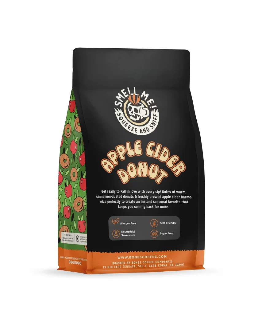
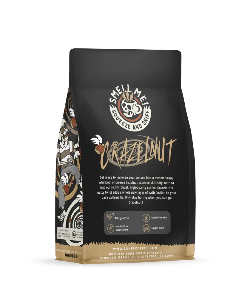
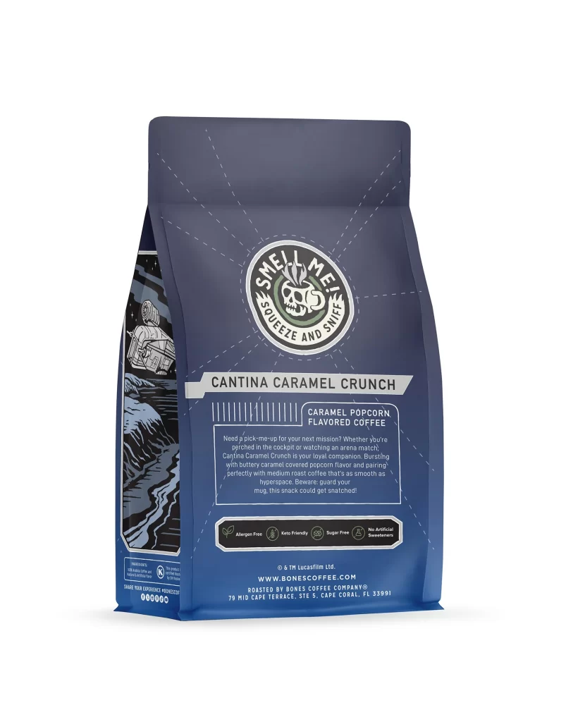
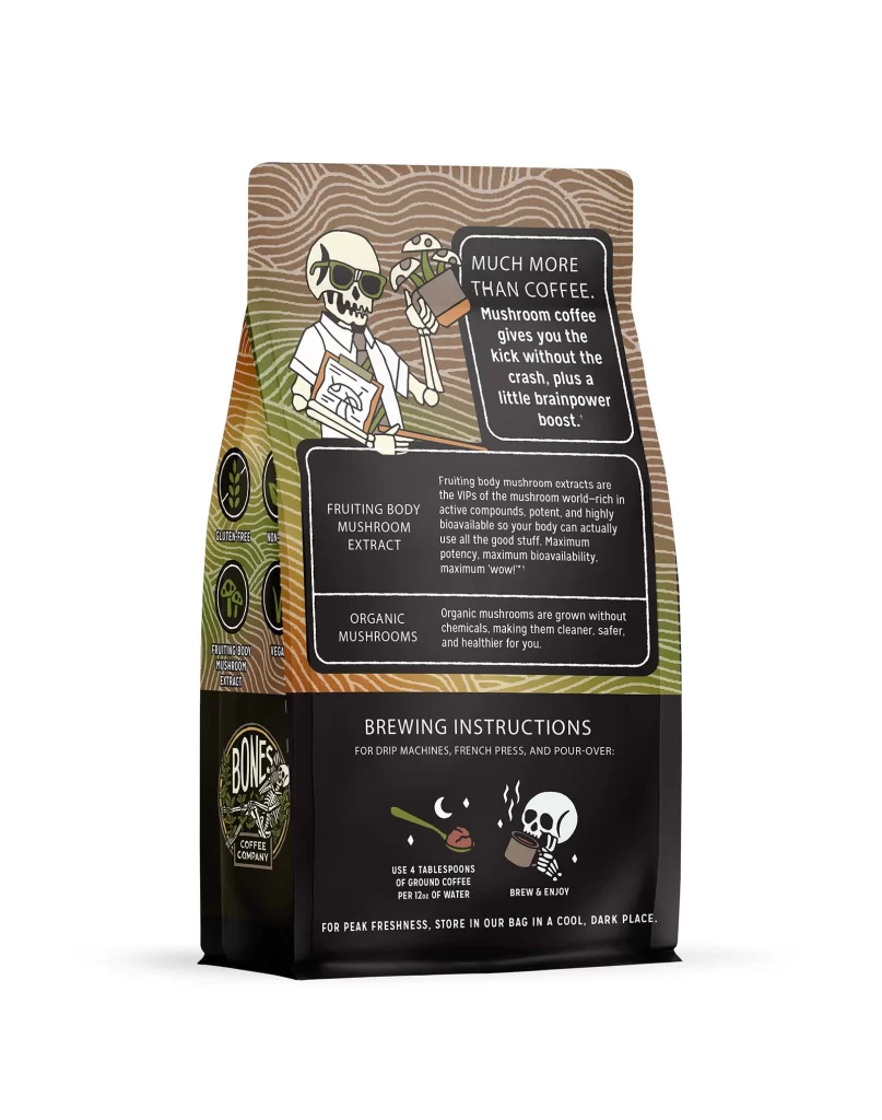
Designers should note how the back panel balances regulatory details with lifestyle messaging. The Allergen Free, Keto Friendly, and Sugar Free icons are arranged neatly for quick scanning. Brewing text and the 12 oz 340g weight declaration are set in a readable font. This integration of facts and user instructions provides a functional yet aesthetically pleasing unboxing experience.