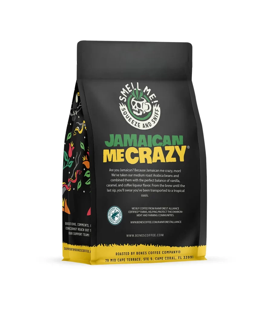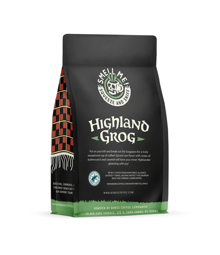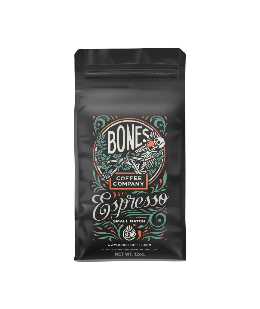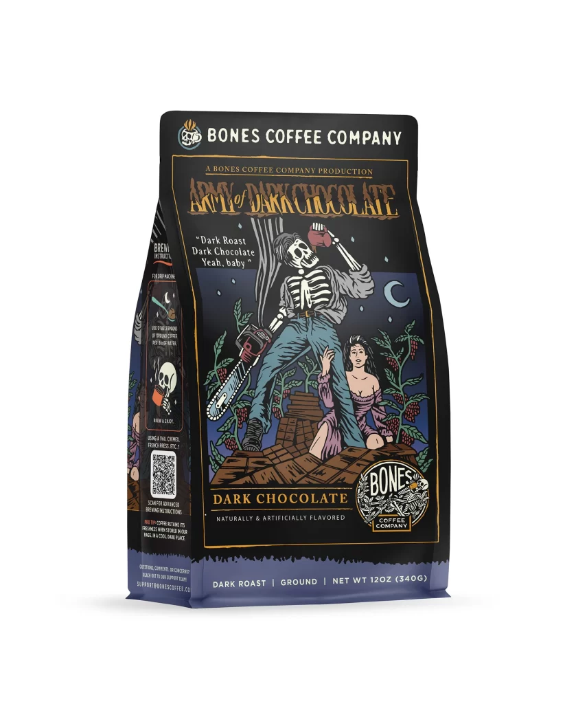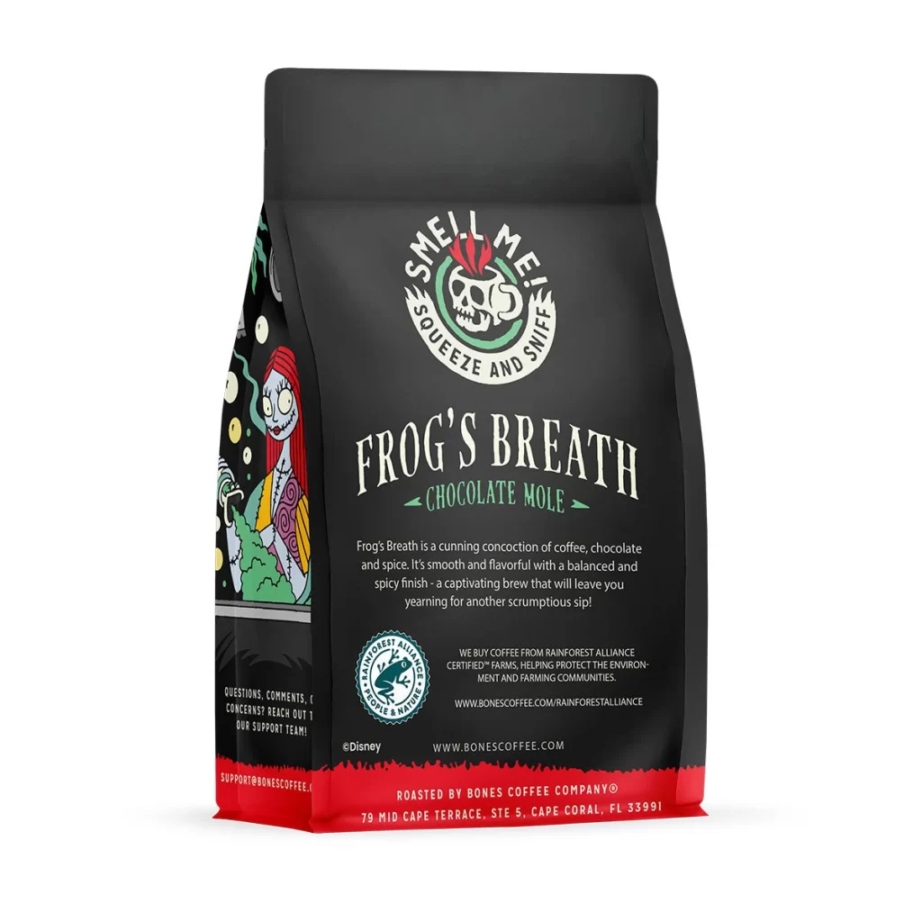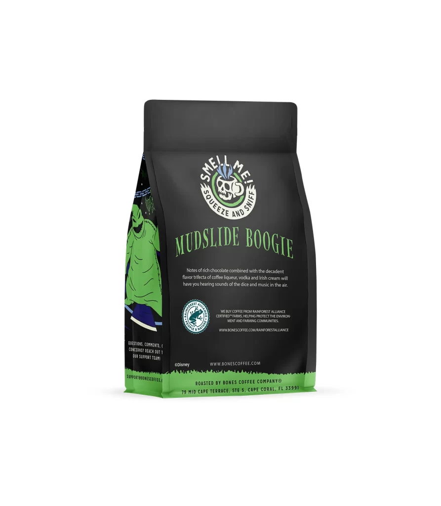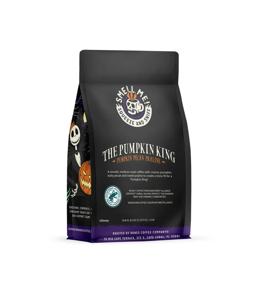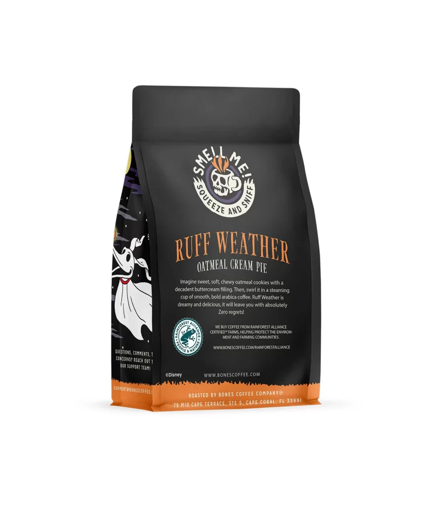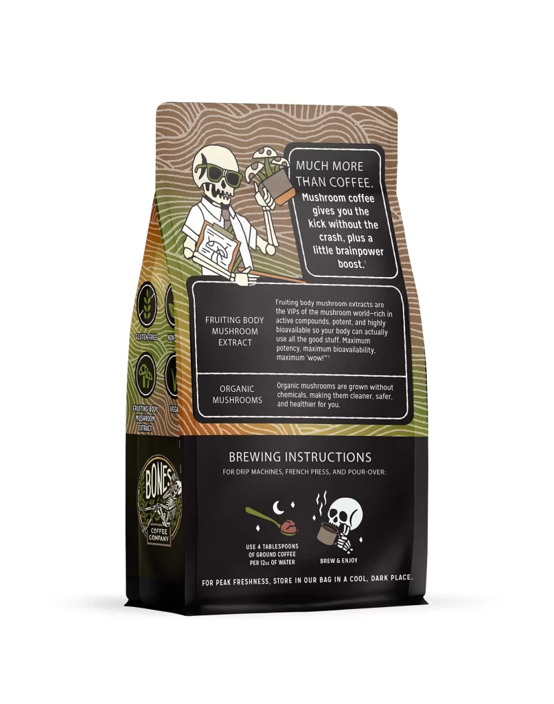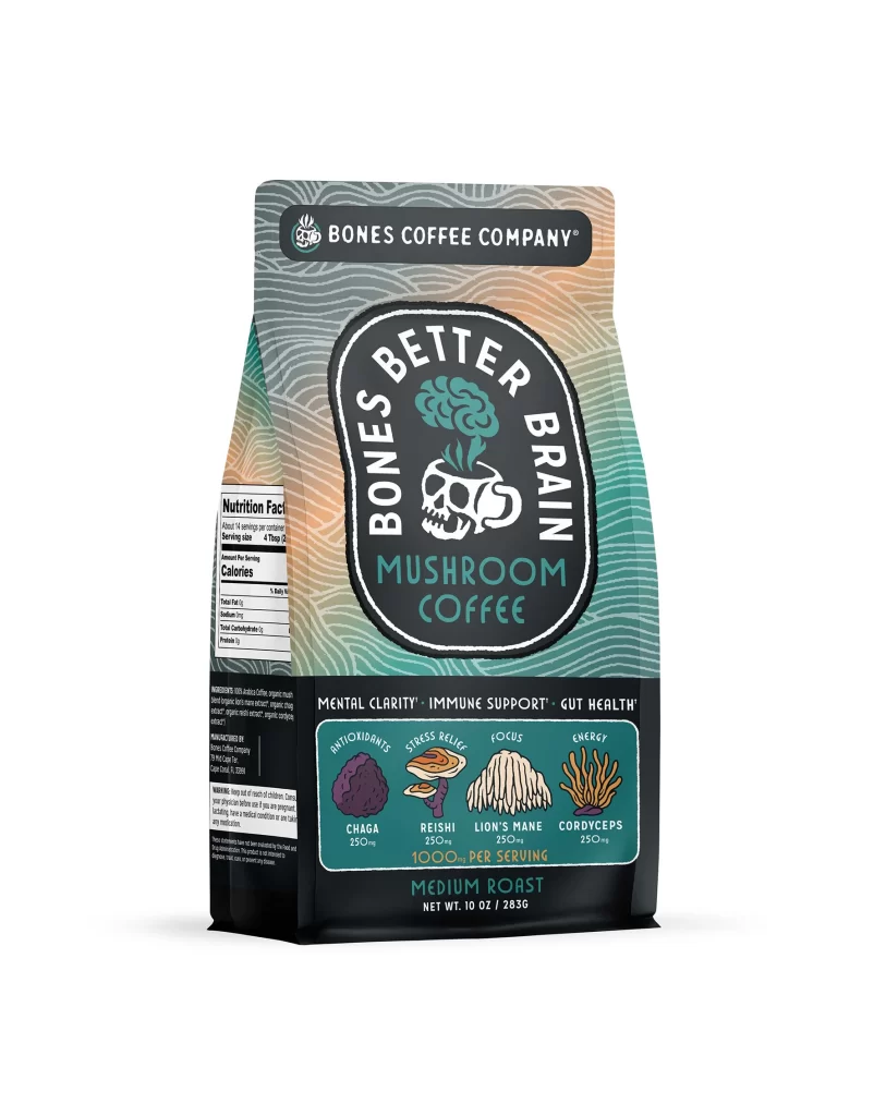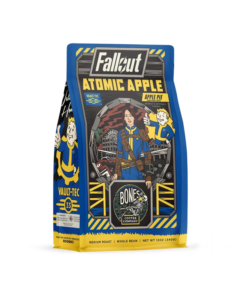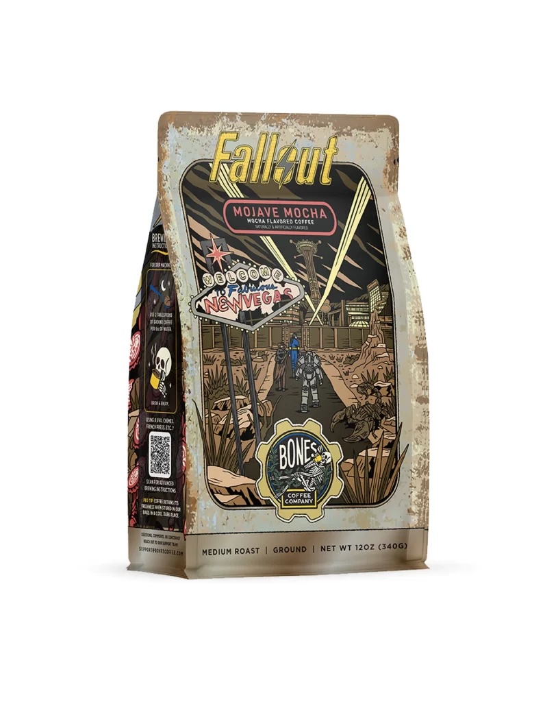
Bones Coffee Crazelnut Coffee Bag Back Packaging
Topics
Details
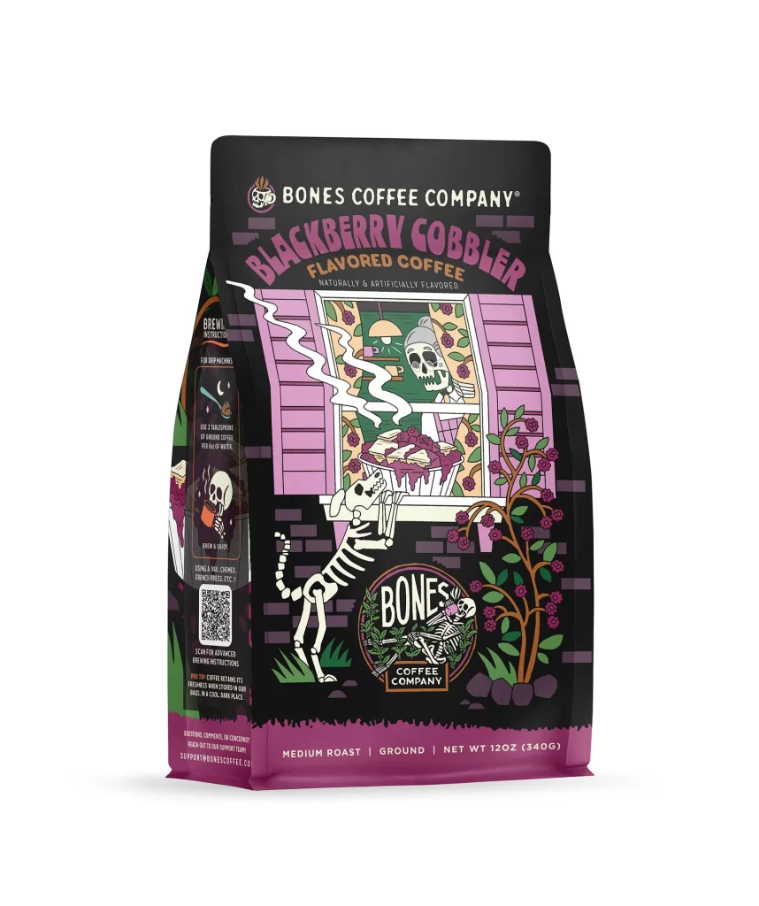
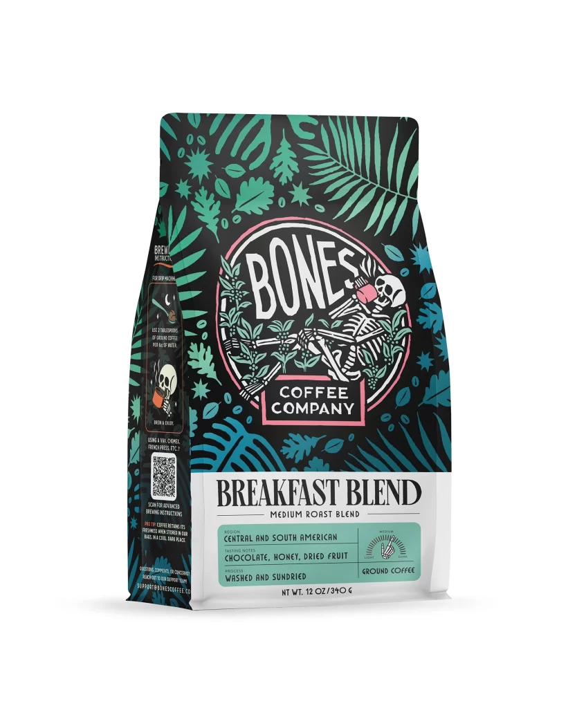
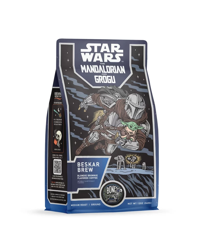
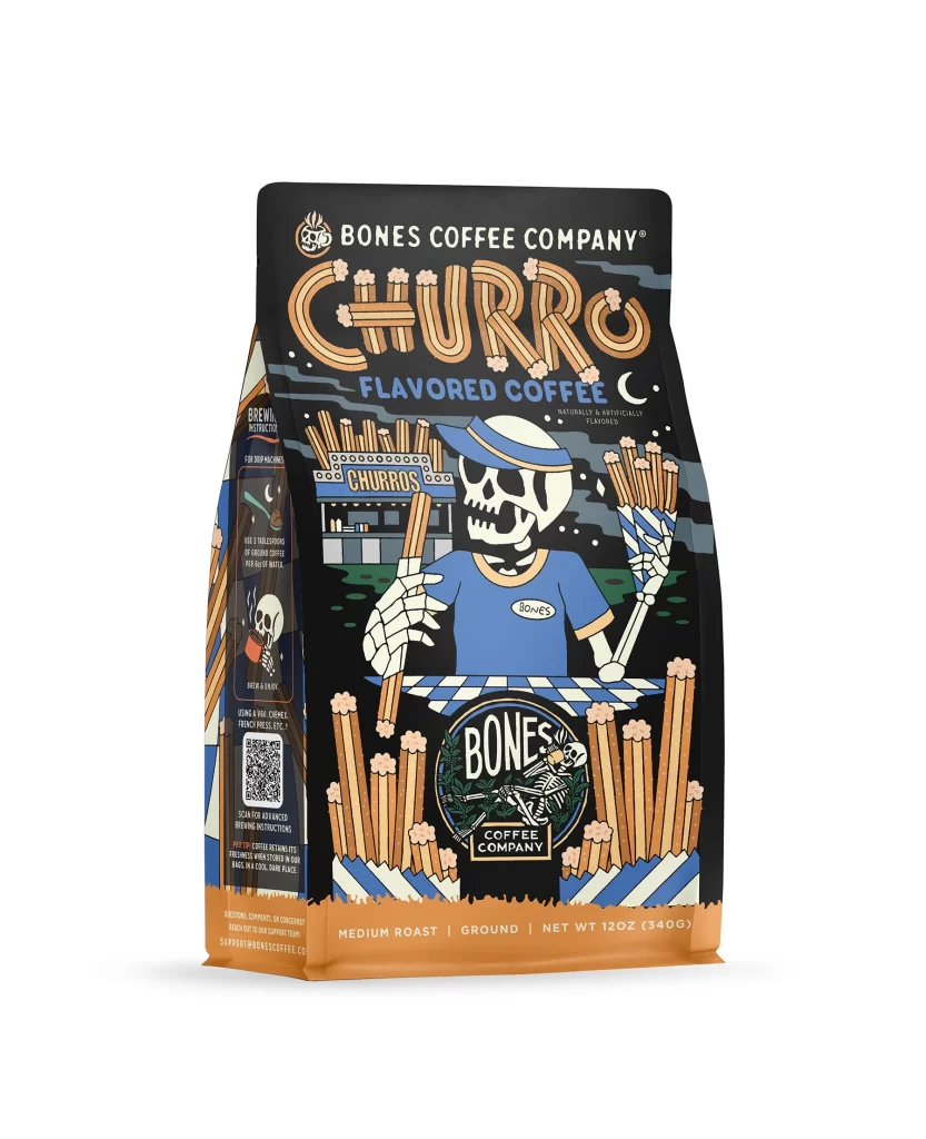
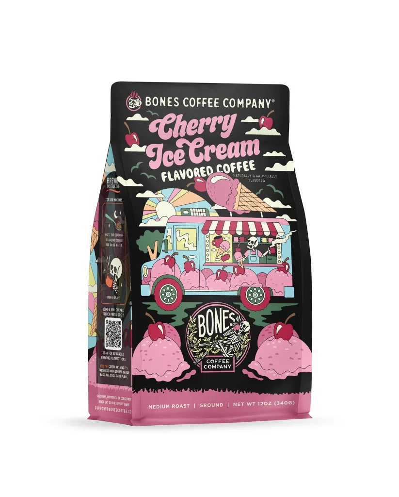
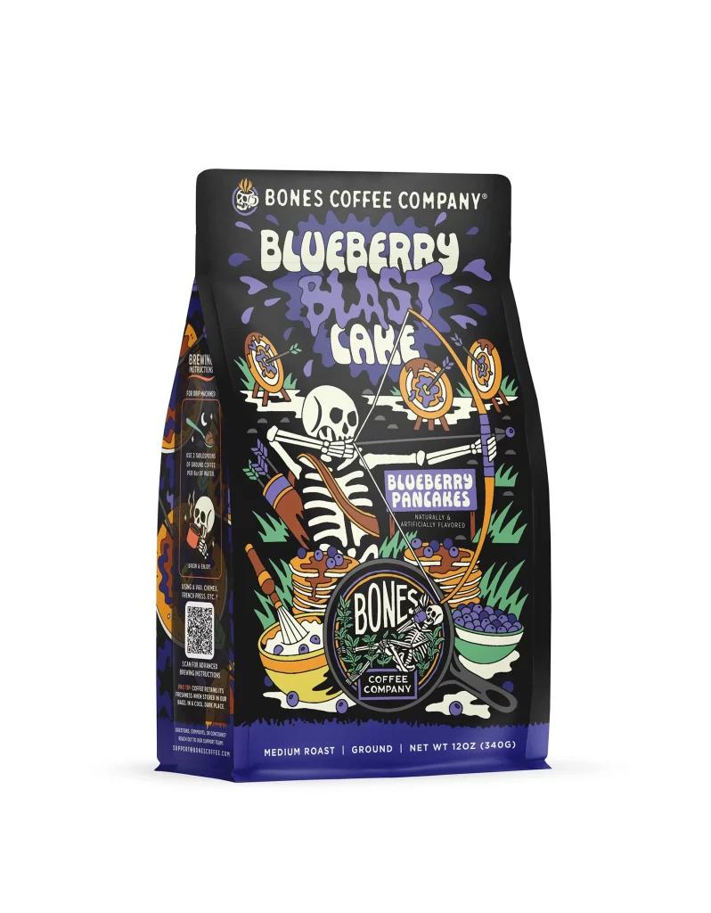
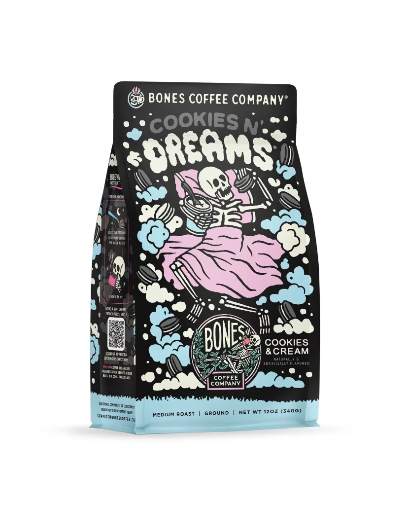
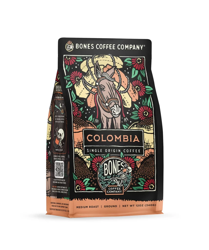
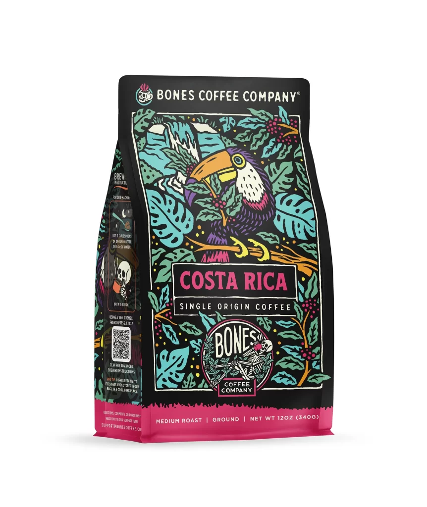
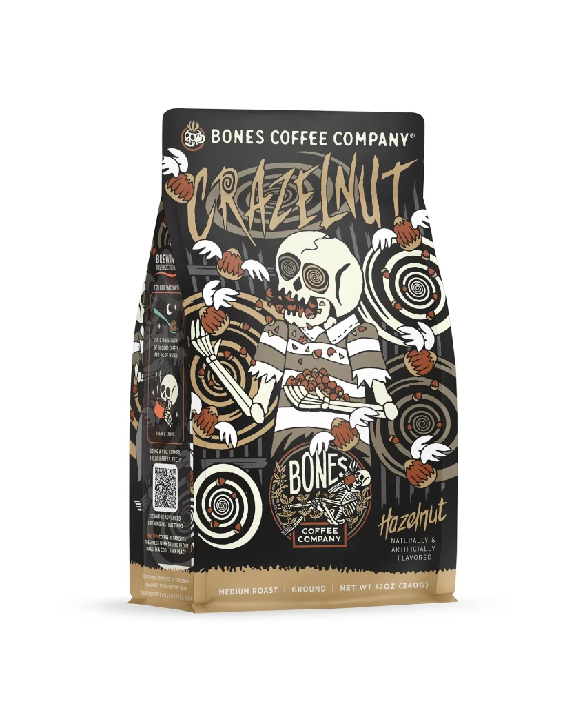
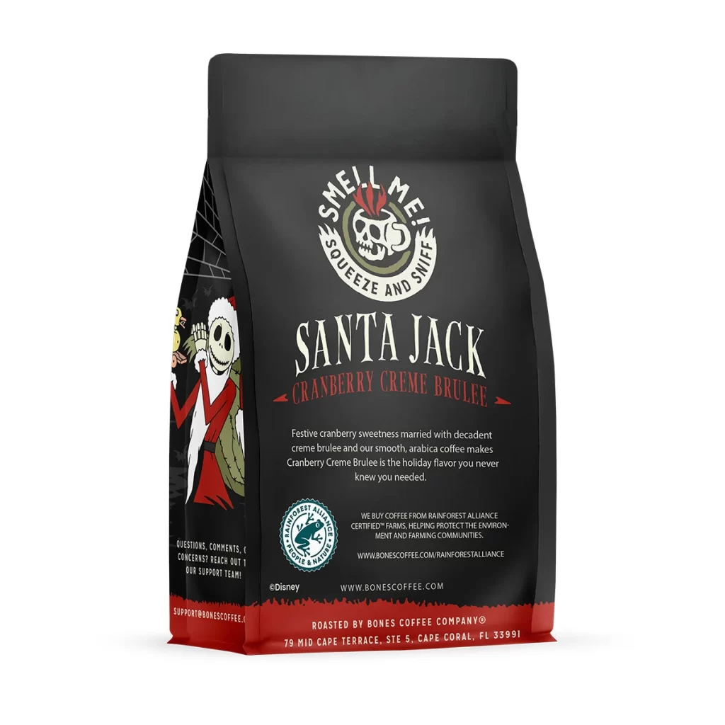
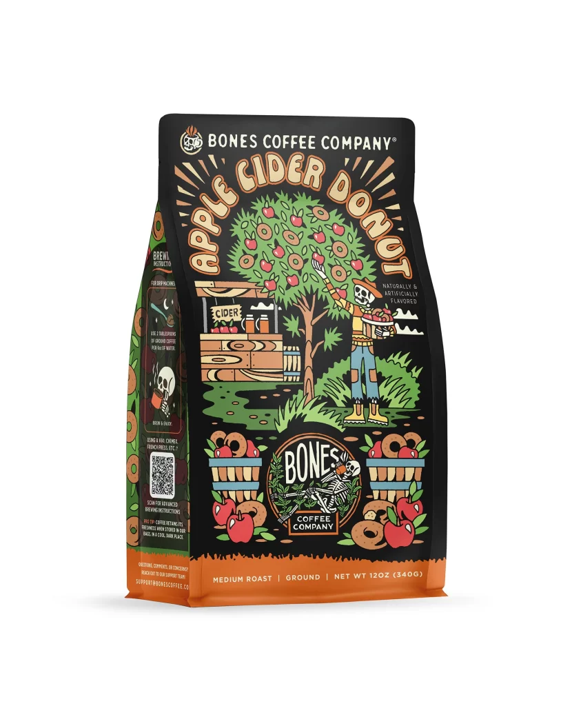
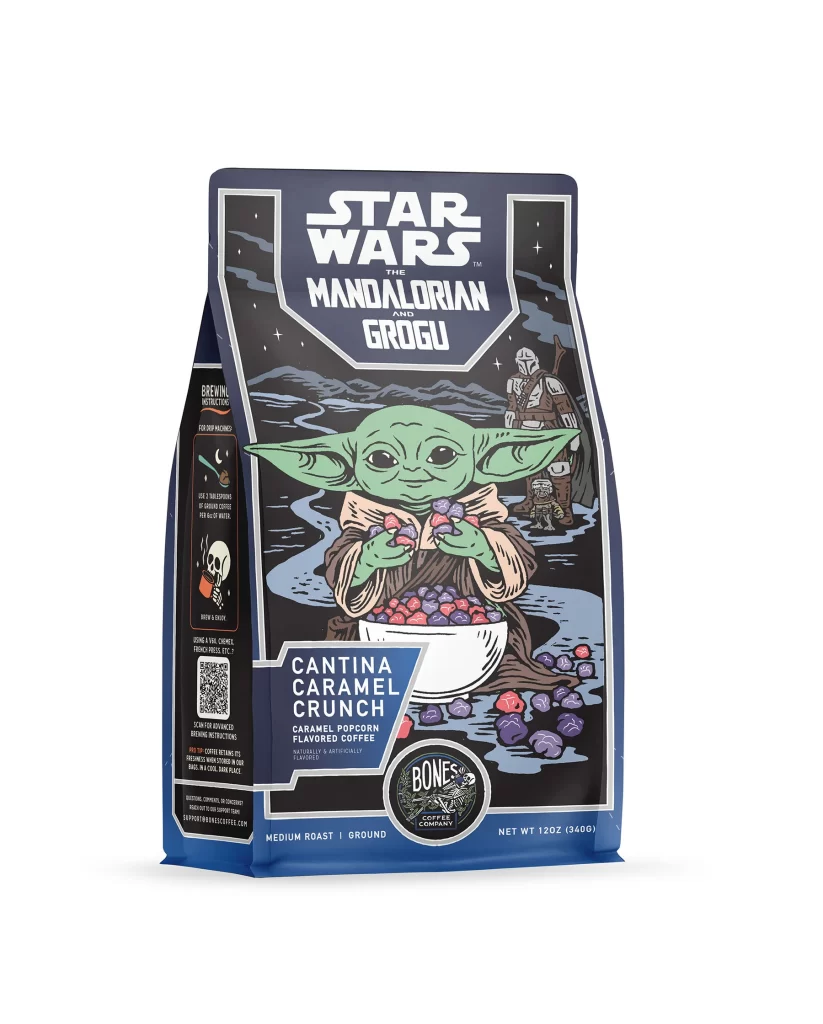
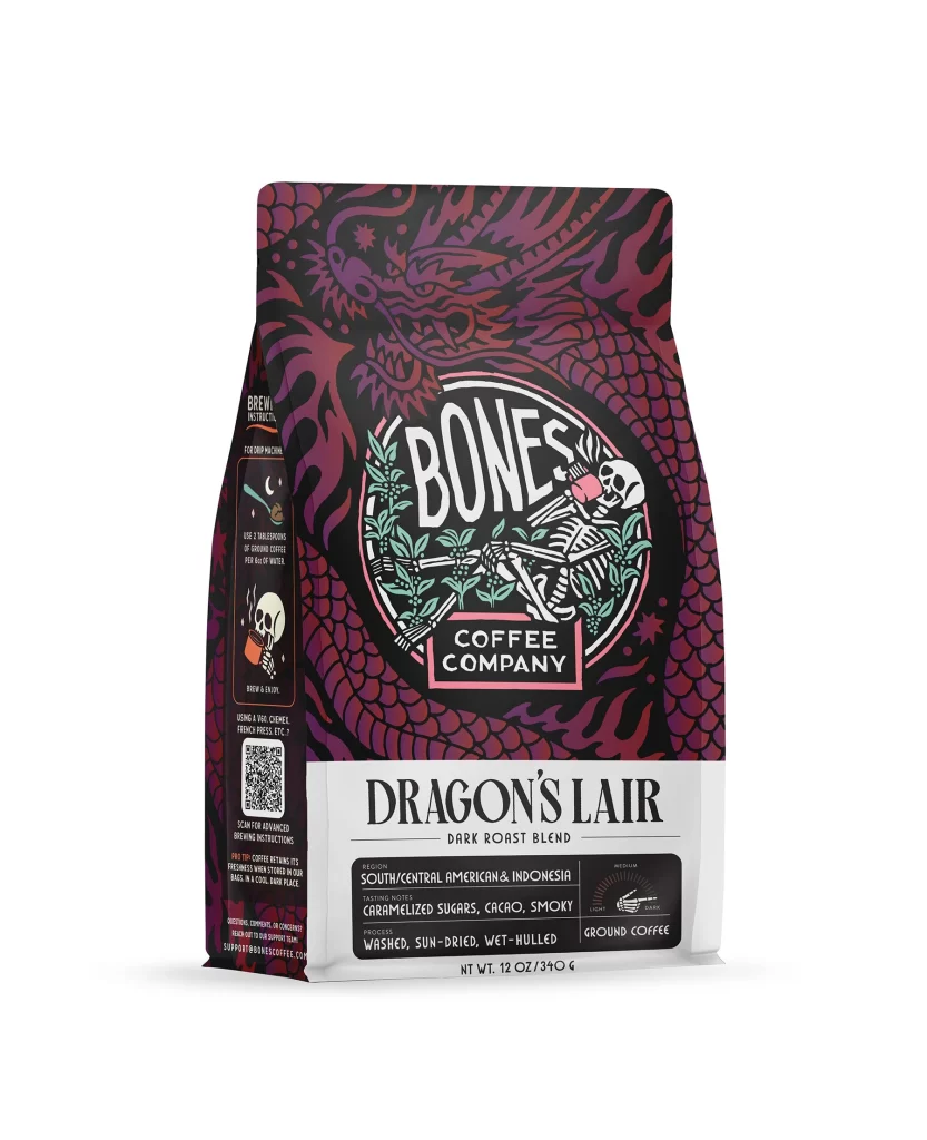
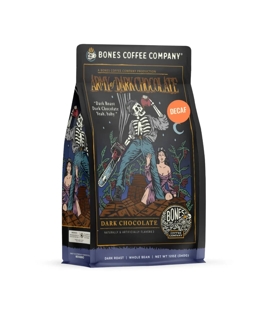
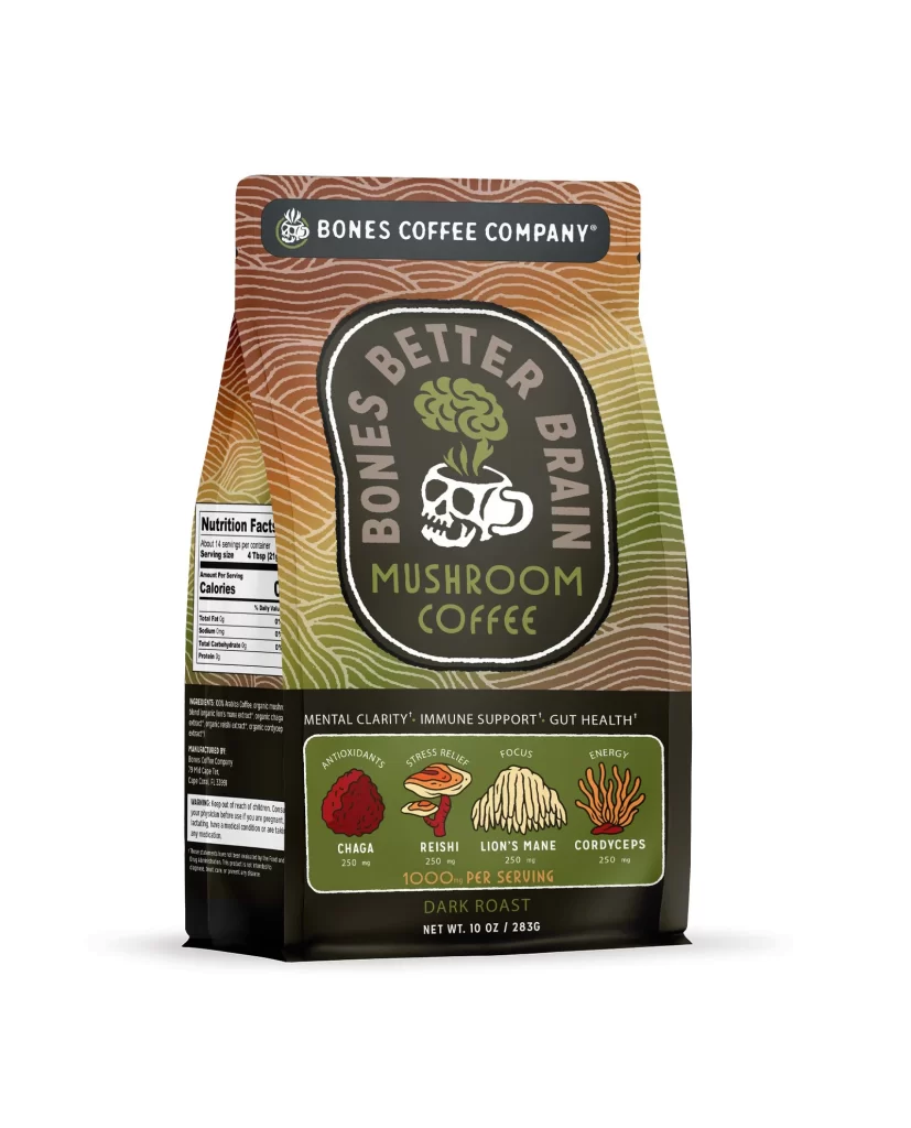
The front layout features a clean white studio background. A bold skull logo anchors the top edge. Below the logo, the brand name sits in large letters. The flavor art shows a hazelnut and a coffee bean. The design uses a minimalist style to draw the eye to the product name and the roasted hazelnut graphic.
Typography relies on thick sans serif fonts for high shelf appeal. The color palette mixes deep brown and warm tan to match the hazelnut flavor. These warm tones create strong appetite appeal. The contrast between the dark text and the white background ensures readability. This bold visual hierarchy helps the bag stand out on retail shelves.
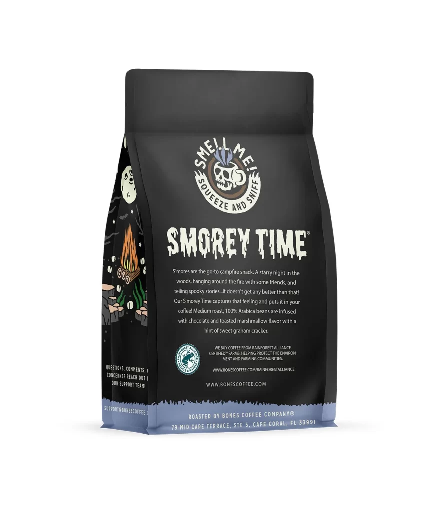
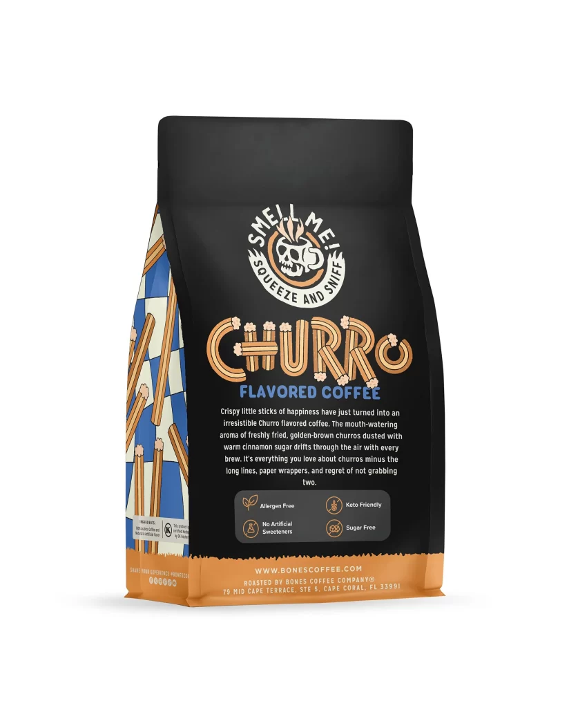
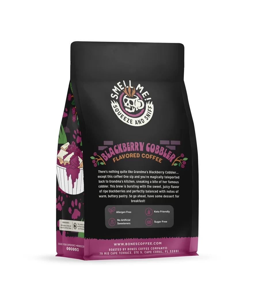
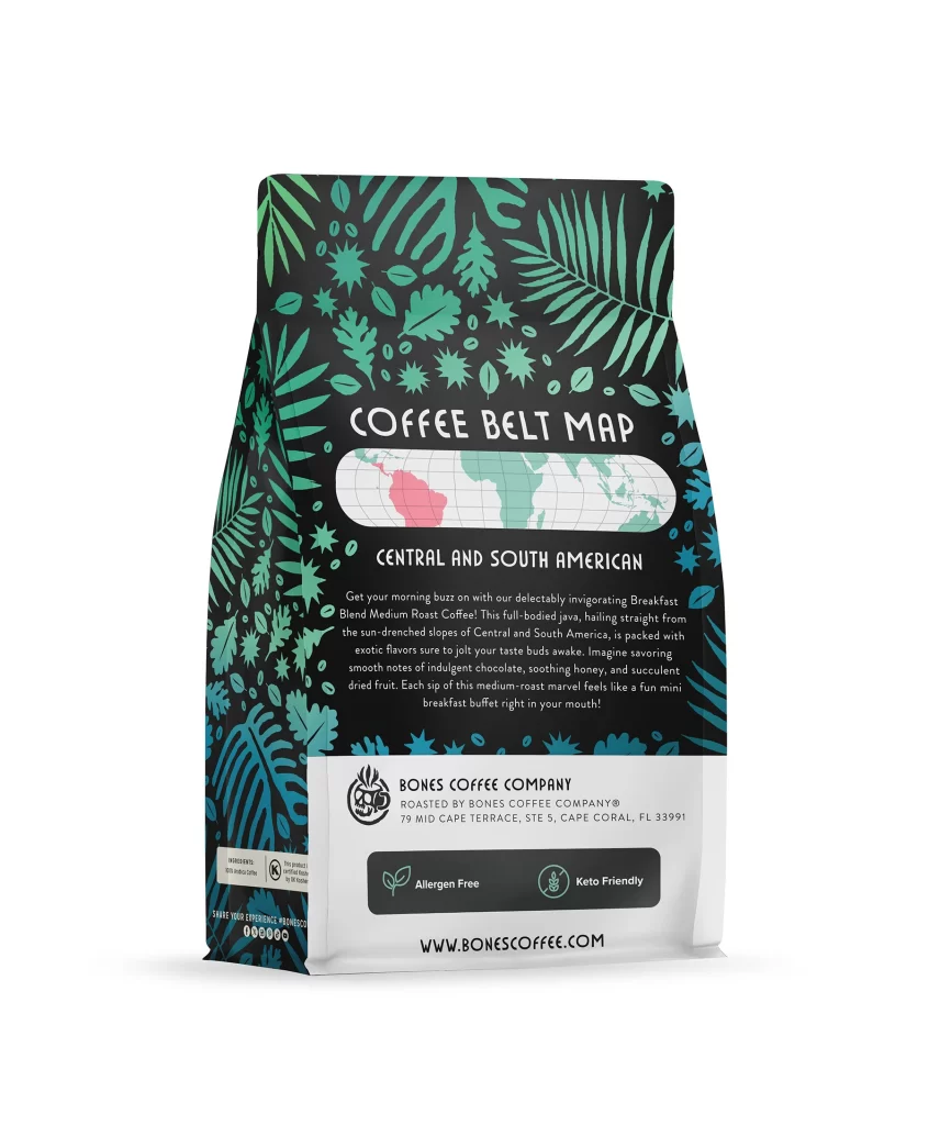
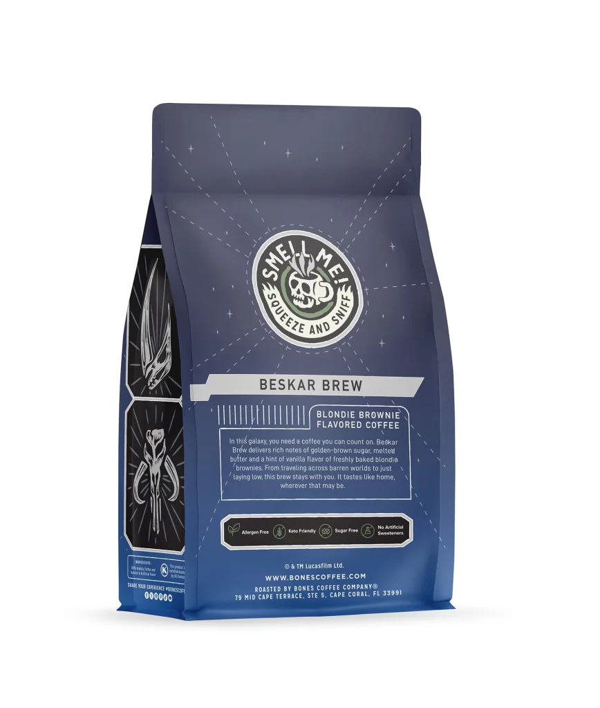
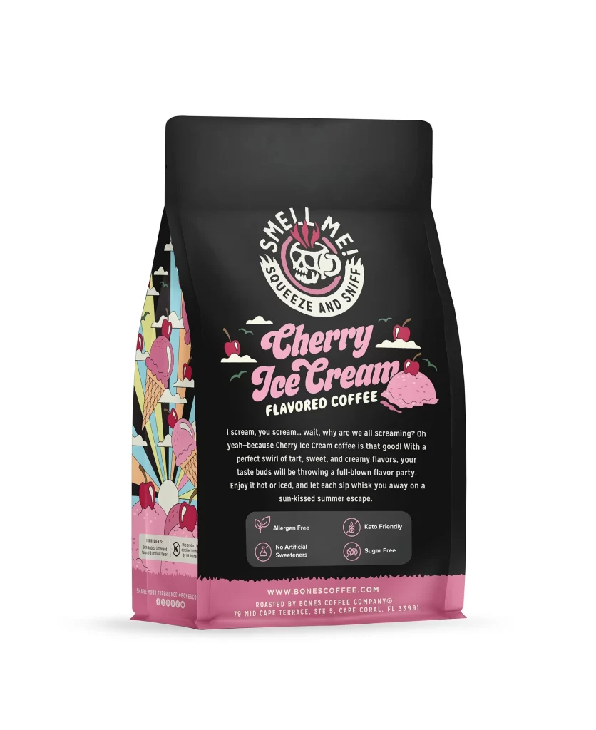
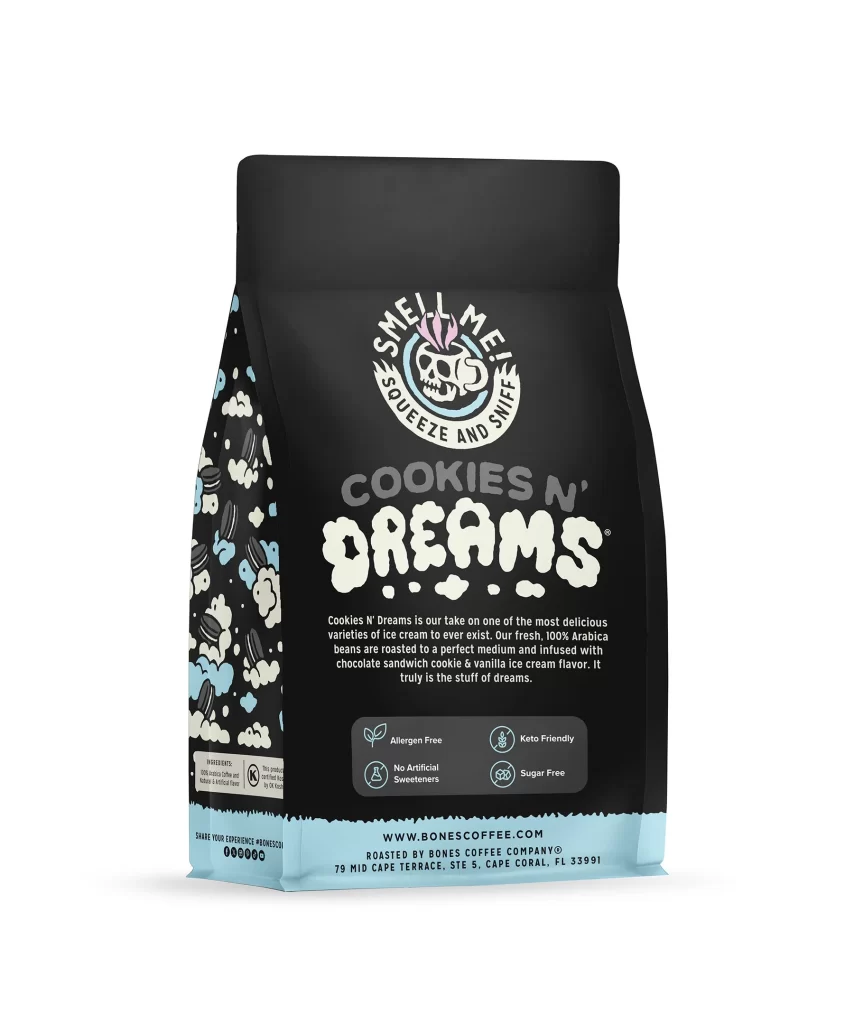
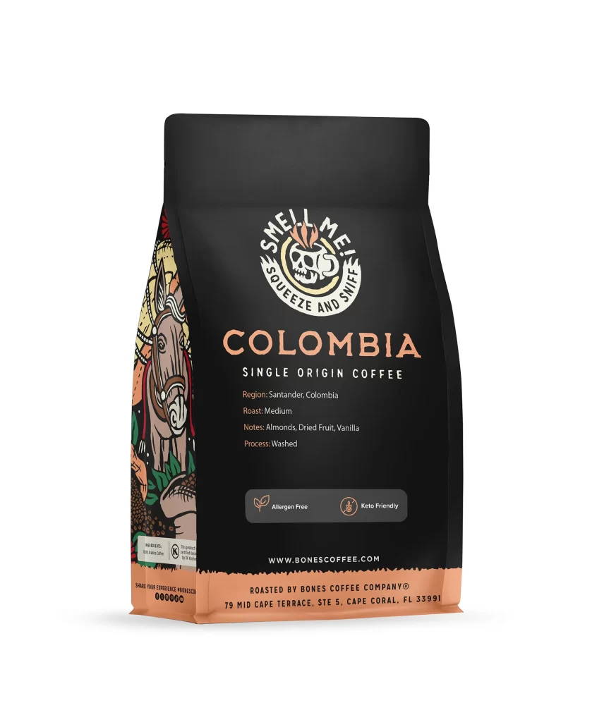
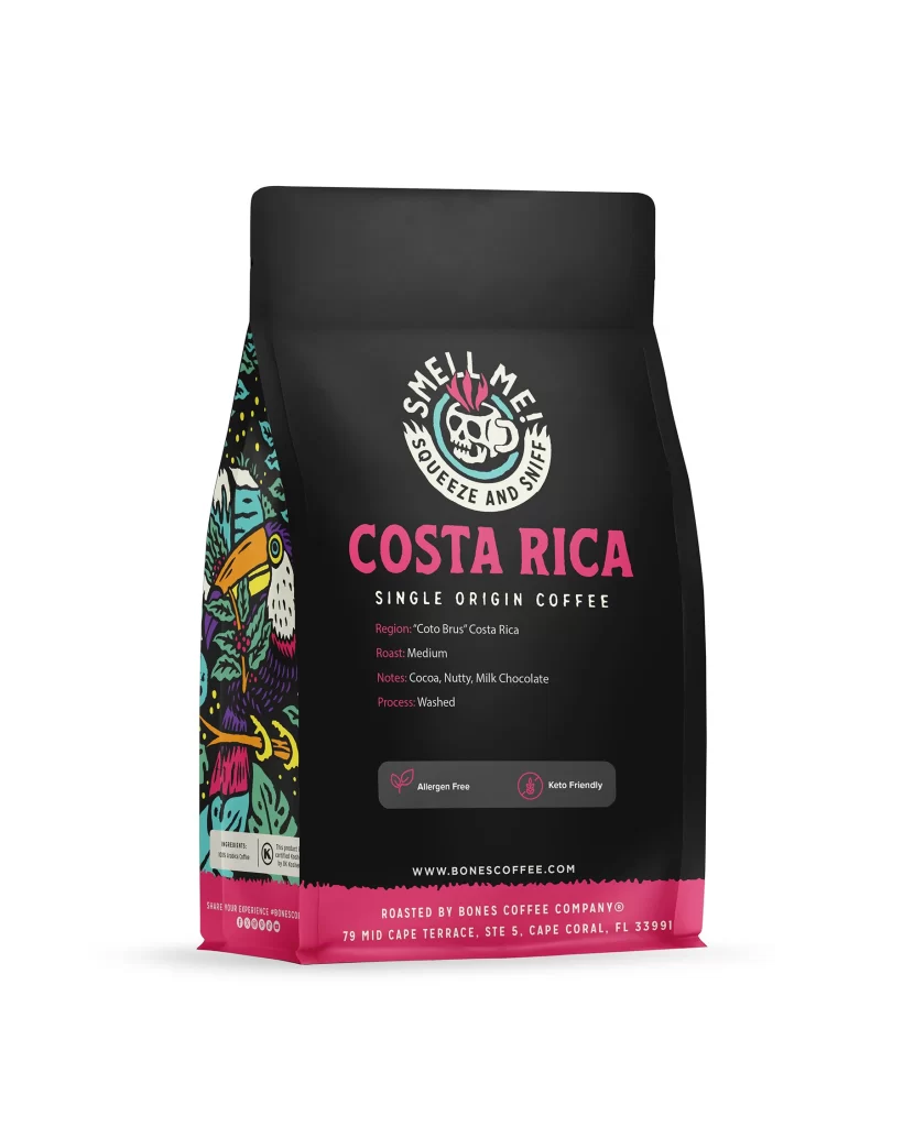
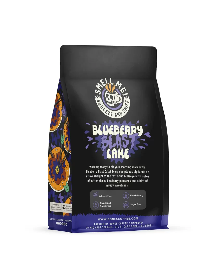
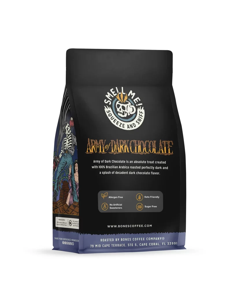
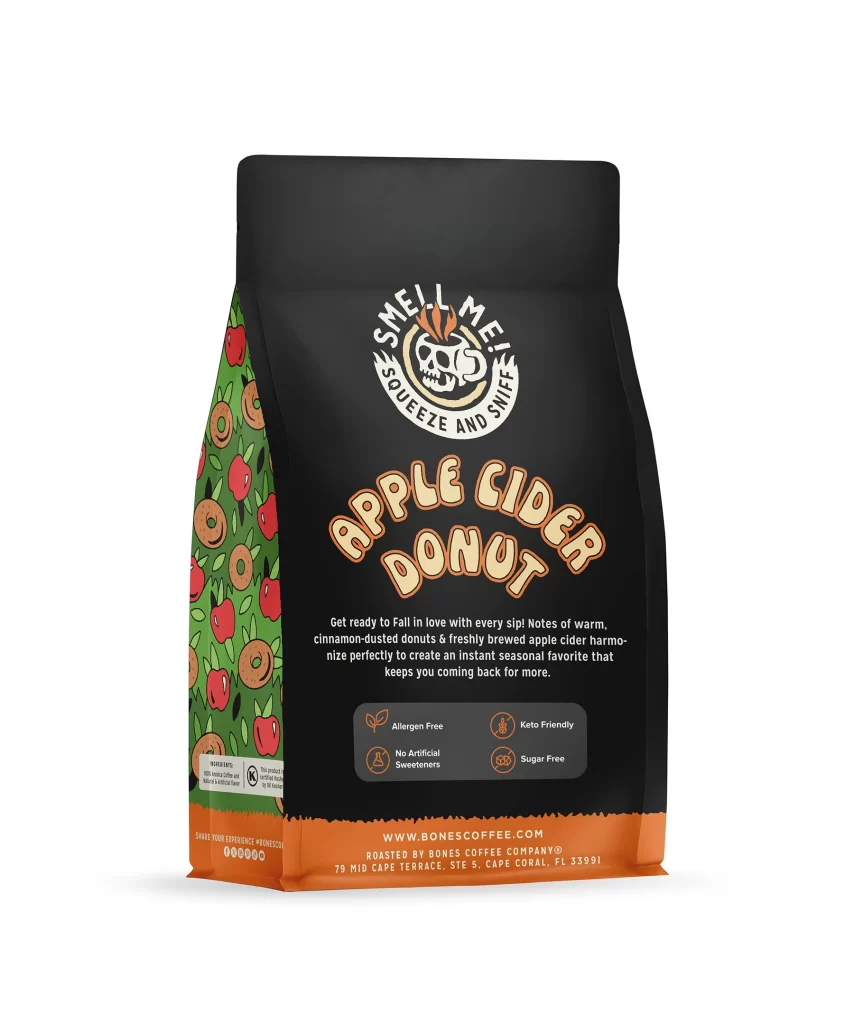
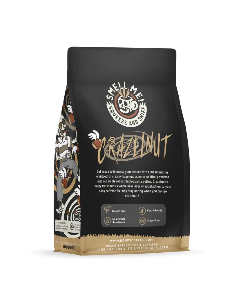
Designers should note the effective use of negative space. The clear icons on the back panel, like Allergen Free and Keto Friendly, communicate value quickly. The brewing text and the 12 oz 340 g weight add practical details without clutter. This balance of bold graphics and functional text makes it a great study for modern packaging.