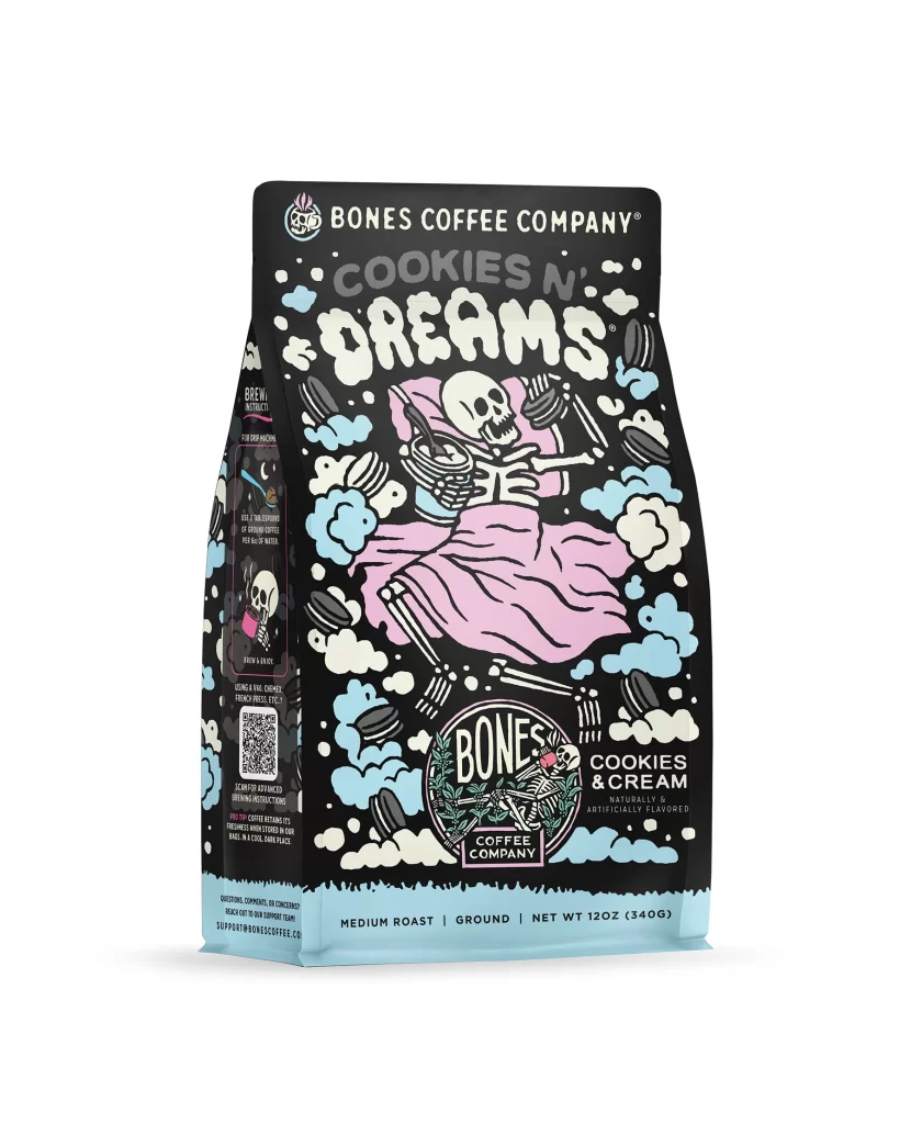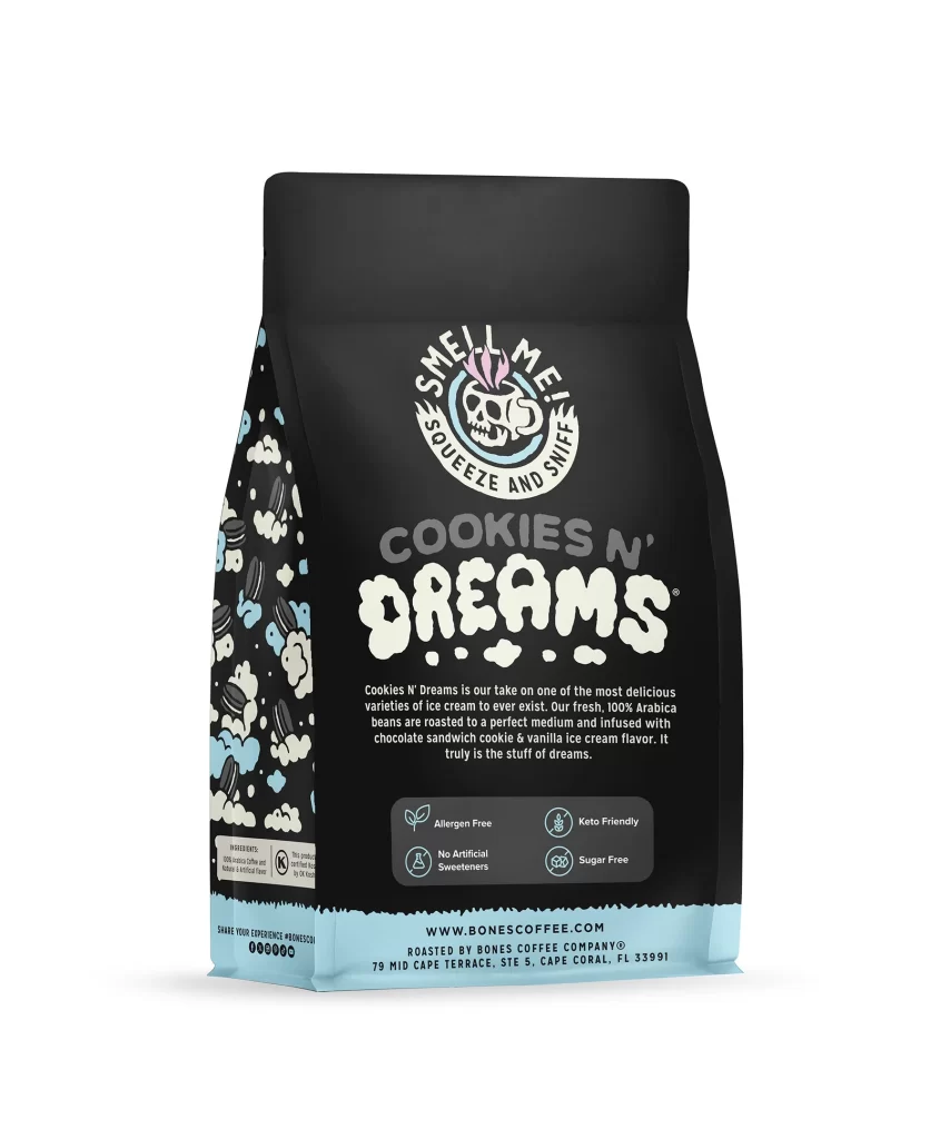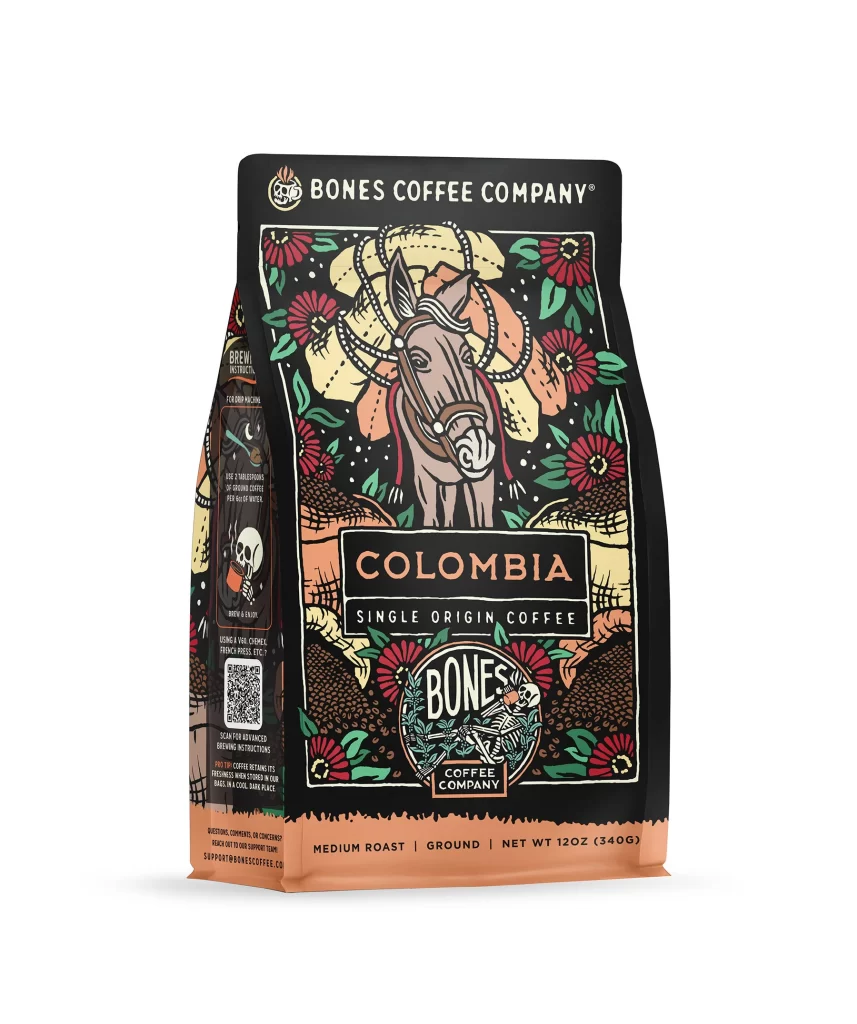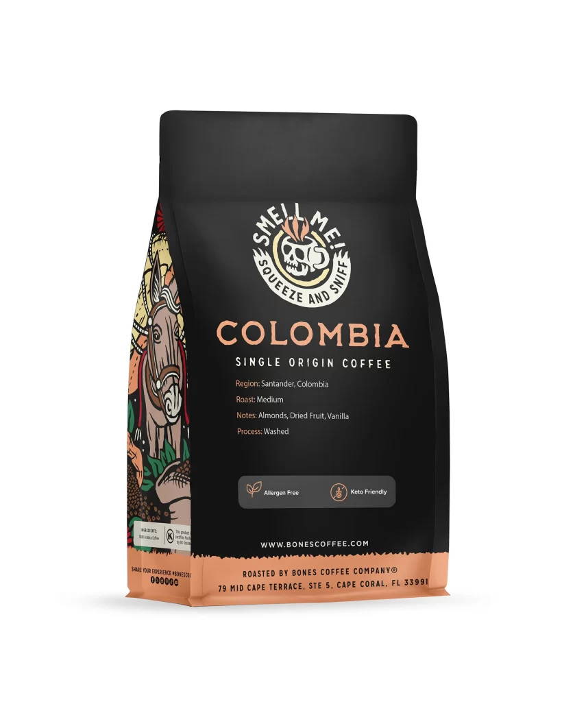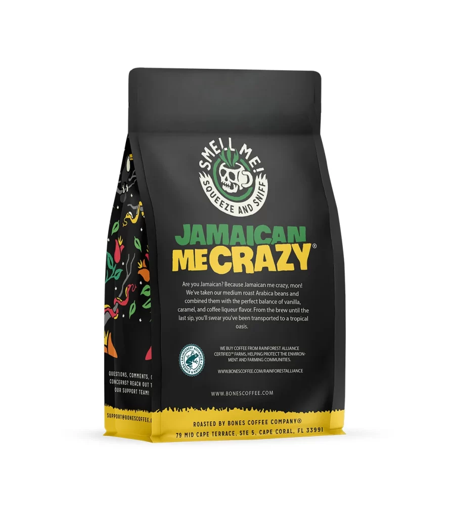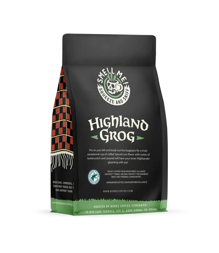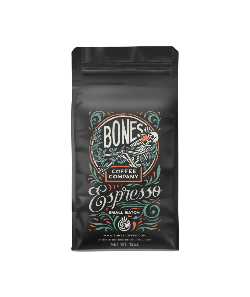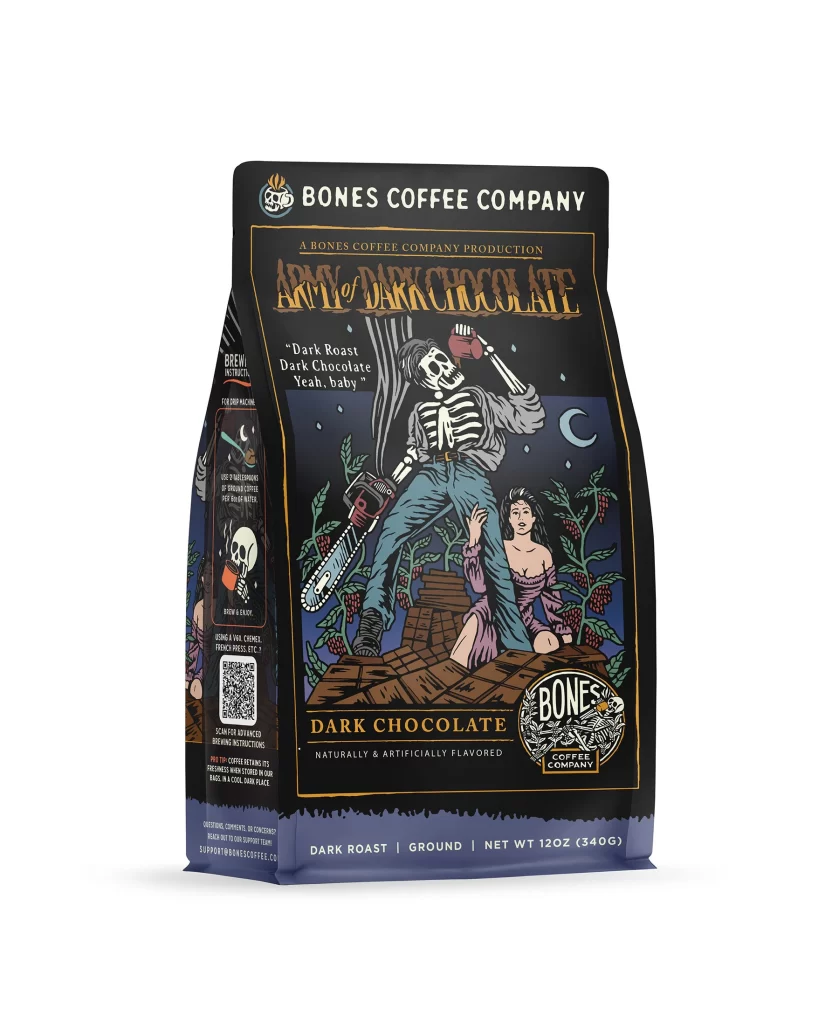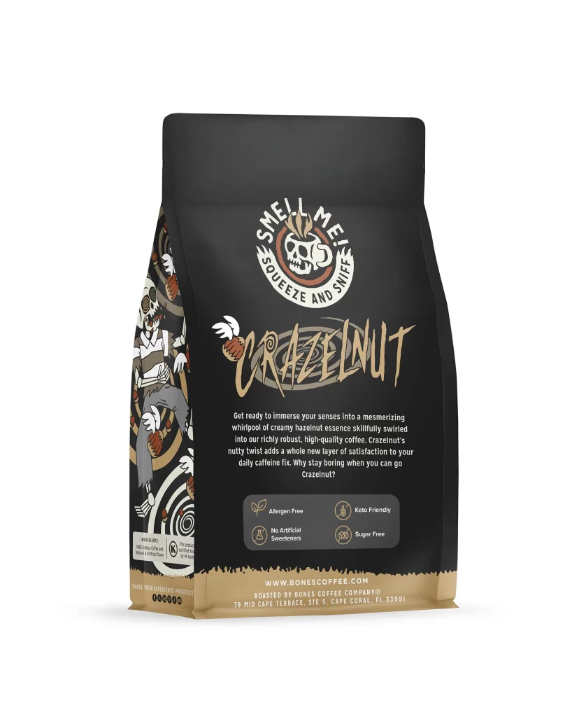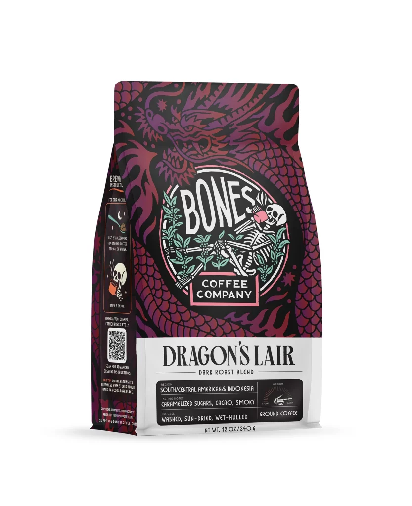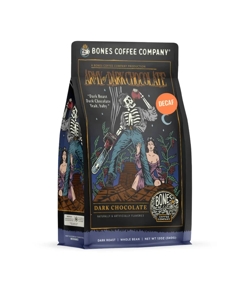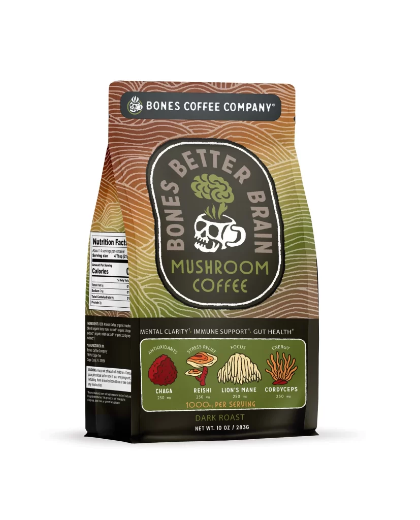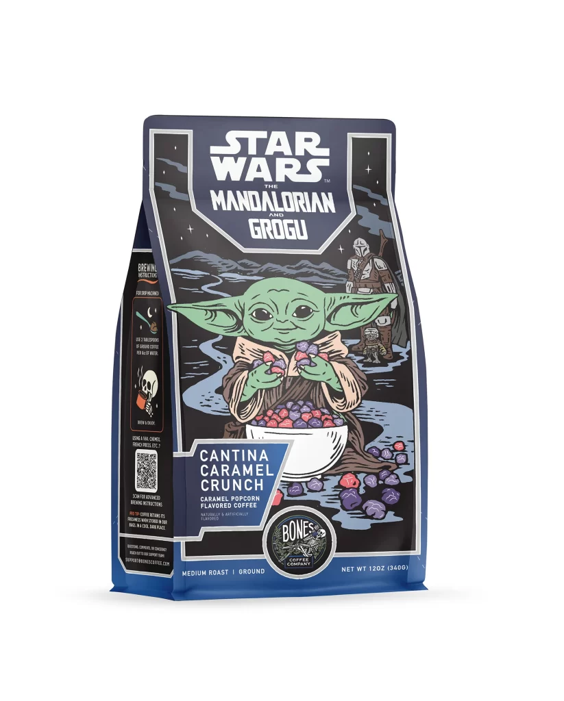
Bones Coffee Cantina Caramel Crunch Coffee Bag Front Packaging
Topics
Details
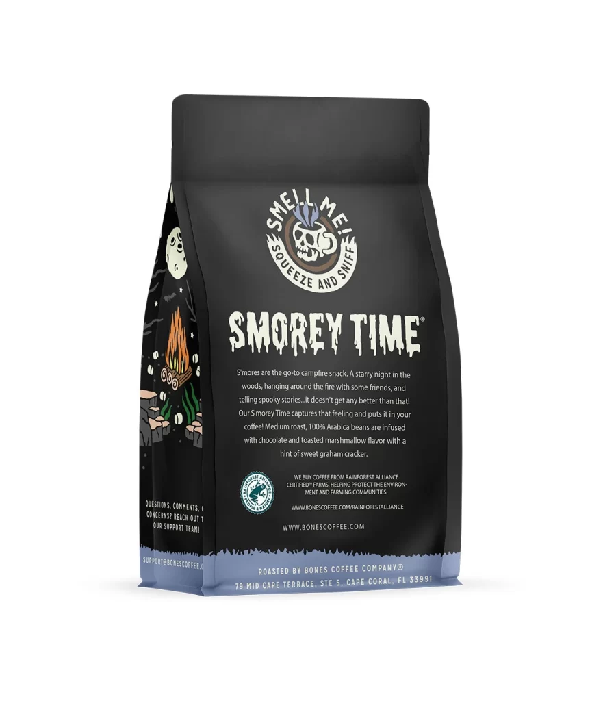
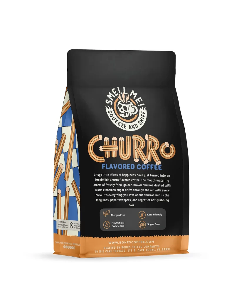
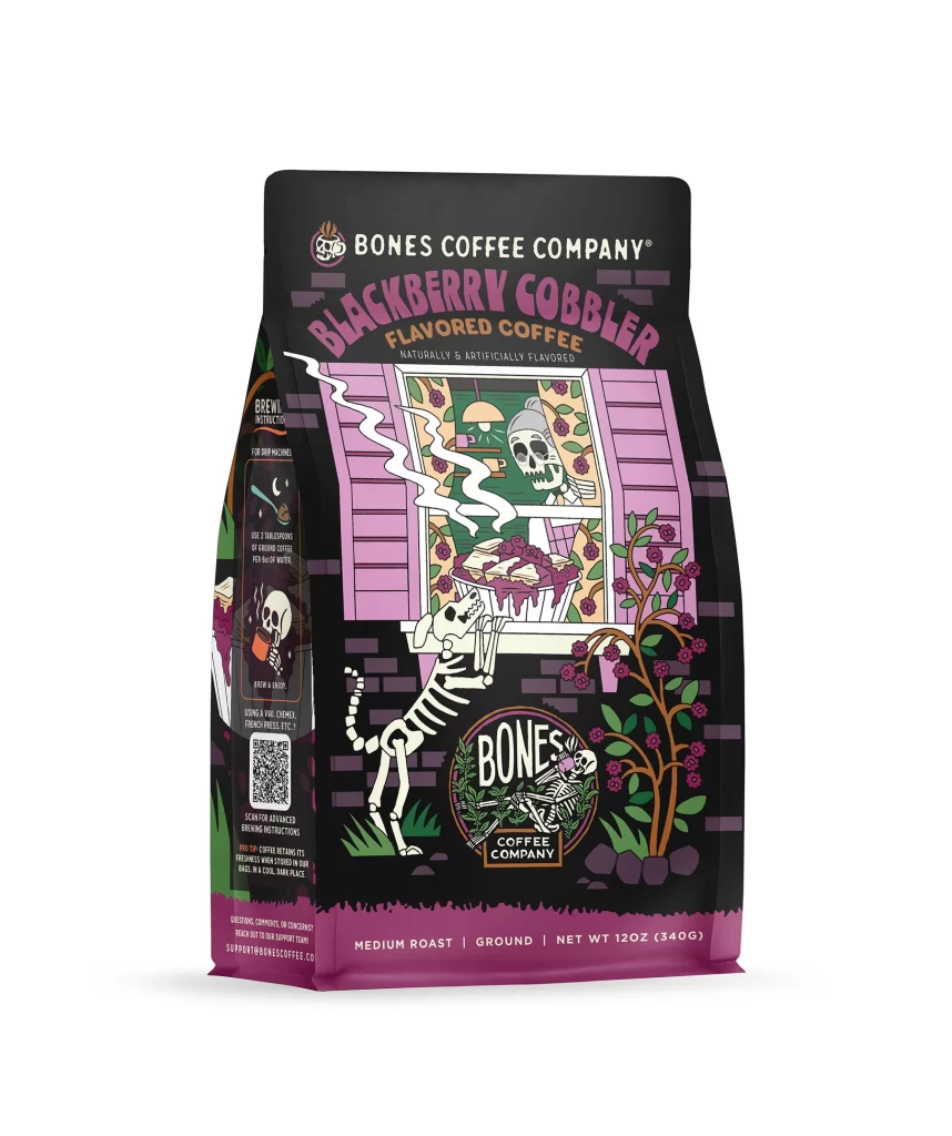
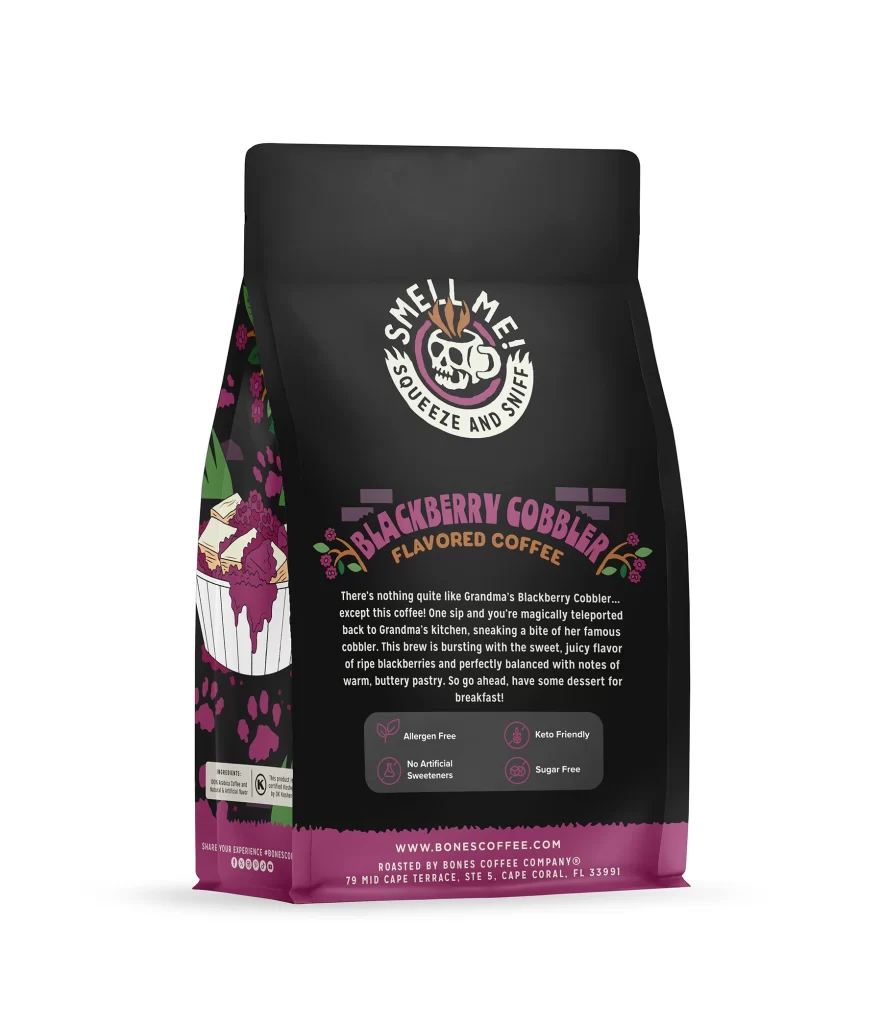
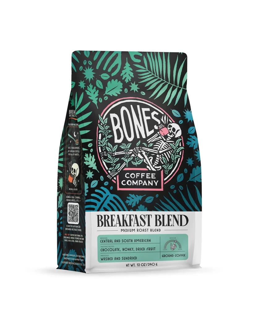
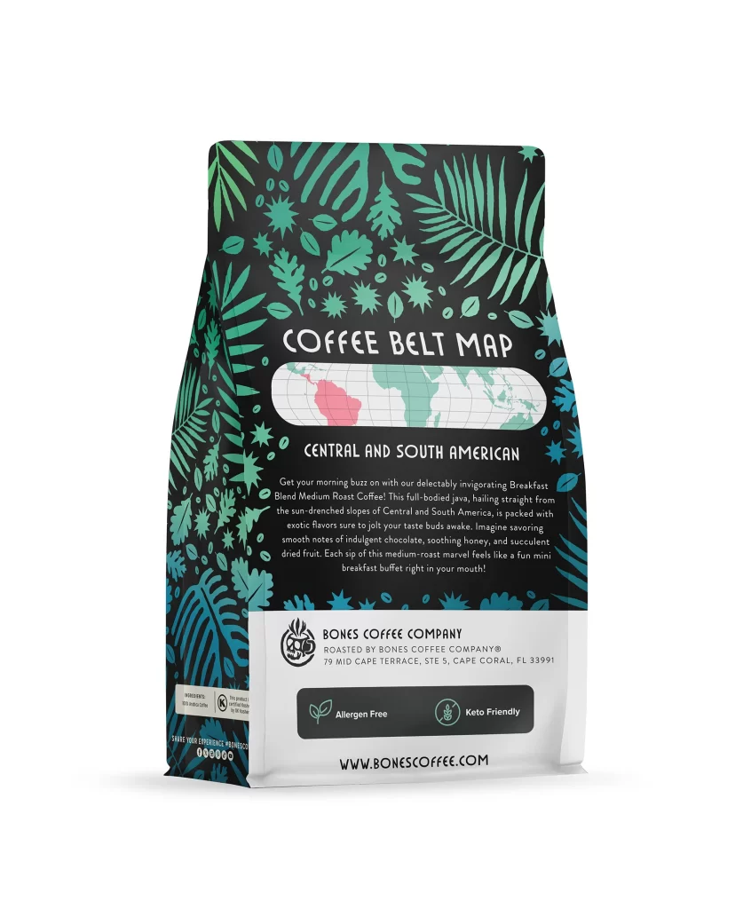
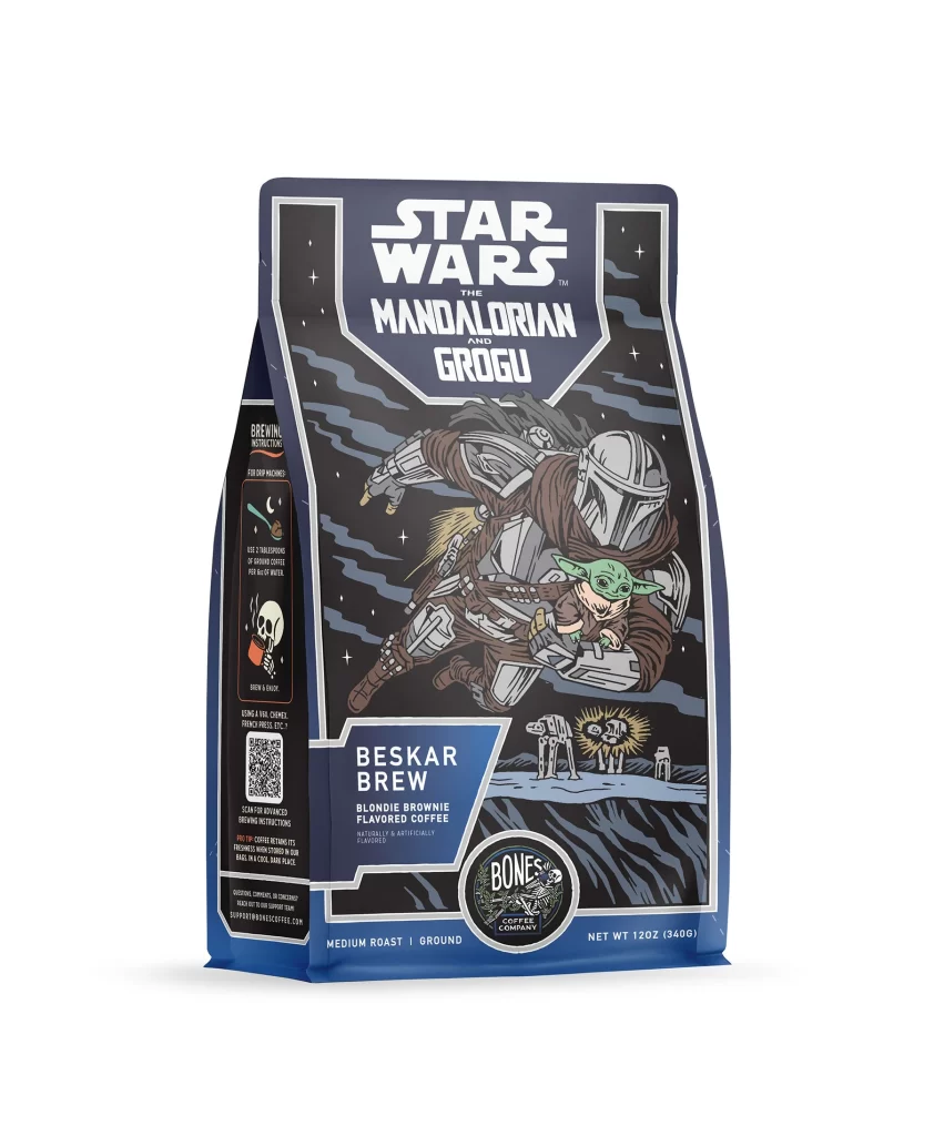
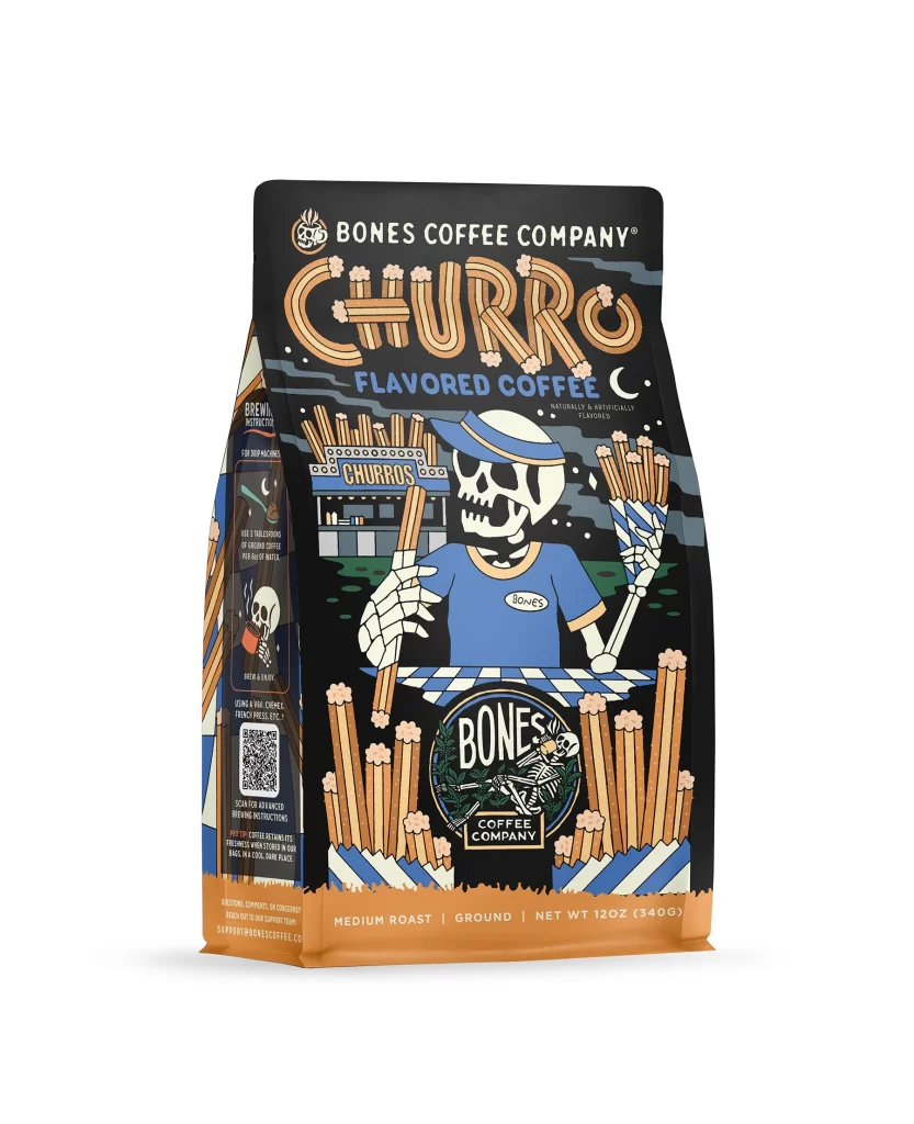
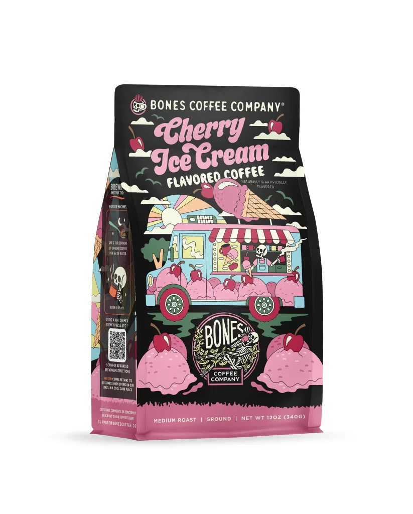
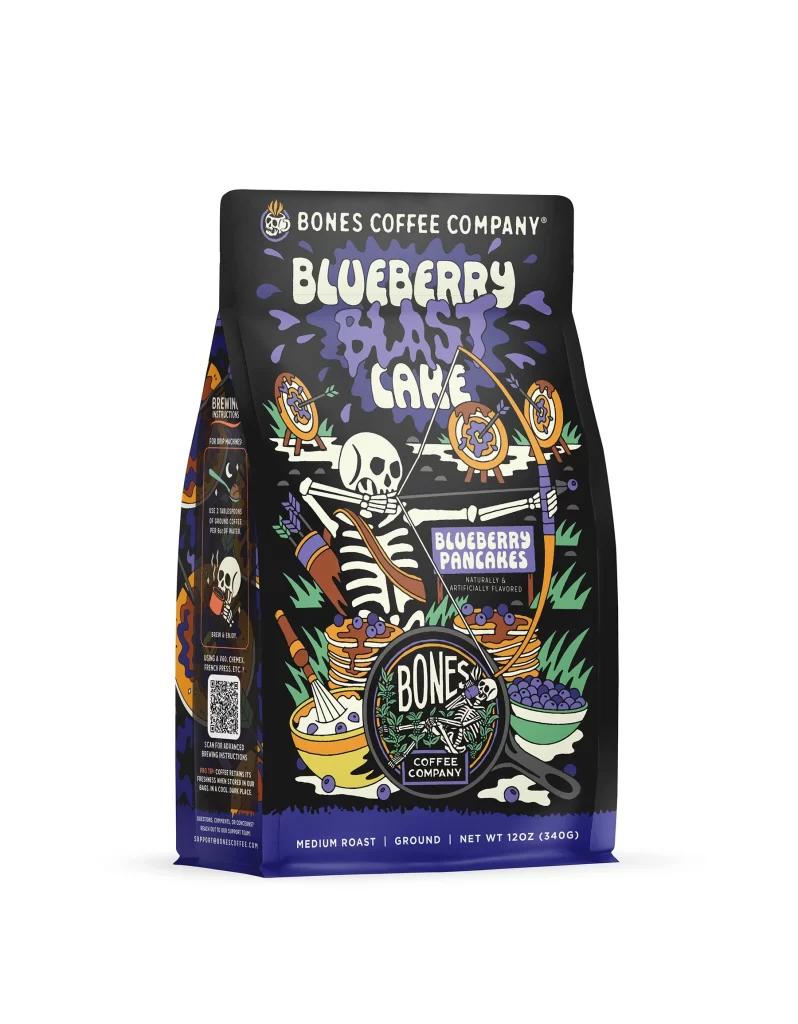
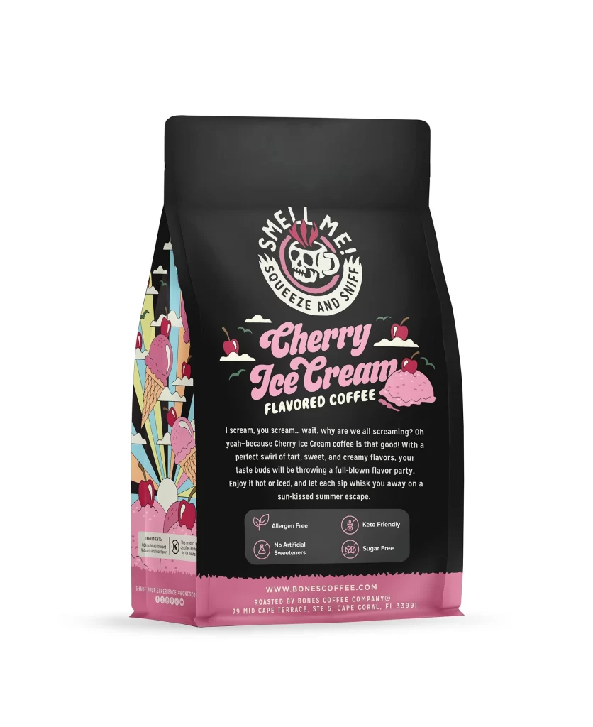
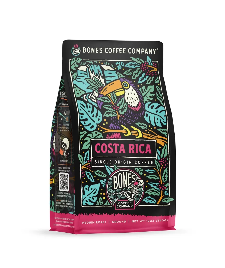
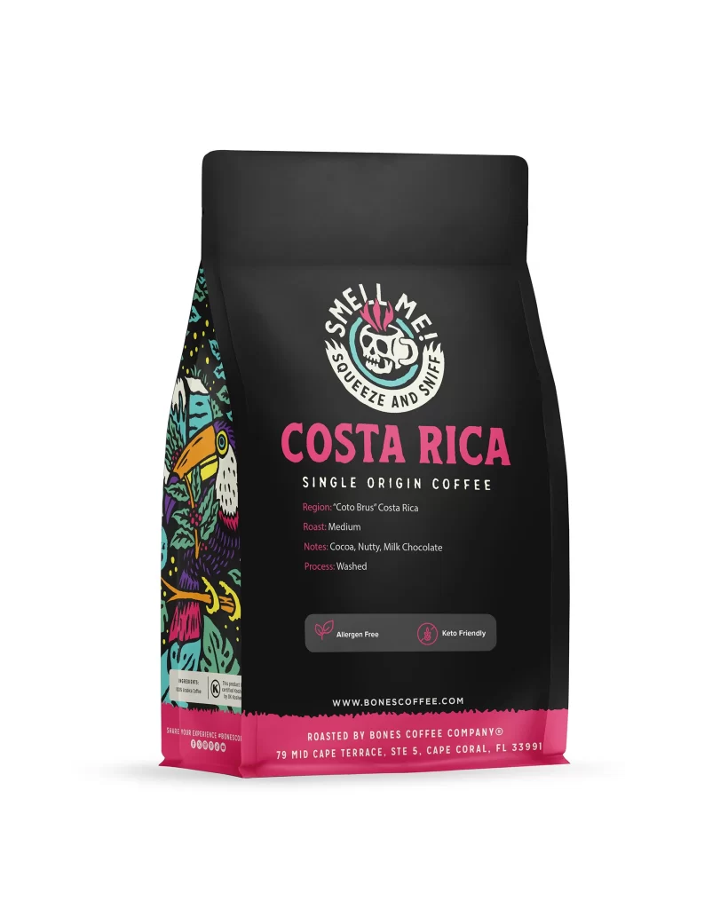
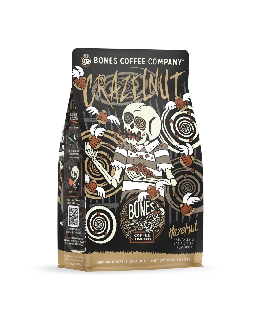
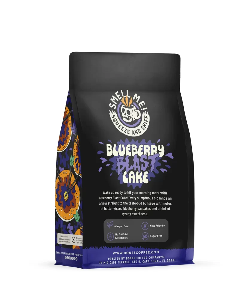
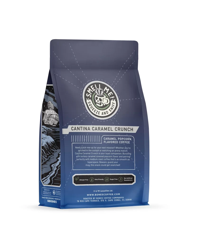
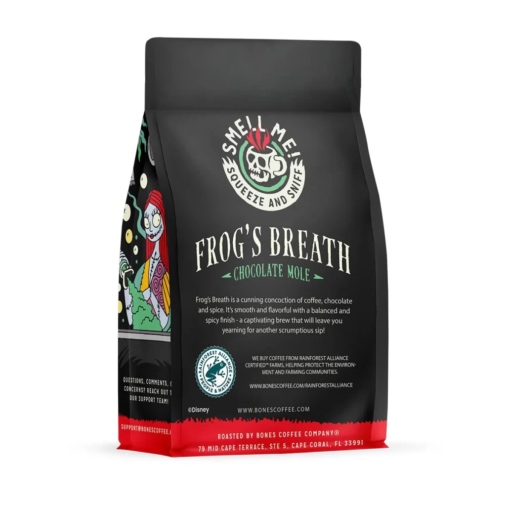
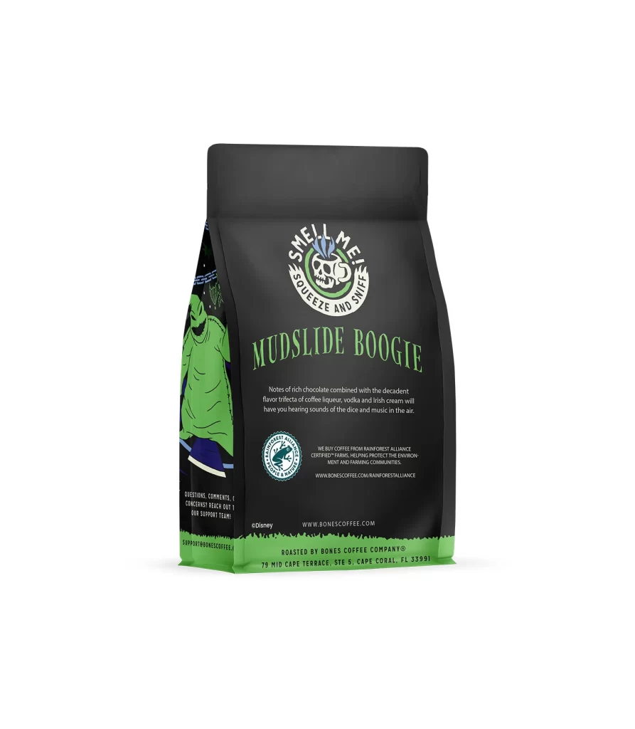
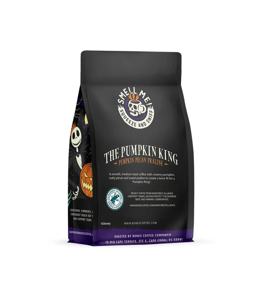
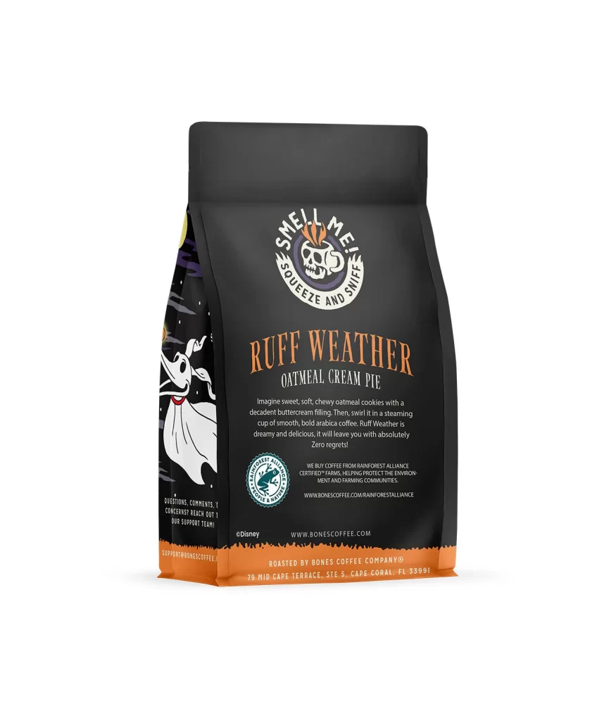
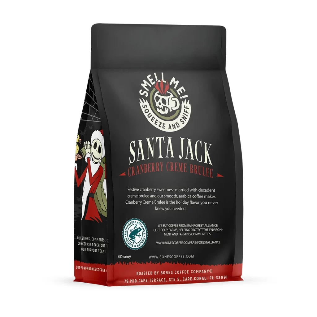
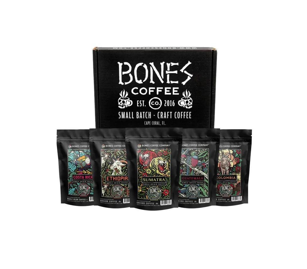
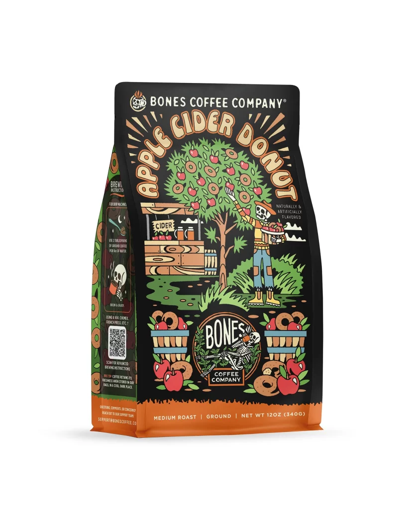
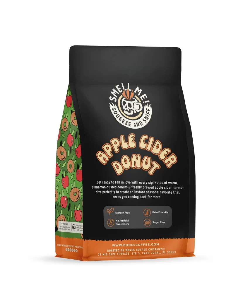
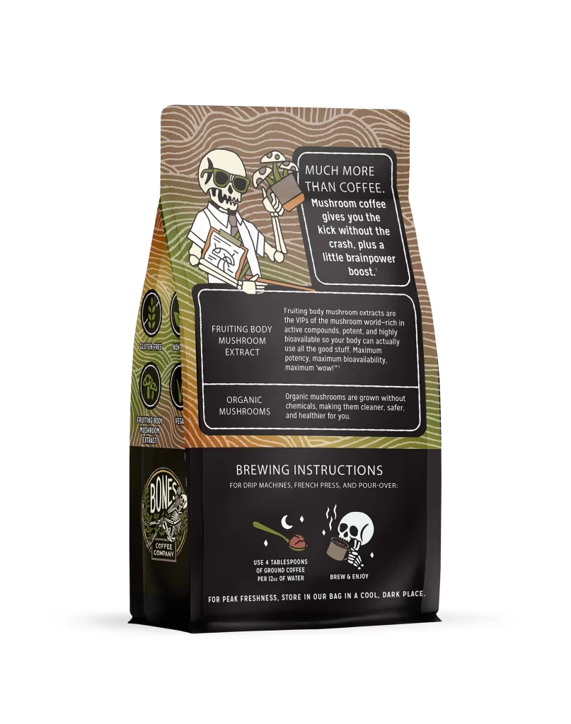
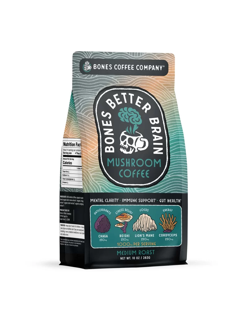
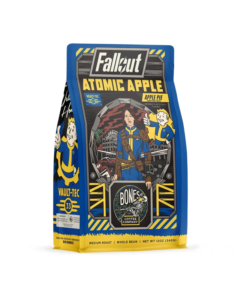
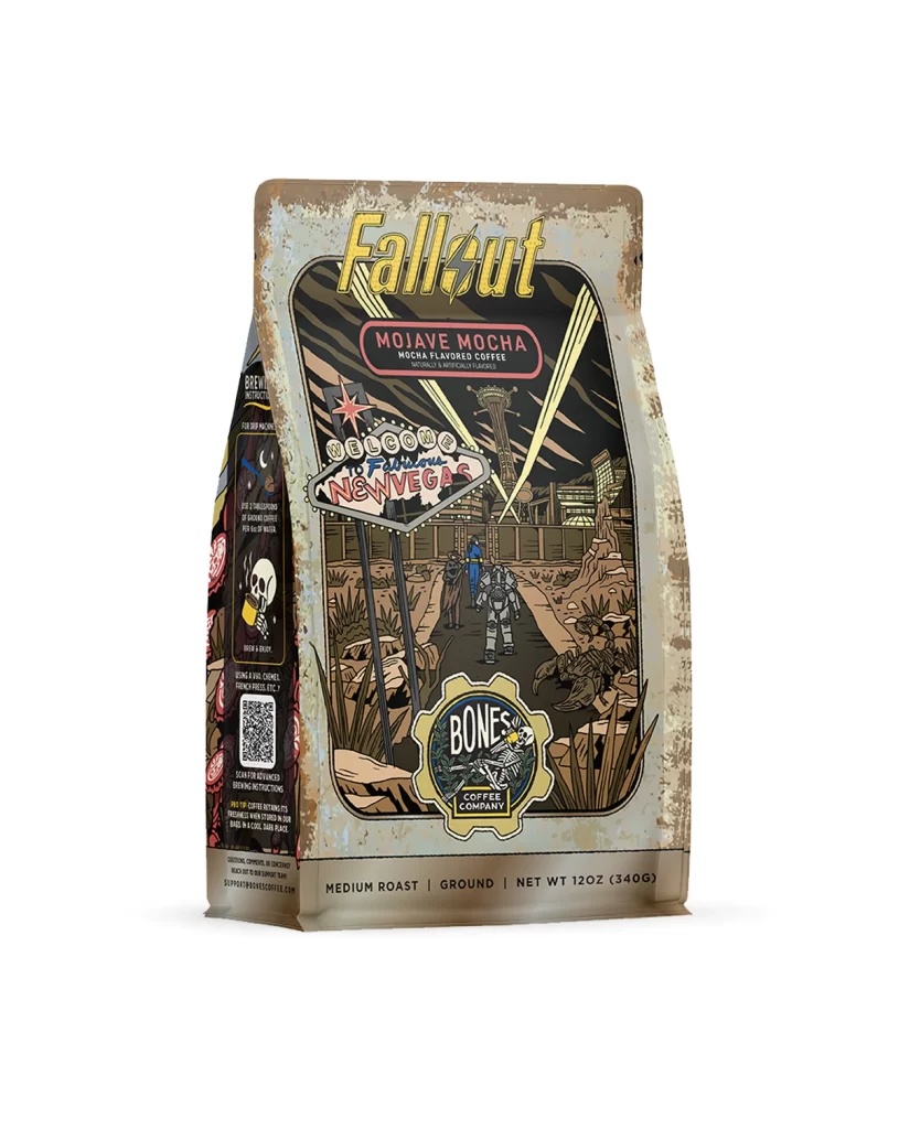
The front of the bag features a dynamic layout centered around detailed flavor art. A white studio product photo of the physical package shows a window revealing roasted beans. Surrounding this central focus, graphics of golden caramel and crunchy popcorn pieces pop against a dark background, visually communicating the sweet caramel popcorn flavor profile to the buyer.
Typography on the front design uses bold, clean sans serif fonts for high shelf appeal. The brand name sits at the top in bright yellow, creating strong contrast against the dark backdrop. Below, the Cantina Caramel Crunch Coffee Bag Front text appears in warm orange tones. These warm colors stimulate appetite and draw the eye quickly.
Designers should note how this layout balances text and flavor art effectively. The clear presentation of the 12 oz 340 g weight helps consumers make quick purchasing decisions. Using a white studio product photo highlights the physical package texture and print quality. This reference provides excellent inspiration for combining appetizing food graphics with bold typography.