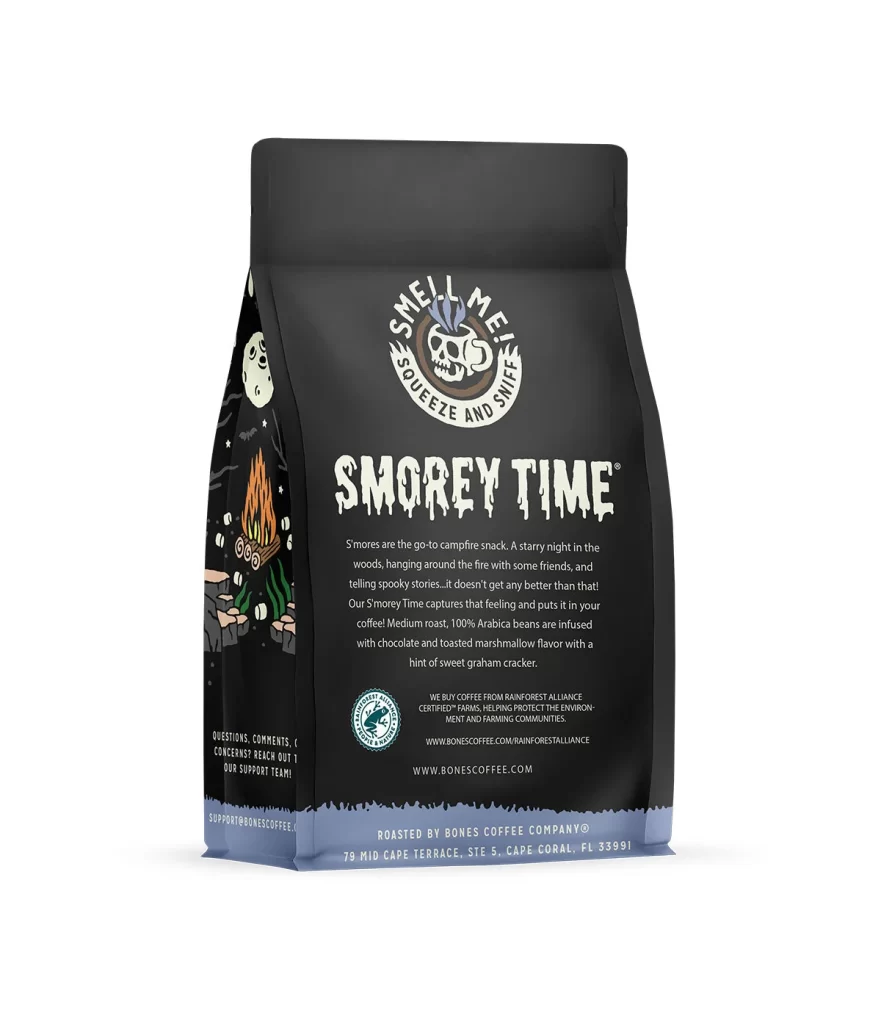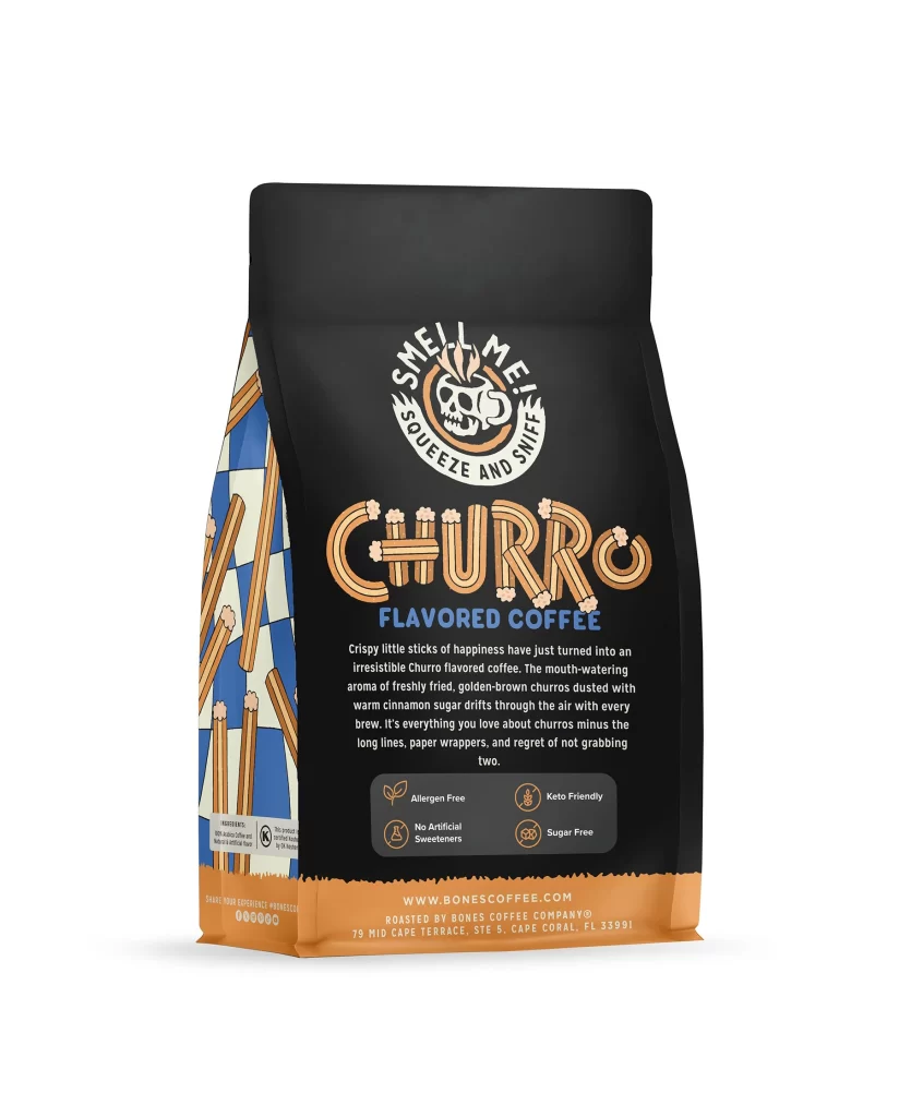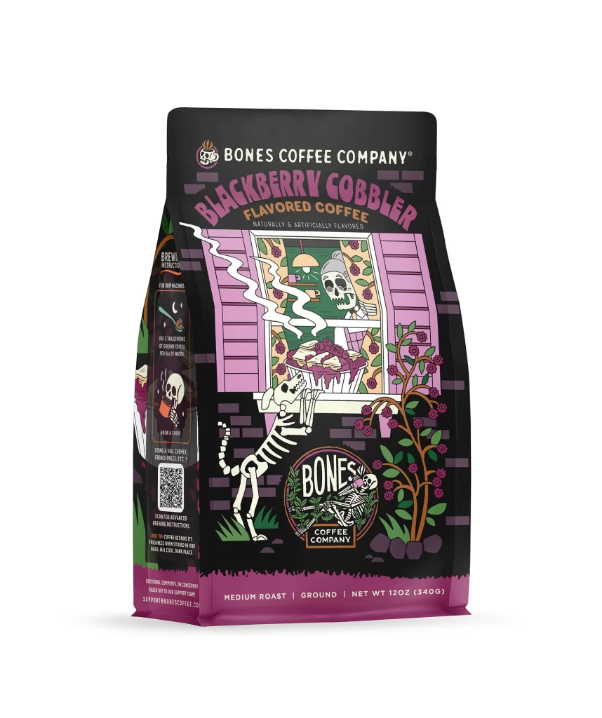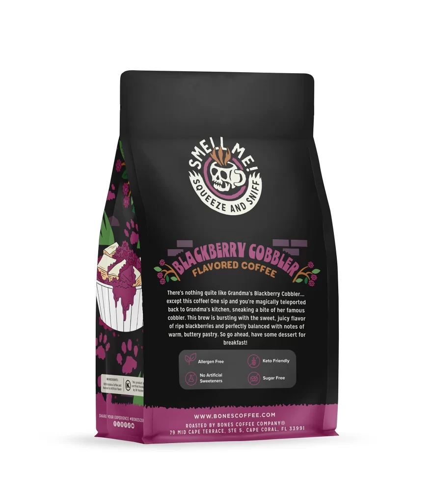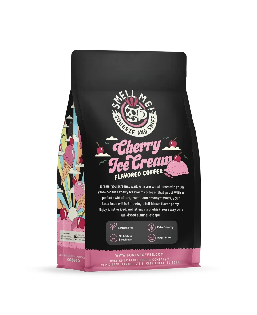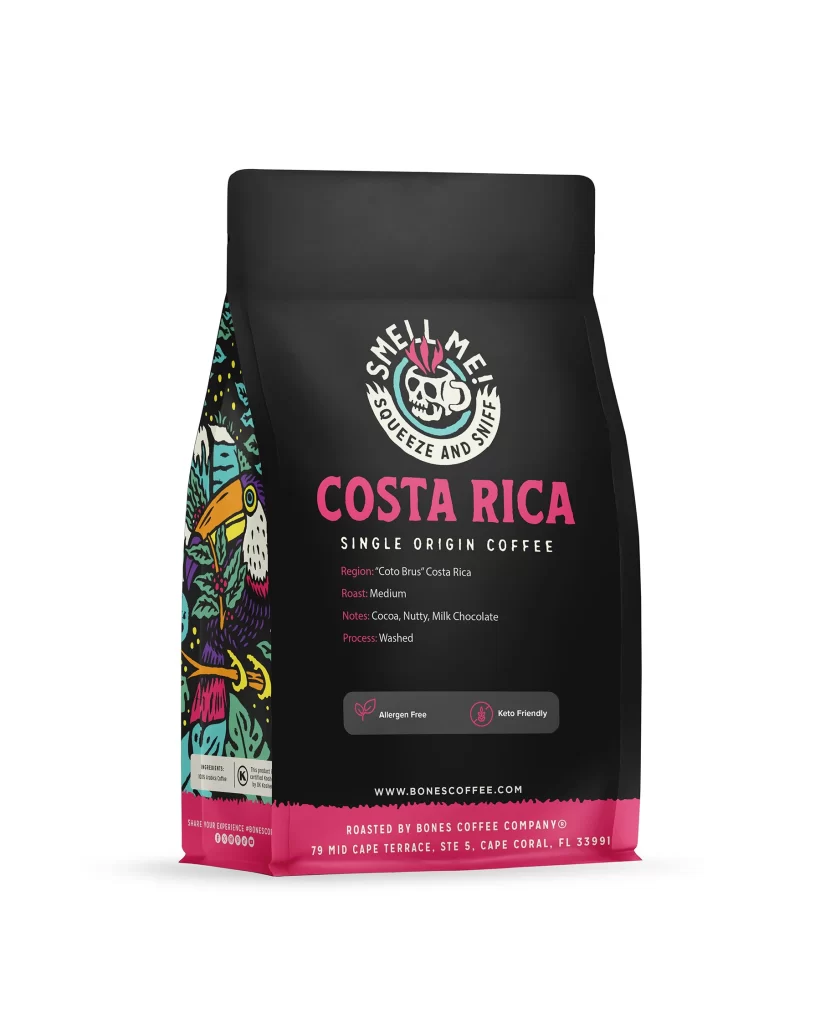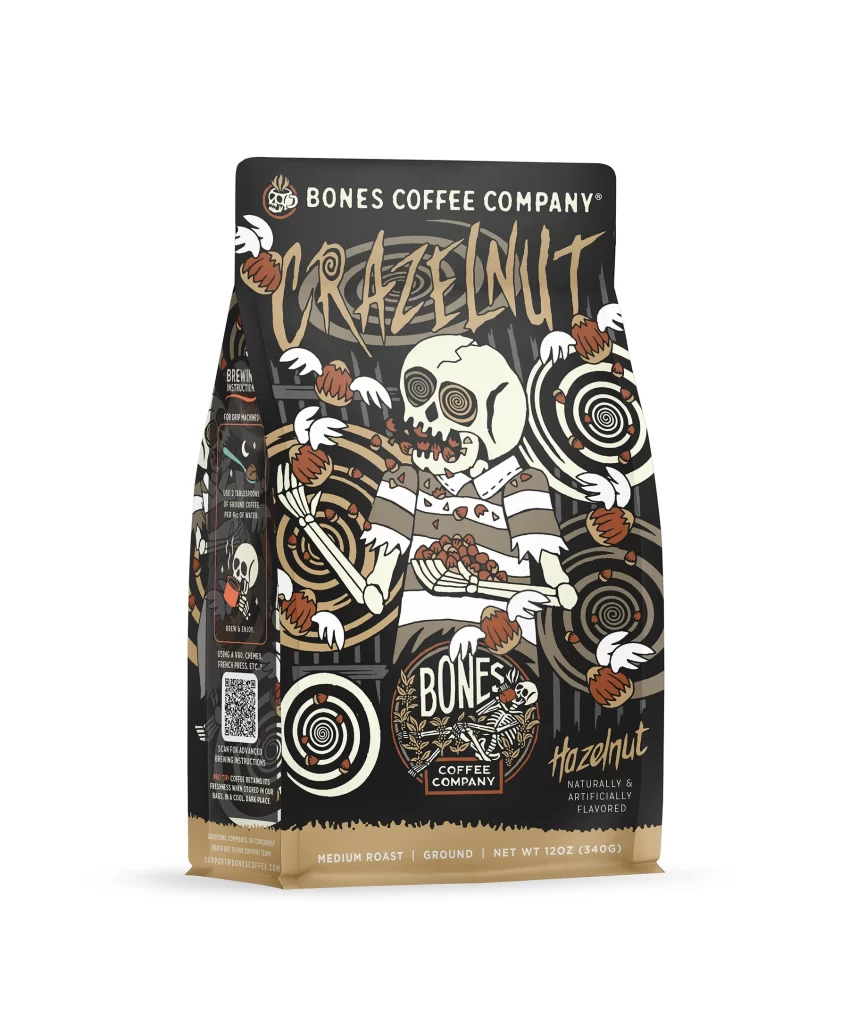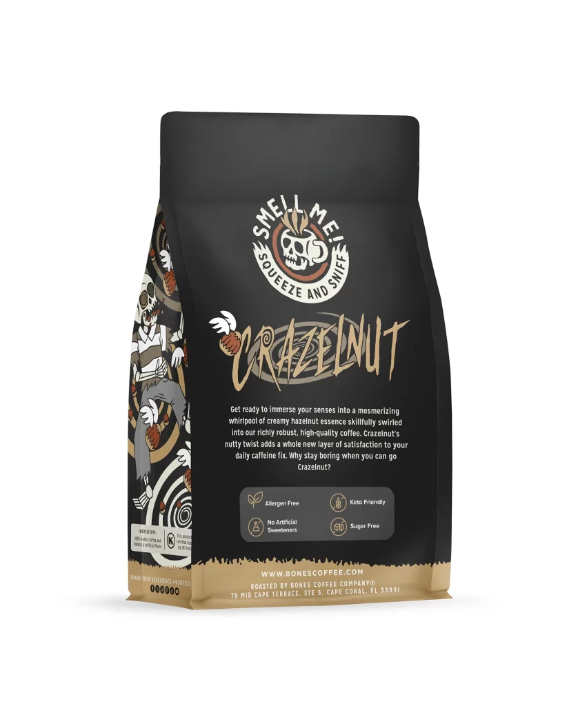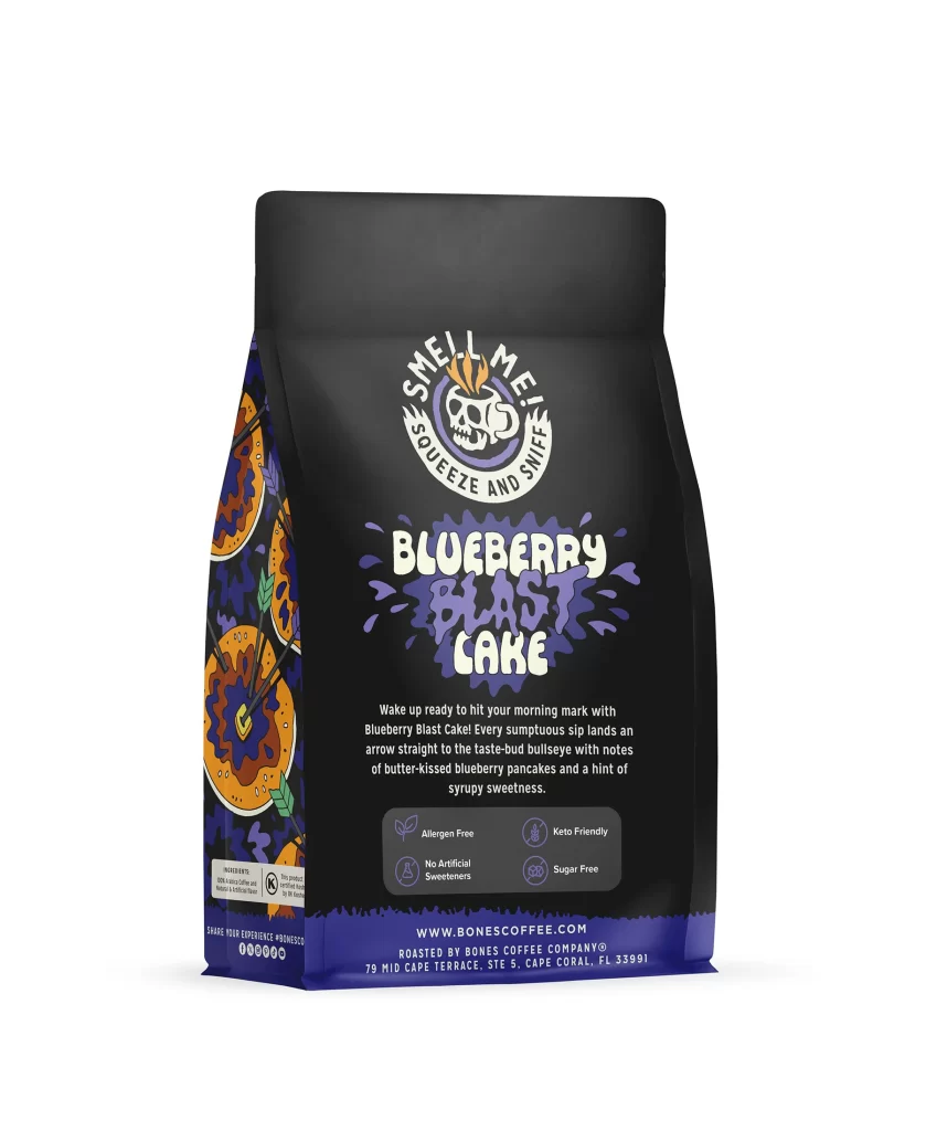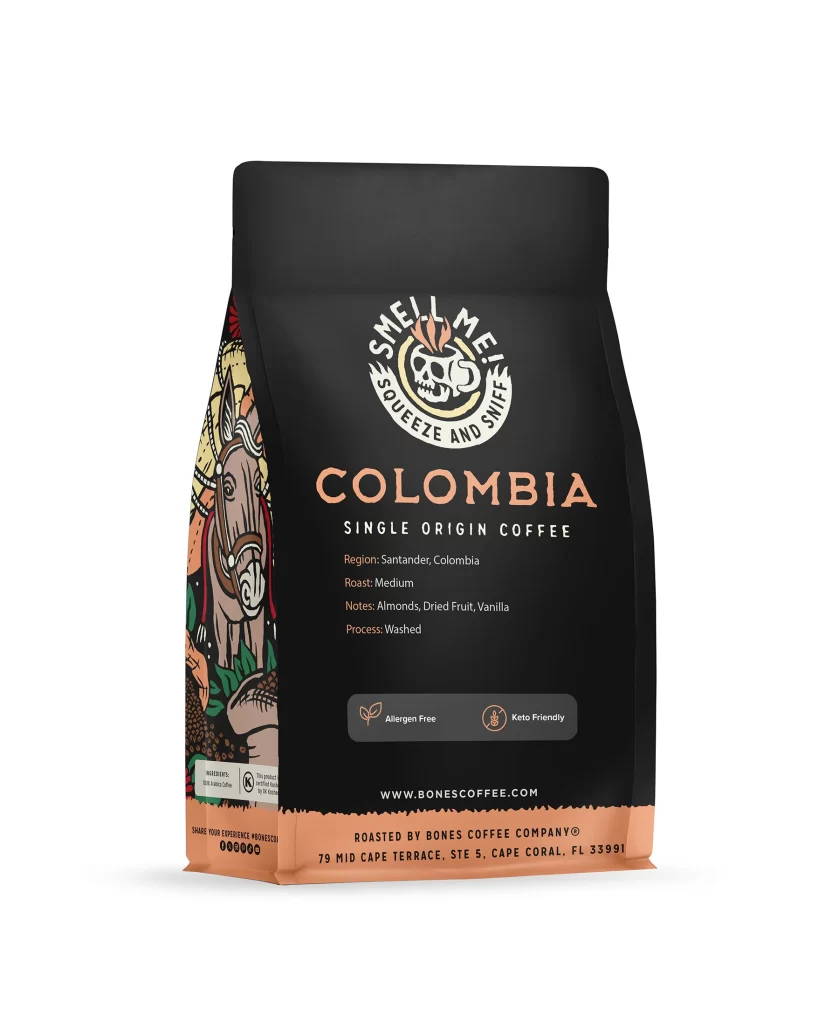
Bones Coffee Colombia Single Origin Coffee Bag Back Packaging
Topics
Details
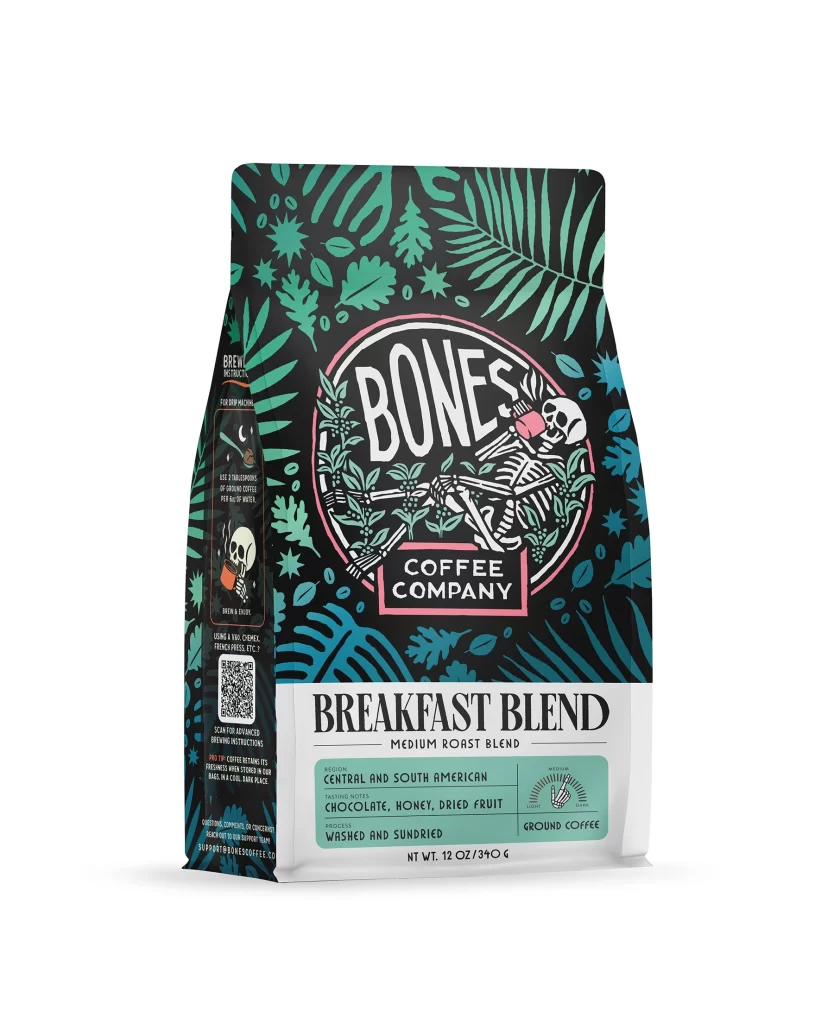
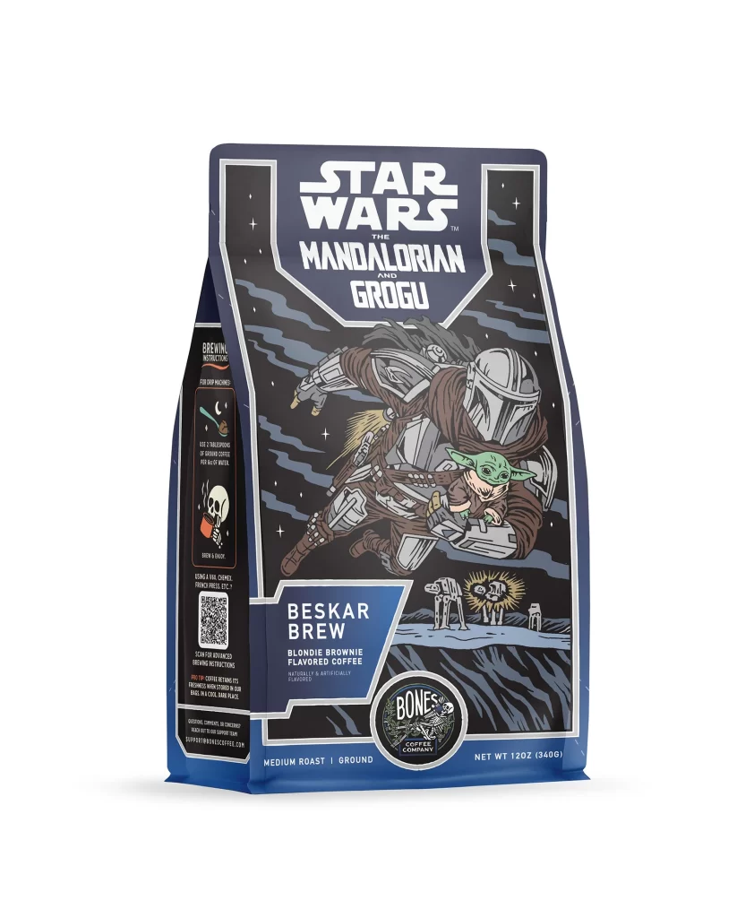
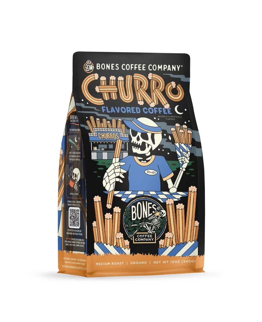
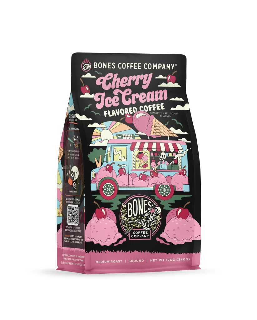
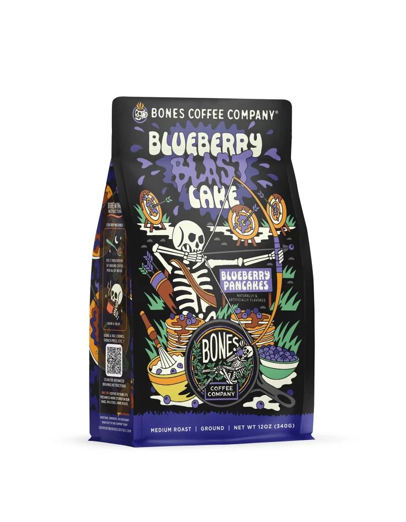
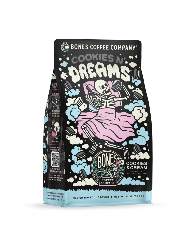
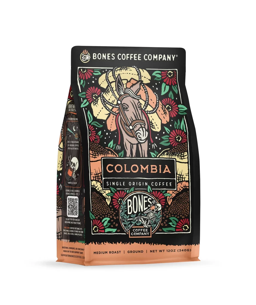
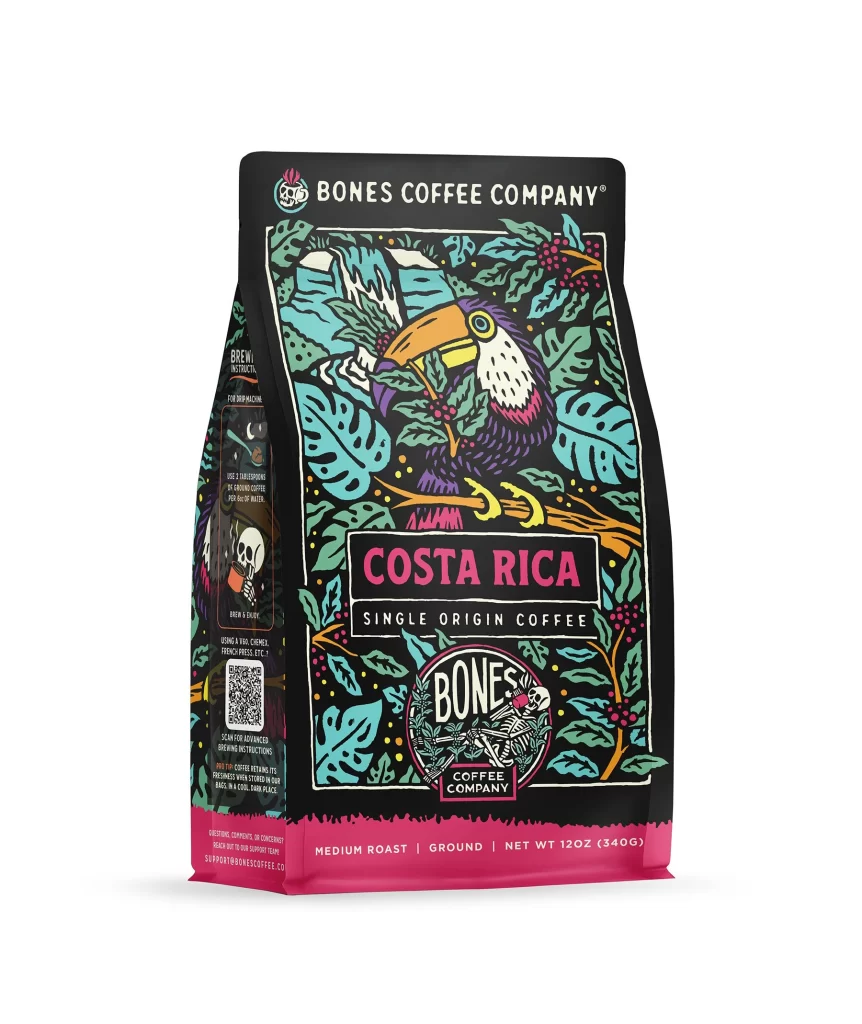
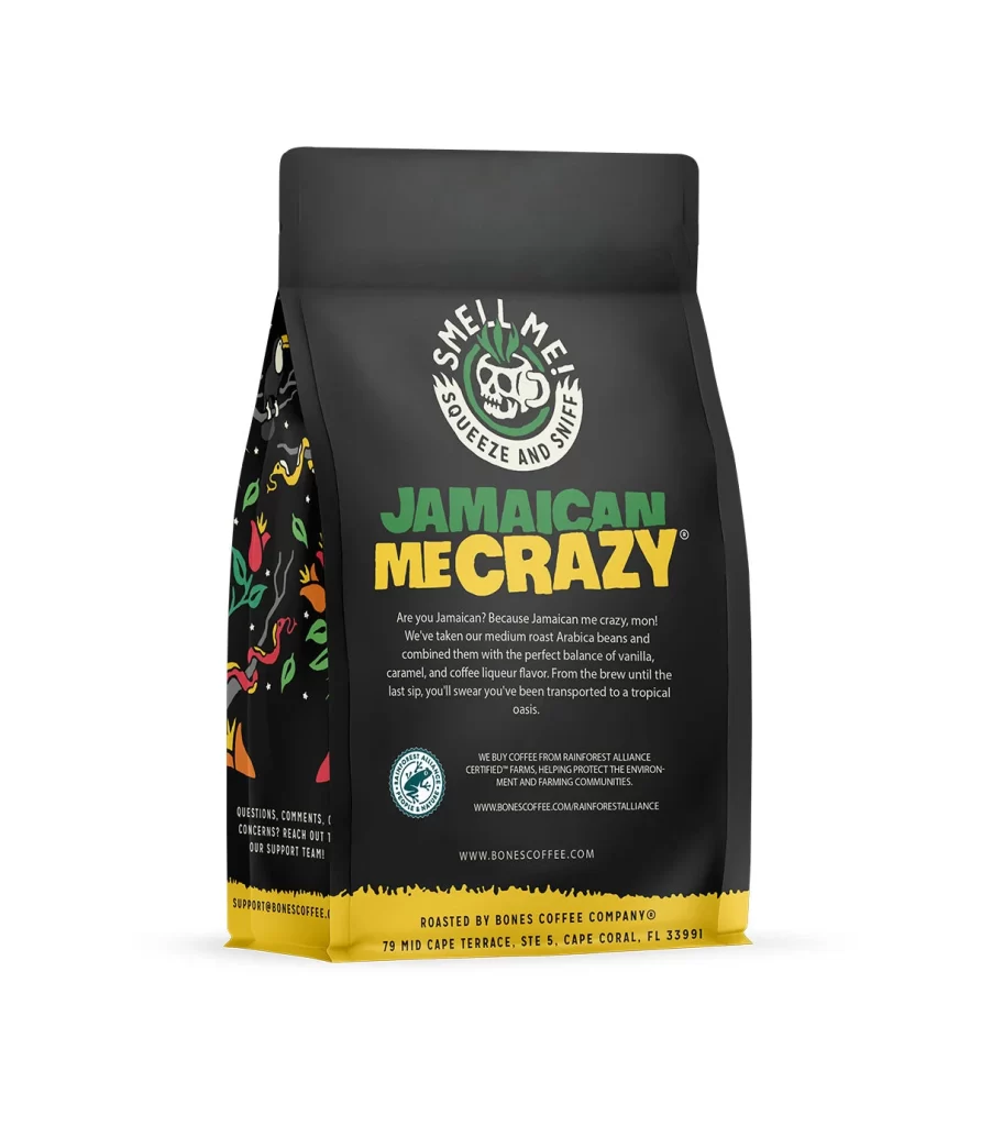
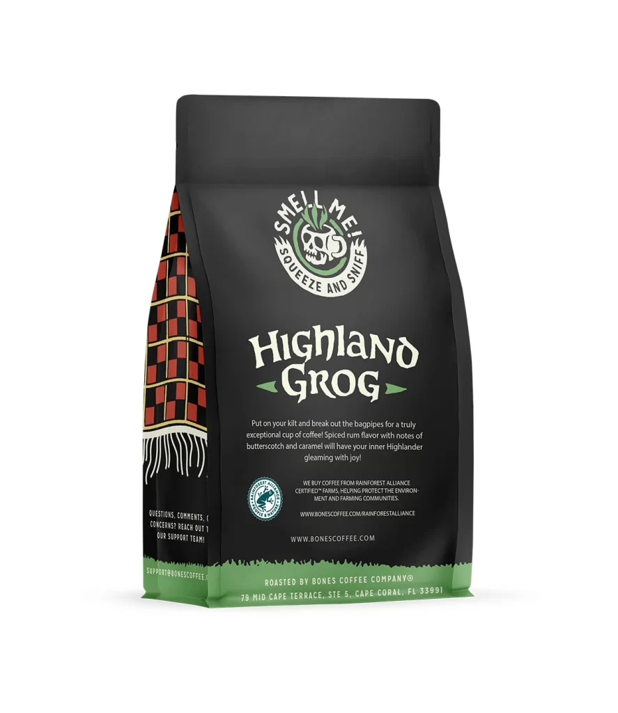
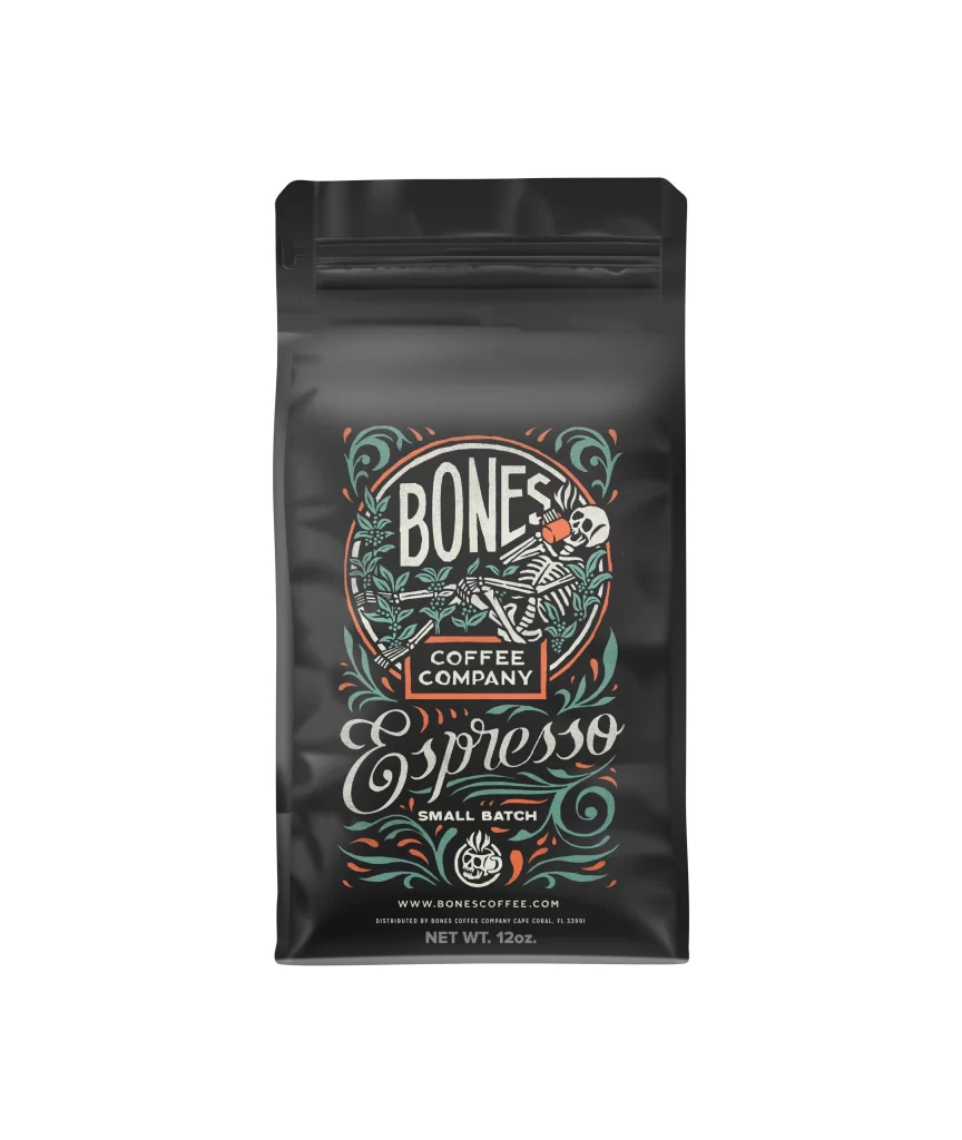
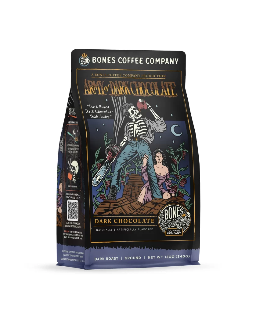
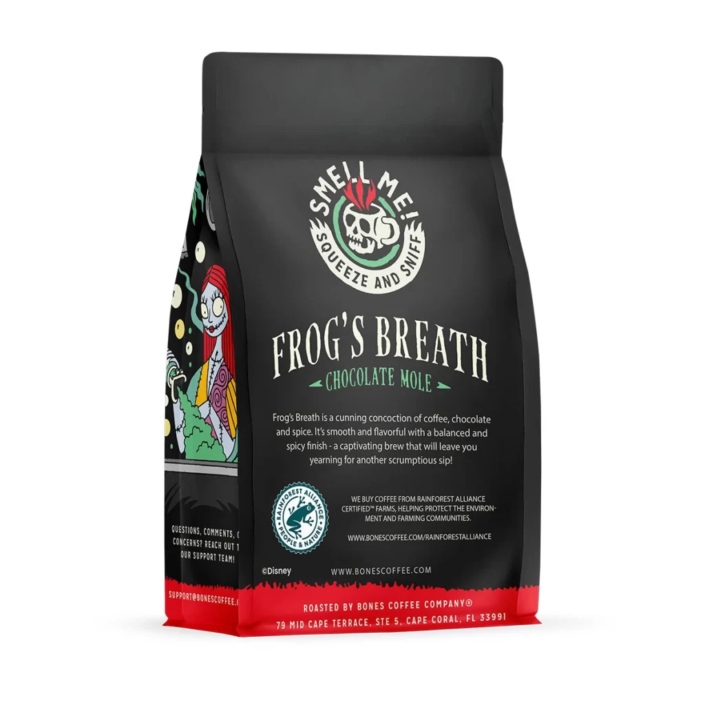
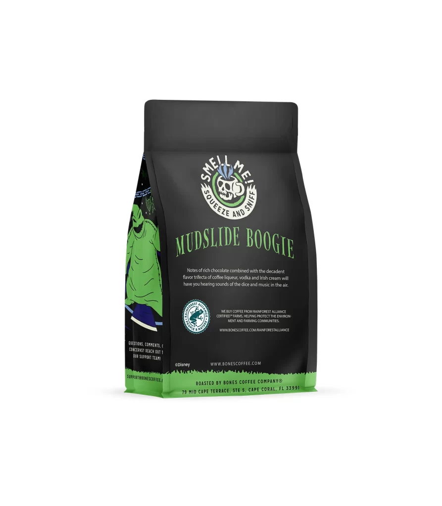
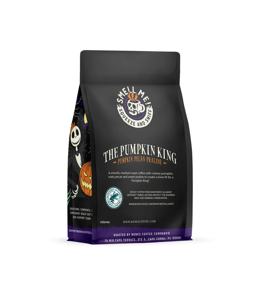
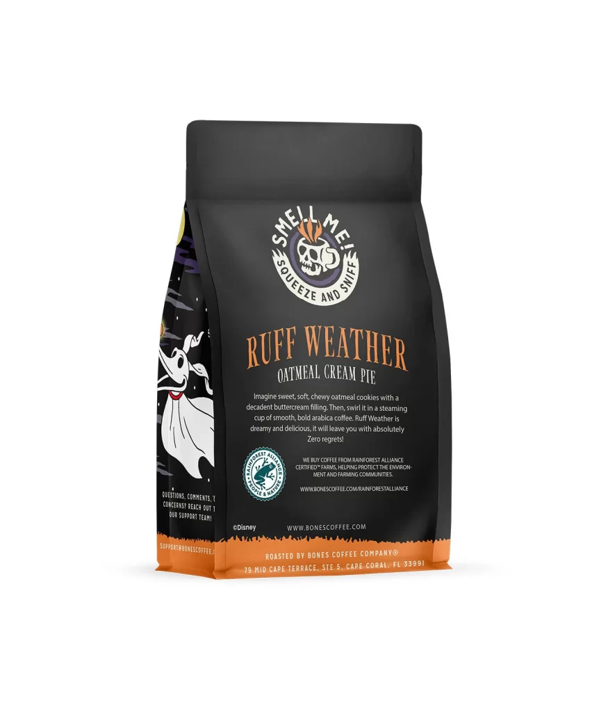
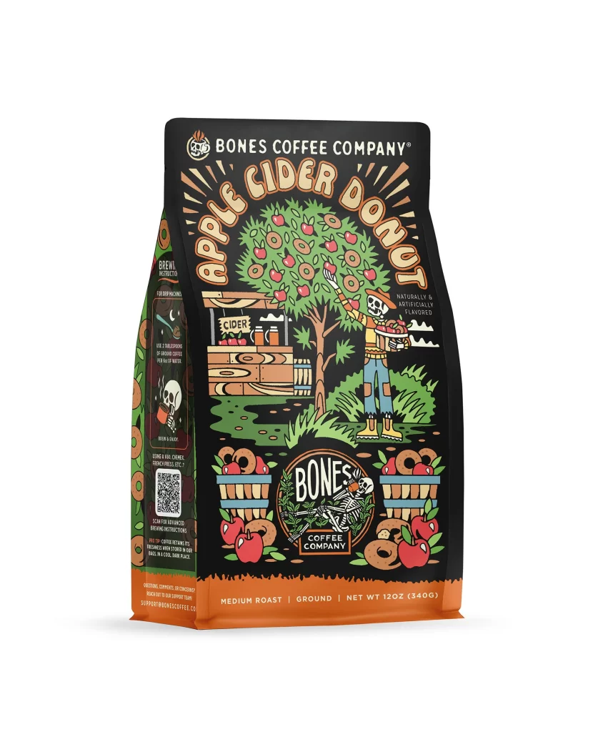
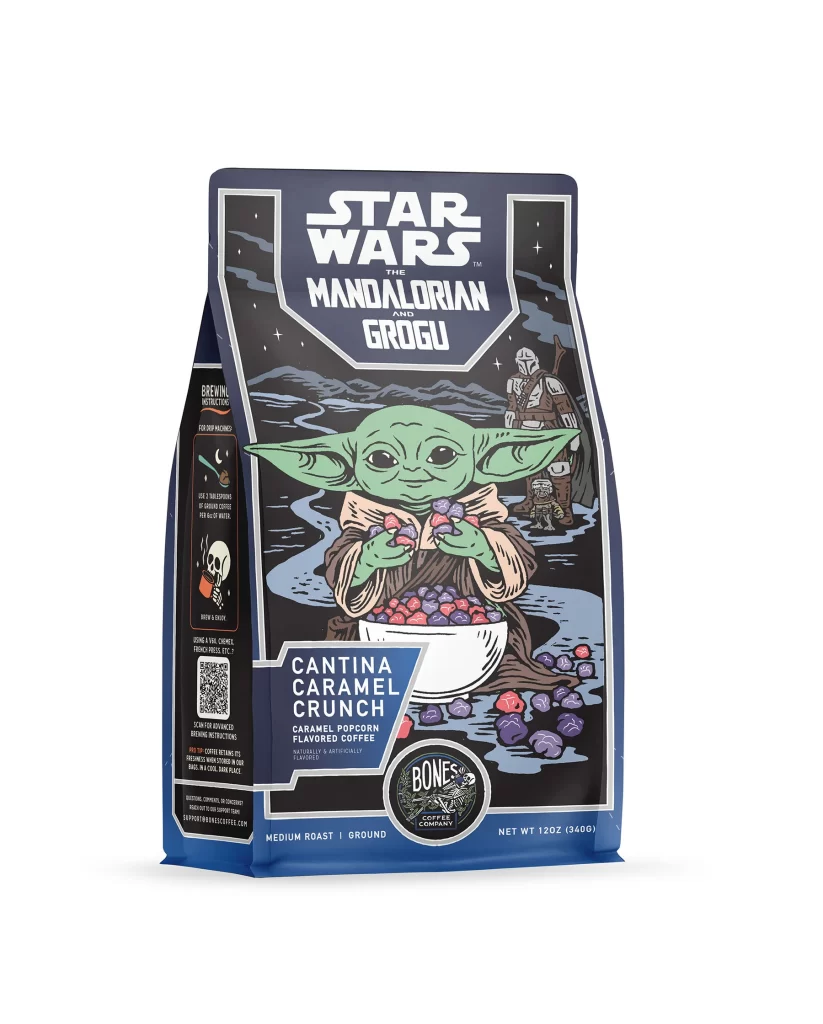
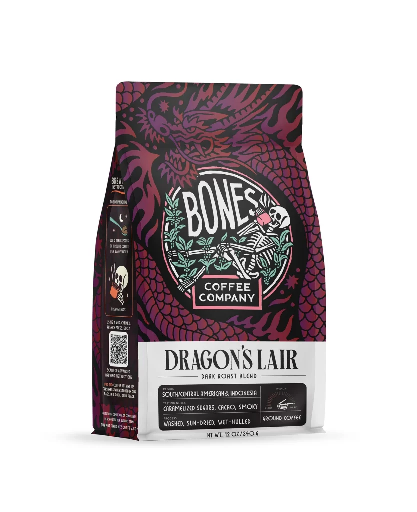
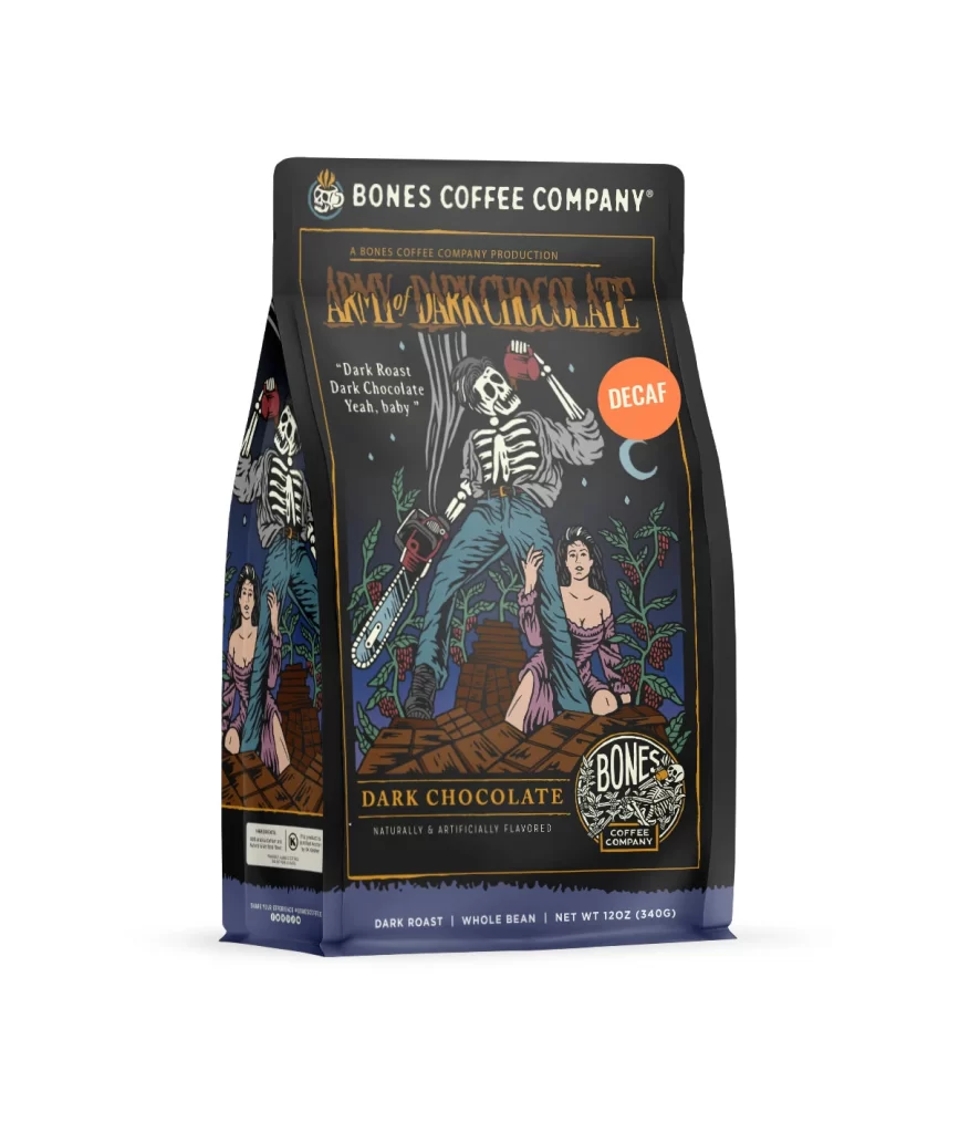
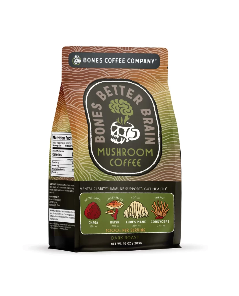
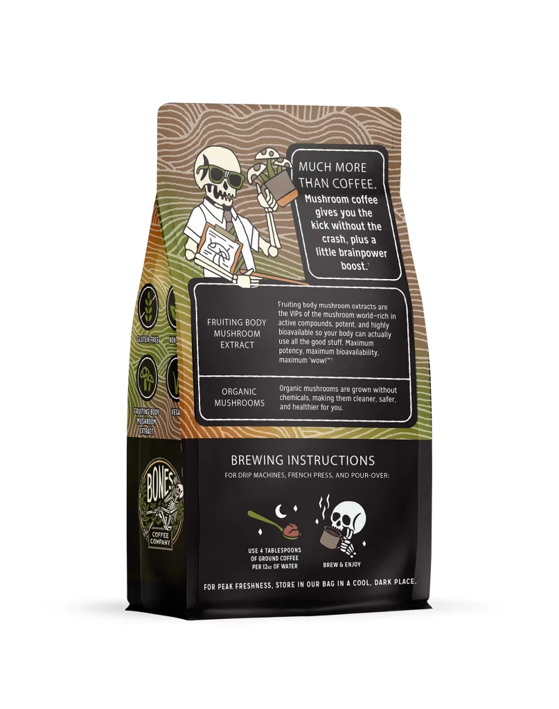
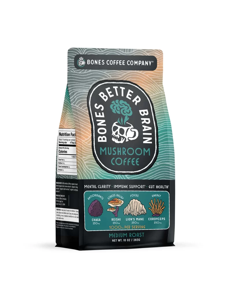
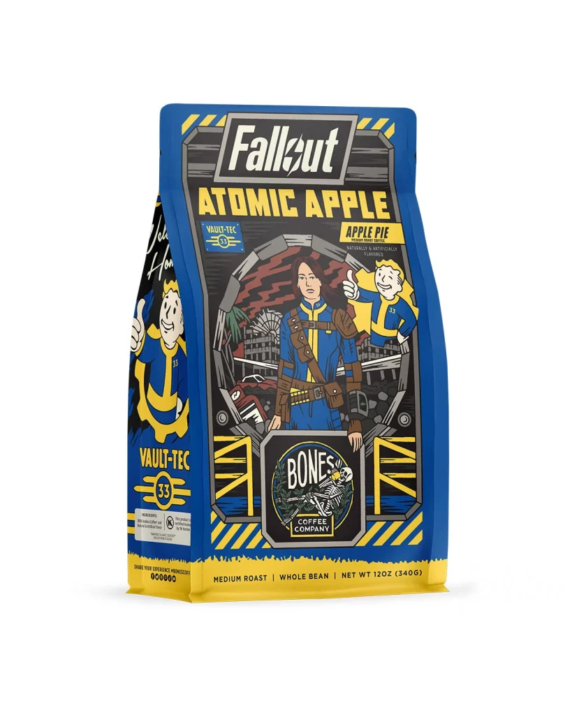
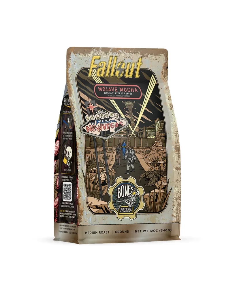
The front layout uses a clean vertical structure with a central skull logo and bold brand text. Flavor art shows a bright red coffee cherry branch with green leaves, adding a natural feel. The bag shape is a flat bottom matte pouch. The design is simple and balanced, guiding the eye from the top logo down to the flavor name and bottom weight details.
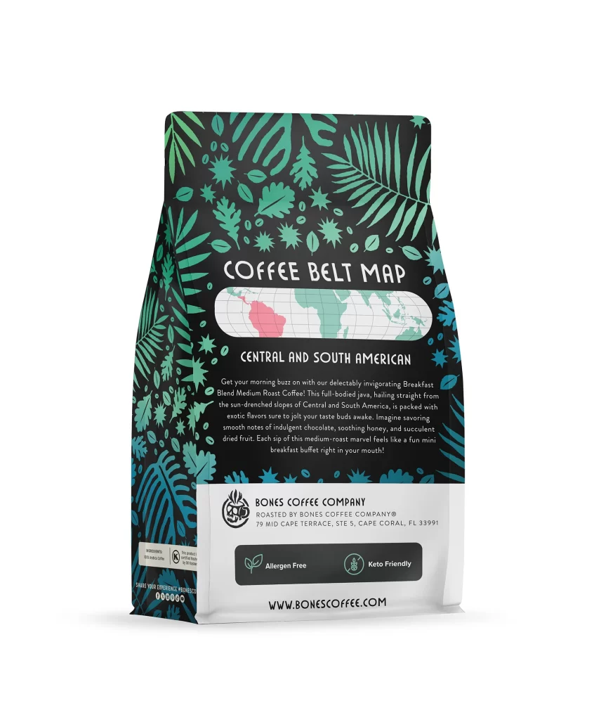
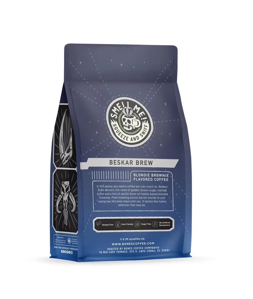
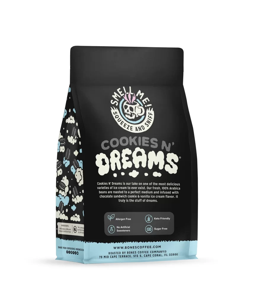
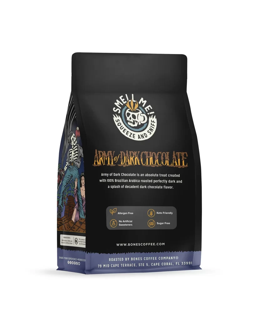
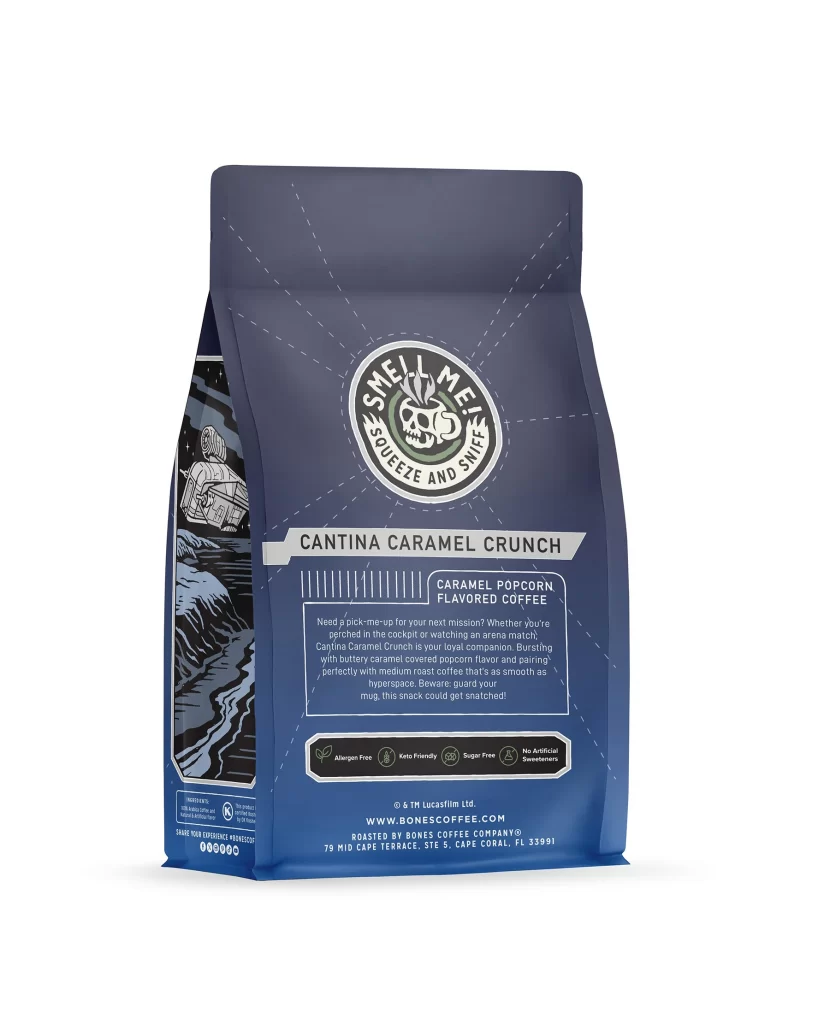
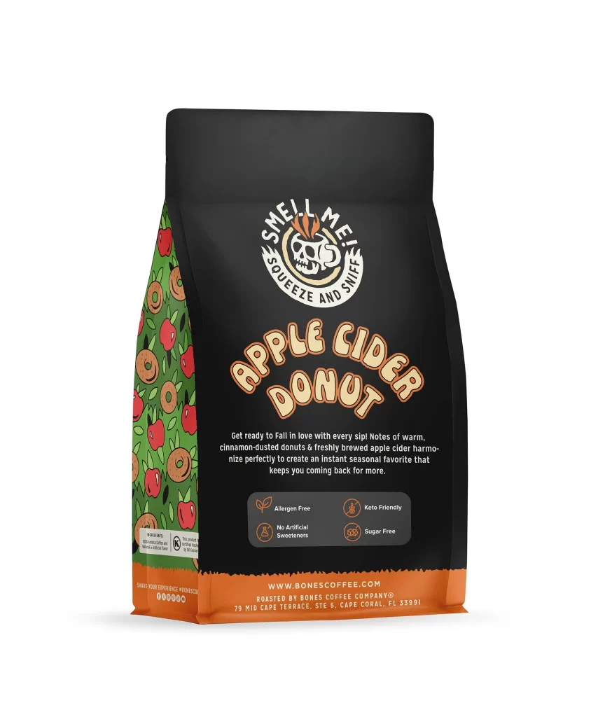
Typography relies on thick sans serif fonts for high contrast against the dark bag. The color palette mixes deep matte black with vibrant red and green accents. This creates strong shelf appeal and stimulates appetite through fresh fruit cues. The bright icons on the back panel, like Allergen Free and Keto Friendly, add quick visual trust for buyers.
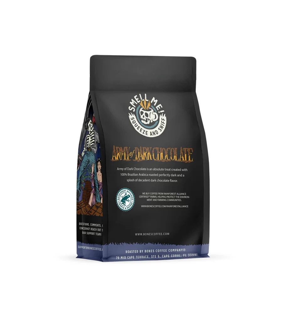
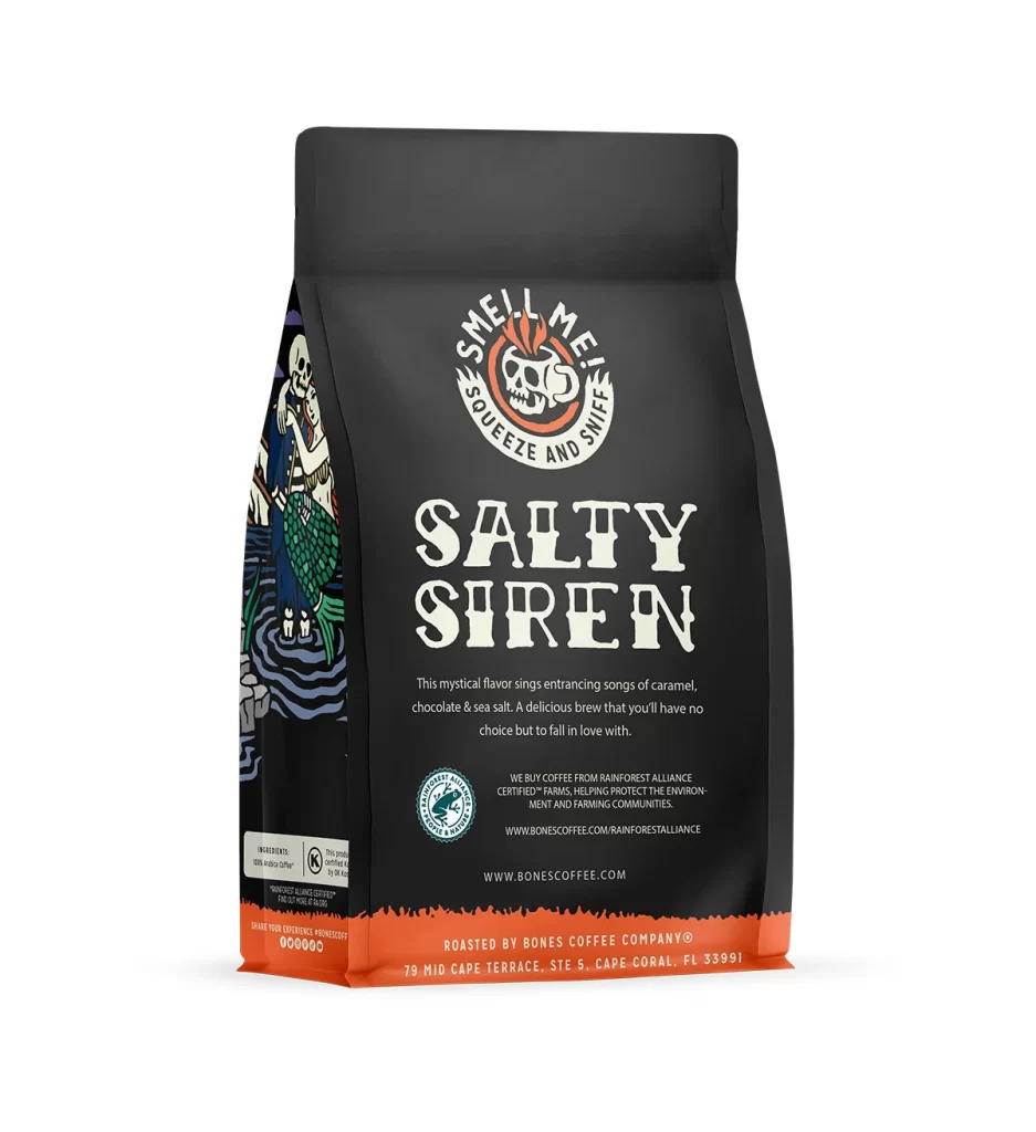
Designers can study this bag for its smart use of negative space and clear hierarchy. The front art draws attention, while the back panel gives dense facts without clutter. Using simple icons for Sugar Free and brewing text helps consumers read fast. The 12 oz 340 g weight is clear. This balance of style and function is a great model for modern food packaging.