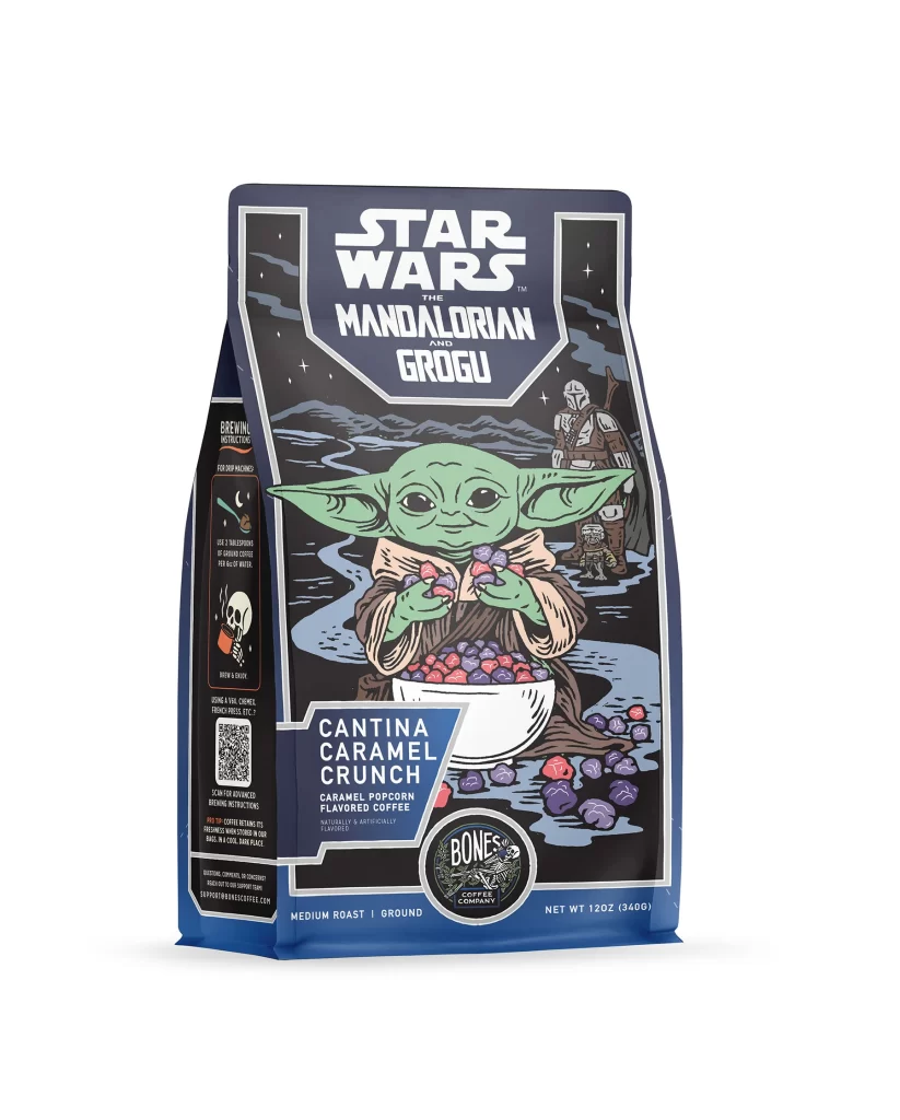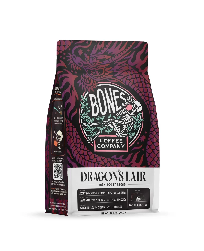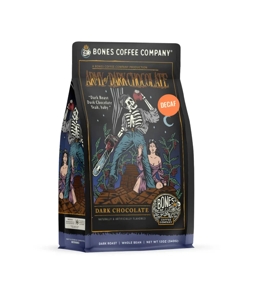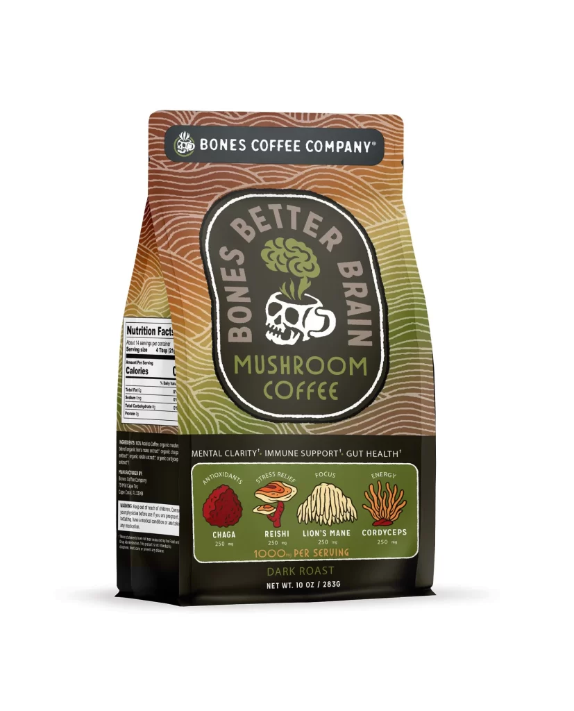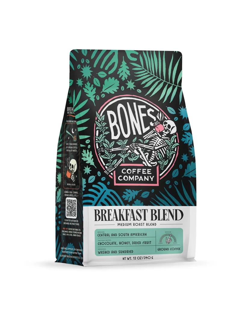
Bones Coffee Breakfast Blend Medium Roast Coffee Bag Front Packaging
Topics
Details
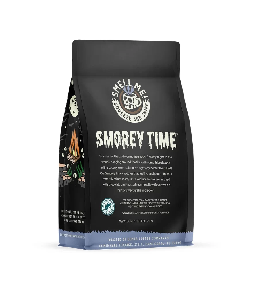
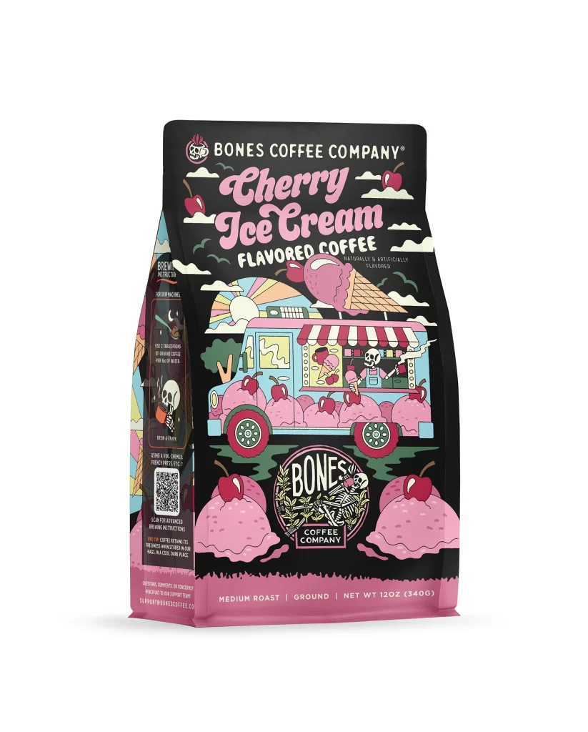
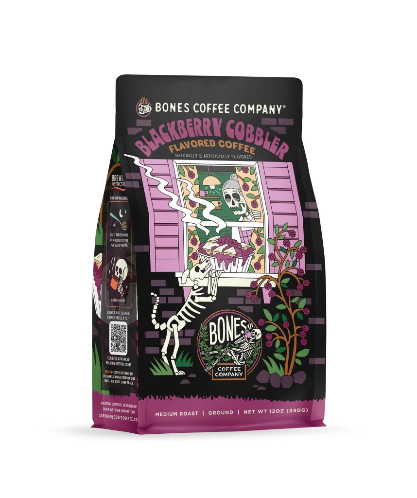
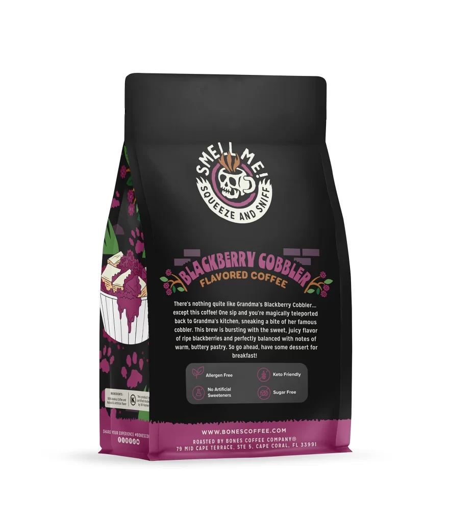
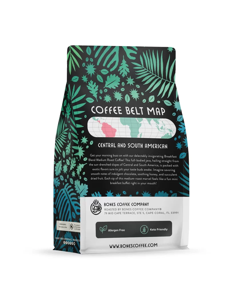
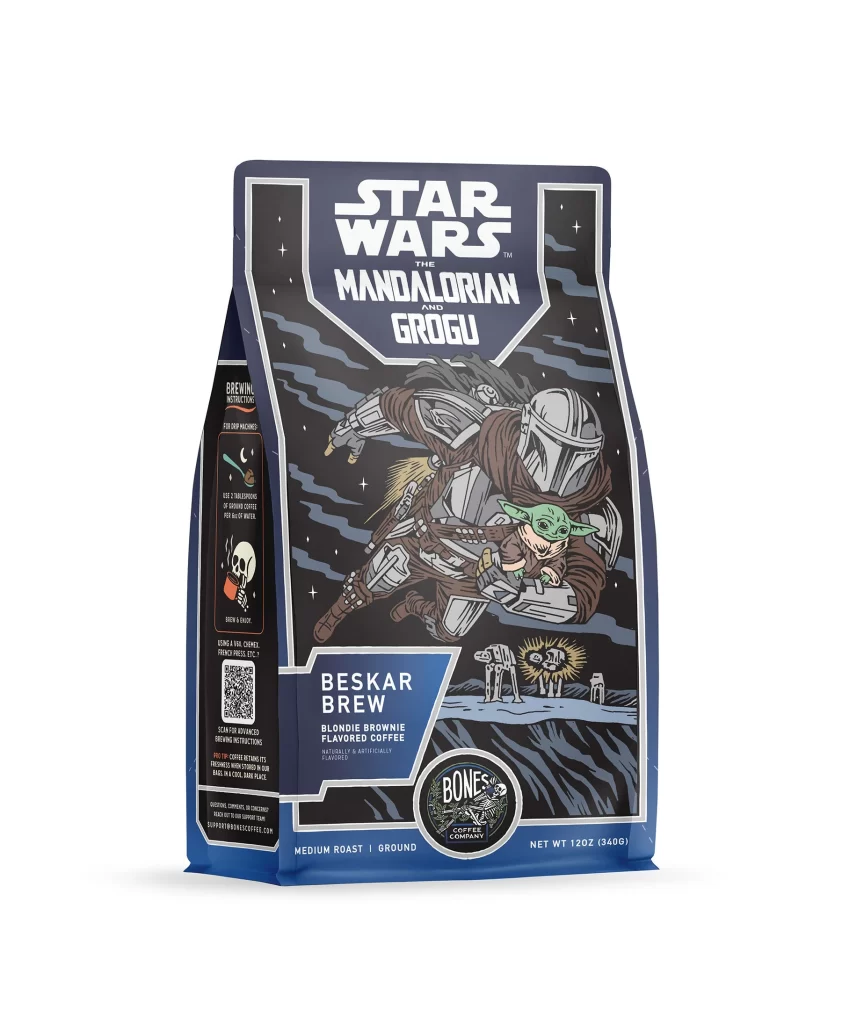
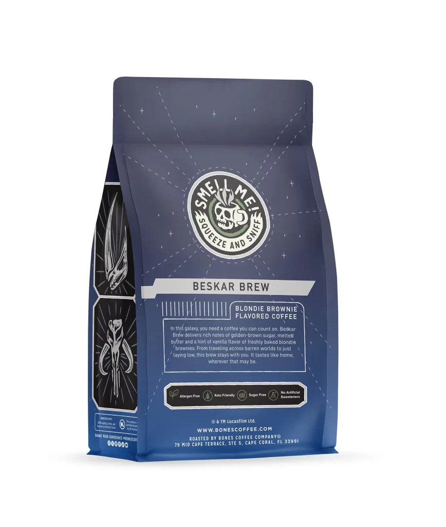
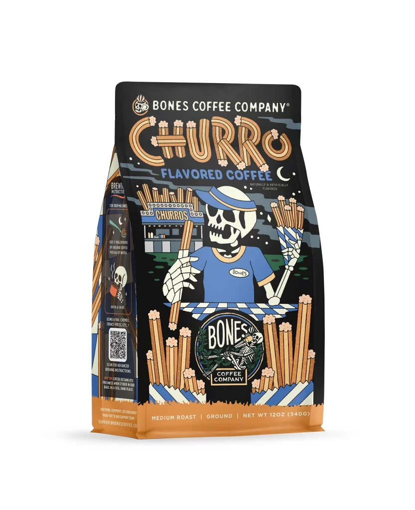
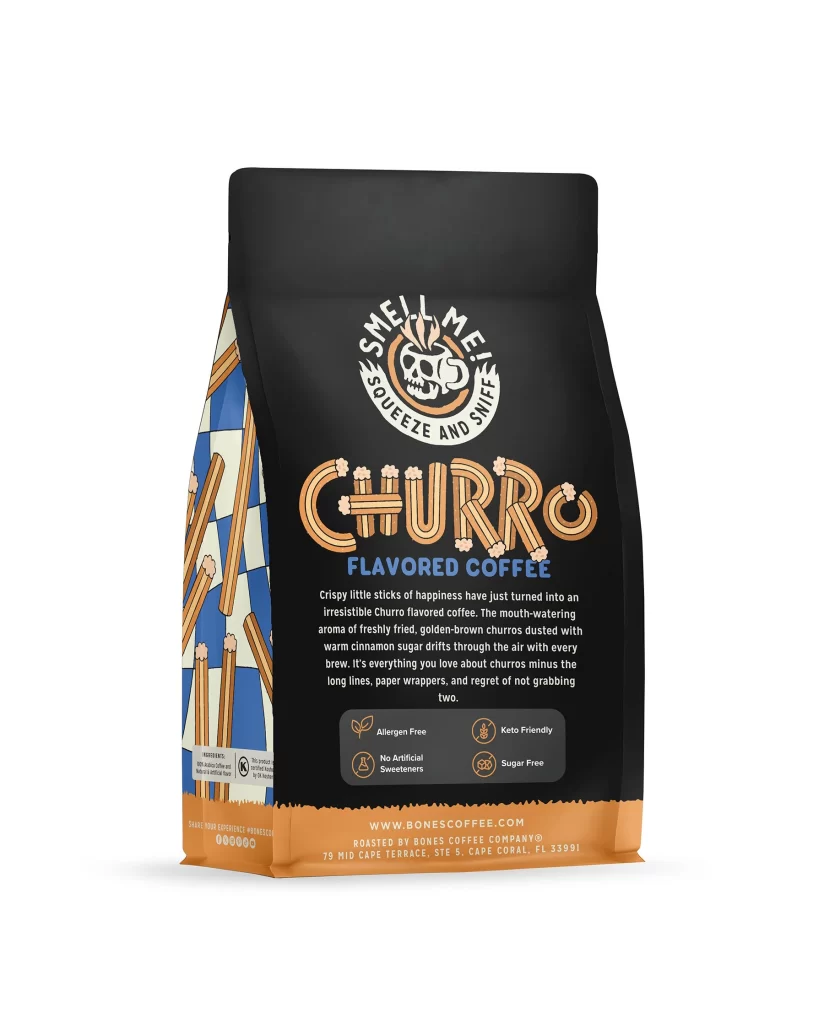
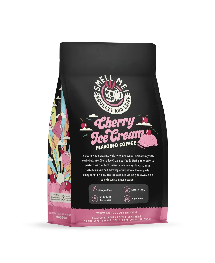
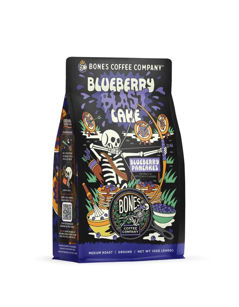
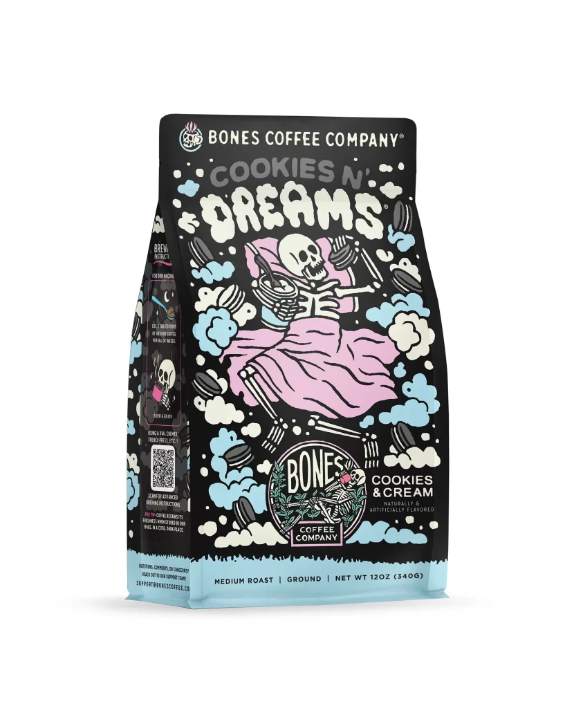
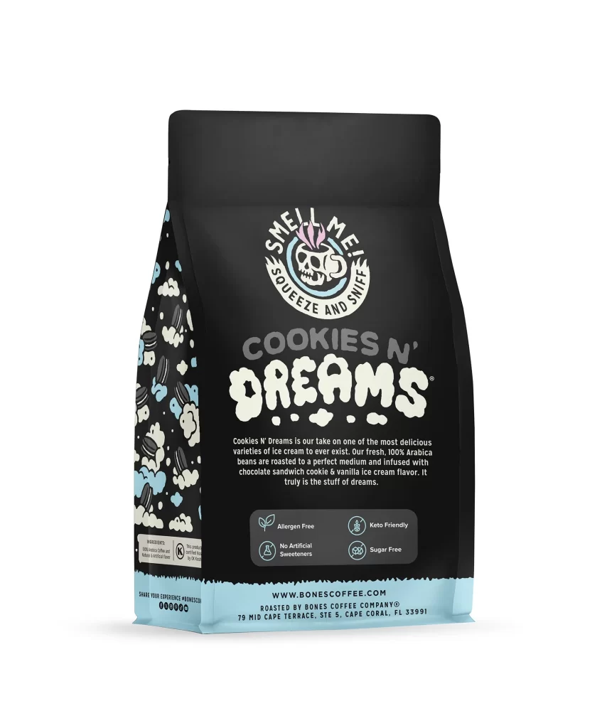
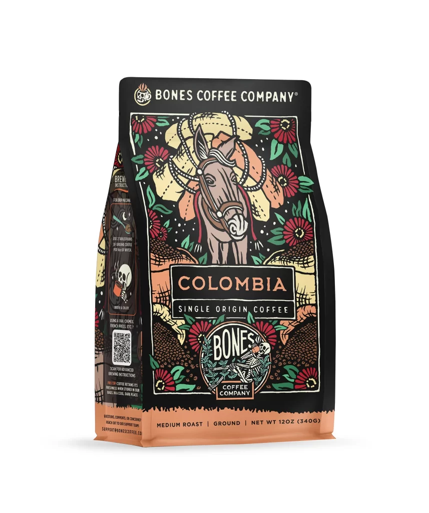
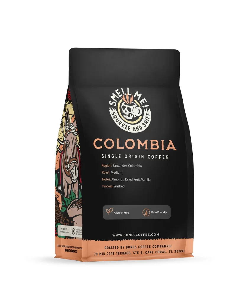
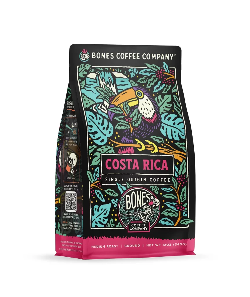
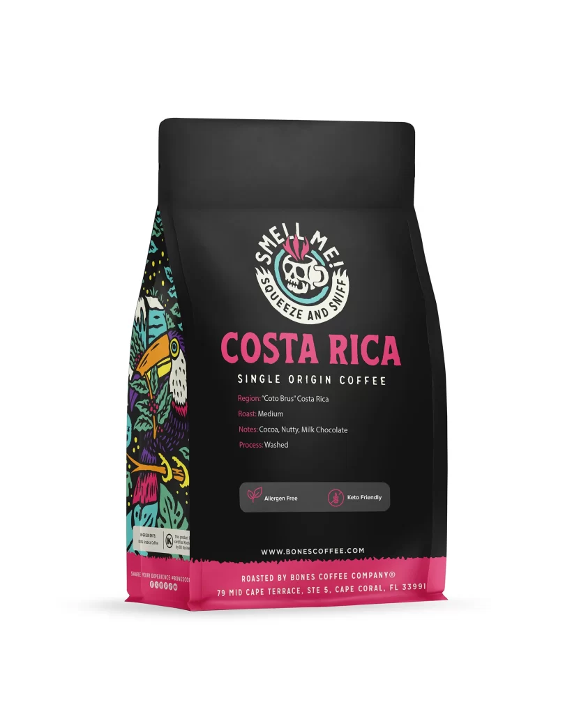
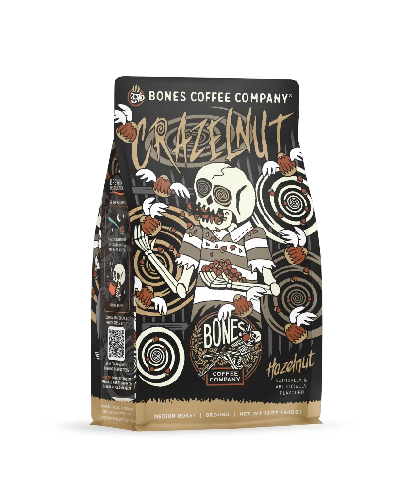
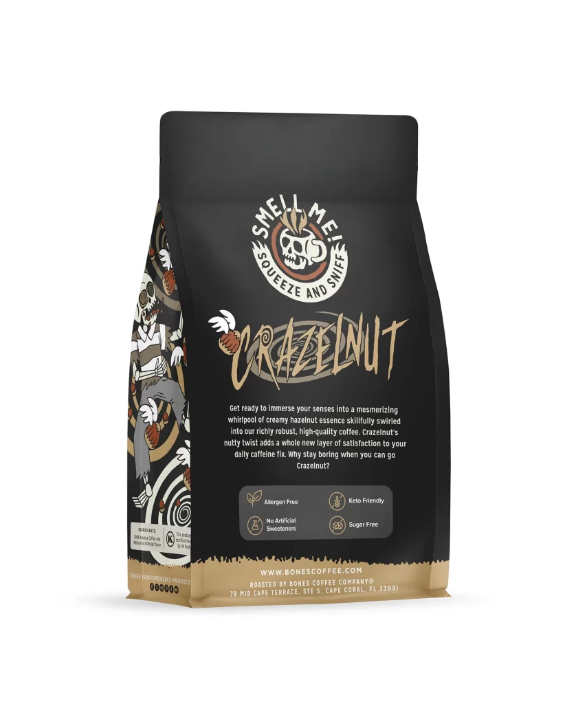
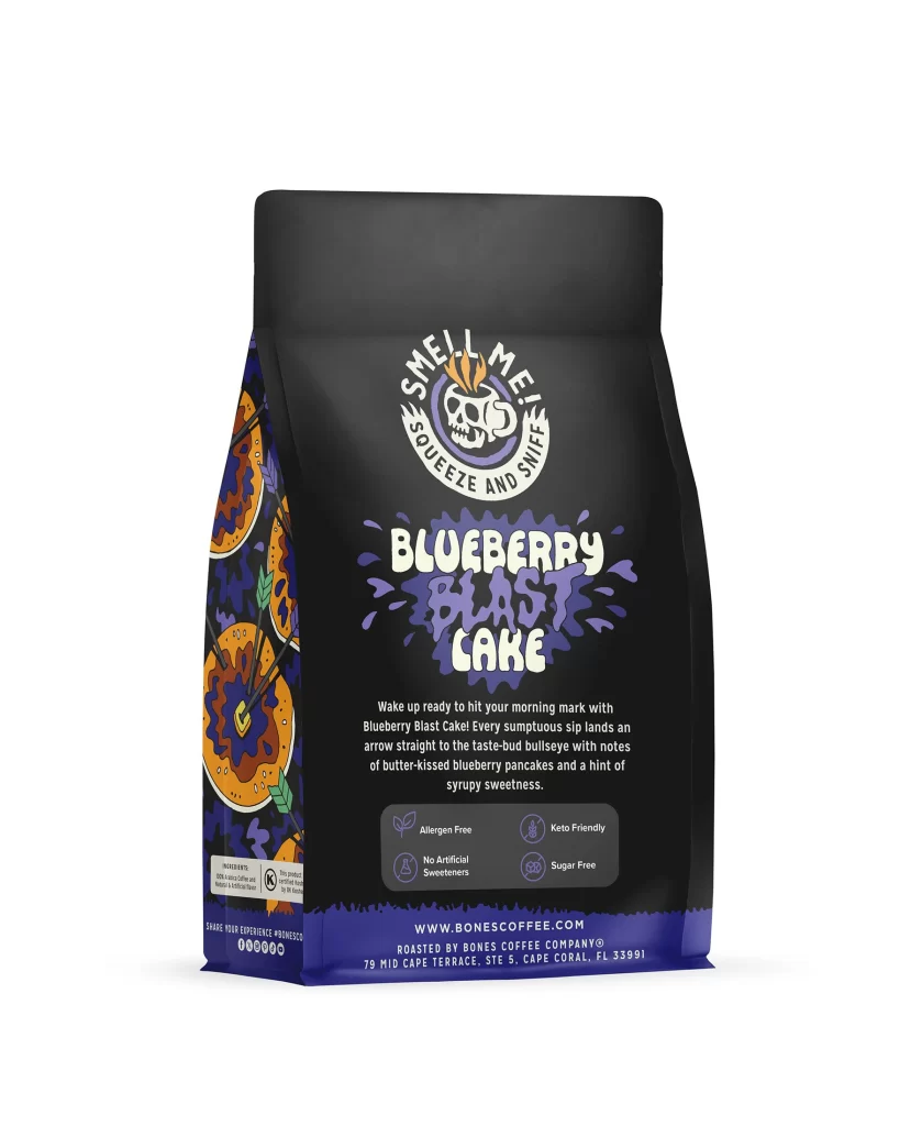
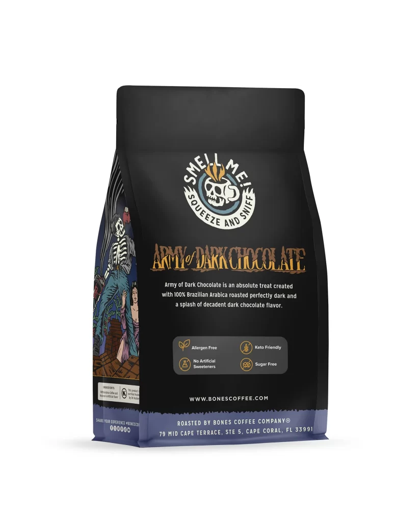
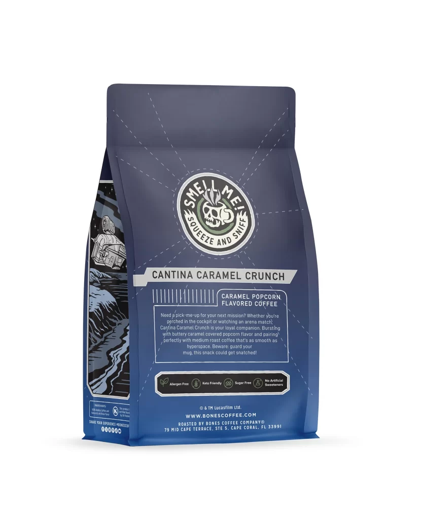
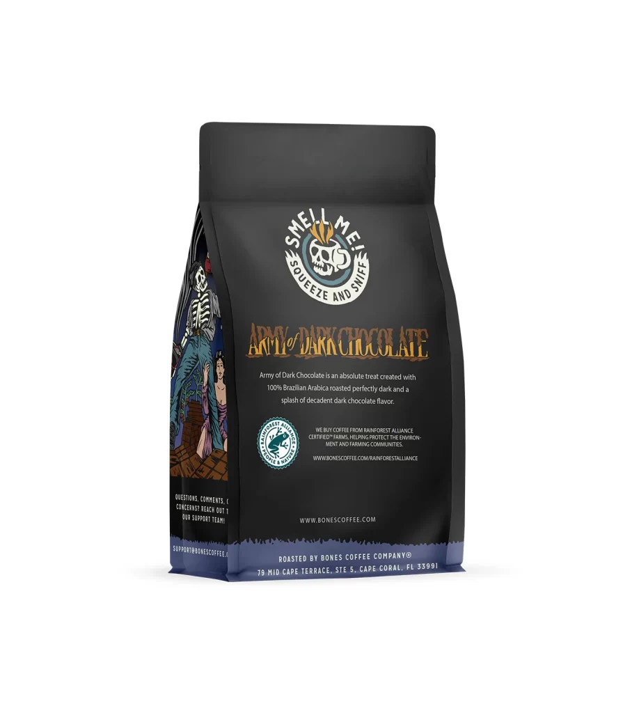
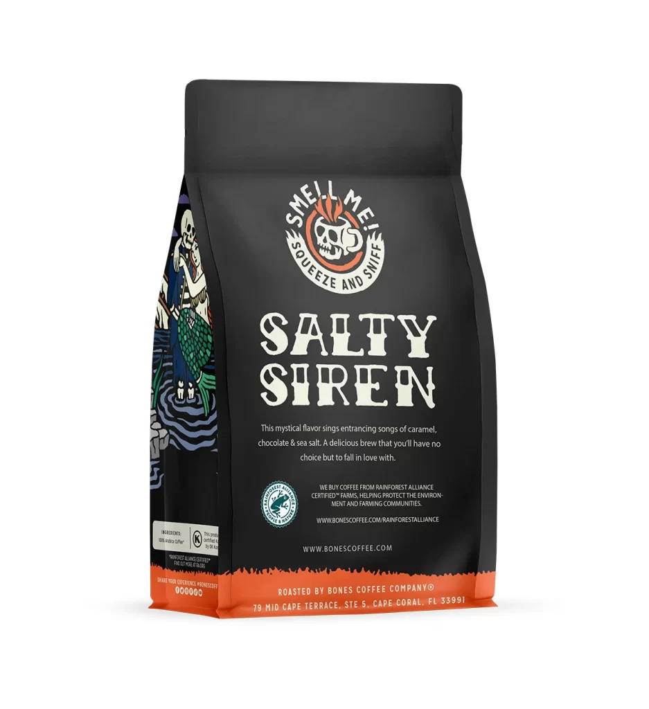
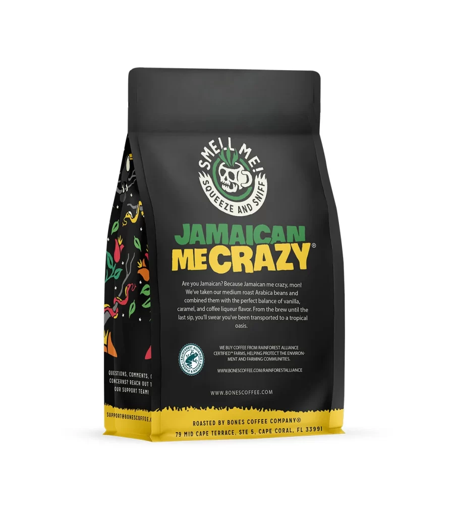
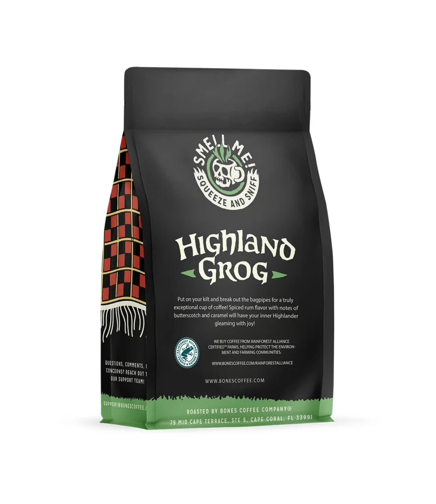
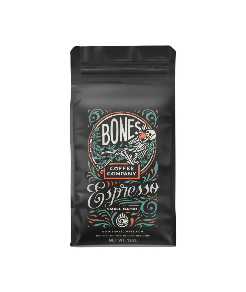
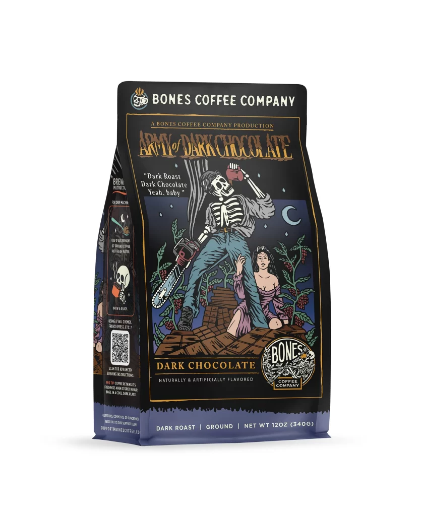
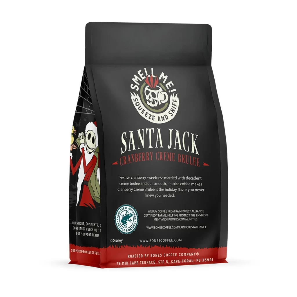
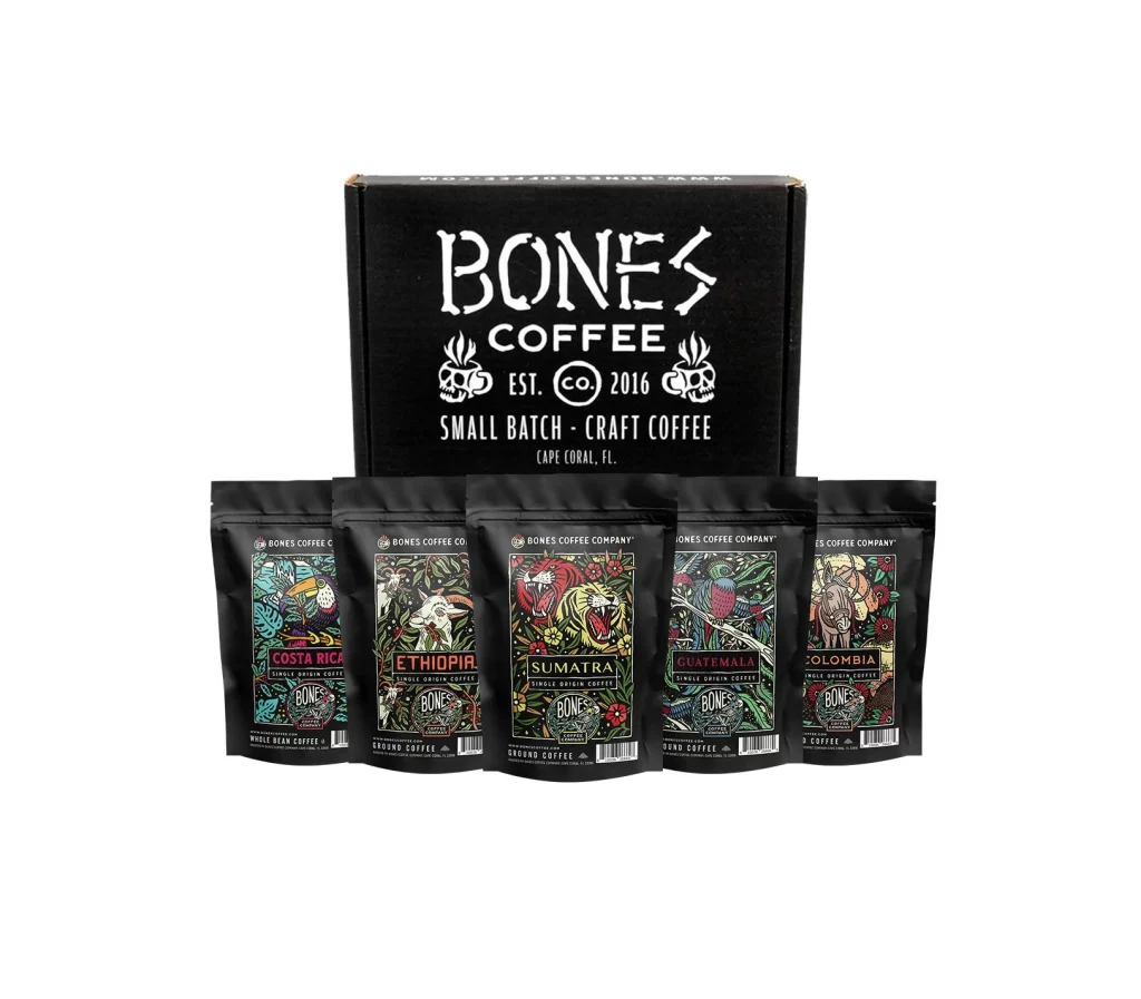
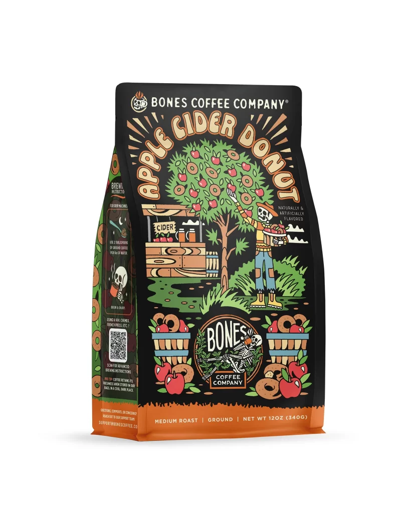
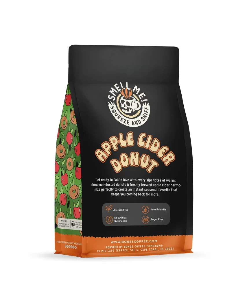
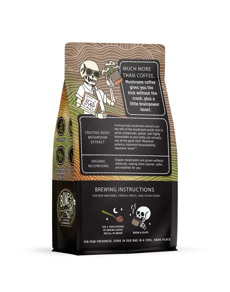
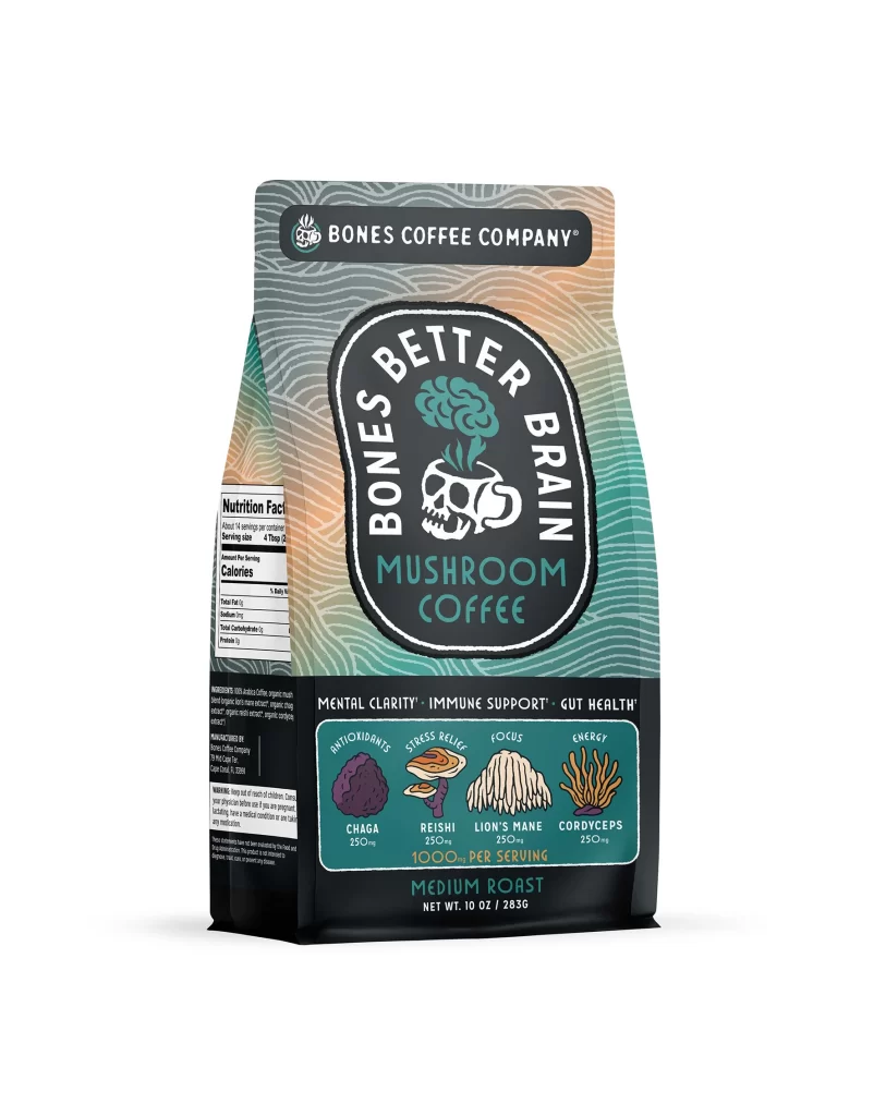
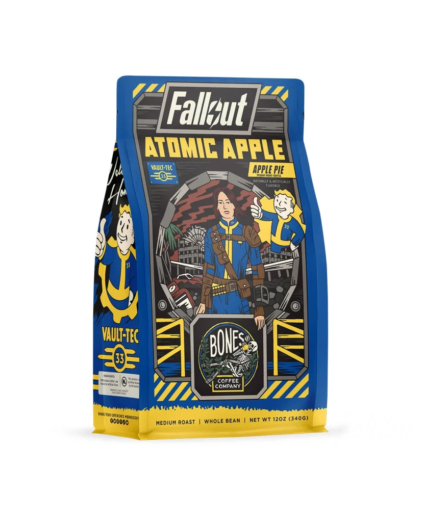
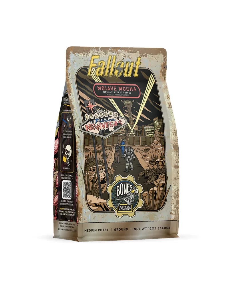
The front design layout centers on a sturdy coffee bag featuring playful flavor art of a classic morning meal. The illustration includes pancakes, syrup, and a steaming cup of coffee arranged neatly to communicate the theme. This visual sits against a clean background, making the product easily identifiable. The composition balances the appetizing artwork with the required text elements for a strong presentation.
Typography on the front uses bold and clear sans serif fonts to ensure high shelf appeal. The dark lettering contrasts sharply with the light background, catching the eye instantly. Warm colors in the flavor art stimulate appetite and evoke a cozy morning feeling. This combination of clear text and inviting hues makes the package stand out to shoppers browsing store aisles.
Designers can learn how to balance whimsical illustrations with essential product information effectively. The layout proves that using a clean background helps appetizing artwork pop without causing visual clutter. Creators should note how contrasting typography improves readability while maintaining aesthetic harmony. This reference demonstrates that integrating thematic visuals with clear text creates a compelling and attractive retail package.