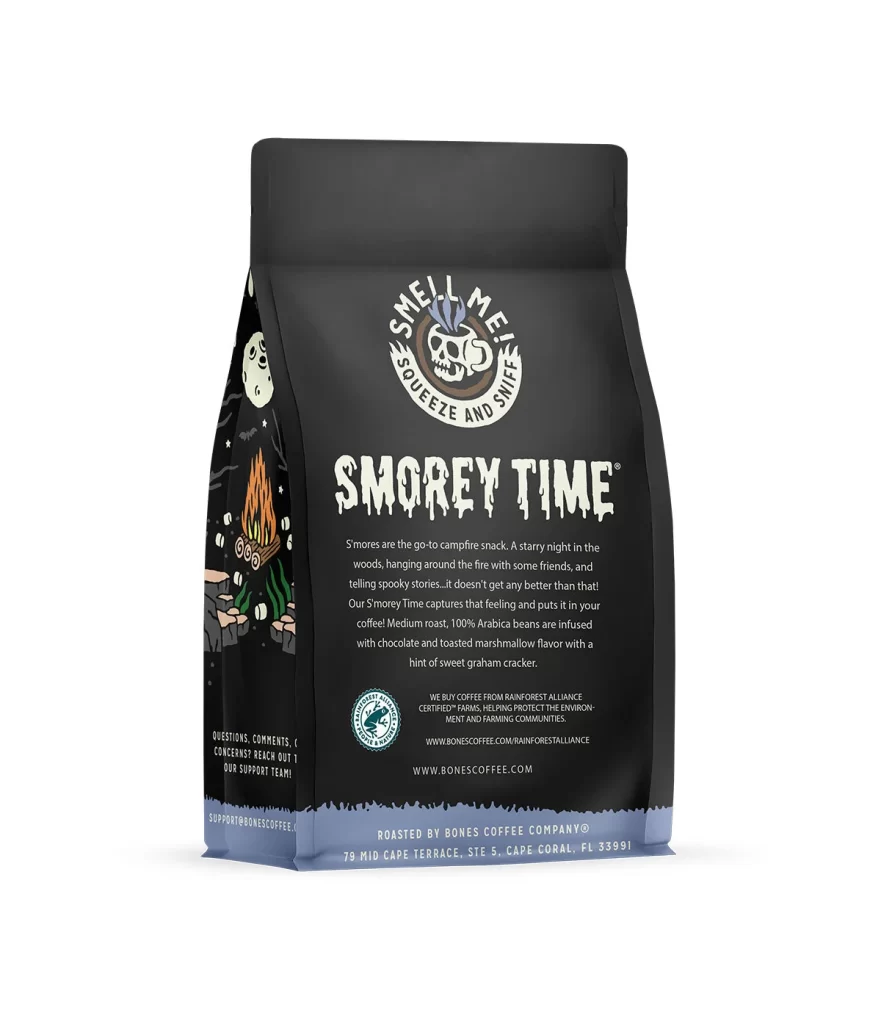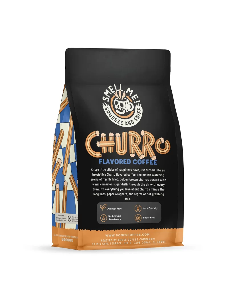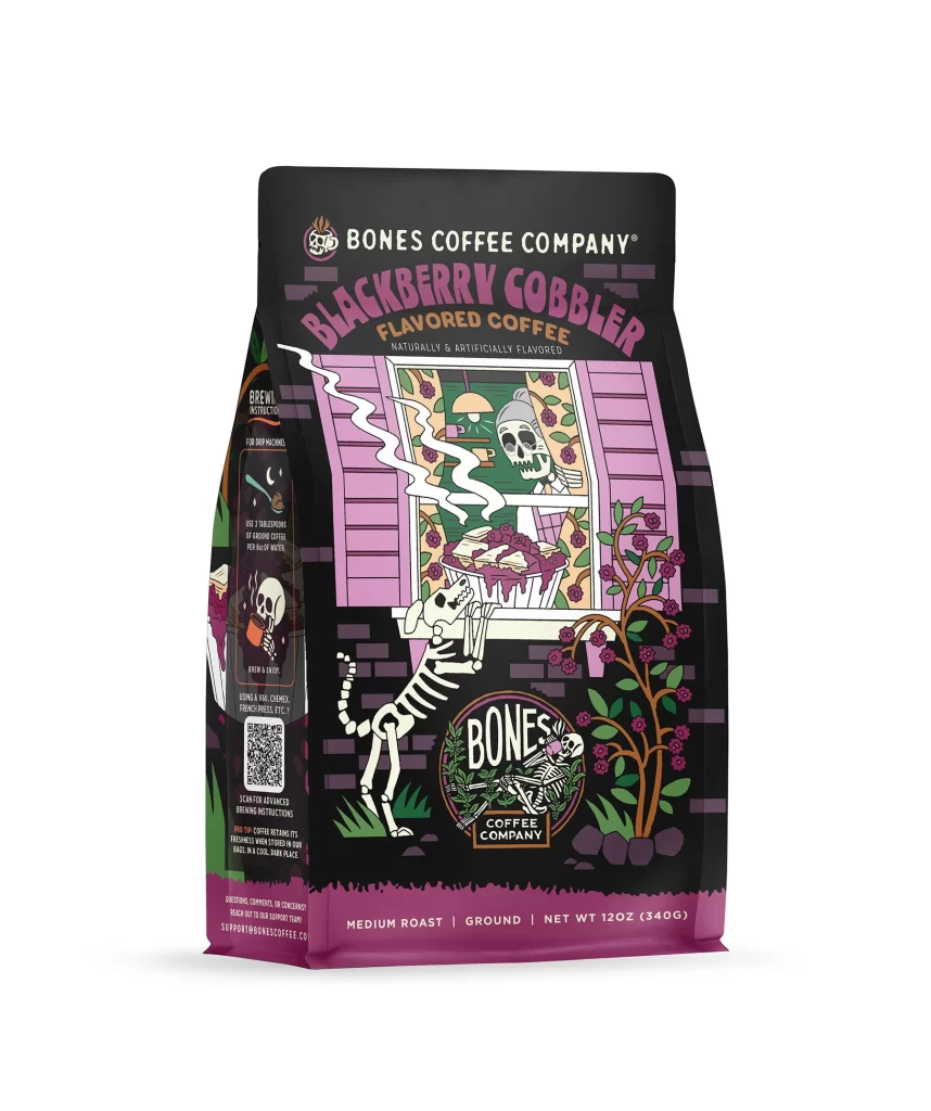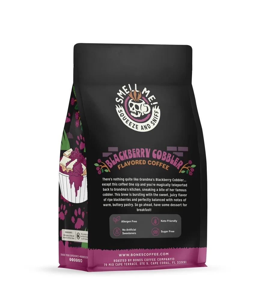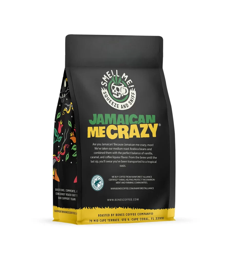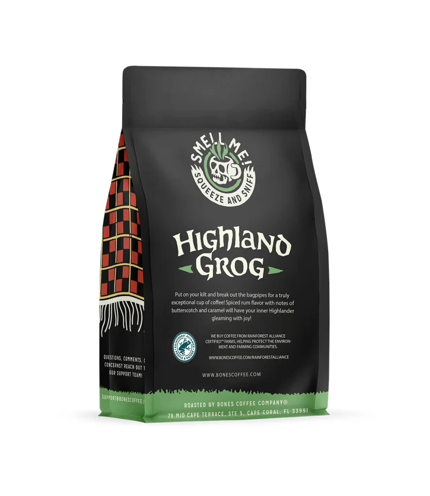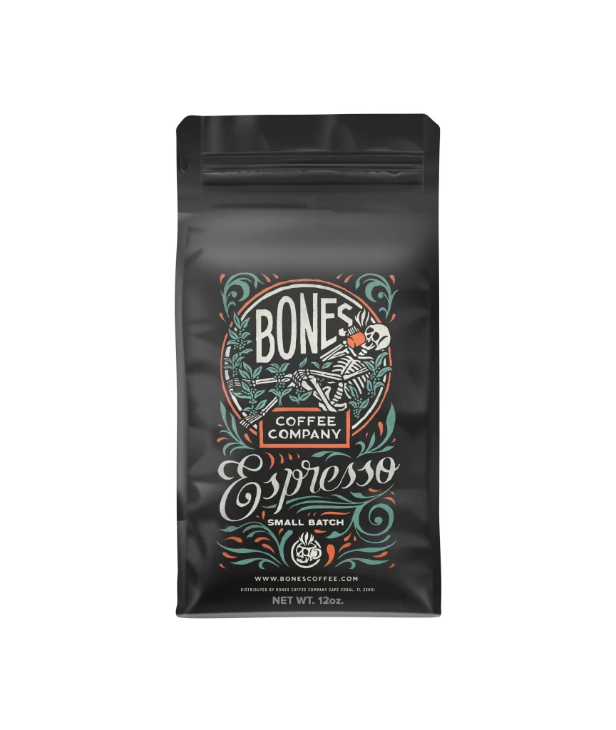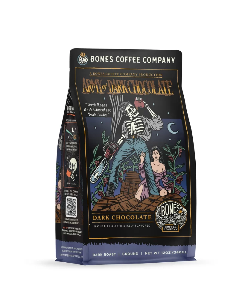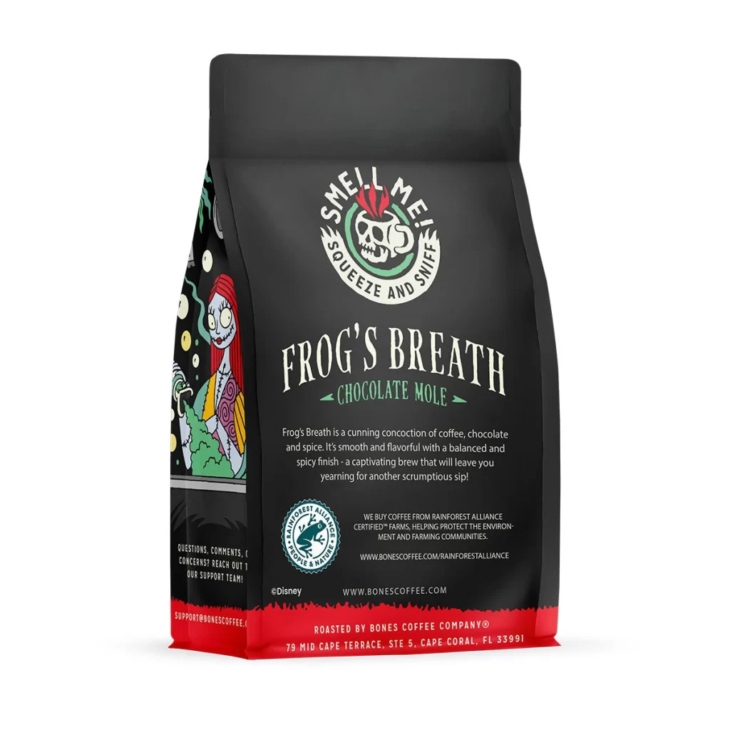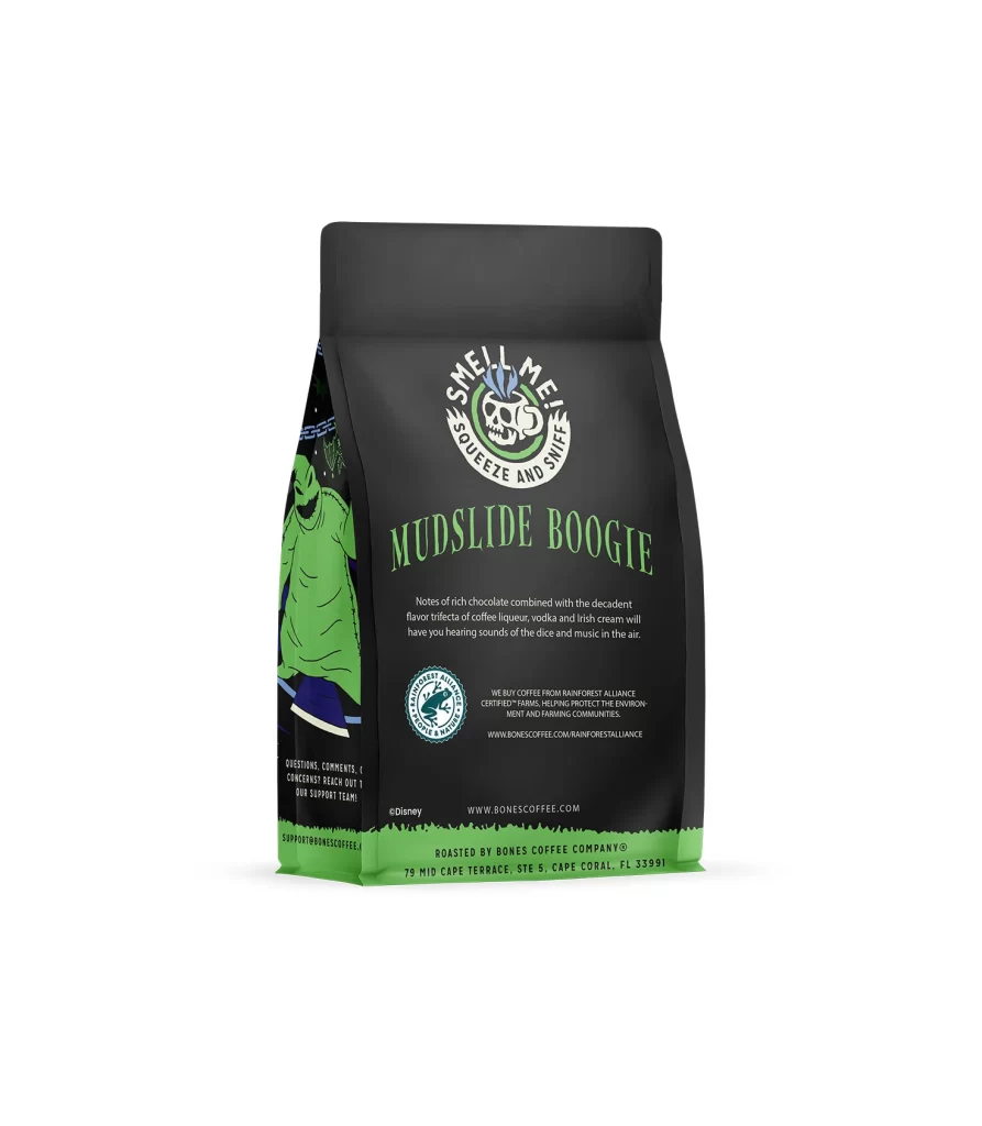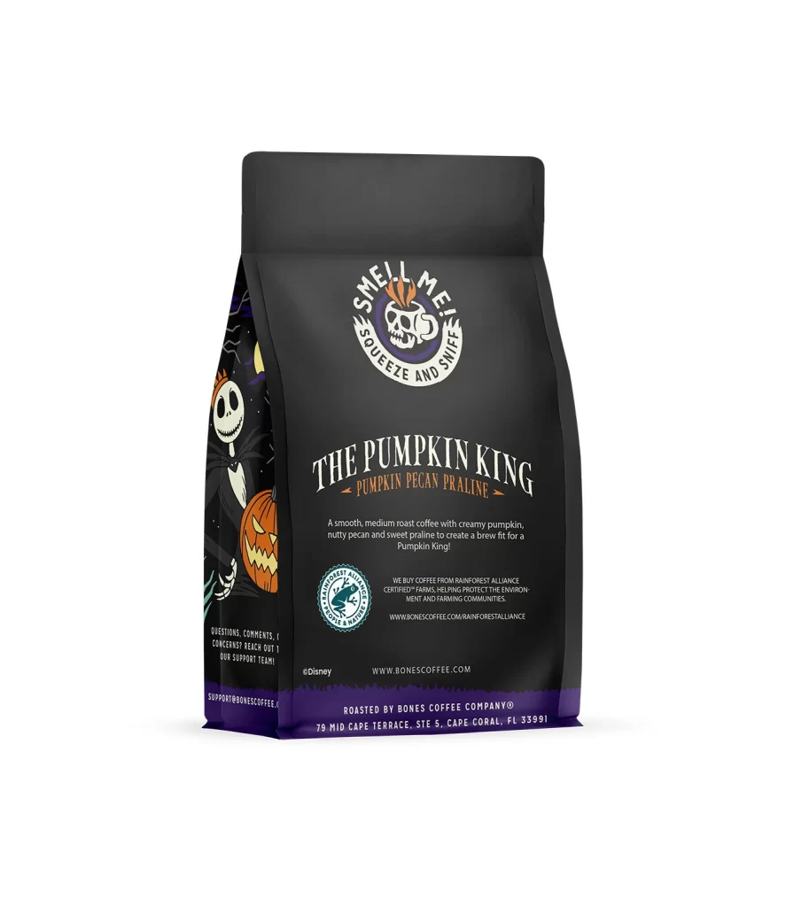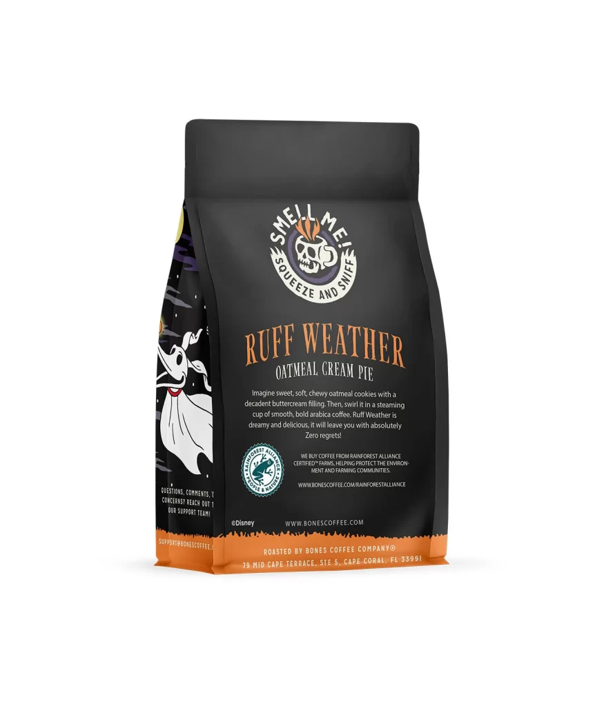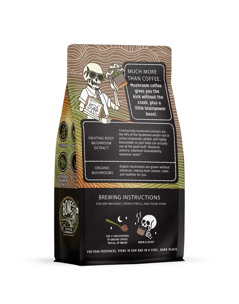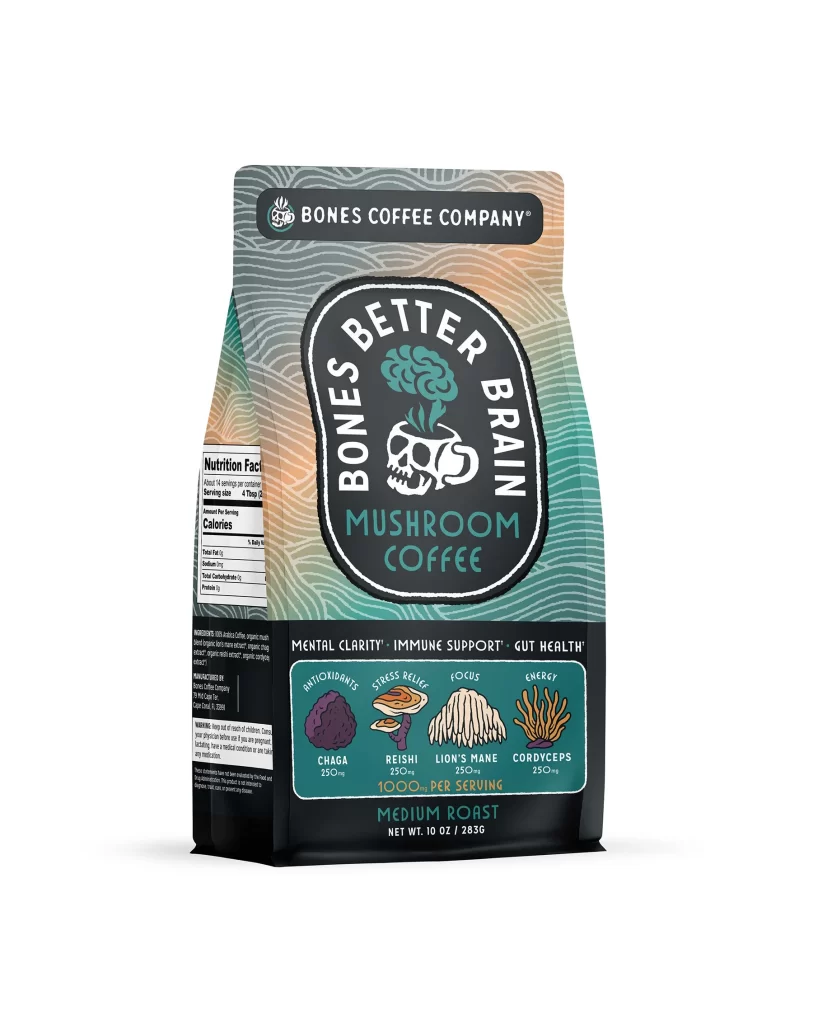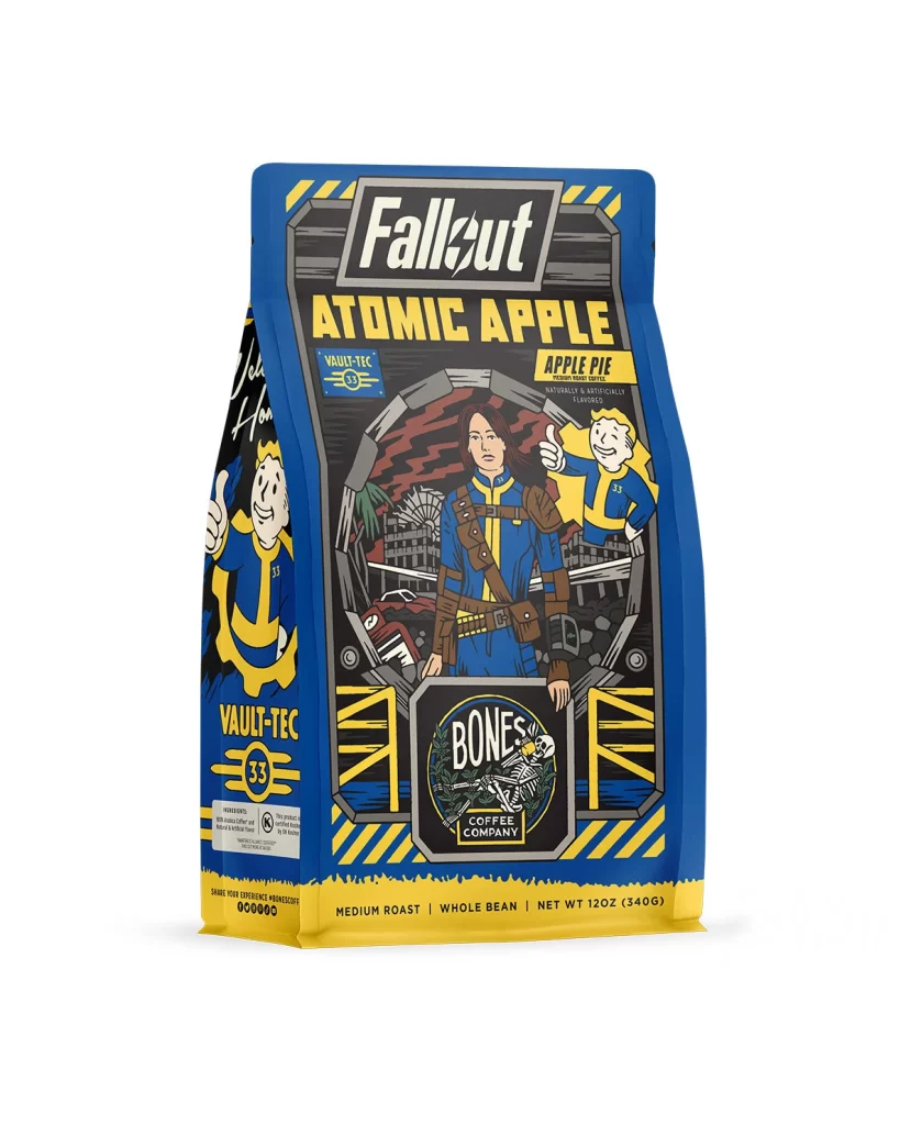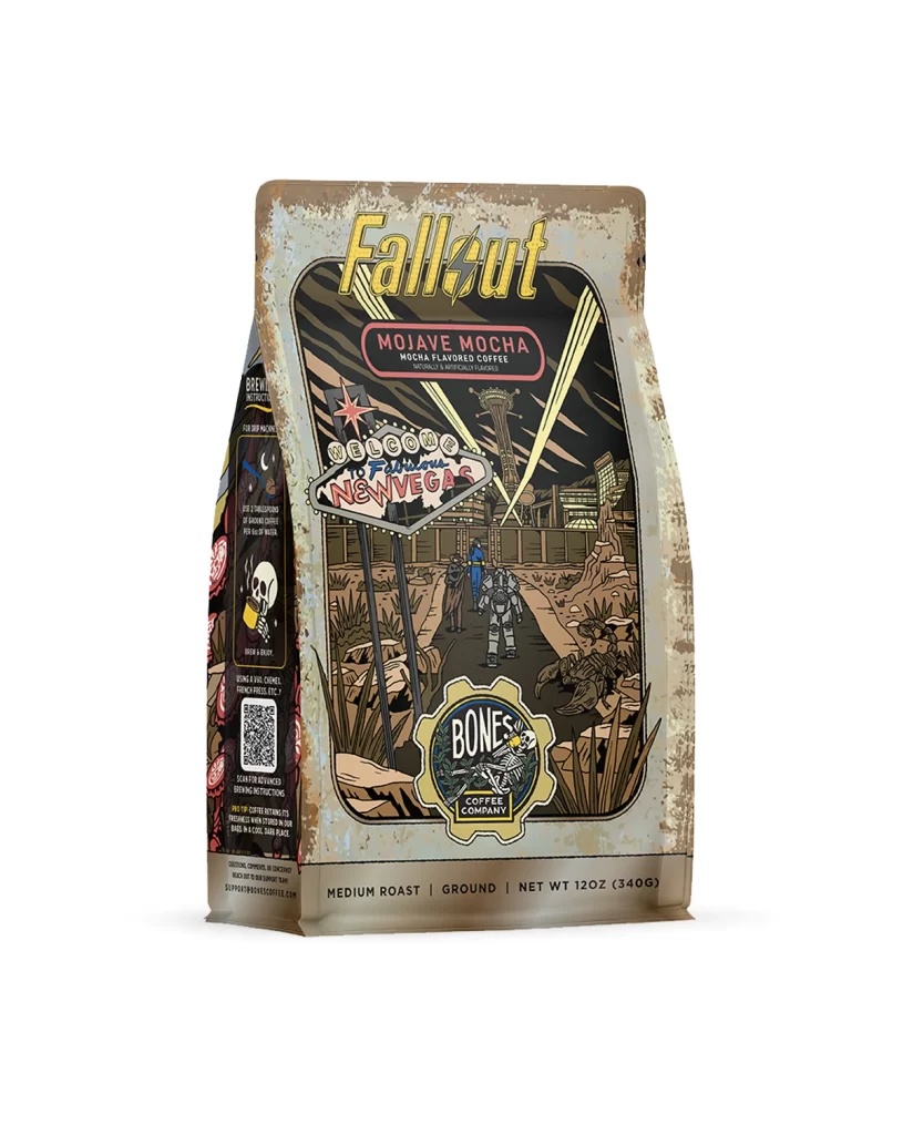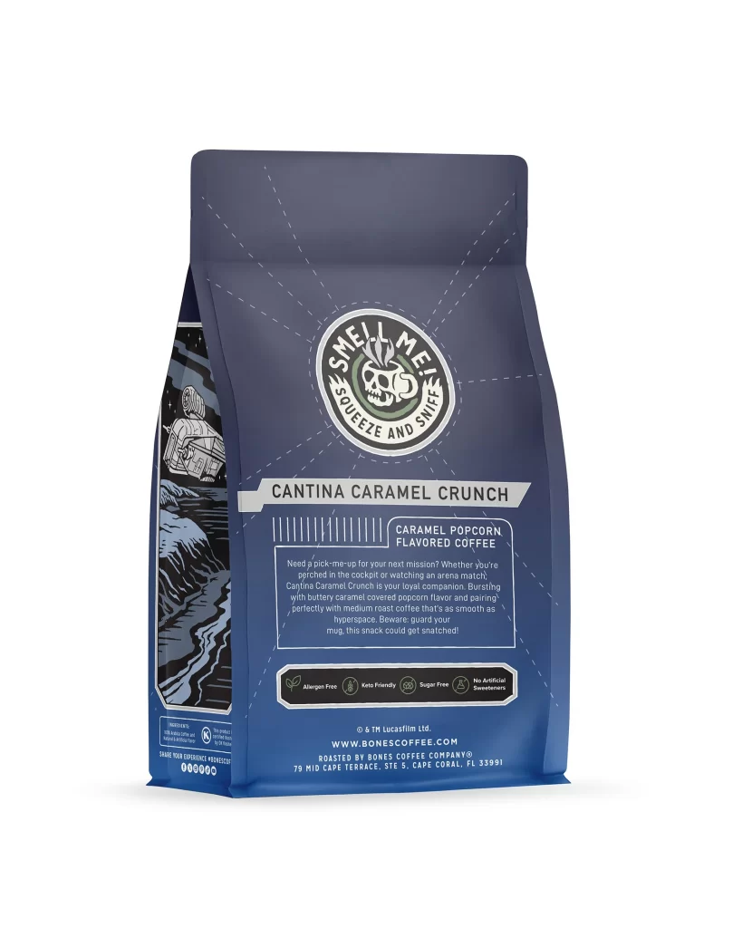
Bones Coffee Cantina Caramel Crunch Coffee Bag Back Packaging
Topics
Details
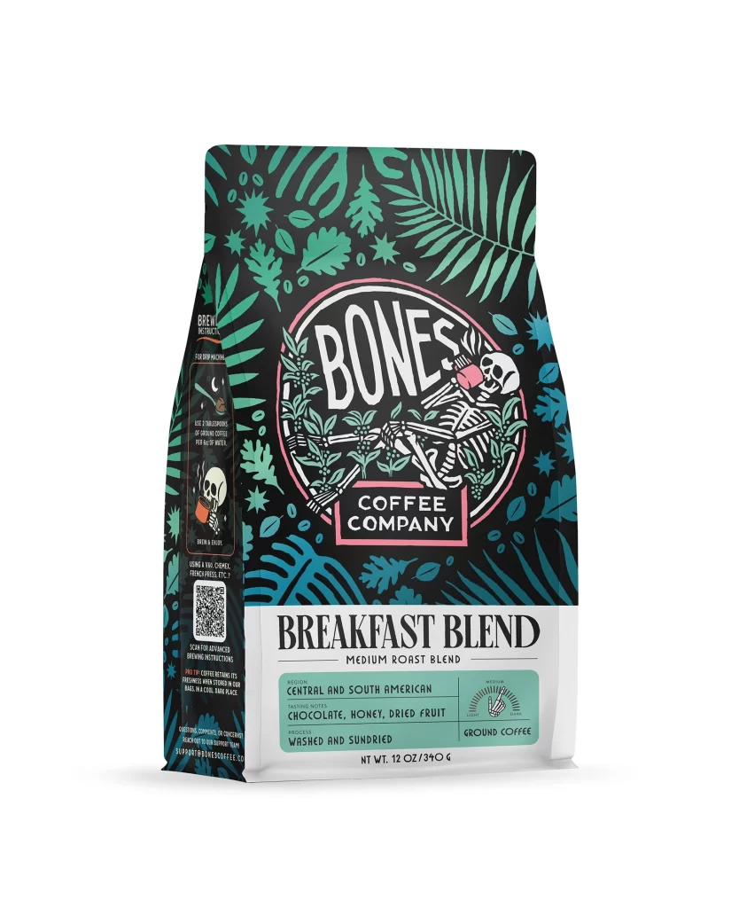
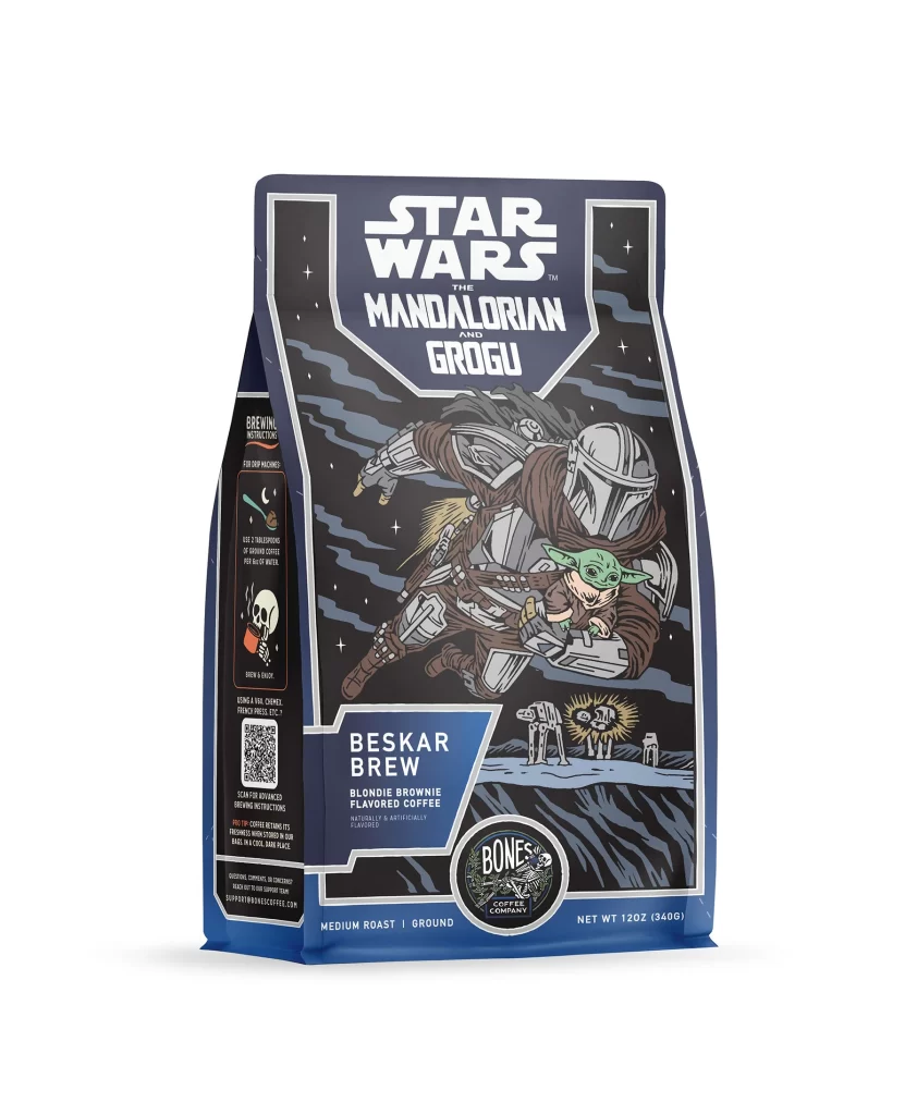
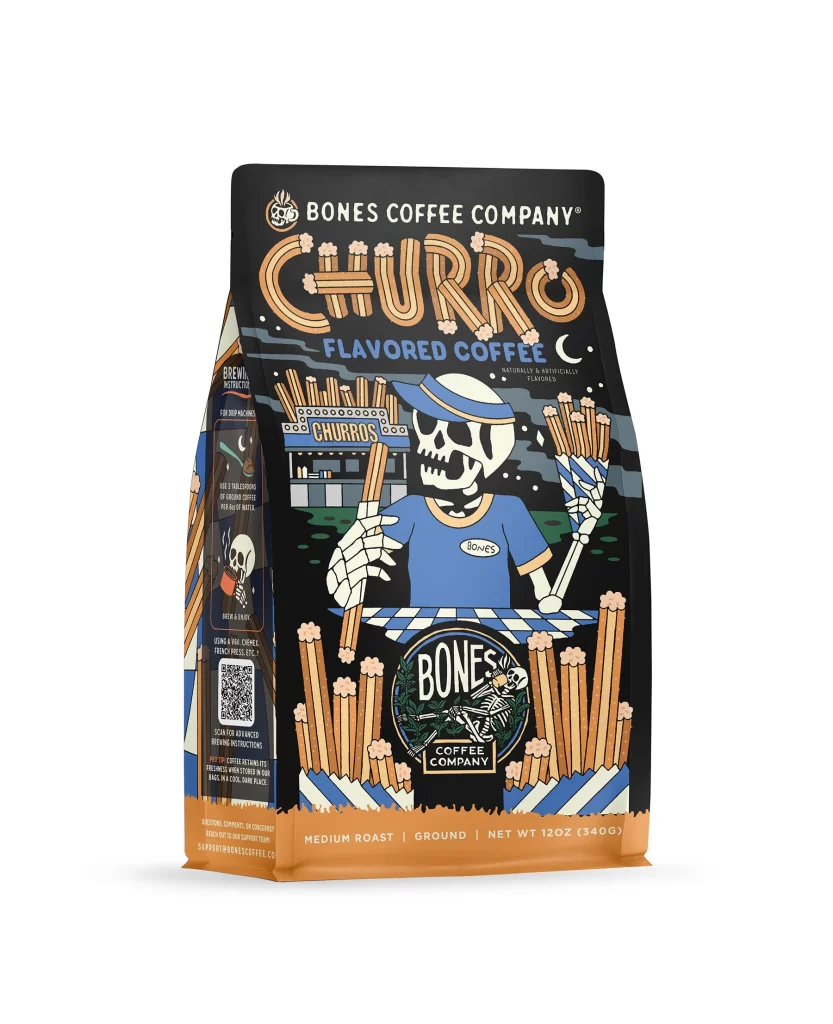
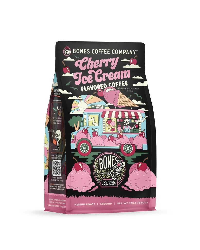
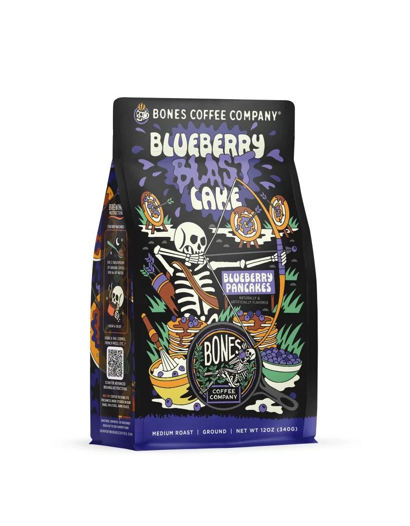
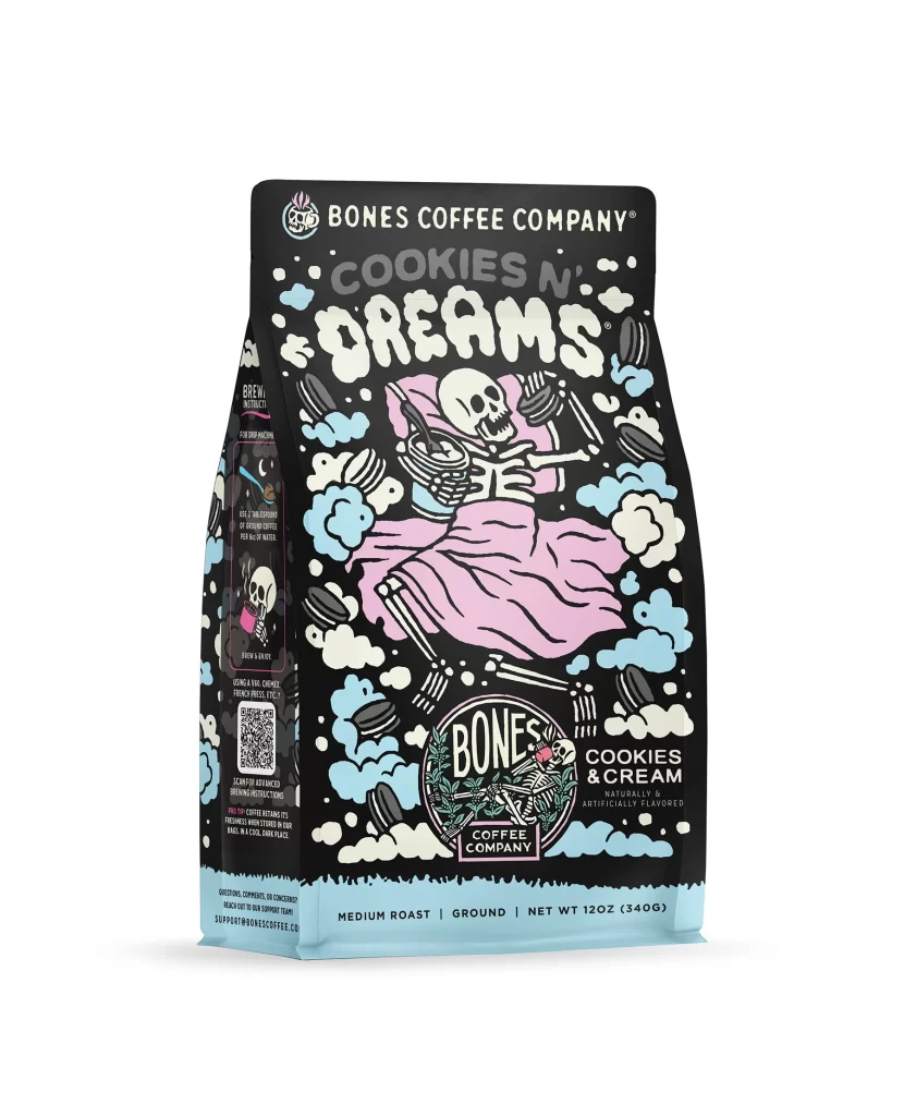
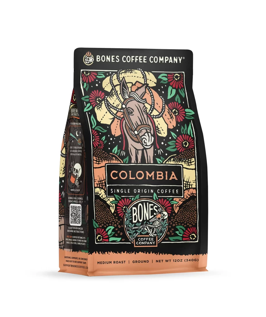
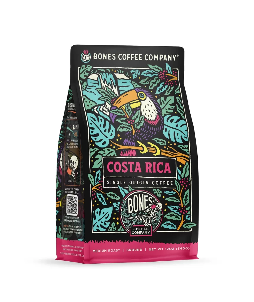
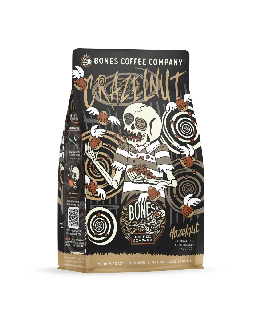
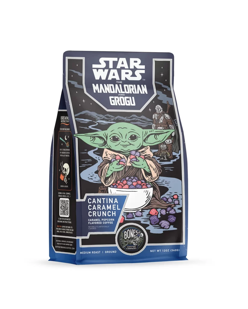
The front layout centers on a bold brand logo above a vivid caramel popcorn illustration. Golden kernels and drizzled caramel art sit against a clean white studio background. The physical package shows a matte finish with a clear window. The design frames the snack theme well and balances the coffee bag shape with appetizing imagery.
Typography uses a strong sans serif for the brand name in dark brown. Flavor text appears in warm gold tones to match the caramel theme. This color palette boosts shelf appeal and signals a sweet taste. The white background keeps the look modern and clean. Appetite appeal rises from the rich amber and gold accents against the light space.
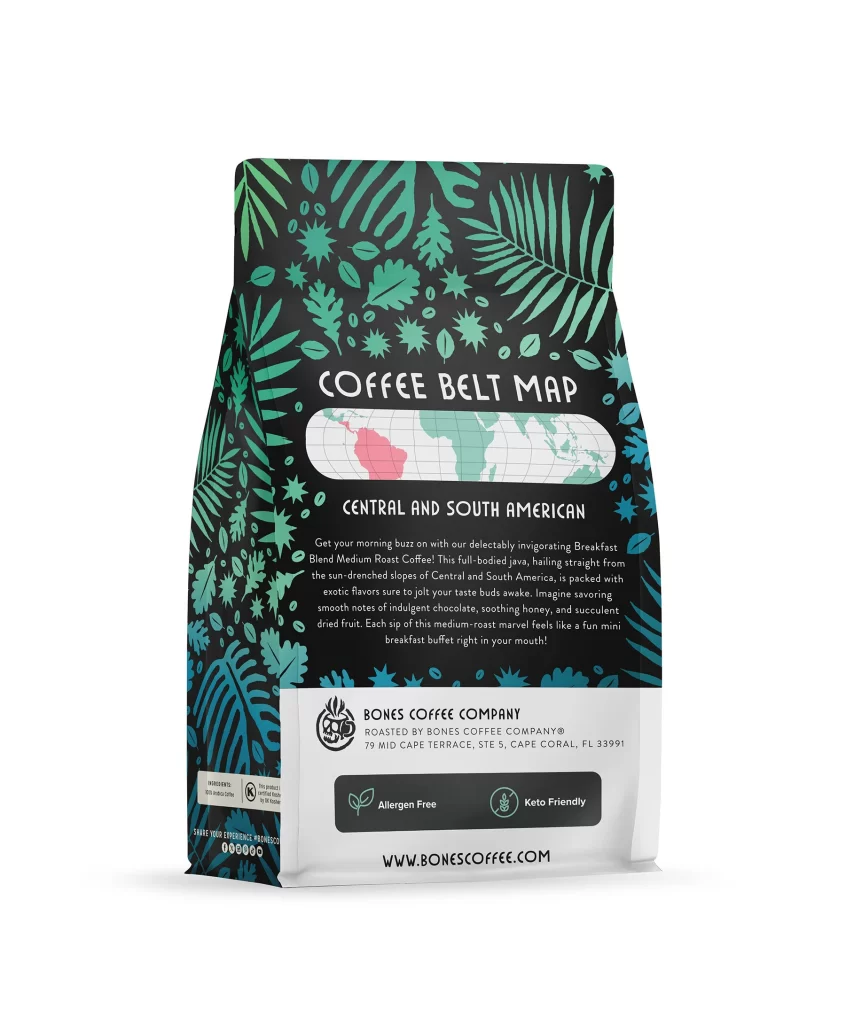
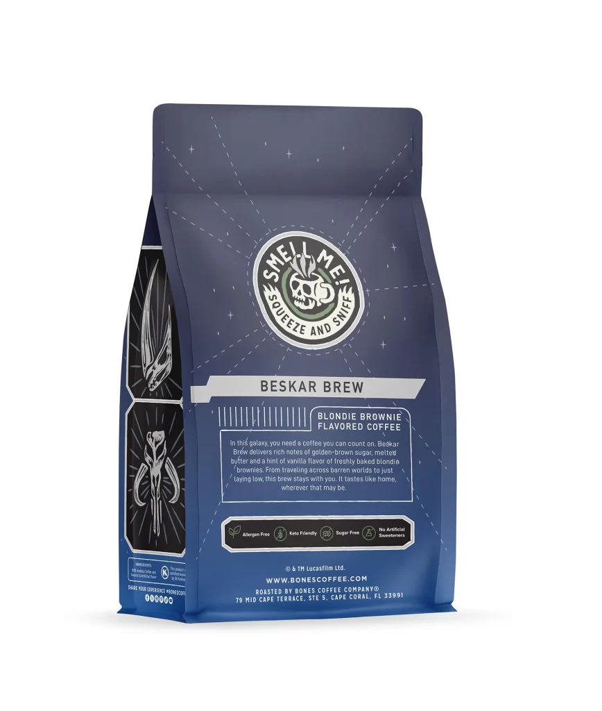
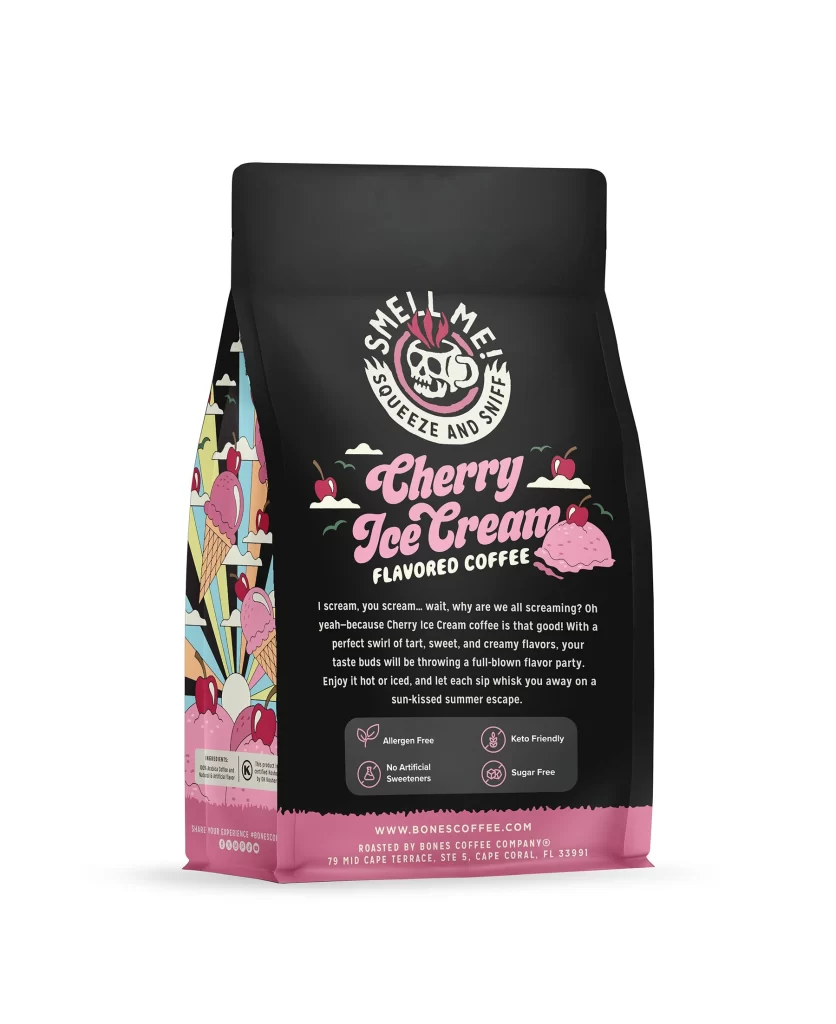
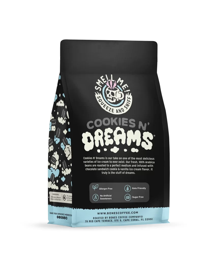
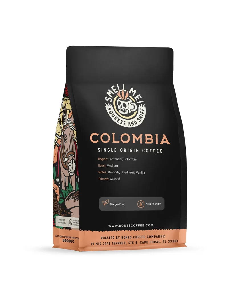
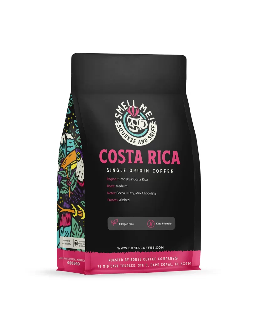
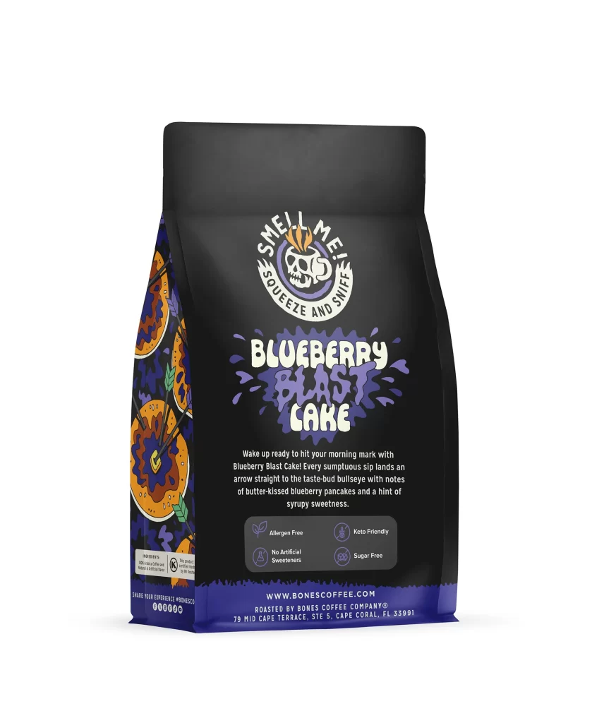
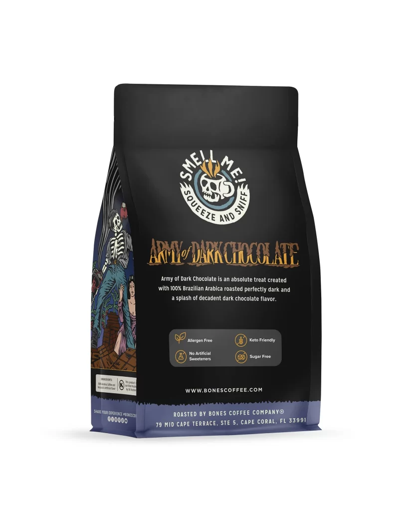
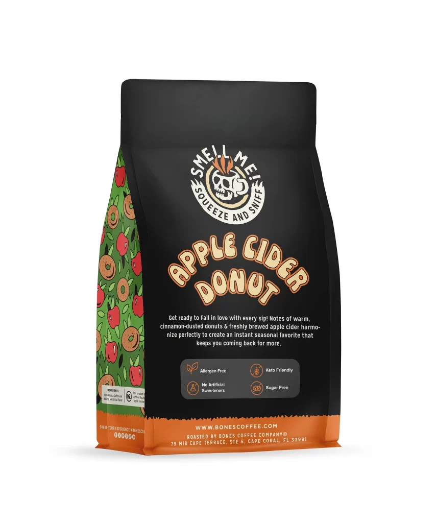
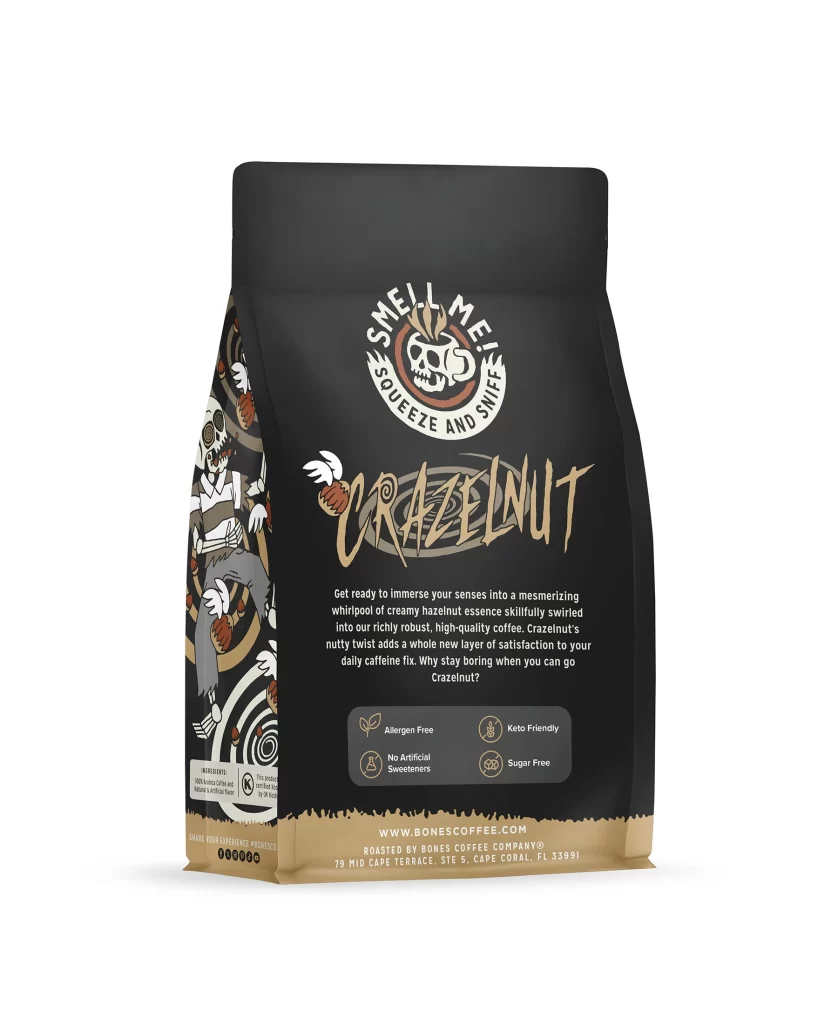
Designers should note how the layout guides the eye from logo to flavor art. The color choices create a strong snack connection without losing a premium coffee feel. Using simple icons for allergen free and keto friendly keeps the back panel clear. This project shows how to blend fun food imagery with clean modern packaging for a strong retail presence.