Energy Drink Bottle
Topics
Details
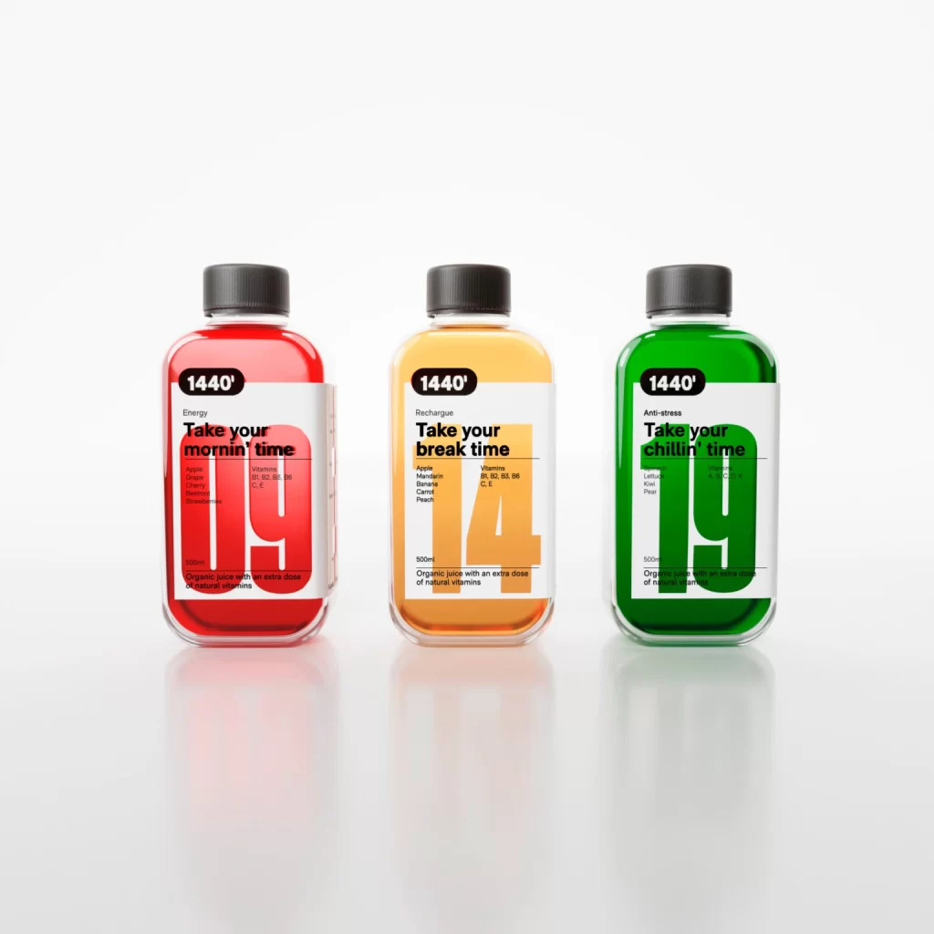
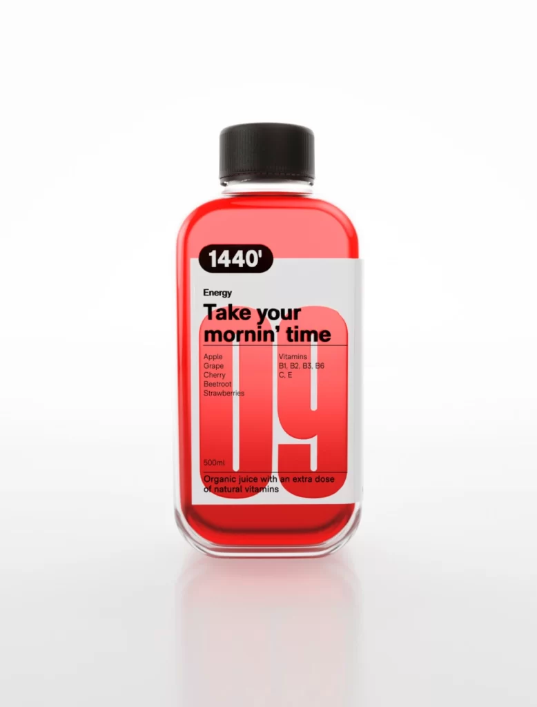
Centered in a clean studio environment, a rectangular glass bottle filled with bright red liquid stands out against a seamless white background. The container features a black screw cap and a white label dominated by bold typography, including the large number '19' in red and the phrase 'Take your mornin' time' in black. Soft lighting creates a subtle reflection beneath the base, while the composition highlights specific details like '1440'' at the top and ingredient lists for apple, grape, cherry, beetroot, and strawberries.
What sets this packaging apart is its clever use of scale and typographic hierarchy to create visual impact without clutter. The oversized numerals serve as both graphic elements and functional design components, drawing immediate attention while the minimalist color palette of red, black, and white maintains a modern aesthetic. Such an approach demonstrates how bold lettering can transform standard beverage labeling into something that feels both playful and sophisticated.
Brand developers studying contemporary juice packaging will find this example particularly useful for understanding how to balance information density with artistic flair. Students learning about label layout can analyze how the designer organized nutritional facts alongside personality-driven copy. Anyone working on health-focused product lines might reference this when exploring ways to make vitamin content feel approachable rather than clinical.