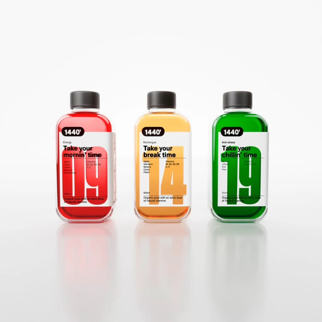
Energy Drinks With Different Flavors Bottle
Topics
Details
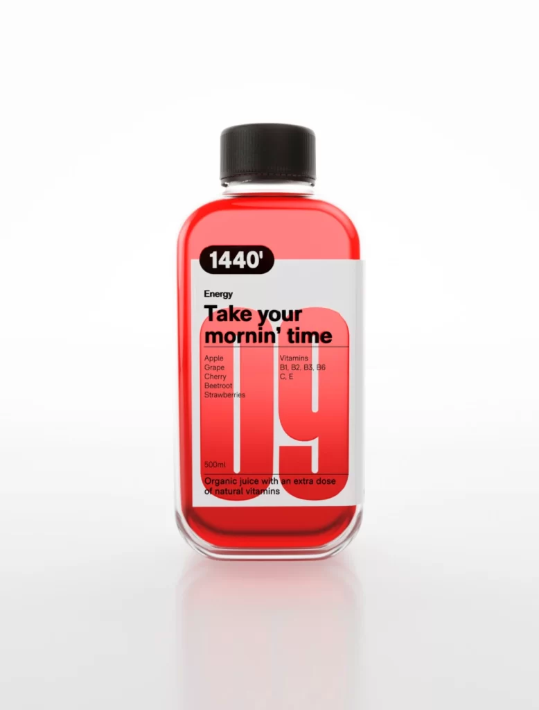
Three rectangular glass bottles with rounded corners and black screw caps stand in a row against a seamless white background, each filled with a distinctively colored liquid. The left container holds a vibrant red juice labeled 'Energy' with the slogan 'Take your mornin' time' and ingredients including Apple, Orange, and Cherry, while the center bottle contains an amber-orange liquid marked 'Recharge' for break times with Apple, Mandarin, Banana, and Peach notes. On the right, a bright green bottle promotes 'Anti-stress' benefits with 'Take your chillin' time' text and a Lettuce, Kiwi, and Pear composition, all featuring bold '1440'' branding and large translucent numerals overlaying the white labels.
Visual hierarchy dominates through the strategic use of oversized typography, where the numbers 19, 14, and 19 appear as watermarks behind the product information, creating depth without obscuring legibility. The color-coded system extends beyond the liquid to inform the entire label aesthetic, employing a clean sans-serif typeface that balances playful colloquialisms with clinical vitamin specifications like B1, B2, B5, B6, and C. Such deliberate chromatic organization allows immediate functional categorization while maintaining a cohesive brand identity across different use-case scenarios.
Packaging designers studying beverage market trends would examine this composition to understand how typographic scale influences consumer perception of daily wellness routines. Marketing teams developing time-of-day product lines could reference the color psychology applied here to differentiate morning energy from afternoon recharge and evening relaxation concepts. Additionally, brand identity specialists might analyze the consistent application of the 1440-minute motif across varying flavor profiles to build a unified yet flexible visual language.