Mole Cola Soft Drink Can Design
Topics
Details
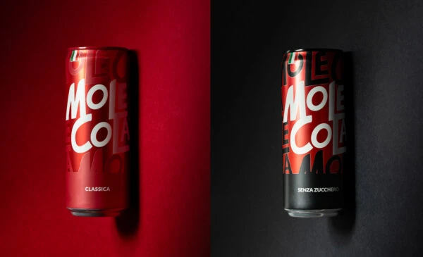
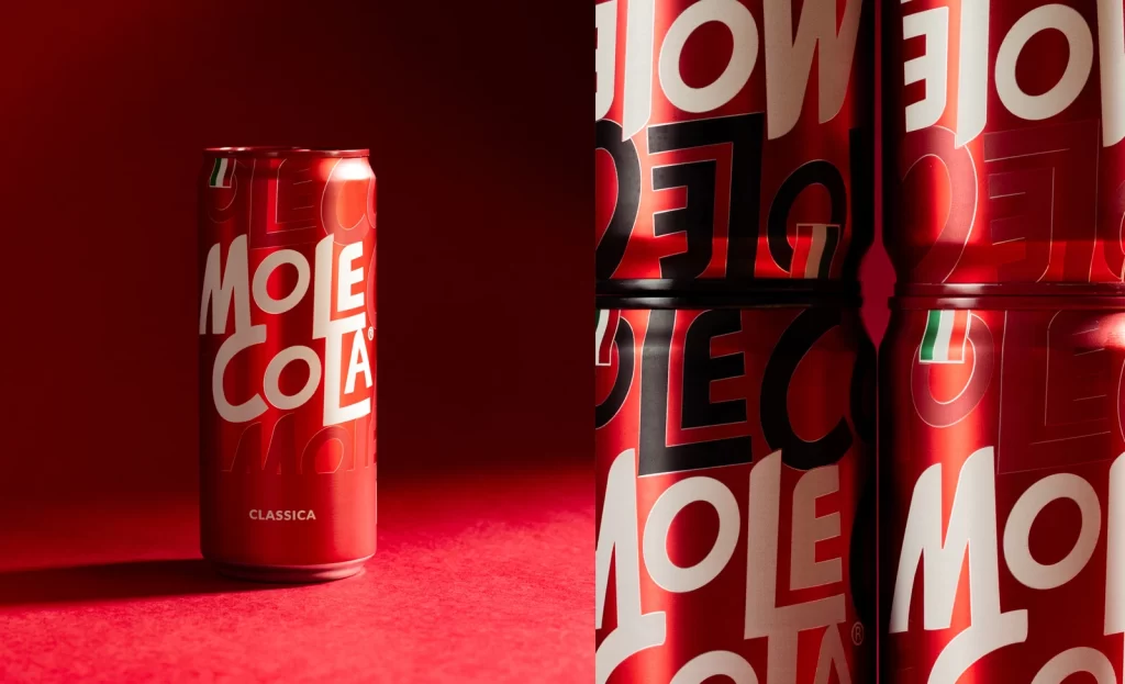
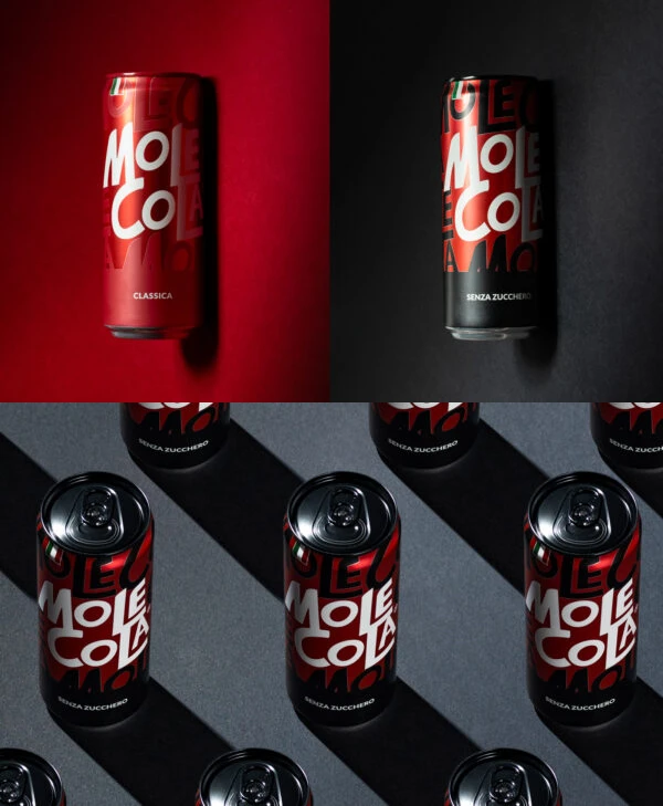
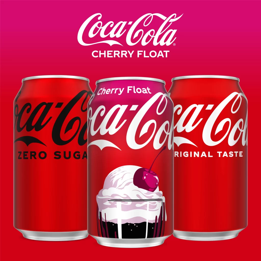
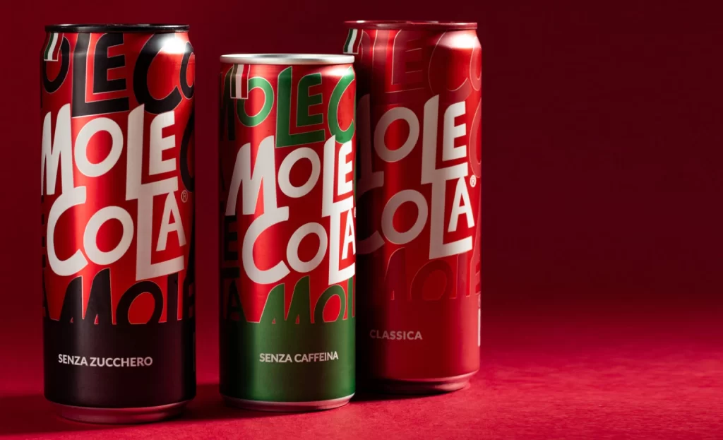
Against a seamless crimson backdrop, three cylindrical aluminum cans of Mole Cola stand in a staggered arrangement, catching light from the upper left that creates sharp specular highlights along their curved metallic surfaces. The leftmost can features a black lower band with 'SENZA ZUCCHERO' in white sans-serif, while the center variant displays a deep green base inscribed with 'SENZA CAFFEINA'; the rightmost can is labeled 'CLASSICA' and maintains an all-red palette. Each container is wrapped in bold, overlapping typography where the brand name repeats in varying scales and orientations, utilizing high-contrast white lettering against saturated red fields with secondary accents of black or forest green.
Visual hierarchy emerges through the deliberate layering of text elements, where the primary logotype dominates while ghosted background characters create depth without cluttering the composition. The color-coded differentiation at the base of each can provides immediate functional distinction between product variants, employing a restricted palette that aligns with traditional cola branding yet distinguishes itself through typographic experimentation. Subtle material qualities of the printed aluminum—specifically the interplay between matte ink finishes and reflective metal substrates—add tactile dimension to the otherwise graphic presentation.
Packaging designers analyzing beverage market positioning would examine this triptych to study how color psychology communicates ingredient modifications such as sugar or caffeine removal. Brand strategists could reference the typographic density when developing visual identity systems for products requiring strong shelf presence across multiple SKUs. Photography professionals studying commercial product lighting might deconstruct the shadow placement and highlight behavior on curved metallic forms to replicate similar studio conditions for client work.