Mole Cola Soft Drink Can Detail
Topics
Details
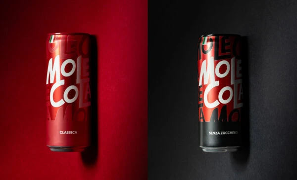
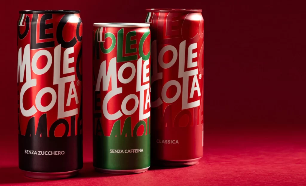
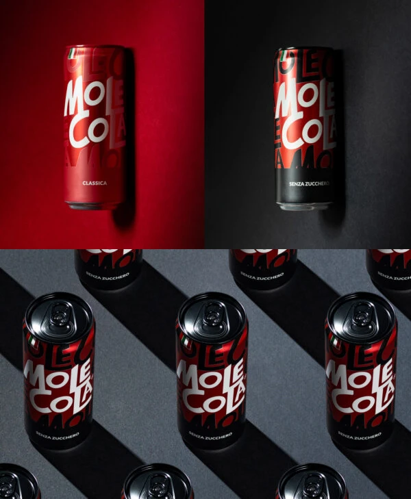
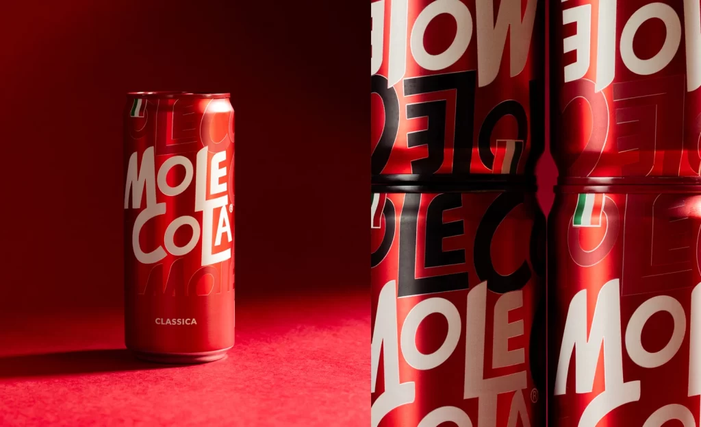
A single red aluminum can stands isolated on the left, while a dense vertical stack of identical containers crowds the right edge of the frame. The cylindrical surfaces display bold white and black typography spelling 'MOLE COLA' in overlapping geometric letterforms, with the word 'CLASSICA' printed in small capitals near the base of the solitary specimen. Deep crimson lighting saturates both the seamless background and the reflective metallic substrate, casting soft shadows that emphasize the curved contours and the subtle green-white-red flag emblem positioned above the primary logotype.
Visual tension arises from the contrast between the uncluttered presentation of the individual unit and the repetitive pattern created by the grouped arrangement on the opposite side. The typographic system employs varying scales and orientations, allowing the brand name to wrap dynamically around the cylindrical form while maintaining legibility through high-contrast color blocking. Such deliberate layering of text elements transforms standard beverage packaging into a graphic object where information hierarchy serves dual aesthetic and functional purposes.
Product photographers might study this composition to understand how directional lighting enhances metallic textures without creating distracting glare. Packaging designers could analyze the spatial relationship between the isolated hero shot and the contextual cluster when planning e-commerce asset libraries. Art directors developing beverage campaigns would find value in examining how monochromatic color palettes unify disparate compositional zones within a single frame.