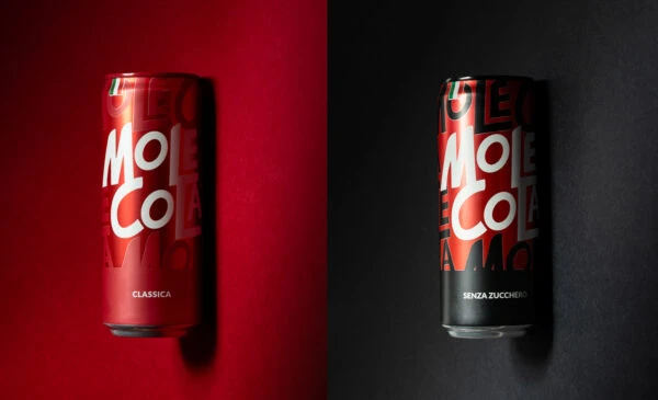
Mole Cola Soft Drink Can
Topics
Details
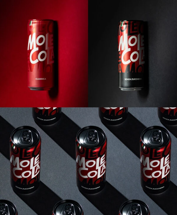
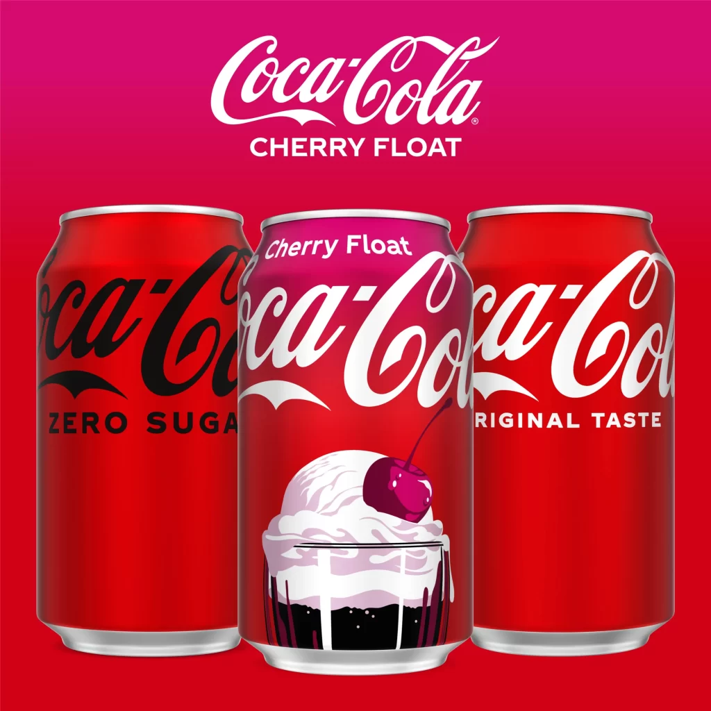
Split vertically down the center, this composition presents two aluminum beverage cans against contrasting backdrops of saturated crimson and matte charcoal. The left vessel displays a metallic red finish with white typography reading 'Mole Cola' above the word 'Classica', while its right counterpart features a black base with identical lettering and the designation 'Tenza Zuccherata'. Both cylinders exhibit subtle surface reflections and cast soft shadows, photographed from a straight-on perspective that emphasizes their cylindrical geometry and the bold, overlapping sans-serif characters decorating their surfaces.
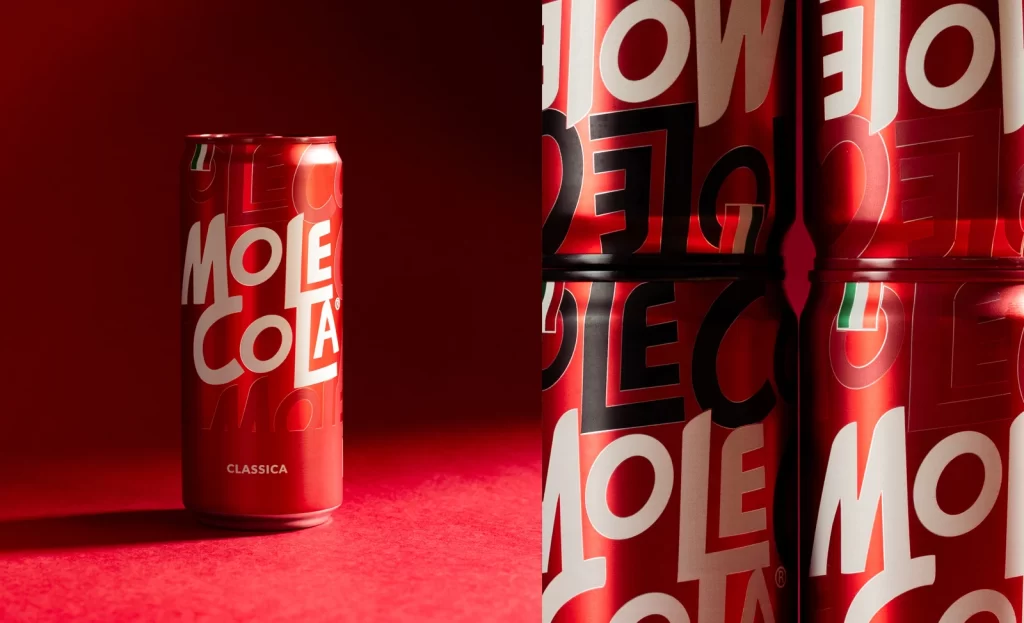
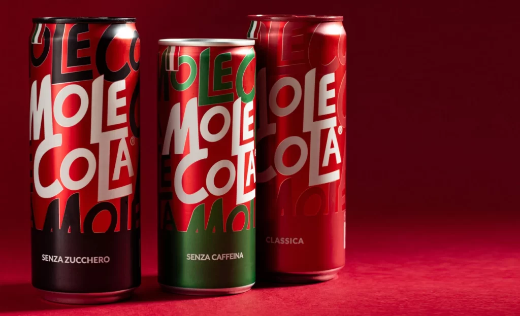
Visual distinction emerges from the deliberate chromatic duality between the classic red variant and the sugar-free black edition, creating an immediate product differentiation system. The typographic treatment employs oversized, slightly irregular letterforms that overlap with background text fragments, generating a dynamic layered effect reminiscent of contemporary streetwear aesthetics. Such a side-by-side presentation effectively demonstrates how color psychology and consistent branding elements can communicate product variations while maintaining unified visual identity across a beverage line.
Packaging designers studying beverage market positioning would examine this reference to understand how minimal color shifts convey nutritional information without additional iconography. Brand identity developers could analyze the scalability of the logotype across different substrate colors and lighting conditions. Marketing teams evaluating premium soft drink positioning might utilize this comparative layout to strategize retail shelf arrangements that highlight both traditional and health-conscious options within a single product family.