Mole Cola Soft Drink Can View
Topics
Details
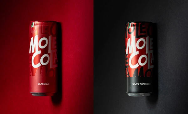
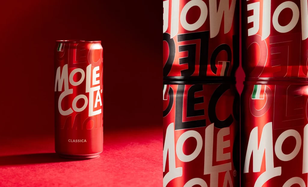
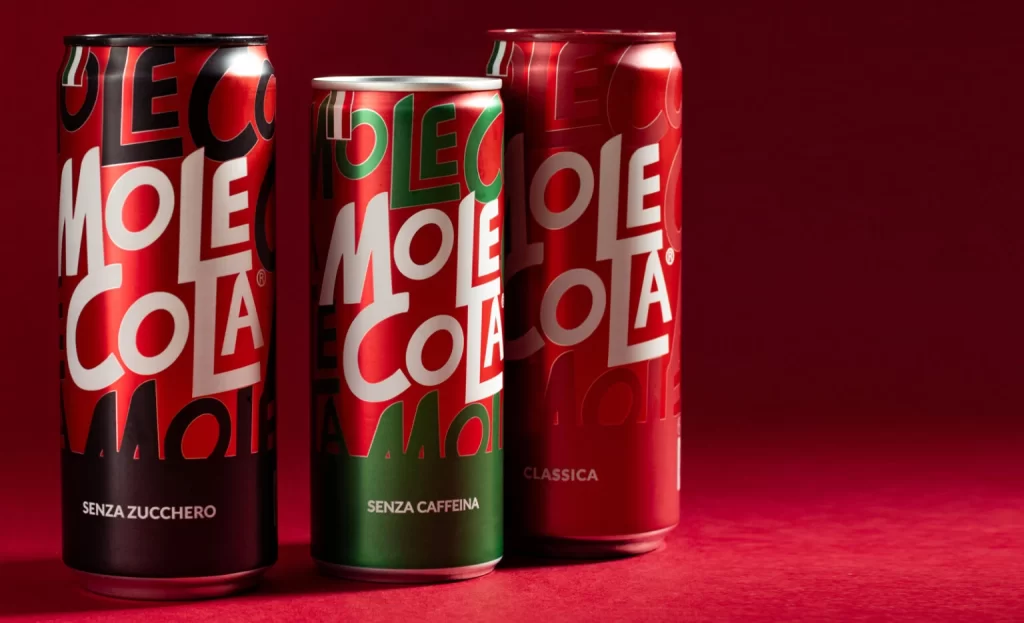
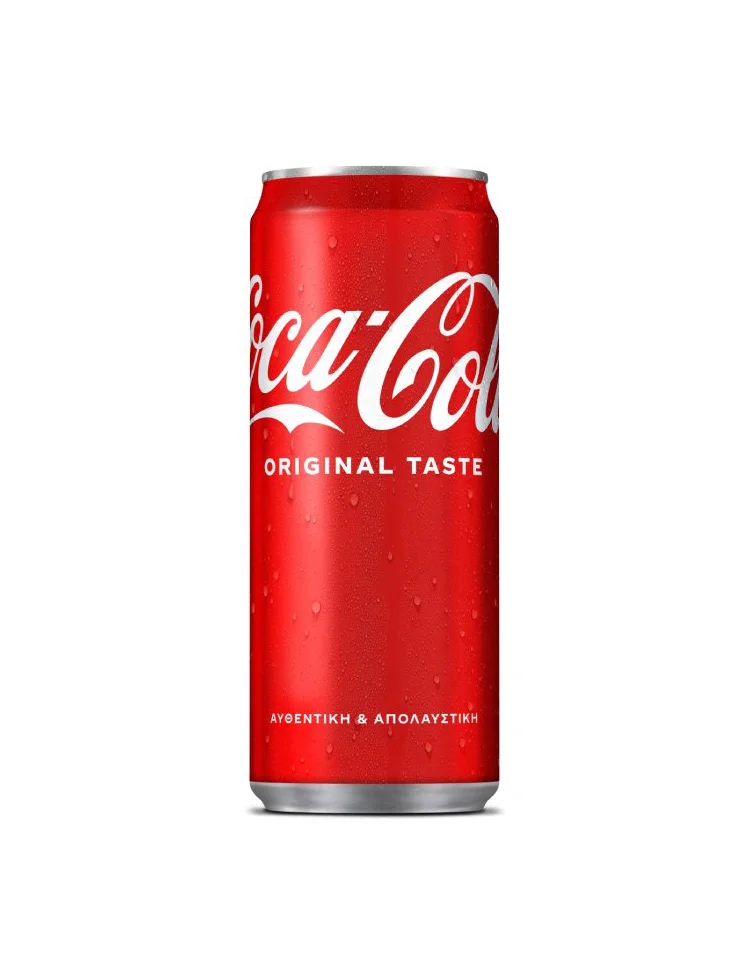
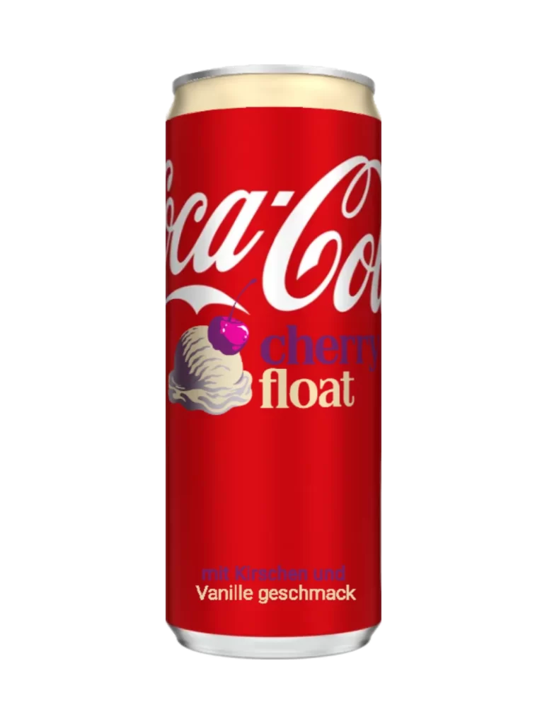
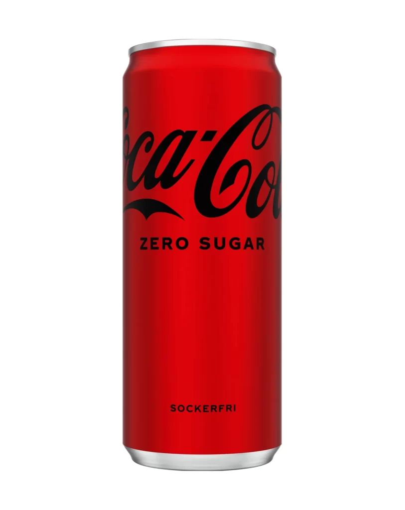
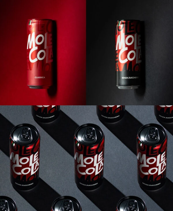
Against a split backdrop of deep crimson and matte charcoal, two aluminum cylinders stand in sharp relief, their metallic surfaces catching dramatic directional light. The left can features a vibrant red wash with 'MOLE COLA' rendered in bold, white, hand-drawn lettering above the smaller text 'CLASSICA', while its counterpart on the right inverts the palette with black graphics over silver, labeled 'SENZA ZUCCHERO'. Below this duo, a grid of the sugar-free version repeats across a dark grey surface, casting long, crisp shadows that emphasize the cylindrical form and the reflective quality of the pull-tab tops.
What sets this packaging apart is its playful, almost street-art approach to typography, where the brand name appears to be scrawled with a thick brush rather than typeset with clinical precision. The high-contrast color blocking between the classic red and the stark black-and-white zero-sugar variant creates an immediate visual hierarchy that feels both nostalgic and aggressively modern. Subtle gradients on the metal suggest a premium finish, while the overlapping background text adds a layer of depth that prevents the design from feeling flat or generic.
Product photographers might study the lighting setup here to understand how to make metallic packaging pop without losing detail in the highlights or shadows. Branding teams could analyze how varying the background color fundamentally alters the perception of the same physical object, which is crucial for marketing different product lines. Even 3D artists looking to mock up beverage containers would find the specular reflections and shadow falloff incredibly useful for achieving photorealistic renders.