White Paper Bags With Black And Yellow Logos Bag
Topics
Details
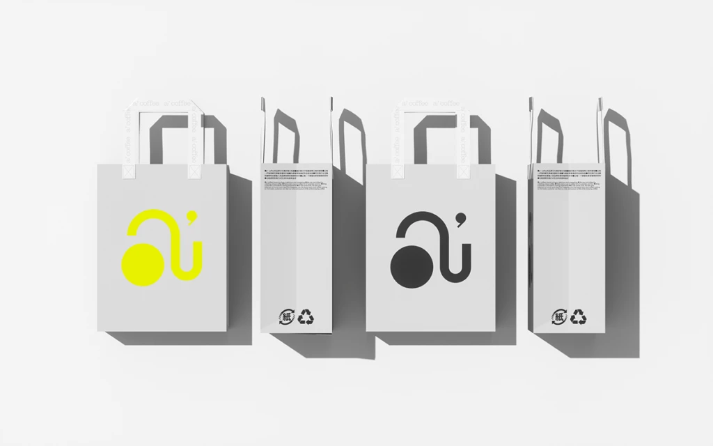
Four white paper shopping bags are arranged in a horizontal row against a clean, light gray background, casting soft shadows to the right that suggest a studio lighting setup from the upper left. The composition alternates between front and side views, with the leftmost and third bags displaying a stylized logo consisting of a circular dot connected by a curved line to a U-shaped stroke with a small dot above it. This mark appears in bright yellow on the first bag and solid black on the third, while the intervening side views reveal Japanese text blocks at the top and recycling symbols near the bottom.
Visual interest stems from the deliberate color contrast between the vibrant lemon-yellow logo and its monochromatic black counterpart, demonstrating how the same graphic identity adapts across different print specifications. The minimalist aesthetic is reinforced by the unbleached paper texture and simple flat handles, which keep focus entirely on the bold, abstract typography. Subtle details like the faint branding on the handle reinforcement tape add layers of authenticity without cluttering the overall spare composition.
Brand identity designers studying retail packaging systems would find this arrangement useful for comparing logo visibility across different material finishes and ink densities. Environmental consultants evaluating sustainable packaging standards could reference the recycling icon placement and paper stock choices shown on the bag profiles. Art directors planning product photography shoots might employ this layout as a template for presenting multiple packaging variations in a single cohesive frame.