Italiano Chocolate Bar Box
Topics
Details
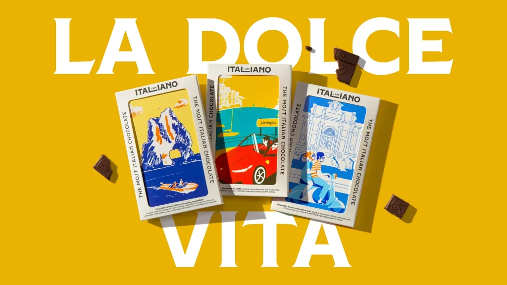
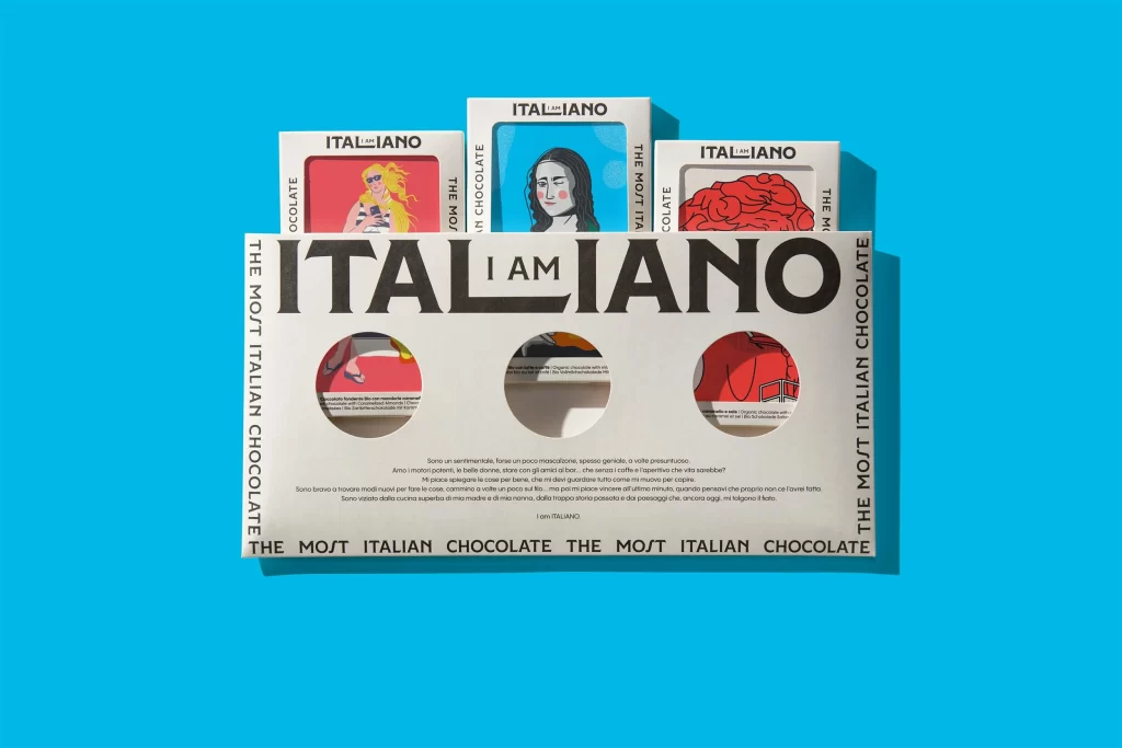
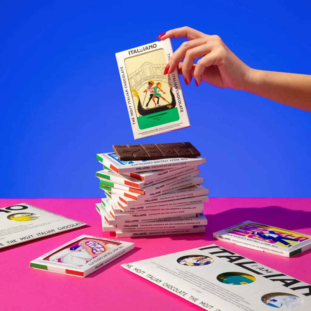
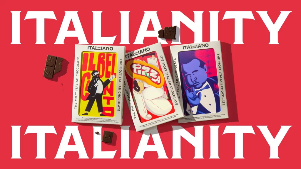
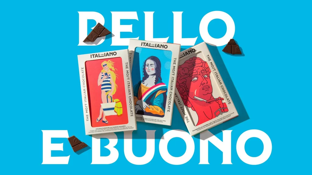
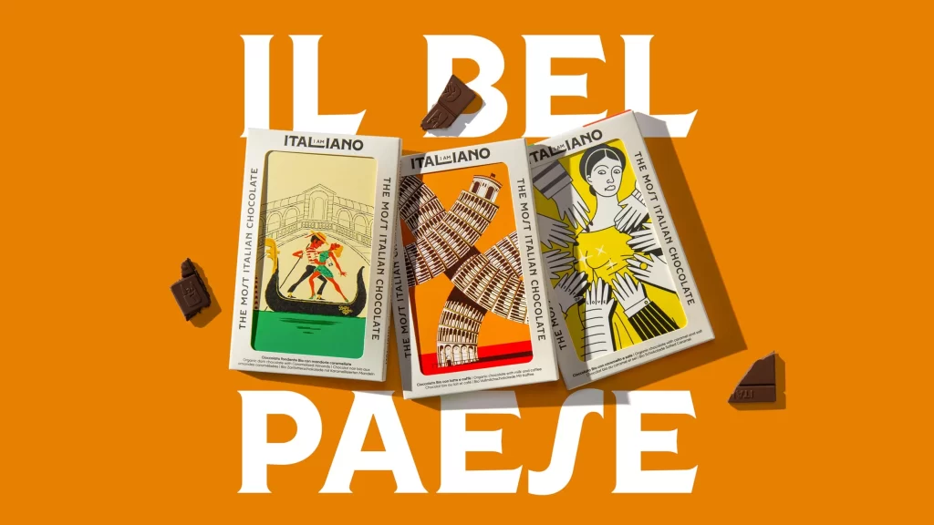
Three rectangular Italiano chocolate bar boxes rest at a slight diagonal angle on a saturated orange background, each featuring bold, graphic illustrations of iconic Italian imagery—a Venetian gondola beneath an arched bridge, the Leaning Tower of Pisa, and a stylized figure in yellow surrounded by reaching hands. The packaging displays clean white borders with black printed text reading 'ITALIANO' and 'THE MOST ITALIAN CHOCOLATE' along the vertical edges. Scattered dark chocolate pieces with visible embossed logos lie near the boxes, while large white serif typography spelling 'IL BEL PAESE' dominates the upper and lower portions of the frame under even, bright lighting.
Visual distinction comes from the marriage of modern graphic illustration with traditional product packaging. The use of flat, high-contrast colors—specifically the pairing of cream, orange, and black line art—creates a retro yet contemporary aesthetic that stands out from typical confectionery designs. Typography plays a crucial role here, with the vertical orientation of ‘THE MOST ITALIAN CHOCOLATE’ on the side panels reinforcing the tall, elegant shape of the boxes.
Packaging designers studying how to integrate cultural iconography into luxury food products would find this arrangement particularly useful for analyzing layout balance. Art directors working on editorial spreads could utilize the color palette and spatial relationships to plan similar still-life photography sessions. Additionally, illustrators looking to understand how to adapt architectural landmarks into simplified, commercial art styles would benefit from examining the specific rendering techniques used on these covers.