Italiano Chocolate Box
Topics
Details
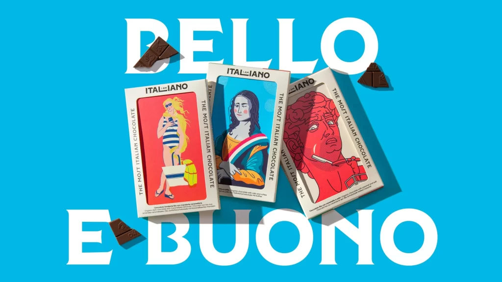
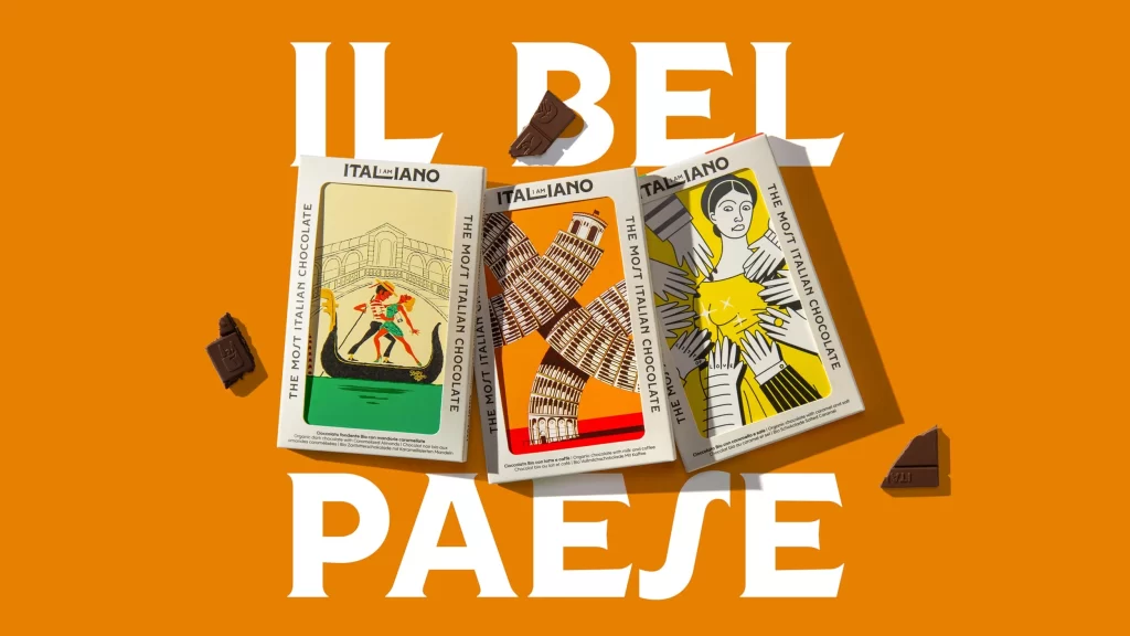
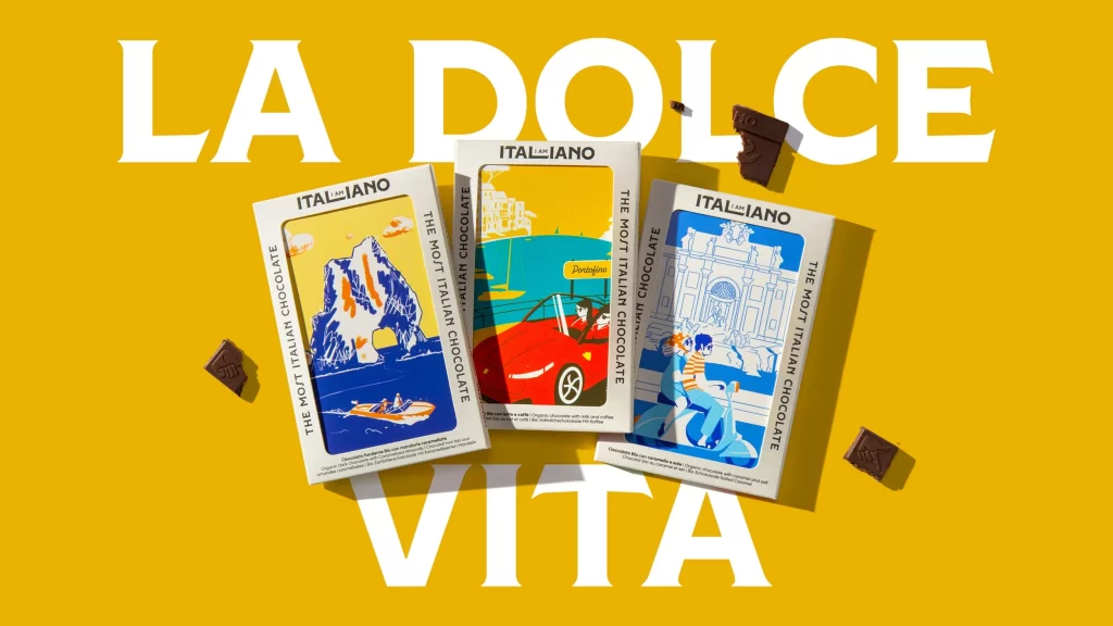
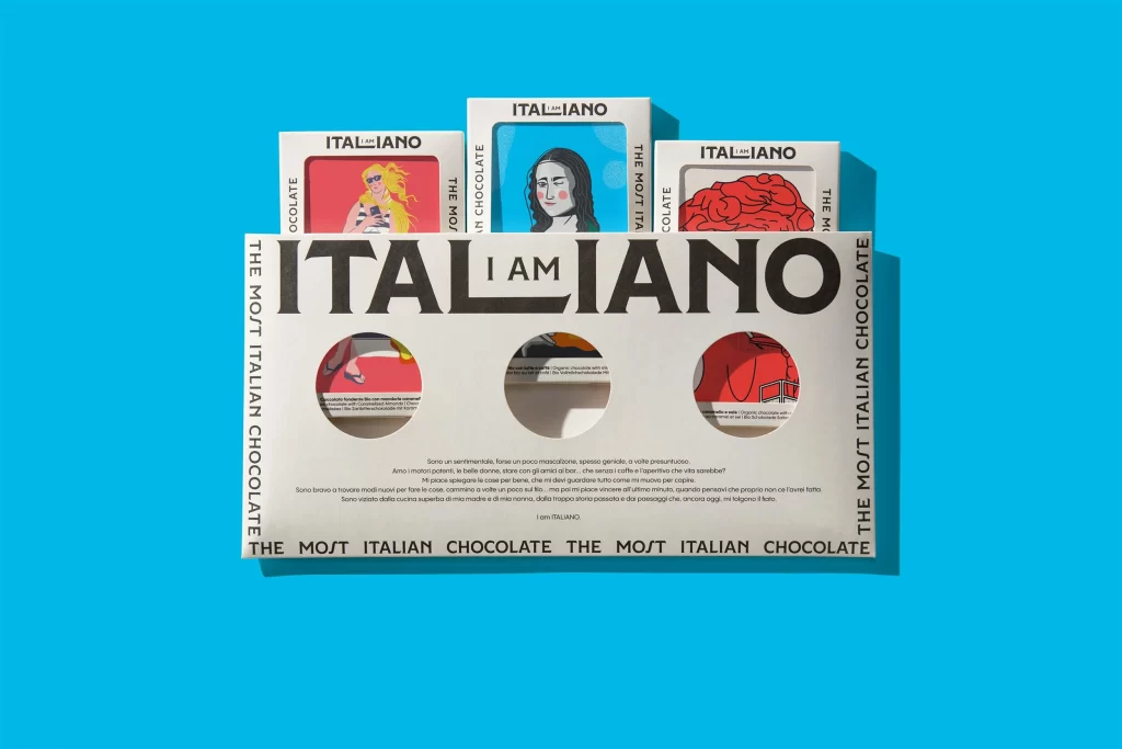
Vibrant cyan fills the frame, providing a high-contrast backdrop for a white cardboard chocolate box and three smaller individual packages arranged above it. The main container features bold black typography spelling 'ITALIANO' with the word 'I AM' nested inside the letter 'L', while vertical text along both edges reads 'THE MOST ITALIAN CHOCOLATE'. Three circular die-cut windows reveal partial illustrations of red-toned imagery beneath, and the upper boxes display distinct graphic portraits—one with yellow hair against pink, a mona lisa-style face on blue, and a red brain-like form—all bearing the 'ITALIANO' brand name in a clean sans-serif font.
Visual interest stems from the clever typographic integration where the brand name becomes a declarative statement about identity, reinforced by the bilingual wordplay. The circular windows create depth and mystery by showing only fragments of the internal artwork, encouraging physical interaction with the packaging to reveal complete images. A cohesive color palette of primary reds, blues, and yellows unifies the varied illustration styles across all components, establishing a playful yet sophisticated visual language that balances modern graphic design with traditional Italian cultural references.
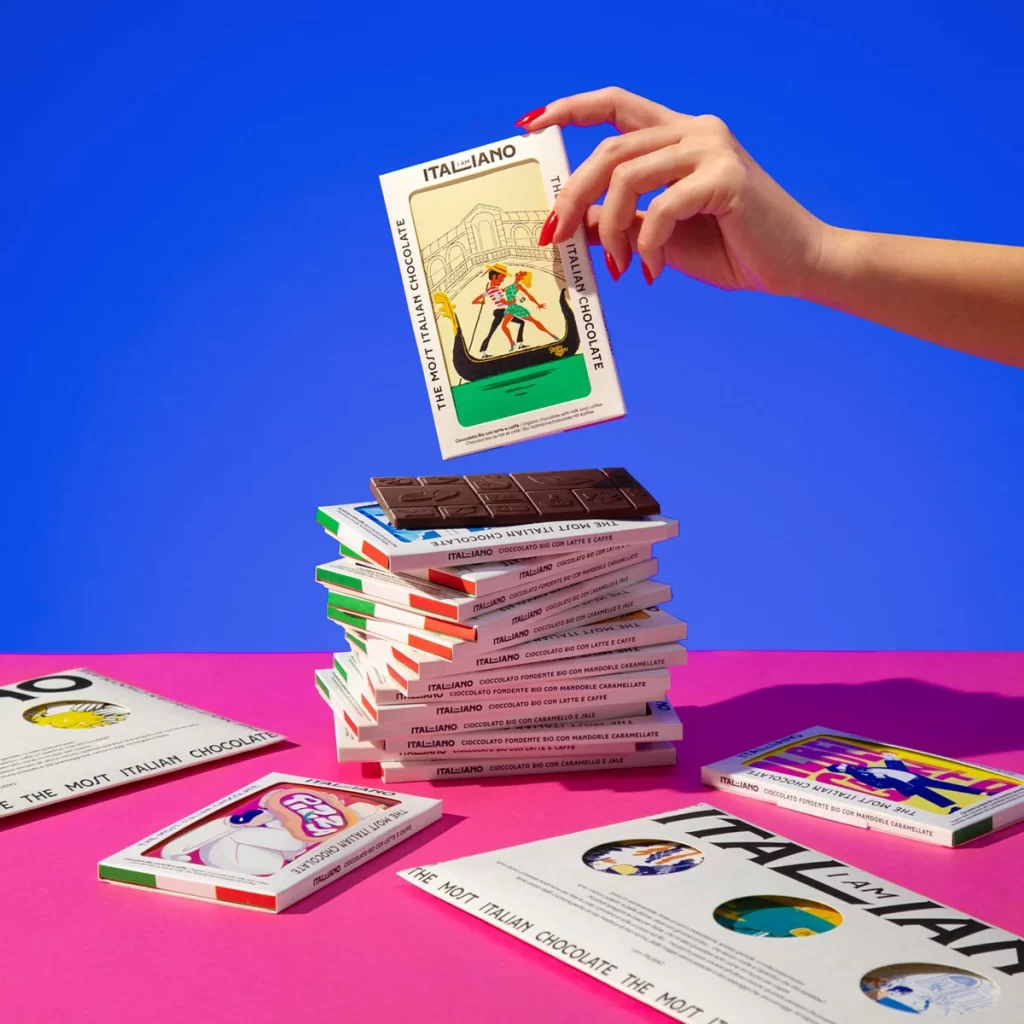
Packaging designers studying structural innovation would examine how the die-cut windows transform a flat surface into an interactive reveal mechanism. Brand strategists analyzing identity systems could reference how the typographic nesting technique creates memorable verbal-visual synergy without additional imagery. Art directors developing product photography compositions might note the effectiveness of using saturated background colors to make white packaging materials appear crisp and premium while maintaining legibility of fine text details.