Italiano Chocolate Box Detail
Topics
Details
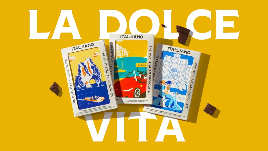
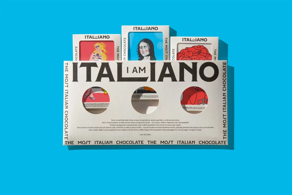
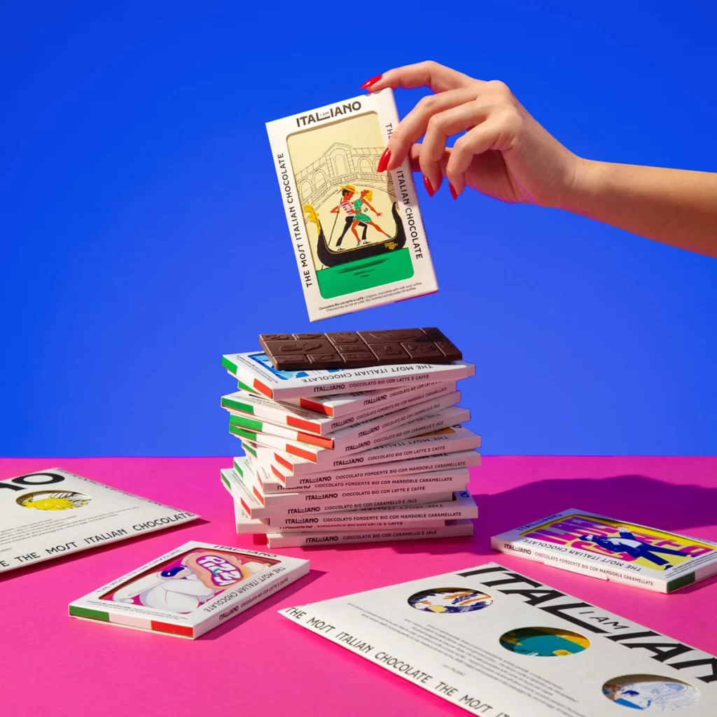
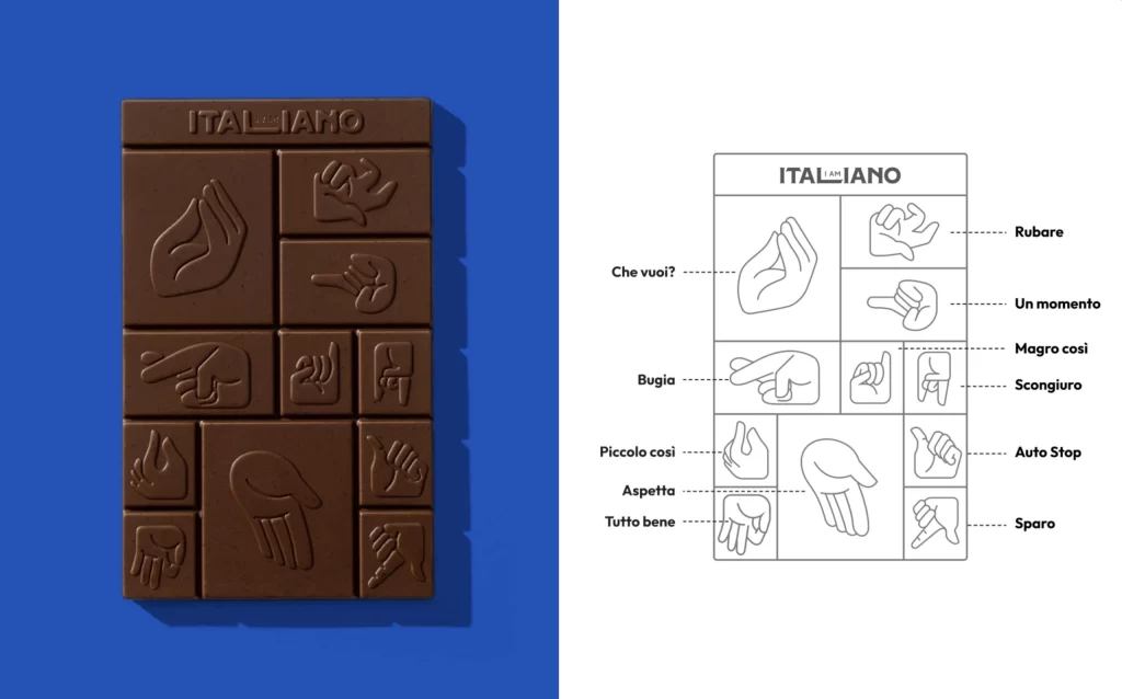
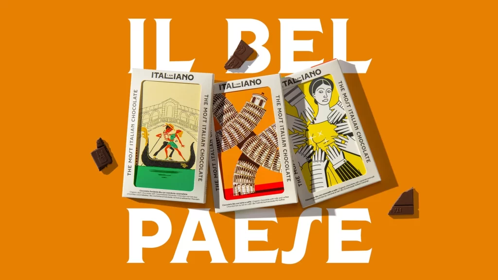
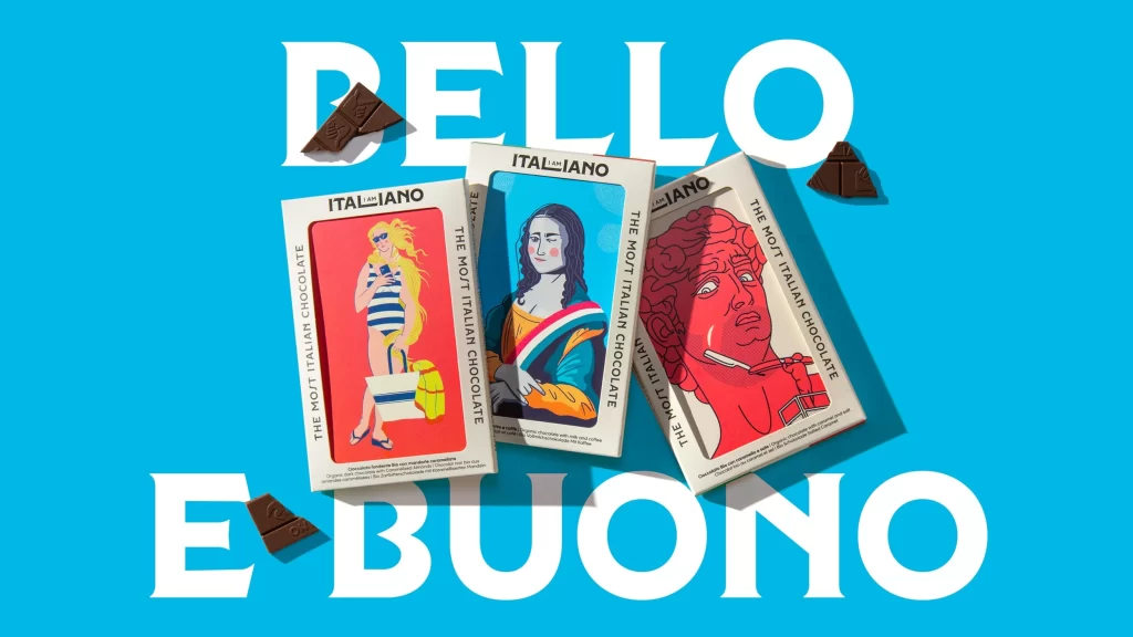
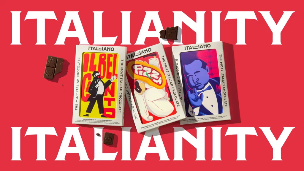
Vibrant crimson floods the entire frame, serving as a bold backdrop for three rectangular chocolate boxes arranged in a slight fan formation. Each white package features a distinct, stylized illustration: the left box displays a tuxedo-clad figure against yellow with 'IL BEL GUSTO' in red, the center shows a cartoonish face with 'PIZZA' on a red background, and the right depicts a blue-skinned man making an Italian hand gesture. Scattered dark chocolate pieces rest near the packaging, while massive, white serif text spelling 'ITALIANITY' dominates both the top and bottom of the composition under flat, even studio lighting.
Visual distinction emerges from the playful collision of high-fashion illustration aesthetics with traditional Italian cultural tropes. The typography choices—mixing bold, retro-style lettering with clean sans-serif product information—create a dynamic hierarchy that draws the eye across each panel. By utilizing a limited but punchy palette of primary reds, yellows, and blues against the neutral packaging, the design achieves immediate shelf presence while maintaining a cohesive brand identity that feels both modern and nostalgic.
Brand strategists developing premium confectionery lines could analyze this layout to understand how character-driven narratives enhance perceived value. Packaging designers might study the interplay between large-scale environmental text and product placement to optimize their own retail display concepts. Illustrators seeking to blend pop-art sensibilities with cultural motifs would find the figure treatments particularly instructive for balancing personality with commercial appeal.