Italiano Chocolate Box Design
Topics
Details
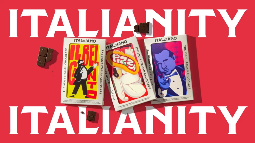
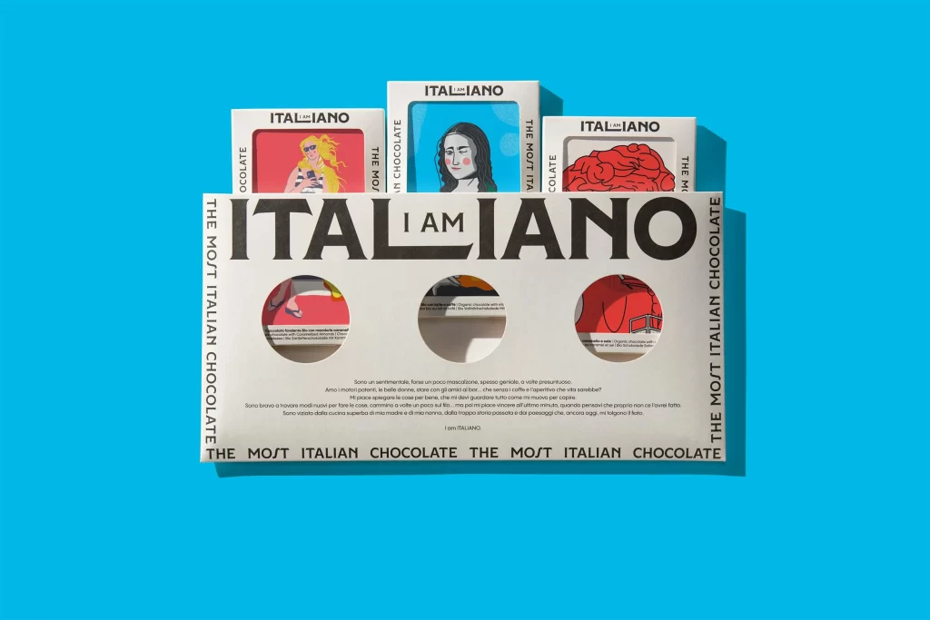
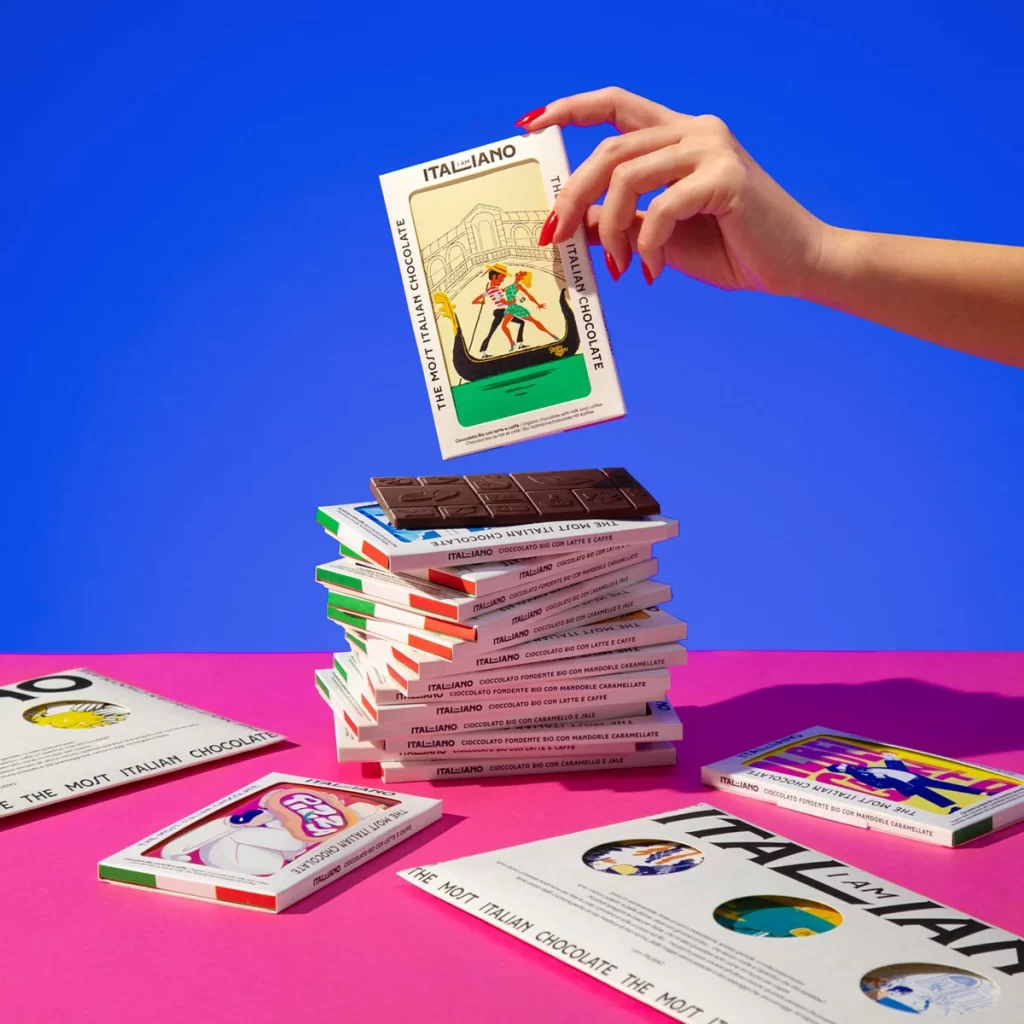
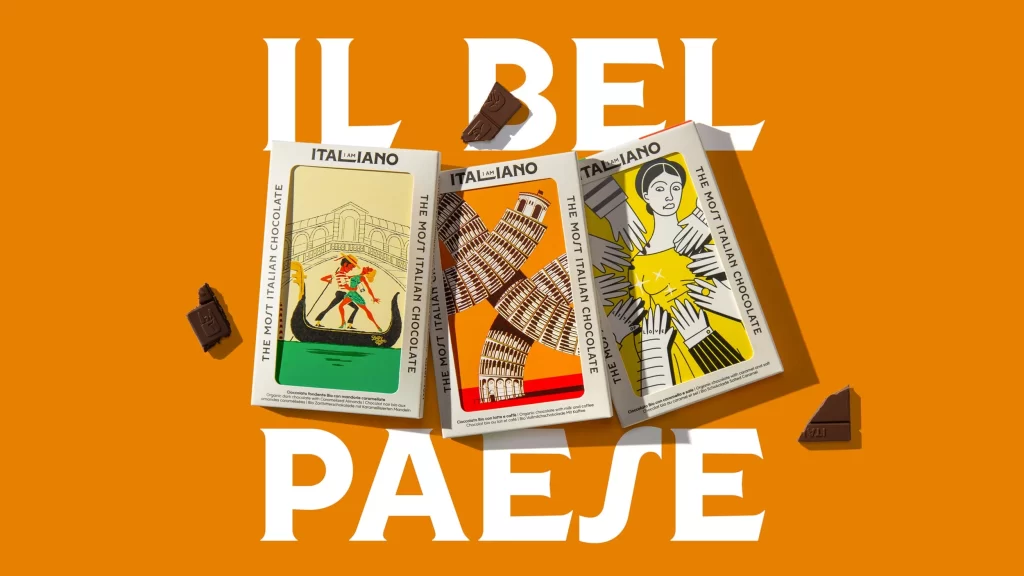
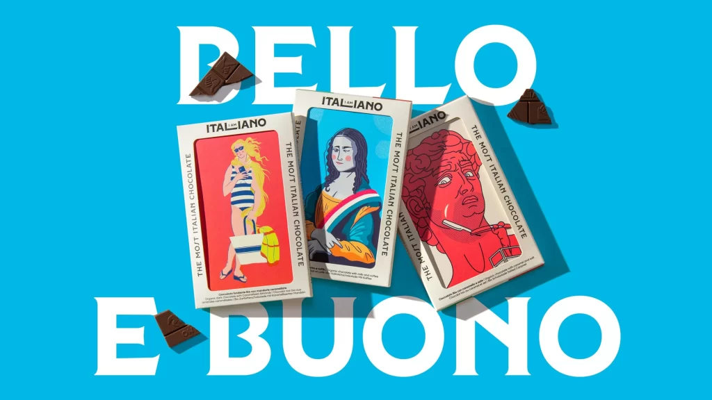
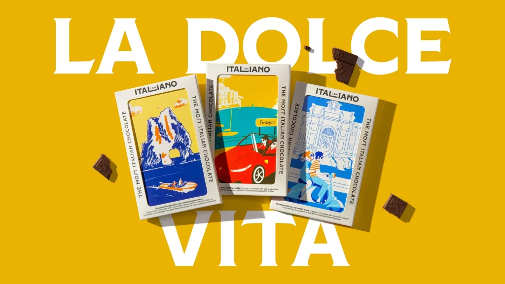
Three rectangular chocolate bars from the brand ITALIANO rest on a vibrant mustard-yellow surface, each featuring bold, retro-style illustrations of Italian landmarks and leisure scenes. The packaging displays crisp white borders framing vivid graphics—a blue coastal rock formation, a red convertible by turquoise waters, and a couple on a scooter before classical architecture—while large white sans-serif text spelling 'LA DOLCE VITA' dominates the background. Soft shadows beneath the boxes and scattered dark chocolate pieces create gentle depth across the flat-lay composition, photographed from a slightly elevated angle that reveals the vertical branding text 'THE MOST ITALIAN CHOCOLATE' running along each package edge.
The packaging leverages a mid-century modern illustration aesthetic characterized by limited color palettes and bold graphic shapes that evoke Italian travel posters of the 1950s. Vertical text running along the box edges reinforces the brand identity while the consistent yellow-to-blue color scheme creates visual cohesion across different product variants. This approach transforms standard confectionery packaging into collectible art objects that communicate lifestyle and destination rather than mere ingredient information.
Brand strategists developing premium food products could analyze this layout to understand how illustration style influences perceived value and cultural association. Packaging engineers might reference the structural proportions and typographic hierarchy when designing similar rectangular formats for luxury retail environments. Marketing teams planning European-themed campaigns could extract the specific color combinations and compositional balance to maintain visual consistency across print and digital touchpoints.