Italiano Chocolate Box Closeup
Topics
Details
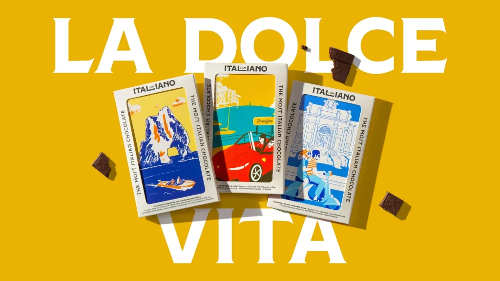
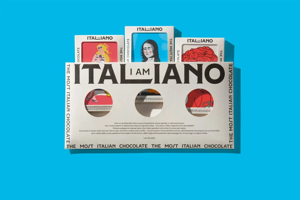
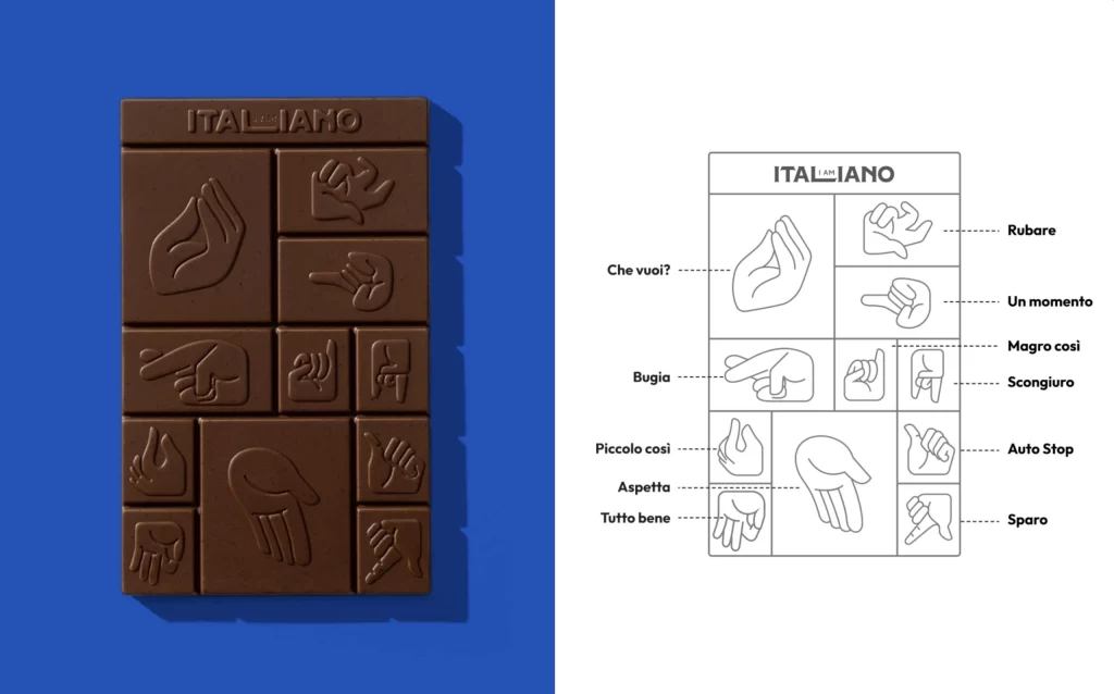
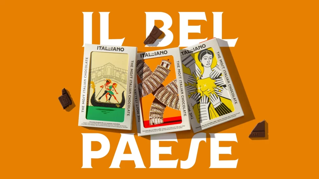
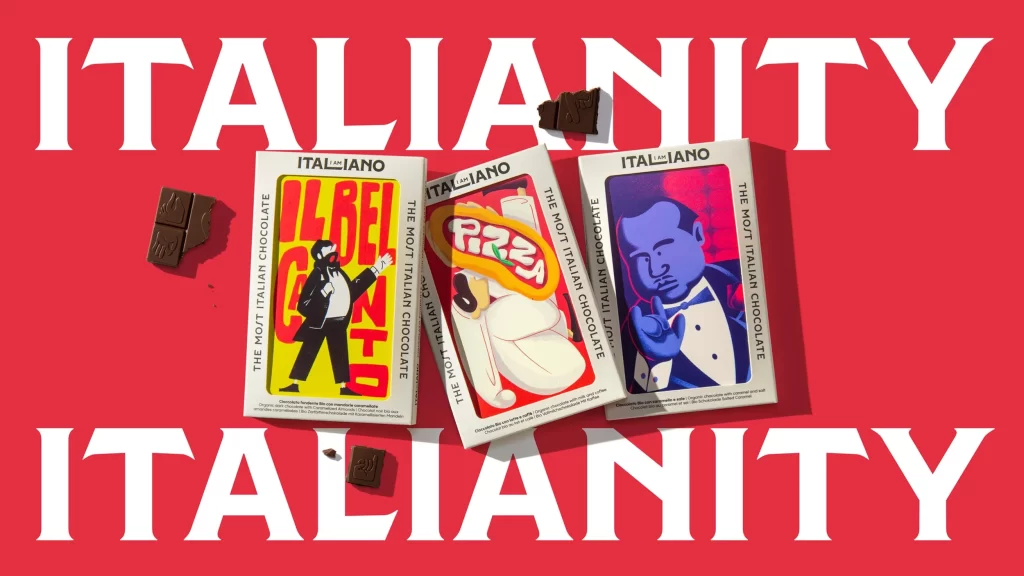
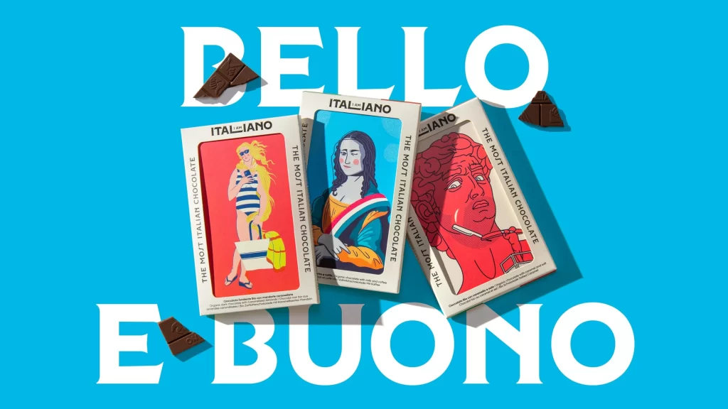
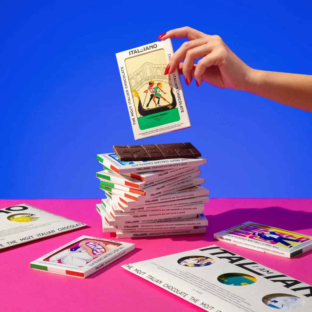
Vibrant electric blue and hot pink create a high-contrast backdrop for a stack of Italiano chocolate boxes, with a hand featuring bright red nails lifting the top package. The packaging displays bold black typography reading 'ITALIANO' and 'THE MOIT ITALIAN CHOCOLATE' alongside retro-style illustrations of gondoliers and abstract figures in circular frames. A dark chocolate bar with a geometric grid pattern rests atop the pile, while additional boxes lie flat on the magenta surface, revealing white backgrounds with green and red accent stripes along their spines.
Visual distinction emerges from the playful juxtaposition of minimalist layout against saturated background colors, creating a pop-art aesthetic that feels both nostalgic and contemporary. The illustration style combines line art with flat color blocks, while the consistent typographic hierarchy across different flavor variants—visible as 'CIOCCOLATO FONDENTE BIO CON MANDORLE CARAMELLATE'—demonstrates systematic brand application. This particular arrangement highlights how physical product photography can transform standard packaging into a dynamic compositional element through careful color coordination and human interaction.
Packaging designers studying color theory applications will find this useful for analyzing how complementary background hues enhance product visibility without overwhelming the primary design. Art directors planning confectionery photoshoots can reference the hand placement and stacking technique to create similar sense of depth and accessibility in their own compositions. Brand identity teams developing retro-inspired visual systems might examine the balance between illustrative elements and typographic weight to achieve comparable vintage-modern fusion aesthetics.