Title

Meiji Greek Yogurt Fruit White Orange Sunburst


Topics

Food Packaging Logos

Details

Uploaded user: Leo

A white plastic cup of Meiji The Greek Yogurt stands centered in the frame, its cylindrical body decorated with radiating orange rectangular bars that resemble sunbeams. Bold black typography spells out 'THE GREEK YOGURT' across the middle, while the red Meiji logo anchors the upper left corner. A photographic illustration of mango and guava slices appears at lower right, accompanied by orange Japanese text announcing five premium fruit varieties. The lid repeats the sunburst motif with additional product claims printed in black and teal characters.
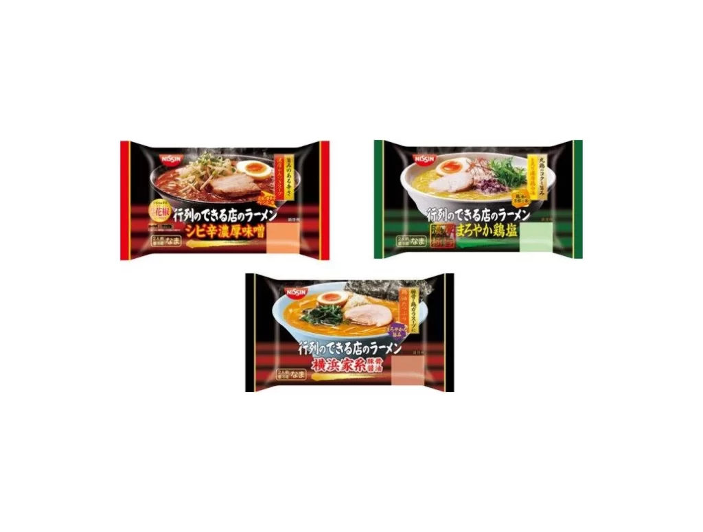

Visual energy derives from the high-contrast interplay between the crisp white substrate and the vibrant orange geometric accents that wrap around the container's curvature. This particular variant emphasizes tropical fruit imagery through realistic renderings, distinguishing it from plain yogurt packaging through its specific color-coded flavor signaling. The typographic hierarchy balances English branding with localized Japanese descriptors, creating a bilingual visual system that maintains clarity across markets.

Packaging analysts might examine this reference to study how dairy brands communicate premium positioning through minimal color palettes and strategic fruit photography placement. Brand identity specialists could analyze the consistent application of the sunburst graphic language across both the cup body and lid surfaces. Product photographers may consult this example when planning lighting setups for curved plastic containers requiring even illumination without harsh specular highlights.