Mini Snacks Colorful Playful Typography
Topics
Details
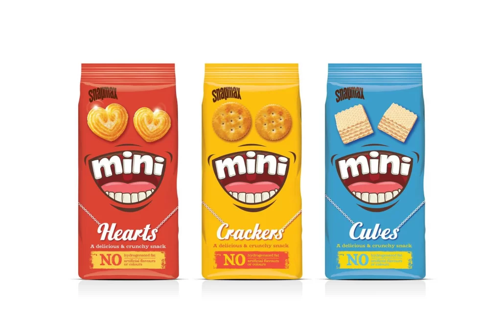
Three vertical snack pouches stand in a row, each featuring a distinct primary hue: crimson red, golden yellow, and cerulean blue. The brand name 'Snapnax' appears at the top of every bag, while the word 'mini' dominates the center inside a cartoonish mouth graphic with white teeth and pink gums. Below the mouth, the product names 'Hearts', 'Crackers', and 'Cubes' are rendered in elegant cursive script, accompanied by small text reading 'A delicious & crunchy snack' and a yellow box declaring 'NO hydrogenated fat artificial flavour colourings'.
Anthropomorphic design elements transform these packages into character-like faces, with heart-shaped biscuits, round crackers, and square wafers serving as eyes above the grinning mouth. The consistent typographic hierarchy across all three variants creates strong brand cohesion while the vibrant color coding allows for instant flavor differentiation on retail shelves. A delicate silver chain graphic drapes across the lower portion of each bag, adding a whimsical accessory detail that breaks up the solid color fields.
Brand identity specialists studying character-driven packaging strategies would find this composition particularly useful for analyzing how facial features can humanize consumer products. Marketing teams developing snack lines for children could reference the balance between playful illustration and clear nutritional messaging when planning their own visual systems. Typography researchers examining the interplay between bold sans-serif display fonts and flowing script lettering might also extract valuable layout principles from this arrangement.