Pesto Carluccios Red Yellow Modern Typography
DownloadTopics
Details
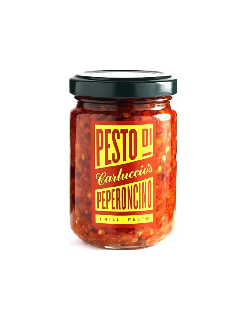
A cylindrical glass jar filled with chunky red chili paste stands as the central subject, sealed with a dark green metal lid that features a subtle reflective sheen. The label wrapped around the container employs a striking color palette of deep crimson and golden yellow, displaying the text 'PESTO DI' in bold sans-serif capitals, followed by 'Carluccio's' in an elegant cursive script, and 'PEPERONCINO' in heavy block lettering below. Soft studio lighting illuminates the scene from the front, creating gentle highlights on the glass surface and revealing the textured consistency of the preserved peppers within, while the surrounding space remains a clean, unobtrusive white.
Typography serves as the primary visual driver here, creating dynamic tension through the juxtaposition of three distinct typefaces that establish a clear hierarchy while maintaining cohesive brand identity. The diagonal orientation of the text blocks adds kinetic energy to the otherwise static product shot, and the high-contrast yellow-on-red scheme ensures immediate legibility from a distance. Designers studying this composition will note how the label's geometric rigidity contrasts beautifully with the organic, irregular texture of the food visible through the transparent vessel. Those seeking to analyze these typographic choices in detail can access the full-resolution file without cost directly from the resource library.
Packaging designers developing condiment labels for Mediterranean food brands would find this reference particularly valuable when exploring how to balance traditional Italian culinary aesthetics with contemporary retail presentation. Art directors working on food photography campaigns could utilize this image to brief photographers on optimal lighting setups for glass containers with opaque contents, specifically regarding how to manage reflections on curved surfaces. Typography enthusiasts might also employ this case study when teaching students about mixing serif and sans-serif fonts within constrained rectangular layouts, demonstrating how weight variations can guide the viewer's eye through complex information architectures.