Pocari Sweat Bottles Cans Ice Spray
DownloadTopics
Details
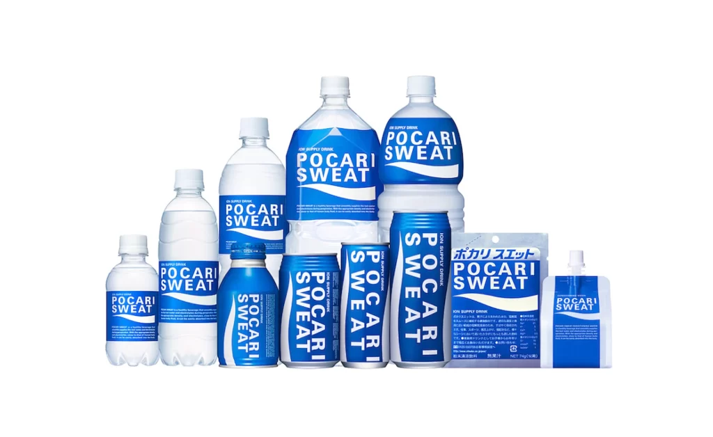
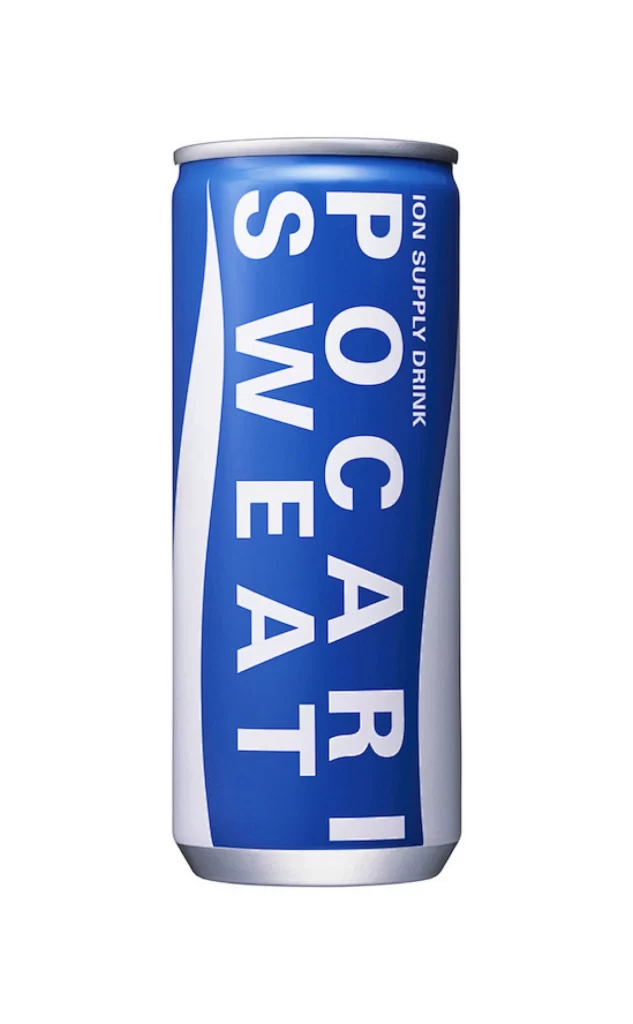
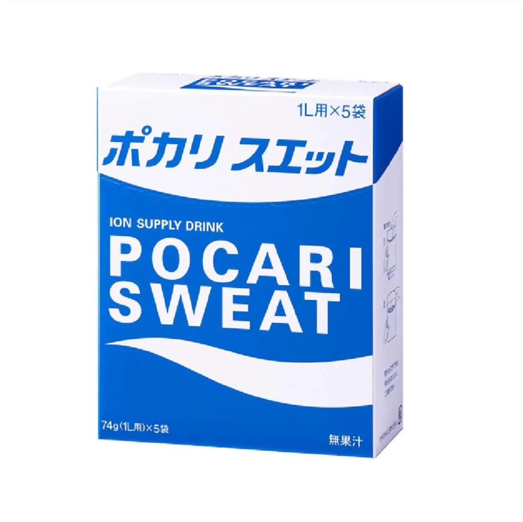
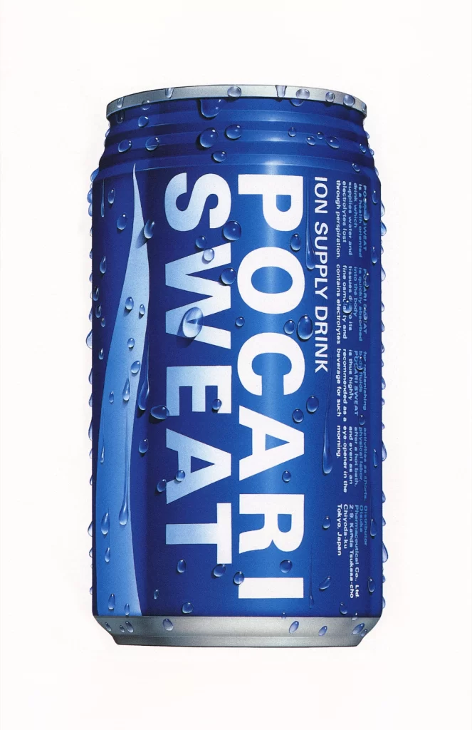
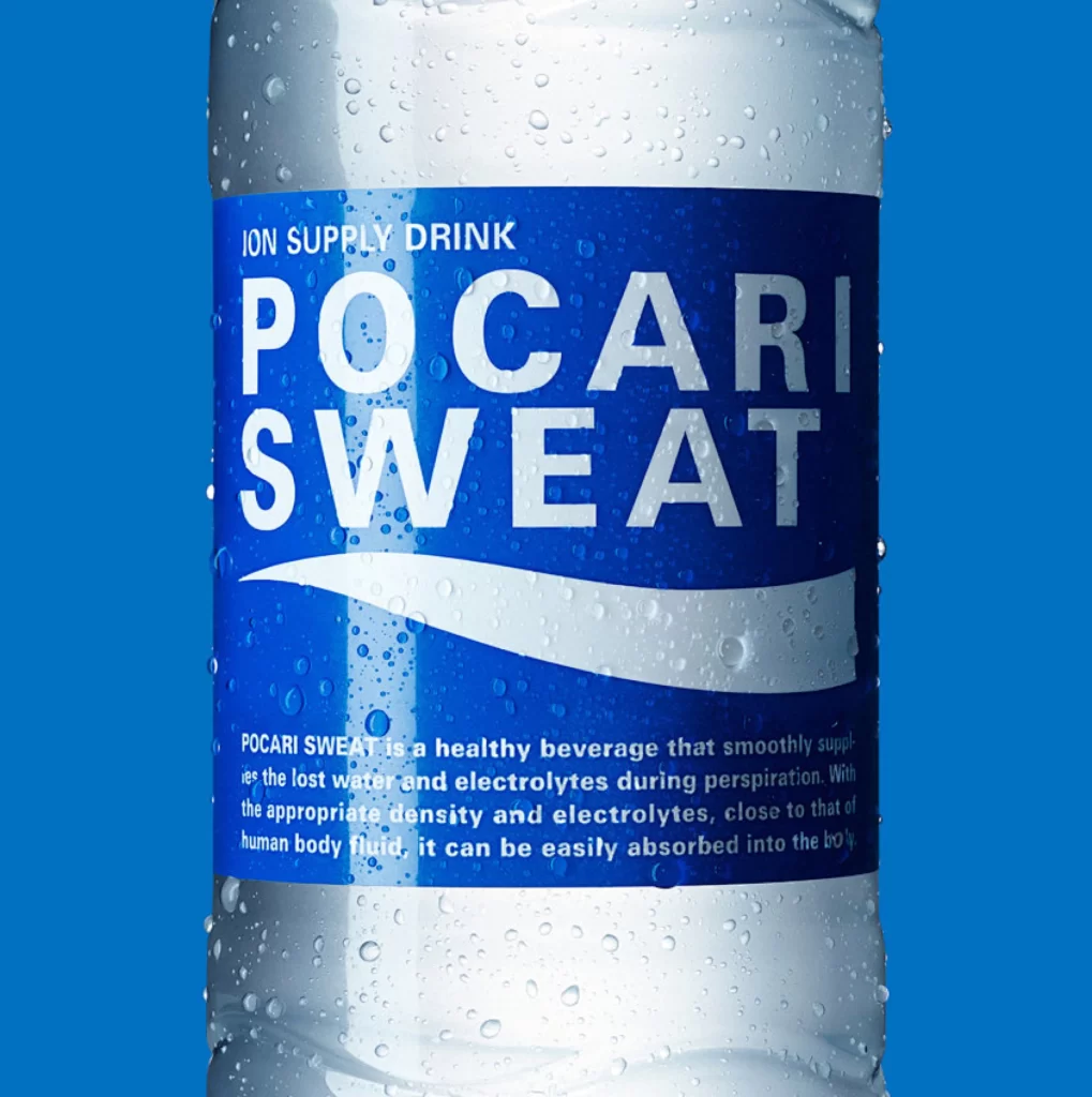
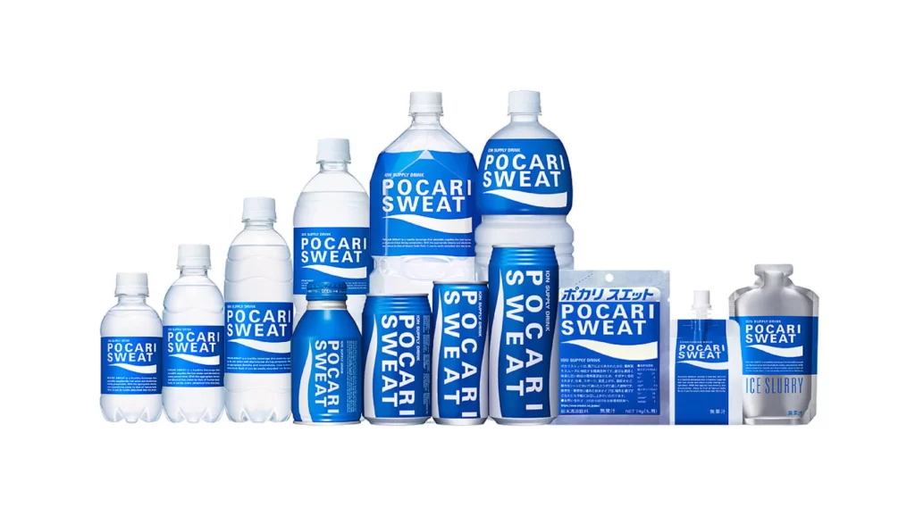
Cobalt blue labels bearing the POCARI SWEAT logotype in bold white sans-serif lettering wrap around a diverse array of packaging formats, ranging from small 100ml PET bottles to large 1.5L containers, plus aluminum cans, a foil powder pouch, and a metallic ice slurry cup. The collection is arranged in a gentle arc that rises toward two prominent central bottles before tapering at both ends, all photographed from a straight-on eye-level perspective under even studio lighting that eliminates harsh shadows. A clean white backdrop isolates every container, making the consistent brand color and varying material textures—glossy plastic, matte aluminum, crinkled foil—immediately apparent.
Visual consistency across such disparate form factors demonstrates how a rigid identity system maintains legibility whether applied to curved cylindrical surfaces or flat rectangular pouches. The repeated wave motif beneath the brand name creates a rhythmic horizontal anchor that unites the lineup despite dramatic differences in scale and substrate. Designers studying this spread can observe how typography scales proportionally while preserving identical weight and spacing rules throughout the entire product ecosystem.
Product photographers and packaging students will find this arrangement useful for practicing lighting setups that must accommodate reflective and absorbent materials simultaneously within a single frame. Brand identity teams could reference the image when establishing guidelines for logo placement across irregular three-dimensional surfaces versus flat flexible packaging. The full-resolution file is accessible at no cost for anyone needing to inspect fine details like label edge alignment or cap textures during their own design process.