Pocari Sweat Bottles Packaging
DownloadTopics
Details
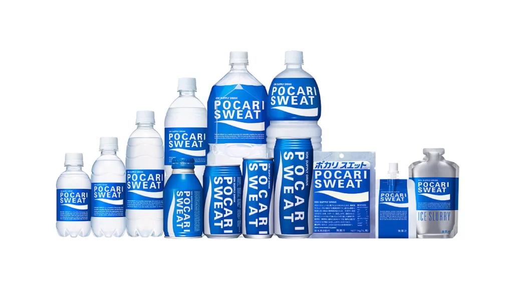
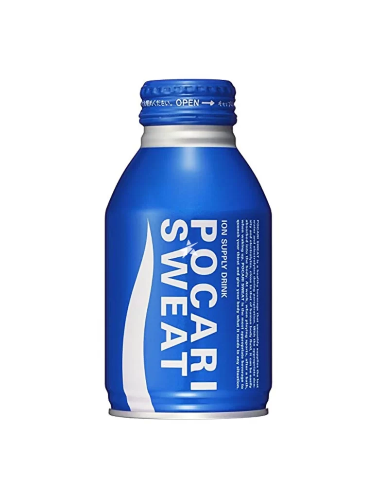
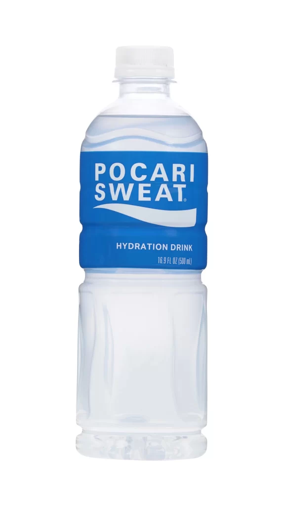
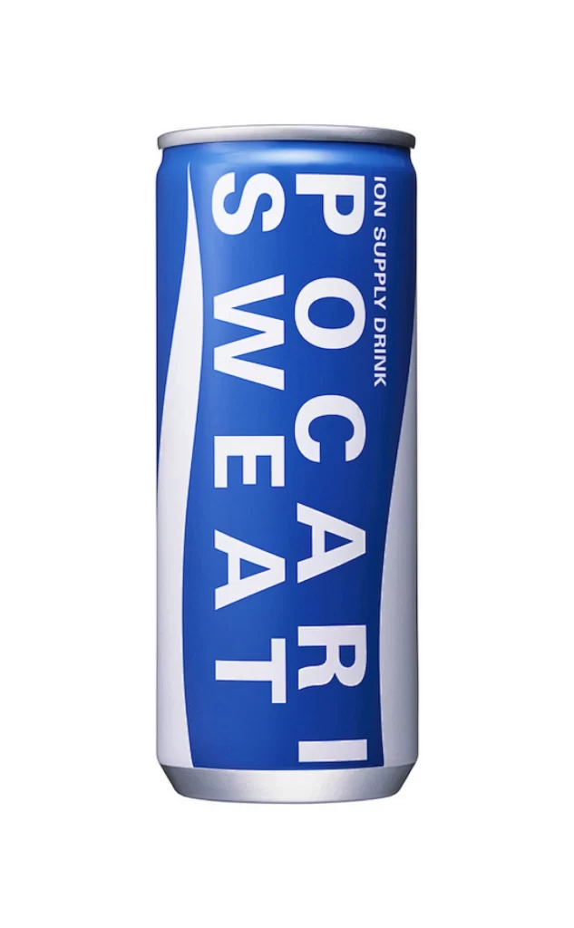
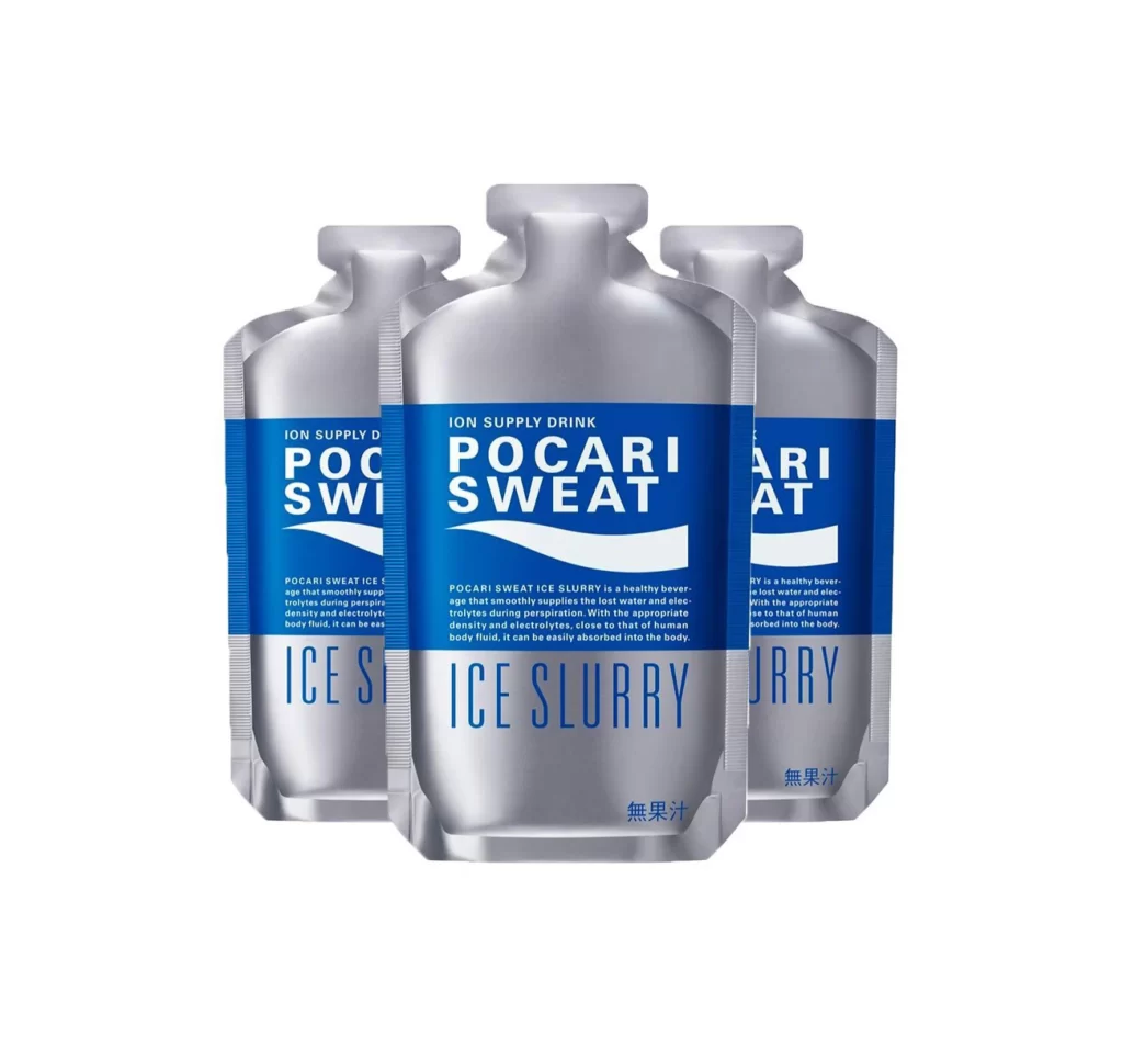
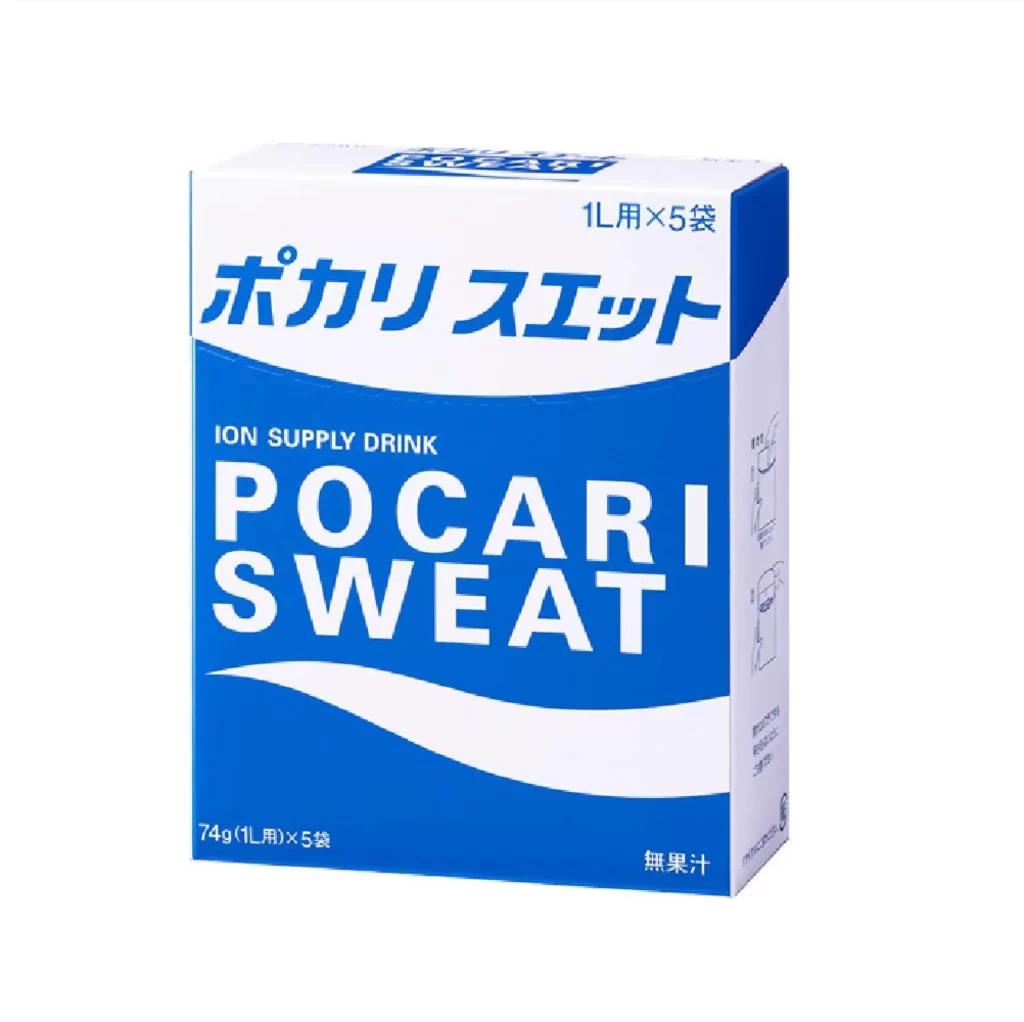
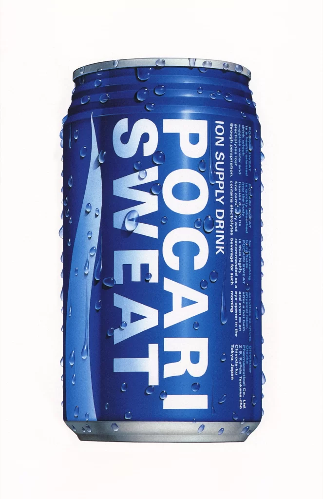
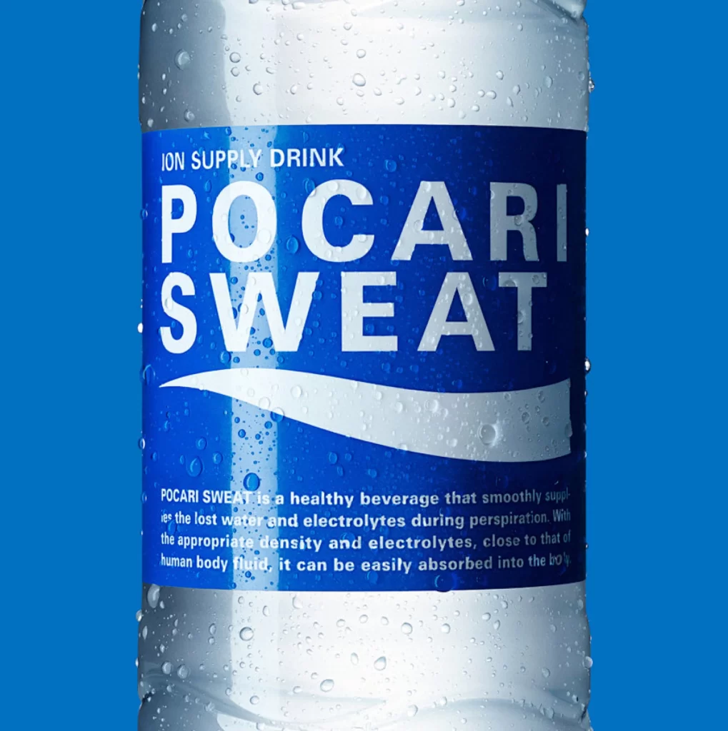
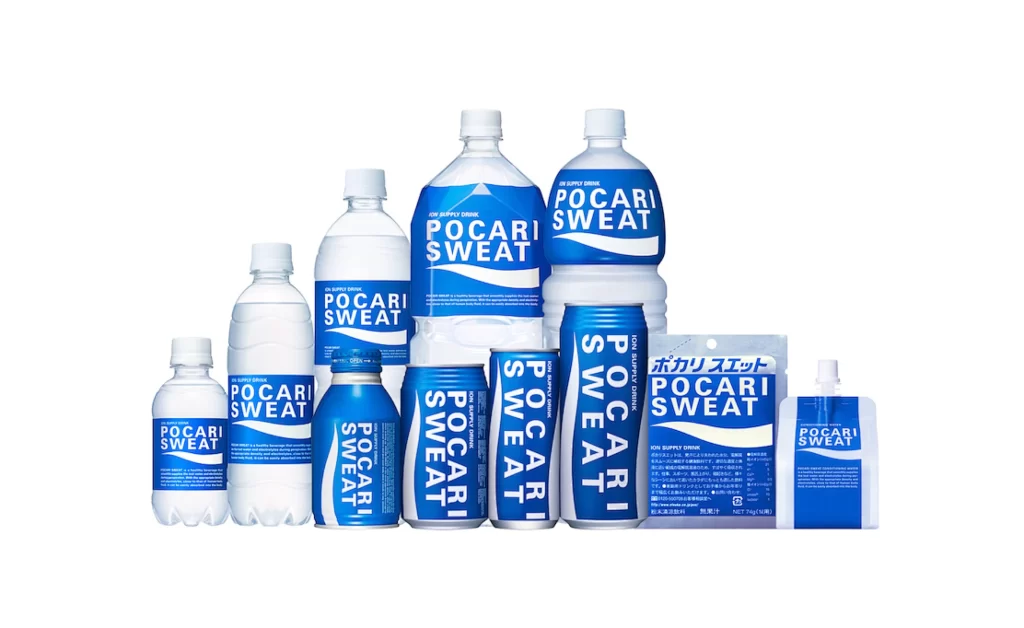
Cobalt blue and transparent plastic containers dominate the frame, arranged in a tiered formation that showcases the brand's extensive product line. The collection includes various bottle sizes, aluminum cans, a foil pouch, and a small sachet, all bearing the iconic white 'POCARI SWEAT' typography alongside Japanese characters. Even studio lighting eliminates harsh shadows across the assortment, while the neutral backdrop ensures every label detail remains legible from the straight-on camera perspective.
Visual consistency unifies these disparate packaging formats through the signature wave graphic and restricted color palette, creating immediate brand recognition regardless of container shape. The vertical text orientation on cans contrasts with horizontal labeling on bottles, demonstrating adaptive design strategies within a rigid identity system. Designers studying this composition can access the full-resolution file to examine how typographic hierarchy shifts between the compact sachet and oversized two-liter vessels.
Product photographers might reference this arrangement when planning multi-SKU catalog shoots requiring balanced visual weight across varying volumes. Packaging engineers could analyze material transitions from rigid PET to flexible film pouches while maintaining cohesive branding elements. Brand strategists evaluating global identity systems will find value in observing how localized text integrates with universal graphic motifs without disrupting the overall aesthetic harmony.