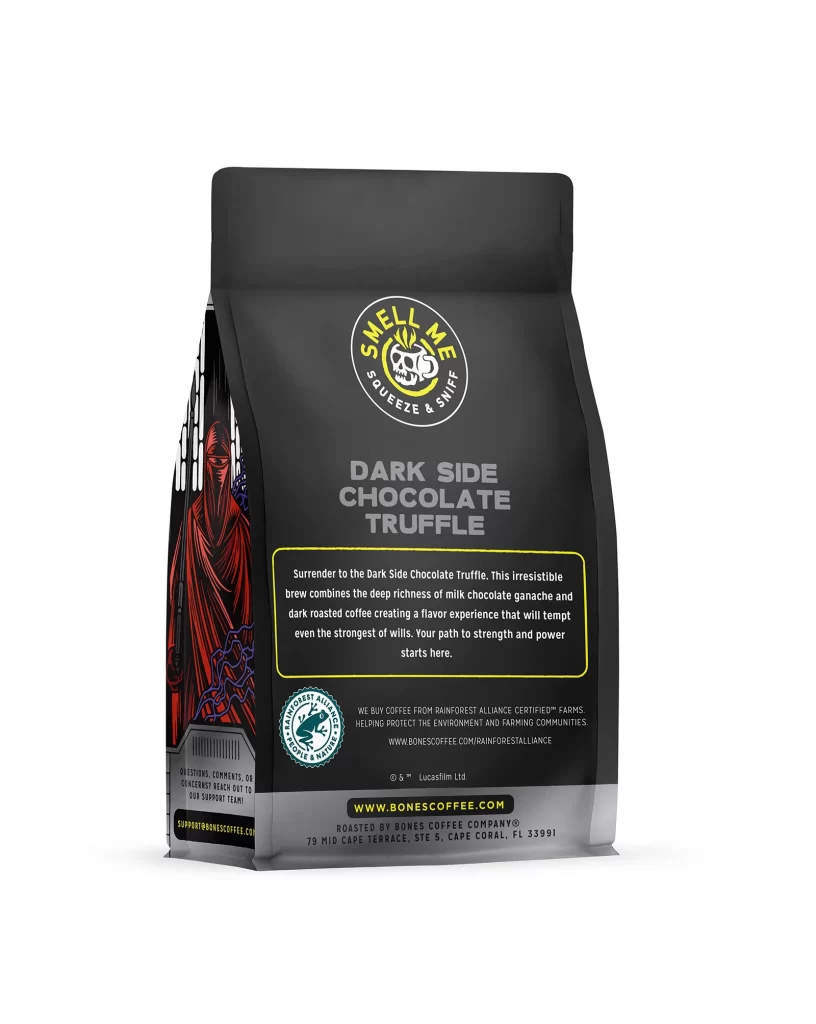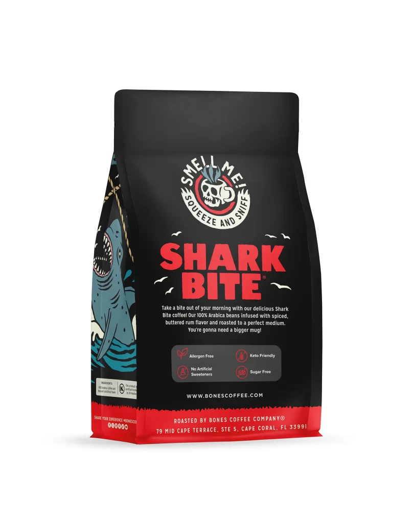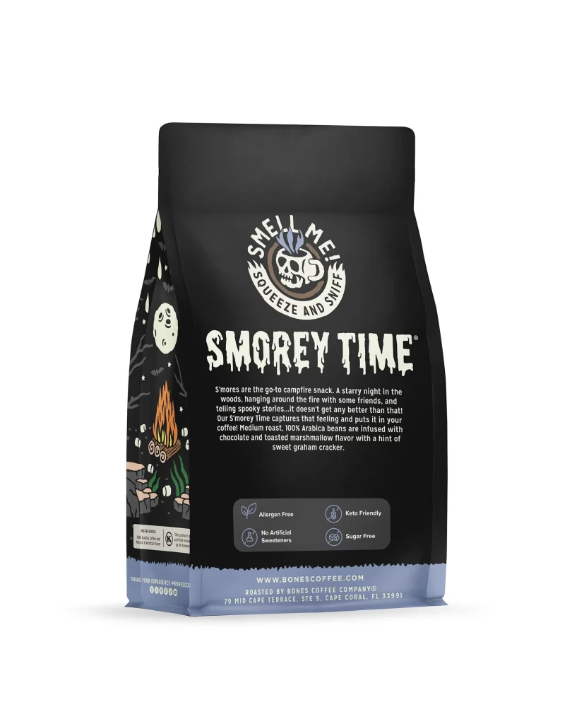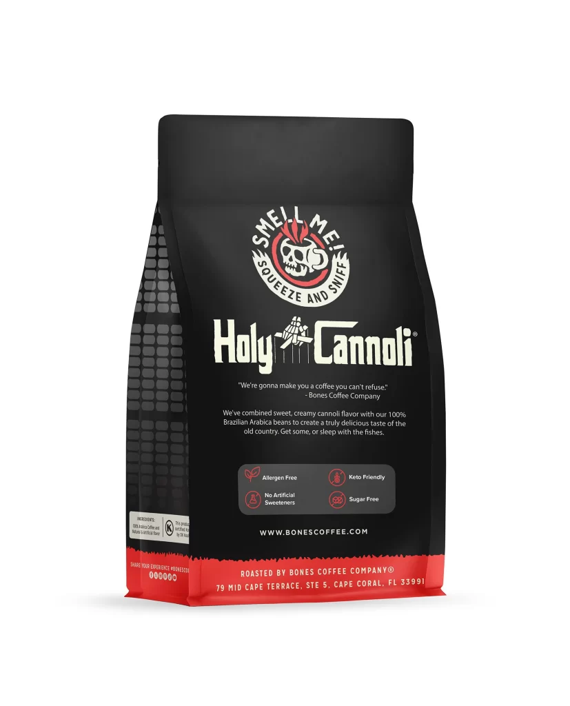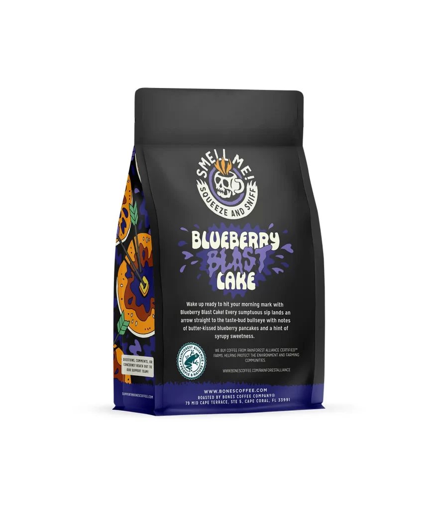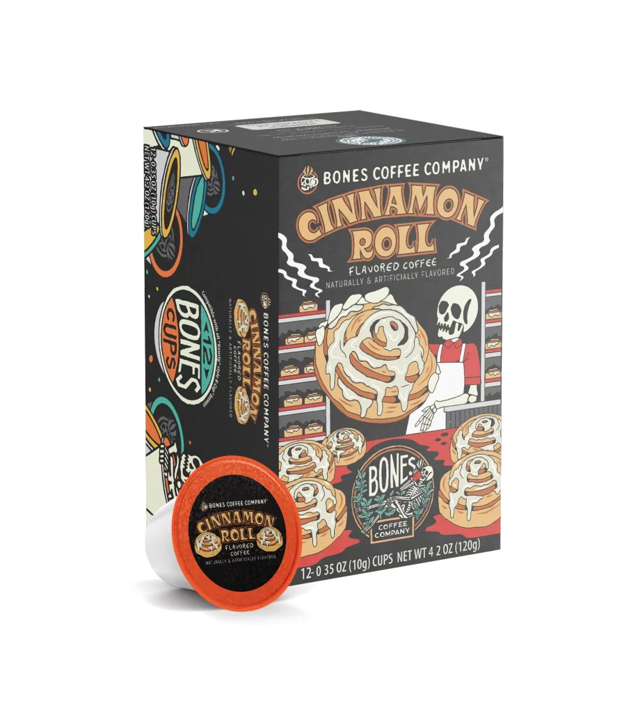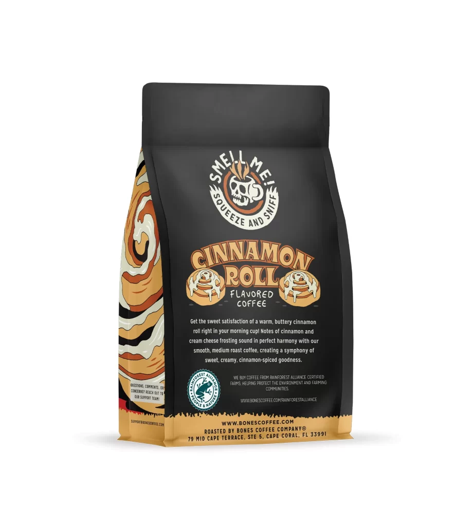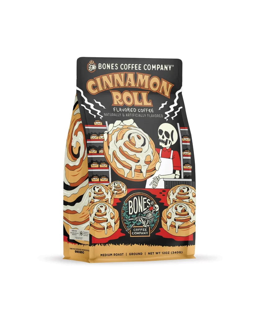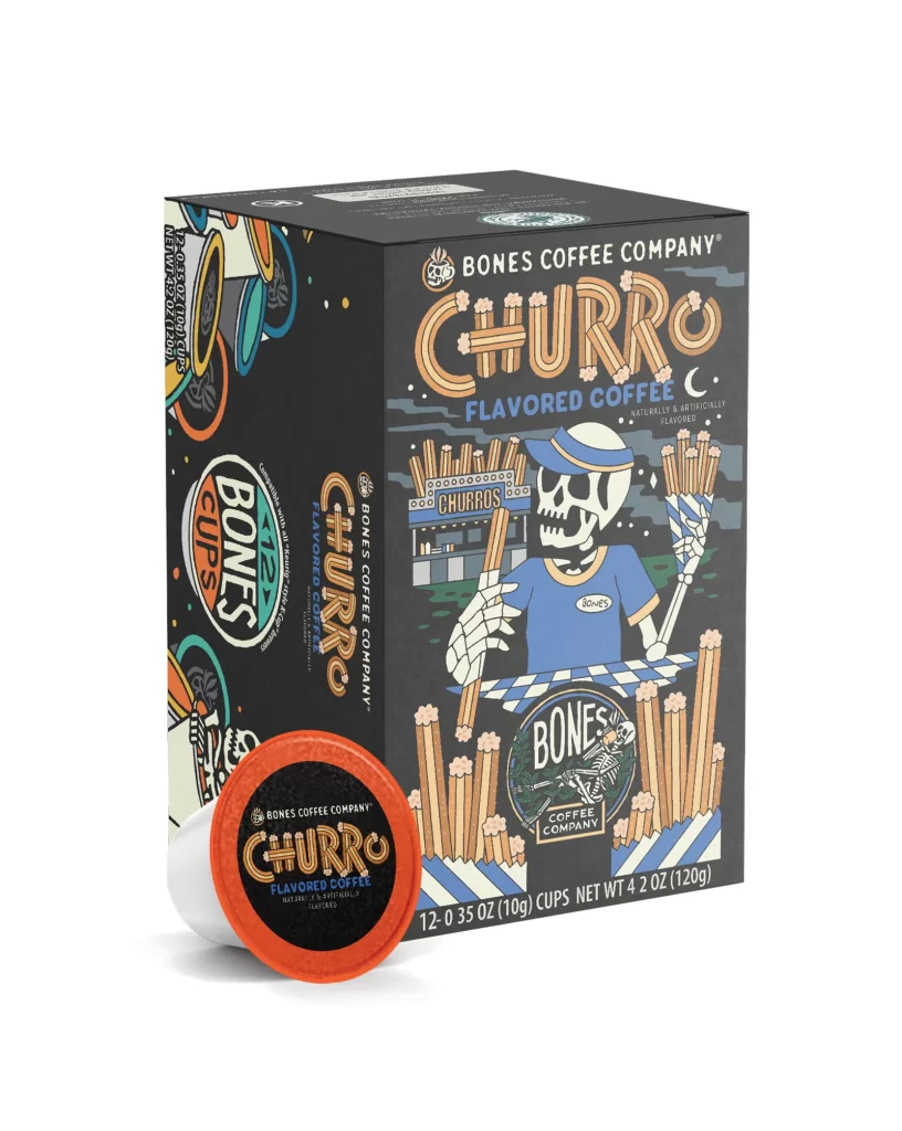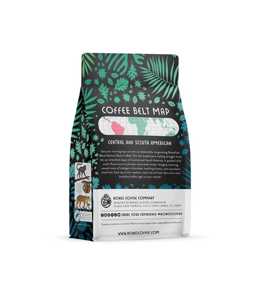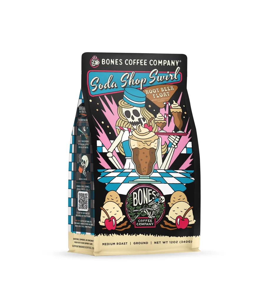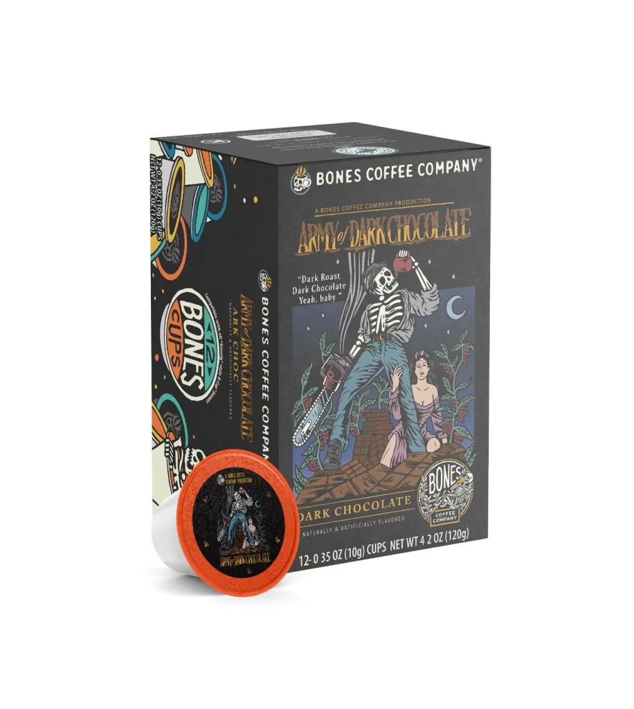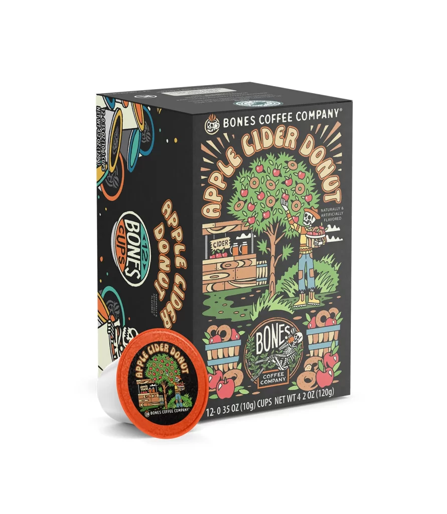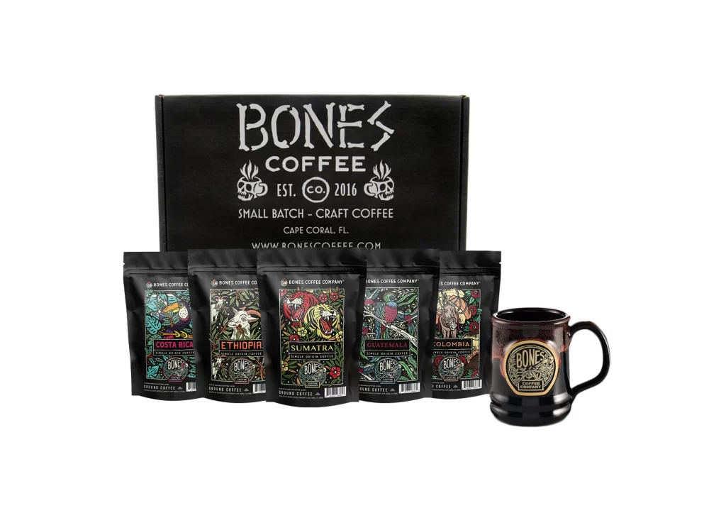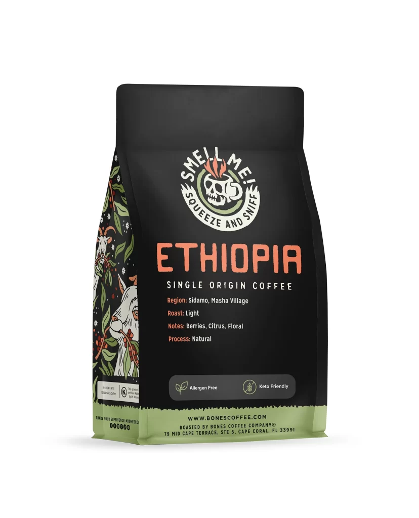
Bones Coffee Ethiopia Single Origin Coffee Bag Back Packaging
Topics
Details
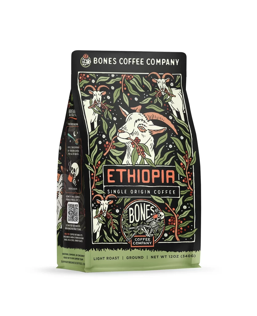
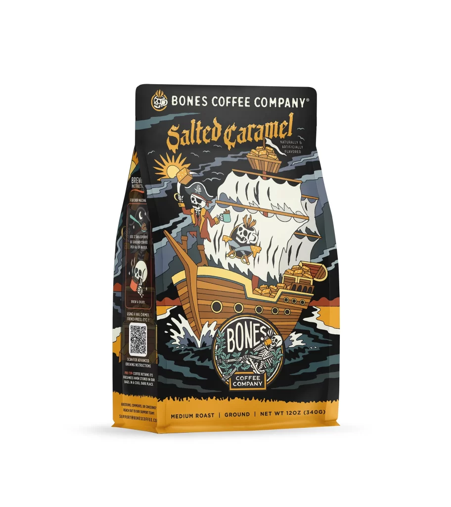
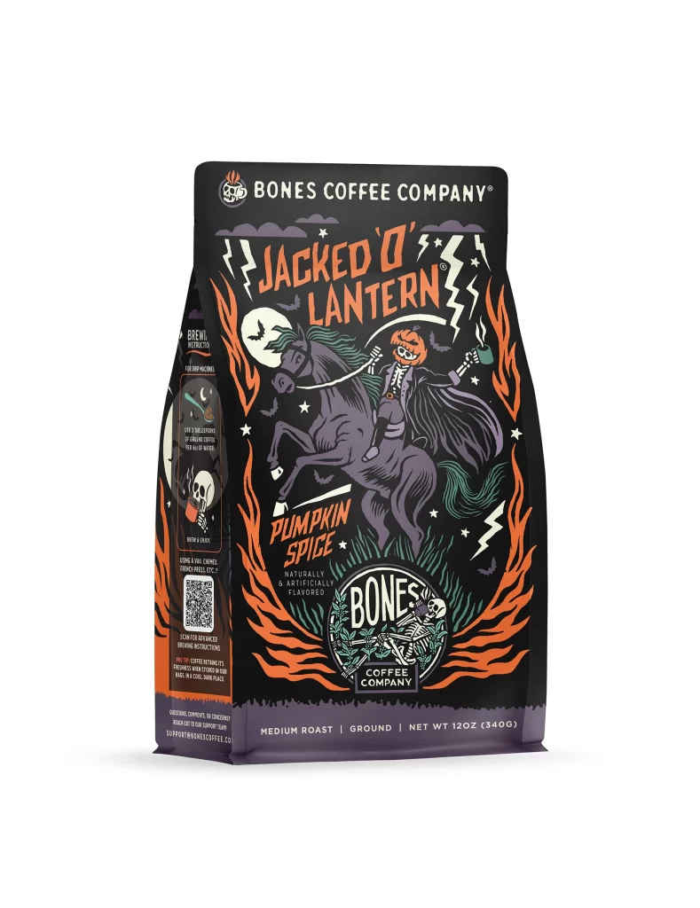
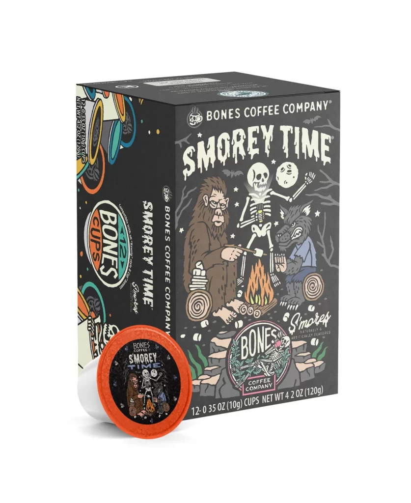
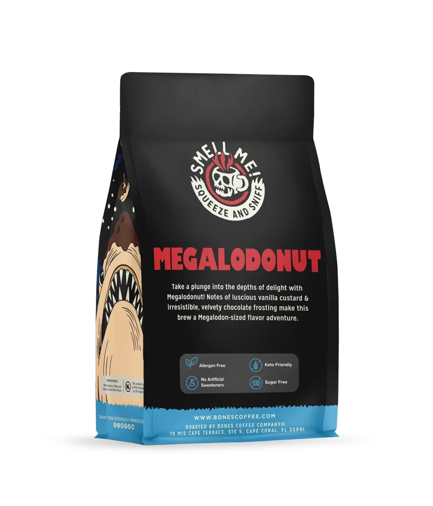
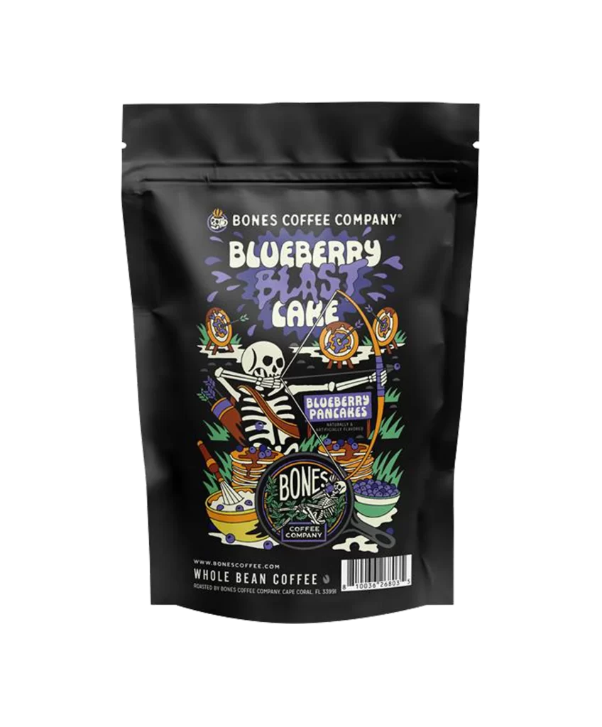
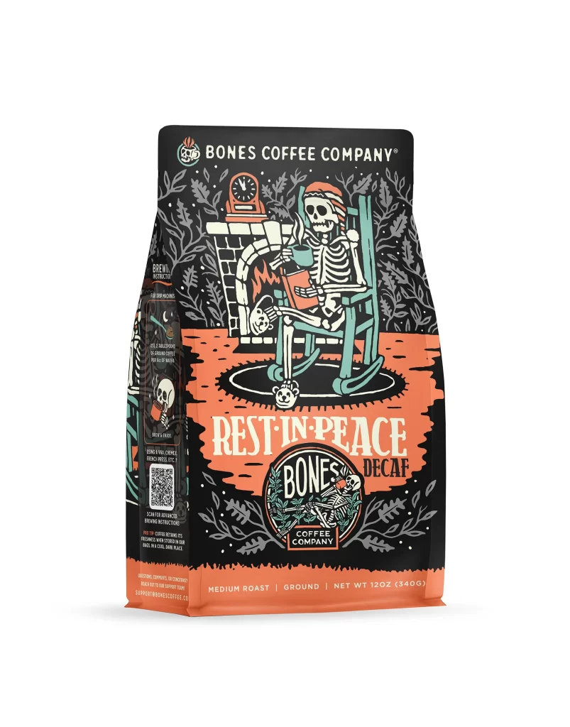
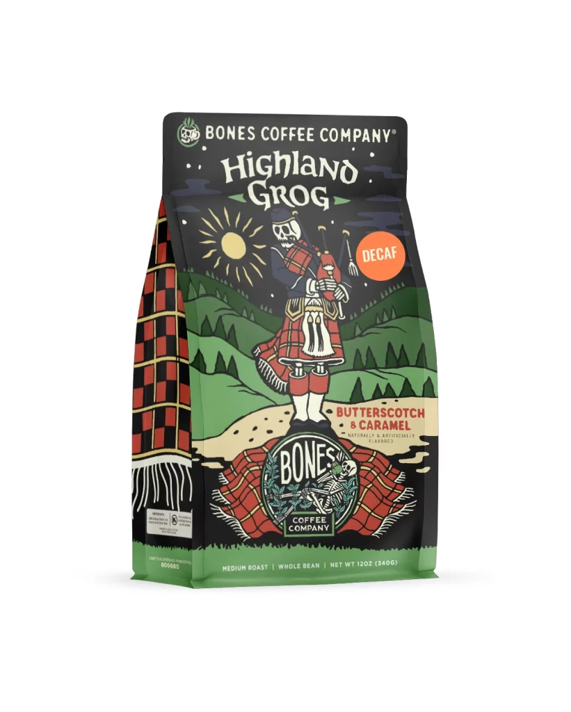
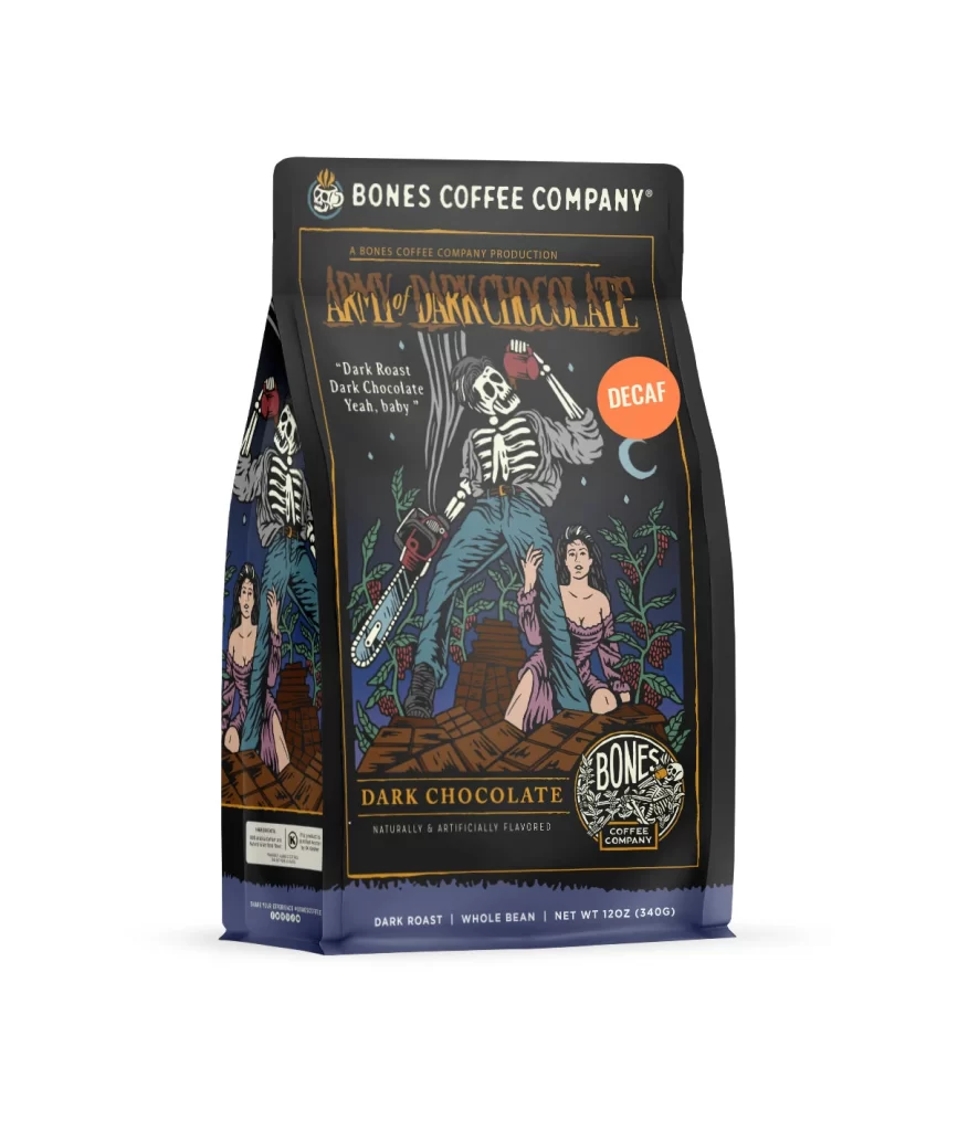
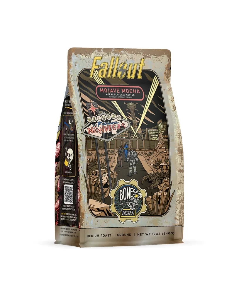
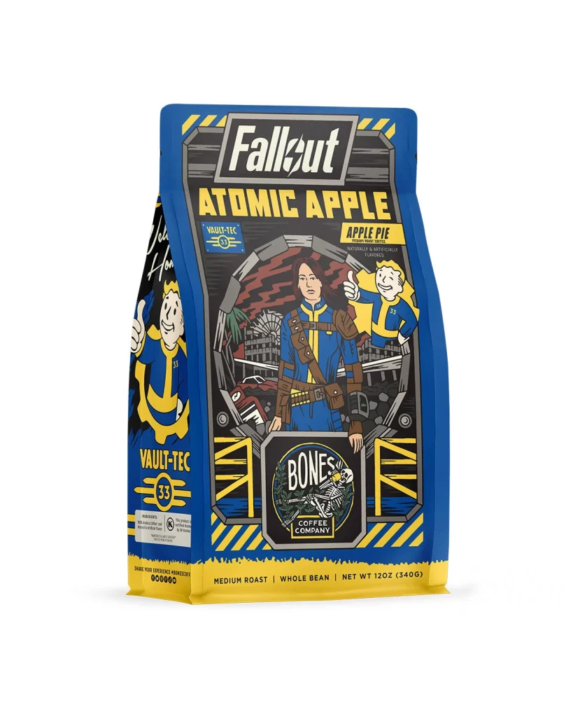
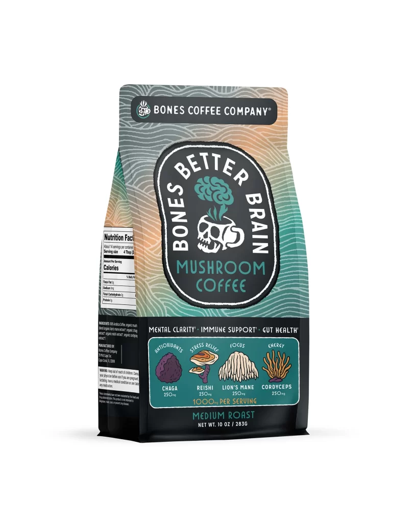
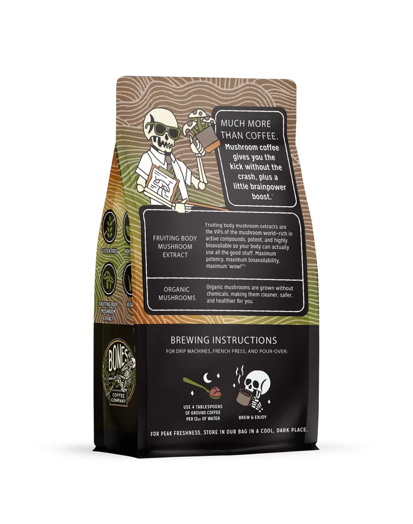
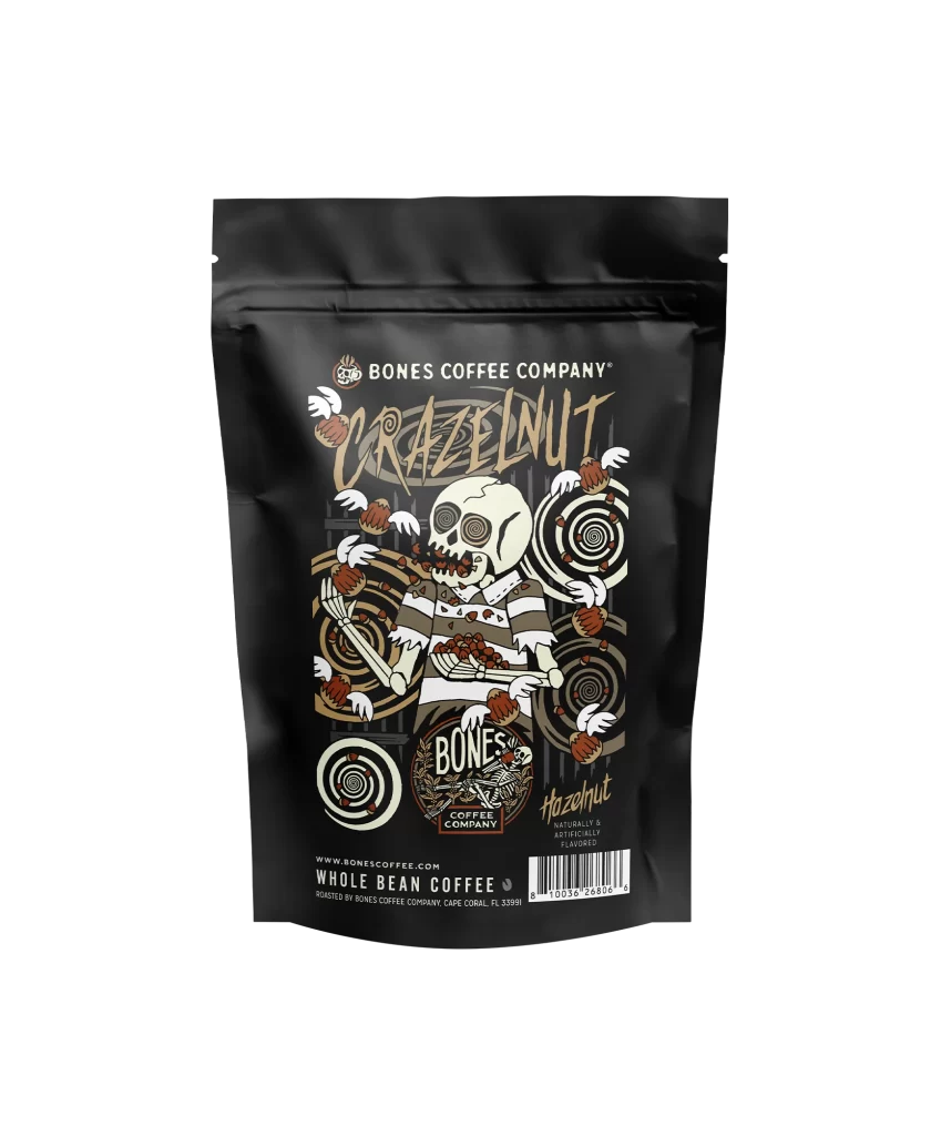
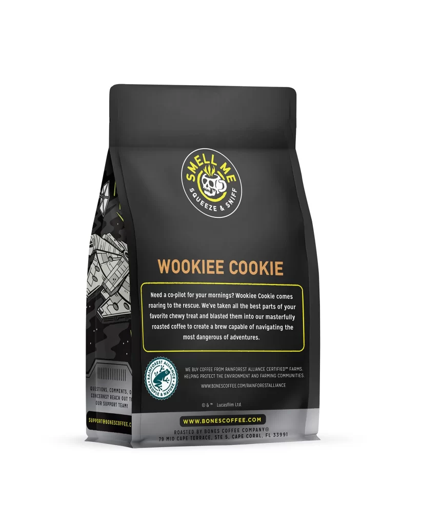
The front layout features a clean white background with a bold central logo at the top. Below the logo, a vibrant illustration of an Ethiopian coffee plant fills the center, showcasing rich green leaves and bright red coffee cherries. The bottom third displays the flavor name and origin in a clear, structured block. The overall composition feels balanced and modern.
Typography uses a sleek sans serif font for all text elements. The brand name appears in deep charcoal, while the flavor name pops in a warm amber hue. This color palette evokes a strong appetite appeal and communicates premium quality. The high contrast against the white background ensures excellent shelf visibility and a contemporary artisanal vibe.
Designers should note the effective use of minimal color to highlight product origin. The clear visual hierarchy guides the eye from brand to flavor to origin seamlessly. This packaging succeeds by blending botanical art with modern typography, creating a premium feel. The clean layout offers excellent shelf impact while maintaining a focused and uncluttered aesthetic.