Future Wise Hydrating Mist Box
Topics
Details
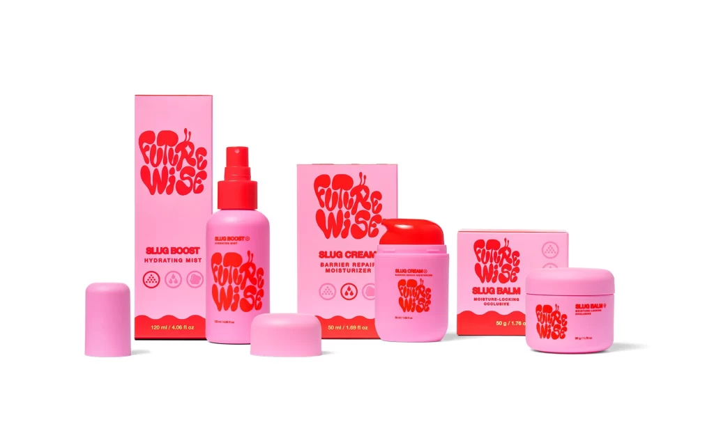
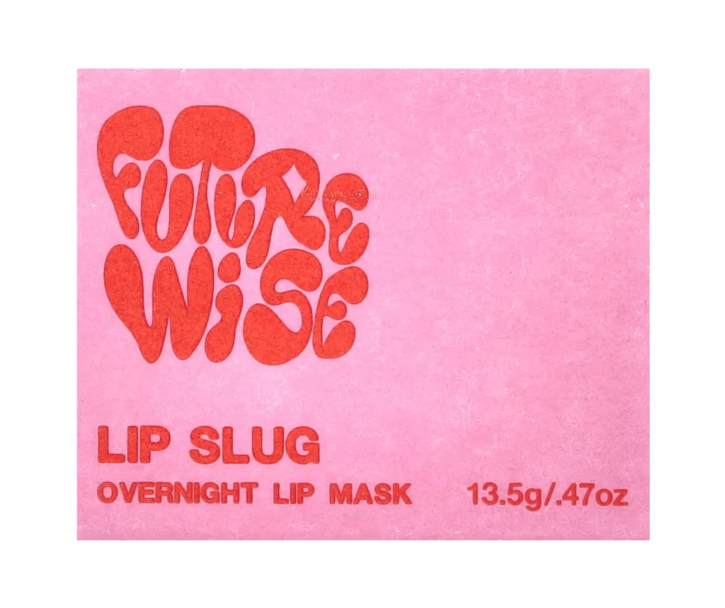
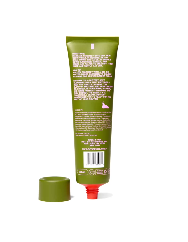
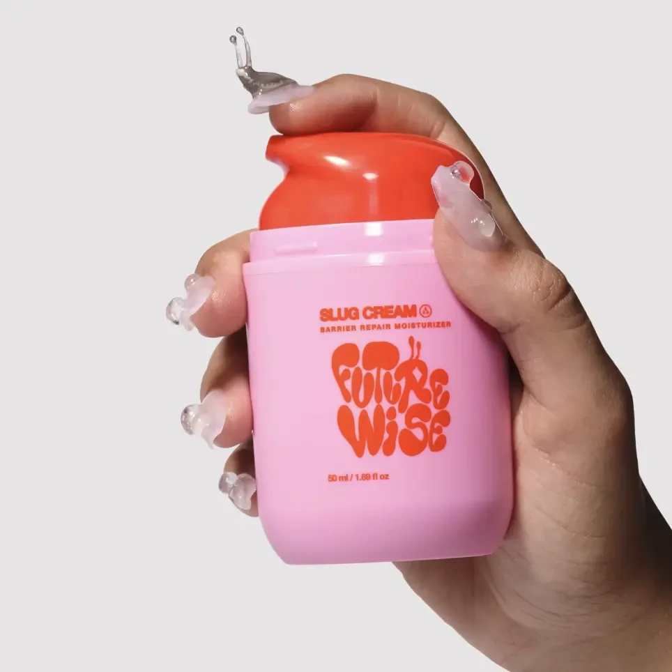
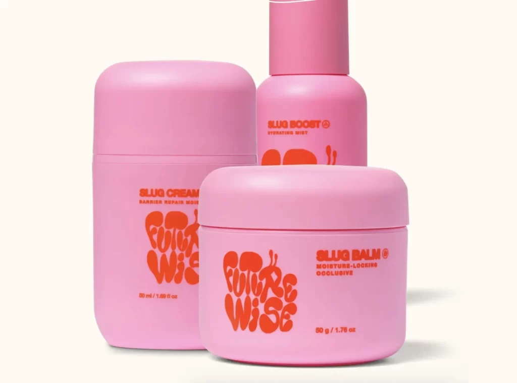
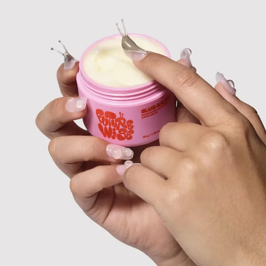
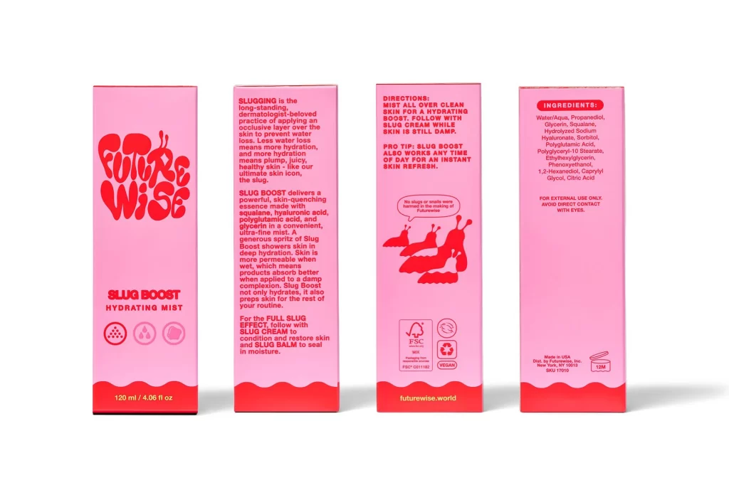
Four rectangular panels of a pink product box are arranged in a horizontal row against a clean white background, photographed from a direct frontal perspective. The packaging features a vibrant coral-red bottom border with a wavy top edge, contrasting sharply with the pale pink main body. Bold red typography displays the brand name 'Future Wise' in a bubbly, rounded font on the front panel, while the remaining three sides contain dense blocks of instructional text, ingredient lists, and playful slug illustrations rendered in the same striking red hue.
Visual distinction comes from the monochromatic red-on-pink color scheme that creates high readability while maintaining a soft, approachable aesthetic typical of modern skincare branding. The typographic hierarchy cleverly balances whimsical elements like the cartoon slugs and speech bubbles with utilitarian information such as FSC certification marks and detailed chemical ingredient lists. This duality between playful illustration and serious regulatory text creates a memorable visual identity that stands out in crowded retail environments.
Packaging designers studying contemporary cosmetic trends would examine this layout to understand how to organize complex regulatory information without sacrificing brand personality. Marketing teams developing K-beauty or skincare product lines could reference this color palette and typographic treatment when briefing their own creative agencies. Students of industrial design might analyze the spatial distribution of icons versus text blocks to learn effective ways of communicating usage instructions and sustainability credentials on limited surface areas.