Only Natural Pet Dog Food Bag Design
Topics
Details
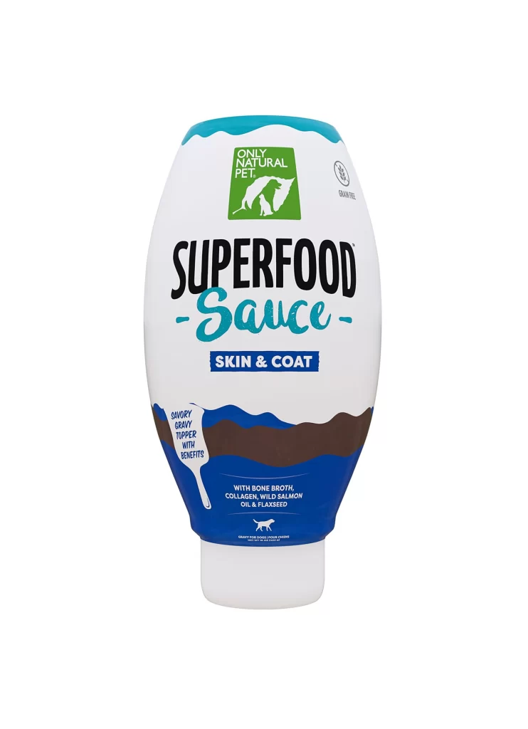
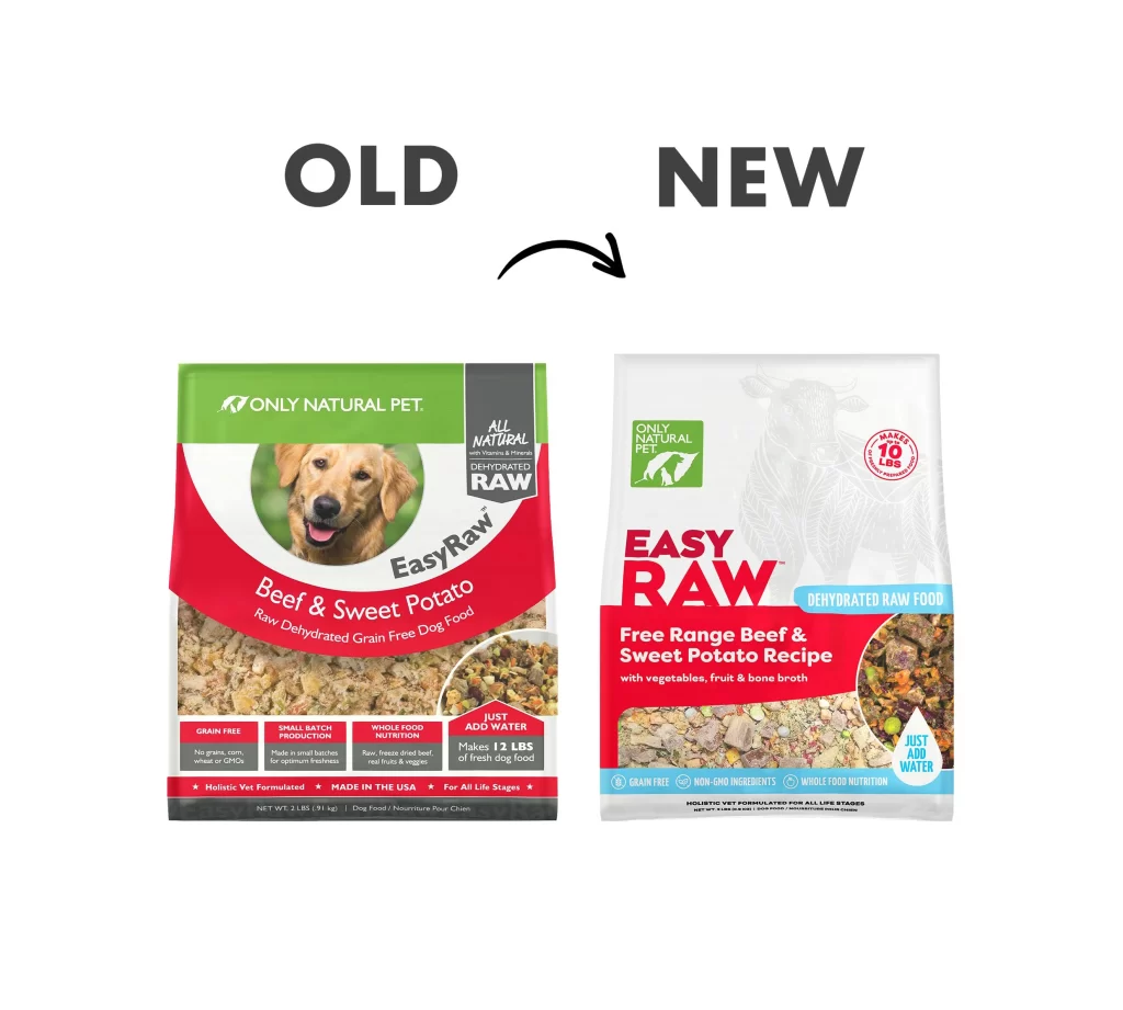
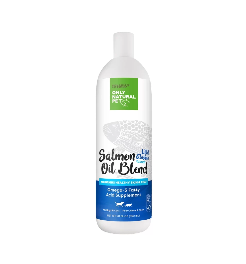
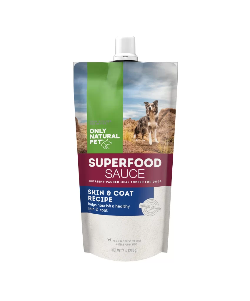
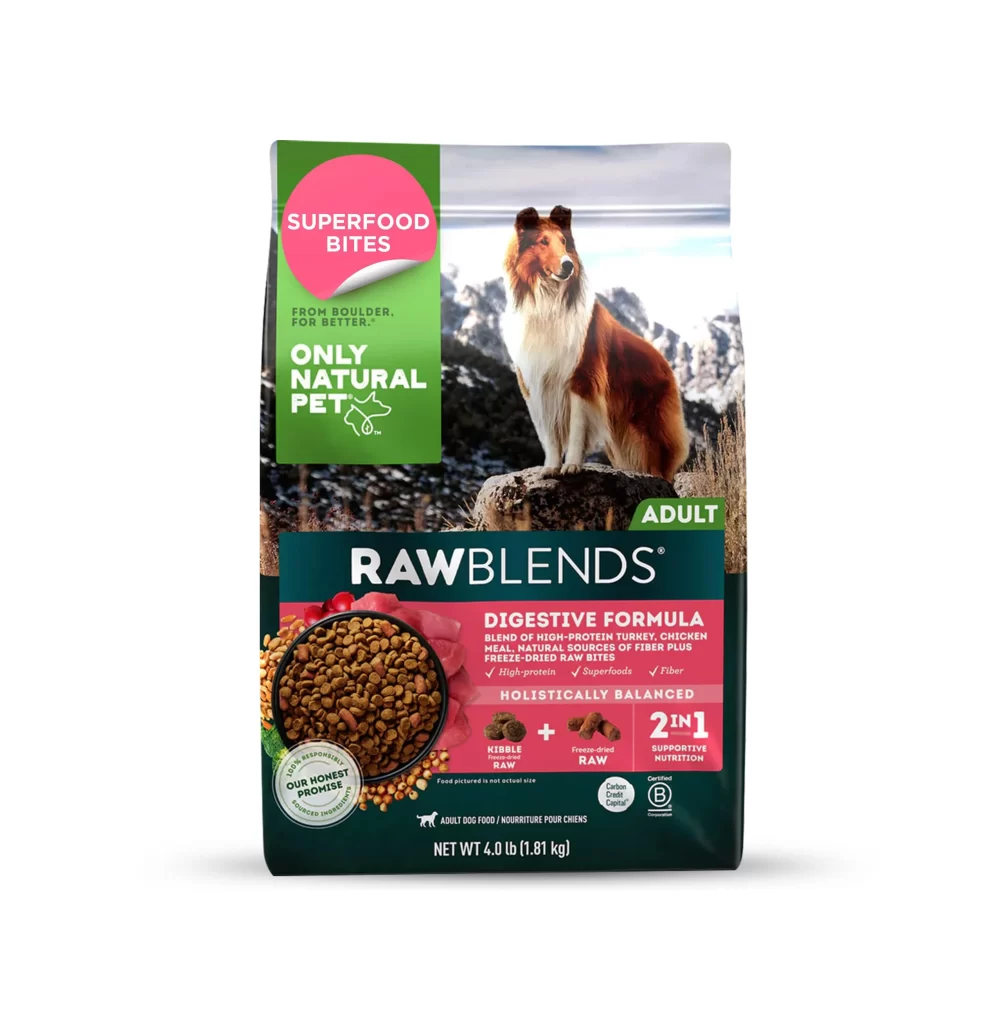
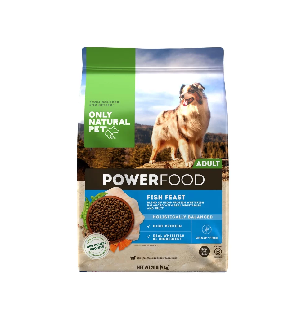
A vibrant green vertical banner anchors the left side of the packaging, featuring the brand name 'Only Natural Pet' in bold white sans-serif type above a minimalist line-art dog icon. To the right, a photograph captures an Australian Shepherd standing alert on rocky terrain against a backdrop of rolling hills and a pale blue sky, with the product name 'POWERFOOD' emblazoned across a dark brown horizontal band. The lower half reveals a circular window displaying dark brown kibble surrounded by fresh vegetable illustrations, while blue and black informational blocks detail the 'Fish Feast' recipe and grain-free certification.
Visual hierarchy is established through a disciplined color-blocking strategy that separates brand identity from product specifics without cluttering the composition. The juxtaposition of the lifestyle photography with clean, geometric text zones creates a professional yet approachable aesthetic typical of premium pet nutrition marketing. Notably, the integration of nutritional claims like 'High-Protein' and 'Real Whitefish #1 Ingredient' within distinct colored fields ensures readability while maintaining the overall structured layout.
Packaging designers studying retail food branding would find this composition useful for analyzing how to balance imagery with dense technical information. Marketing teams could utilize this visual structure to plan their own shelf-ready concepts, particularly when needing to highlight specific ingredient benefits alongside emotional animal photography. Art directors might also reference this example when briefing photographers on how to shoot canine subjects that complement rather than compete with typographic elements.