Only Natural Pet Dog Food Bag View
DownloadTopics
Details
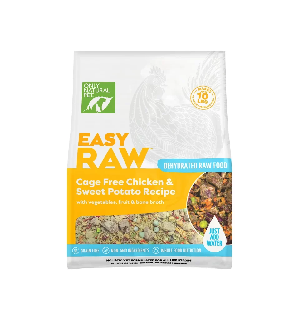
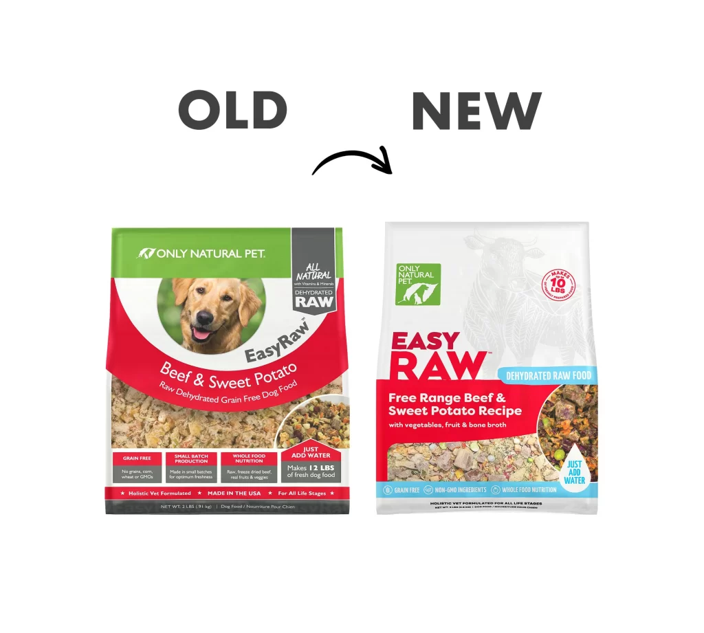
Two pet food bags sit side by side on a white background, with a curved black arrow pointing from left to right between the bold gray text labels 'OLD' and 'NEW' positioned above them. The older package features a vibrant green header with the 'ONLY NATURAL PET' logo, a large red swoosh containing a circular photo of a golden retriever, and 'EasyRaw Beef & Sweet Potato' printed in white script over a textured kibble image. Its replacement displays a predominantly white design with a subtle cow illustration watermark, bold red 'EASY RAW' lettering, and a blue banner reading 'DEHYDRATED RAW FOOD' above a circular food photograph showing visible vegetable pieces mixed with the grain-free base.
Visual contrast between these iterations highlights a strategic shift from busy, multi-colored graphics to sophisticated whitespace and refined typographic hierarchy. The redesign emphasizes premium positioning through cleaner iconography and a structured color palette that guides the eye toward key nutritional claims like grain-free and whole-food nutrition. Anyone studying packaging evolution will appreciate how this comparison illustrates modern branding techniques that balance information density with aesthetic clarity, especially since the full-resolution file is available for free download to examine every detail up close.
Product designers and marketing teams can leverage this side-by-side view when presenting rebrand concepts to stakeholders or analyzing competitor packaging strategies. Art directors might use it as a case study in how pet food brands transition from traditional layouts to contemporary minimalism while maintaining brand recognition. Students of visual communication could also reference this material when exploring how color psychology and spatial organization influence consumer perception in retail environments.