Apple Logo
Topics
Details
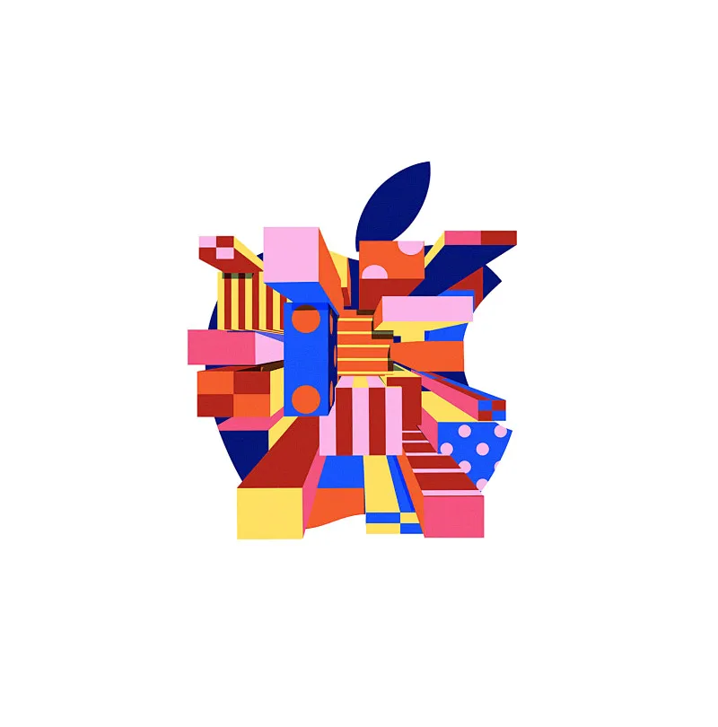
Vibrant geometric blocks in shades of cobalt blue, hot pink, tangerine, and lemon yellow assemble into the familiar silhouette of an apple complete with a single dark navy leaf. Rectangular prisms, striped cylinders, and polka-dotted planes intersect at dynamic angles to construct the fruit's form, while circular motifs punctuate vertical blue elements like oversized buttons. The entire composition floats on a clean white surface that allows every saturated hue and hard-edged shadow to register with maximum clarity.
What distinguishes this interpretation is its rejection of smooth gradients in favor of a chaotic yet harmonious assembly of three-dimensional primitives that feel almost architectural. Each component carries its own pattern—vertical stripes, checkerboards, or scattered dots—creating a visual rhythm that rewards close inspection while maintaining the logo's iconic readability from a distance. The isometric perspective lends genuine depth to what might otherwise be a flat graphic symbol.
Motion designers studying how to deconstruct corporate identities into modular animation assets would find this particularly useful for understanding part-based movement systems. Brand strategists exploring playful reimaginings of tech aesthetics could reference the color relationships and pattern mixing when developing campaigns for creative software or educational platforms. Art directors commissioning illustration work might share this with collaborators to communicate a brief centered on constructive geometry and bold palette combinations.