HiPP Organic Raspberry Rice Cakes Packaging
Topics
Details
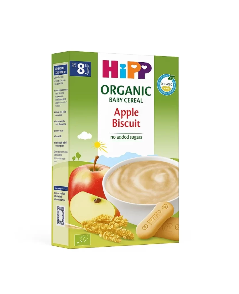
A vibrant red-to-green gradient background frames the central white panel of this baby food package, which features the HiPP logo in bold, multicolored letters. Below the brand name, the product is identified as 'Himbeer Reiswaffeln' in dark blue type, with 'glutenfrei' noted underneath in a smaller font. The lower portion displays a cheerful illustration of an orange elephant holding a raspberry, alongside a red apple, fresh raspberries, and two round rice cakes set against a pastoral landscape with distant blue mountains.
Visual hierarchy is established through the strategic placement of age-appropriate markers, specifically the blue box indicating 'AB 8. MONAT' in the upper left corner and the circular organic certification seal on the right. The transition from the saturated crimson top section to the lime green base creates a natural visual flow that draws the eye toward the appetizing food photography and friendly mascot character. Such color coding effectively communicates both the organic nature of the ingredients and the intended developmental stage for the consumer.
Packaging designers studying infant nutrition branding might analyze how the combination of photographic realism and cartoon elements balances trust with approachability. Marketing teams could examine the typographic choices and spatial arrangement to understand how critical dietary information, such as gluten-free status and organic certification, is prioritized for quick parental scanning. Illustrators looking to create similar assets would benefit from noting the specific palette used for the mascot and the soft, rounded rendering style of the natural elements.