HiPP Organic Combiotic Baby Formula Packaging
Topics
Details
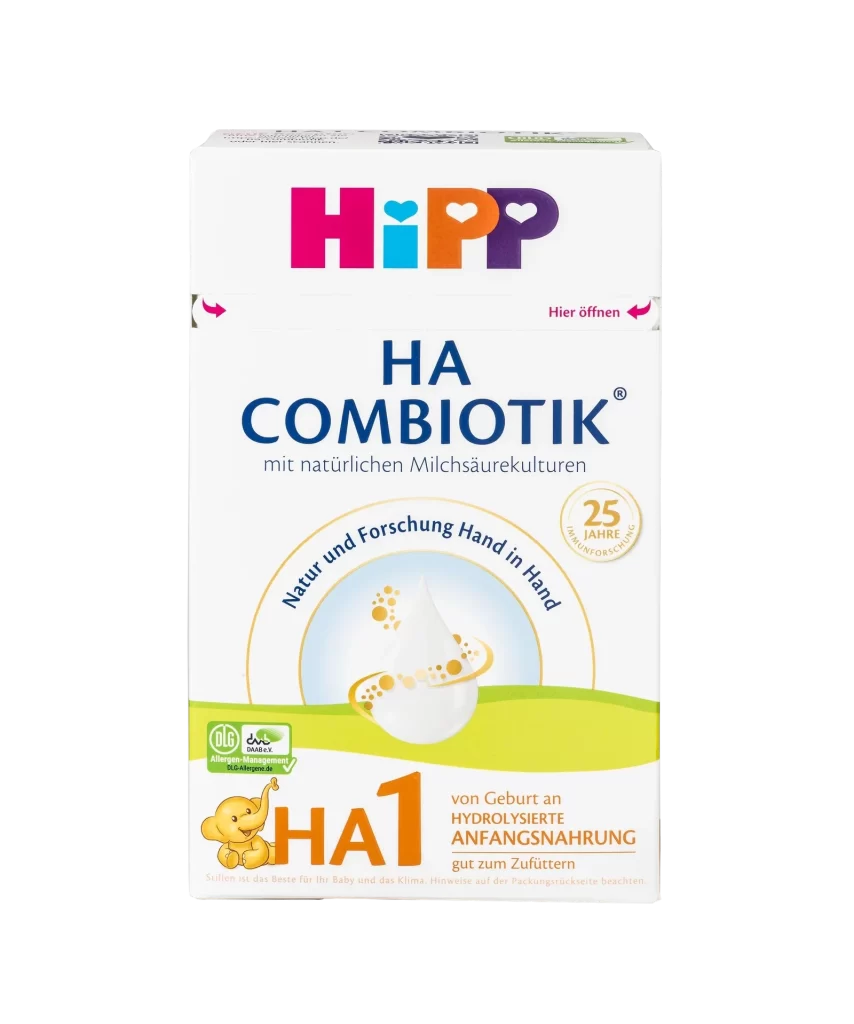
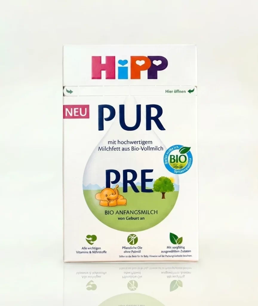
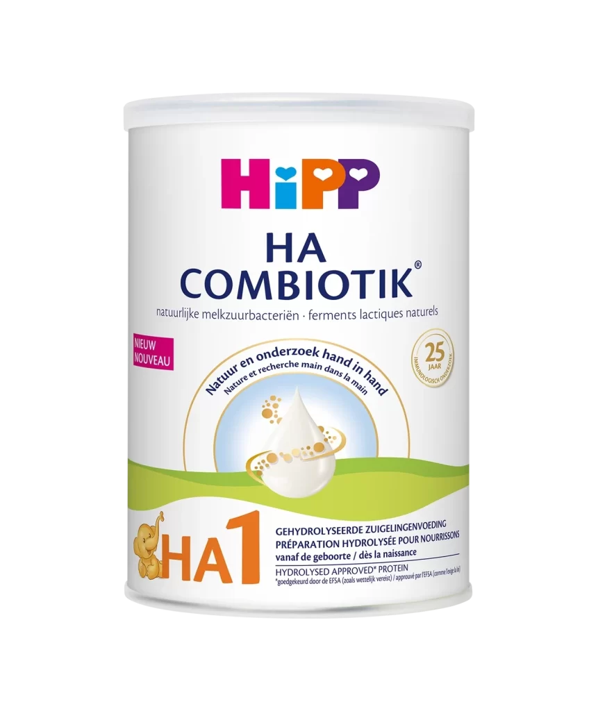
A rectangular cardboard carton for HiPP Organic Combiotic infant milk sits on a white surface, captured from a clean front-facing perspective with soft, even lighting that eliminates harsh shadows. The primary visual identity relies on a vibrant, multi-colored logo at the top—utilizing magenta, cyan, orange, and purple—situated above bold navy blue typography spelling out 'ORGANIC COMBIOTIC'.
Visual interest is generated through the strategic use of circular badges and icons that break up the vertical space, including a prominent blue seal for ‘Vitamin D’ and a green leaf emblem certifying organic status. The side panel introduces a structured grid of informational text and smaller circular graphics, creating a dense but organized layout that balances marketing claims with technical data. A distinct color palette of natural greens and clinical blues reinforces the brand’s positioning as both nature-inspired and scientifically validated.
Brand strategists might utilize this layout to study how organic certifications and health claims are prioritized on premium consumer goods packaging. Packaging engineers could examine the placement of the ‘Please open here’ instructional arrows to understand user experience cues on sealed cartons. Illustrators may reference the specific rendering of the honeycomb texture and the soft-gradient background elements when developing assets for the nutrition sector.