HiPP PUR 2 Bio Folgemilch White Baby Formula Packaging
Topics
Details
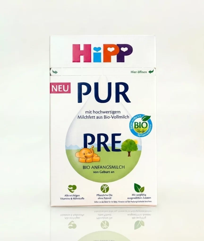
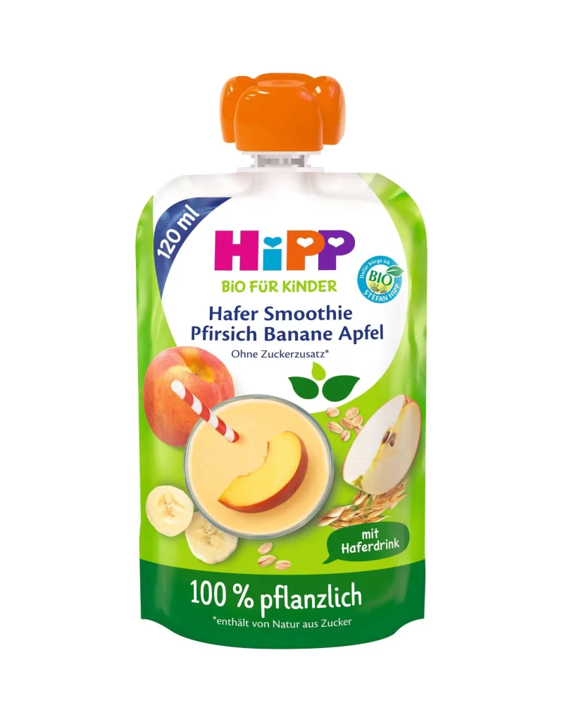
The HiPP logo anchors the upper portion of the packaging in a vibrant palette of magenta, cyan, orange, and violet. A bold magenta 'NEU' tag sits to the left of the large navy blue 'PUR' typography that dominates the upper half of the composition on a white surface. Below this text, a translucent teardrop-shaped graphic contains a pastoral scene with a cartoon
Visual hierarchy is established through the contrast between the saturated brand colors and the soft, organic imagery within the central bubble. The integration of the circular ‘BIO’ seal and three distinct green icons at the bottom creates a structured grid that balances the playful illustration above. This specific iteration relies on clarity and whitespace to emphasize the product’s purity claims, using the teardrop shape as a natural frame for the stage-based numbering system.
Brand strategists might analyze this layout to understand how organic certifications are integrated into primary marketing real estate without cluttering the core message. Packaging engineers could study the placement of nutritional icons to optimize information density for parental decision-making. Furthermore, illustrators may reference the specific color harmonies used to make the mascot appear friendly yet professional within a clinical product context.