HiPP HA Combiotik Baby Food Packaging
Topics
Details
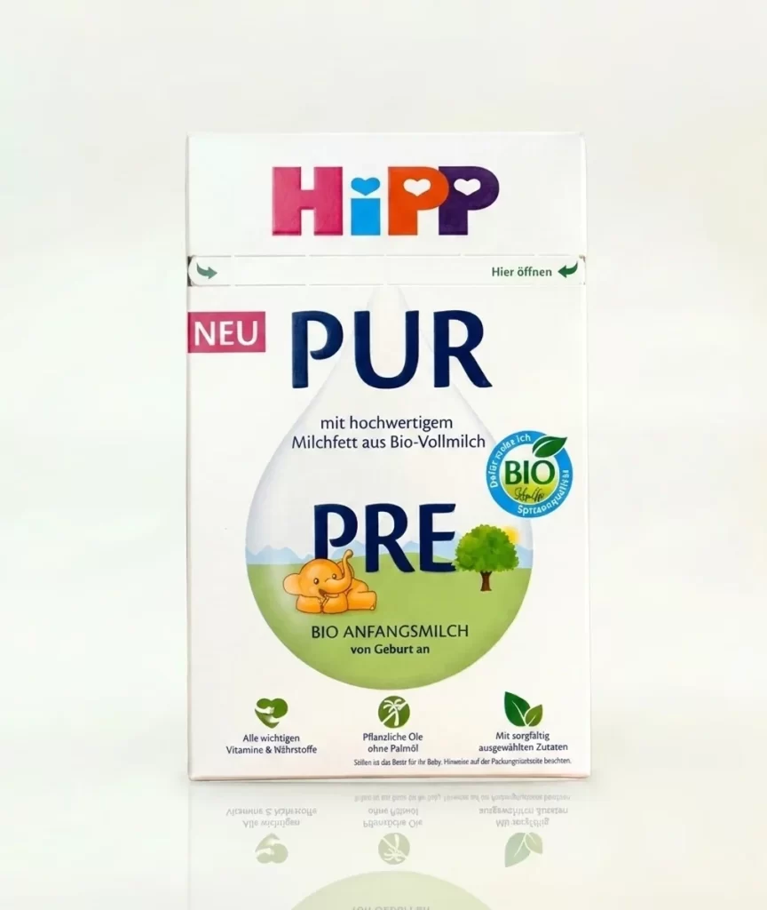
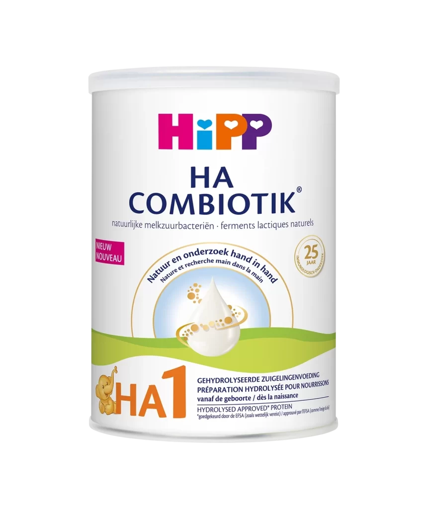
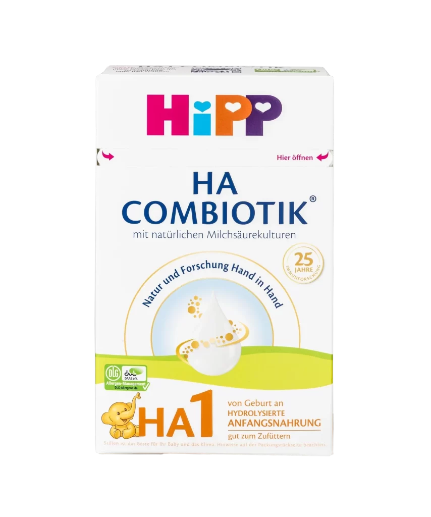
A rectangular cardboard box displays the iconic HiPP logo in a vibrant palette of magenta, cyan, orange, and purple above the bold blue text 'HA COMBIOTIK'. Below this title, a soft circular graphic contains a white milk drop surrounded by golden bubbles, while a bright lime-green band stretches across the lower third to anchor the orange 'HA1' designation and a small yellow elephant mascot.
Visual hierarchy is established through a clever mix of playful typography and reassuring medical-style labeling that signals both safety and nutrition. The use of soft, rounded shapes in the central illustration contrasts effectively with the sharp, authoritative lines of the product name and stage indicator. Furthermore, the specific color coding—particularly the distinct green band—helps differentiate this hypoallergenic formula from standard versions on a crowded retail shelf.
Brand strategists analyzing the baby food market will find this layout useful for studying how to balance organic aesthetics with clinical trust. Packaging engineers can examine the placement of functional elements like the ‘Hier öffnen’ (Open here) indicators and the integration of regulatory badges. Additionally, illustrators looking to create mascots for sensitive skin or dietary products might reference the gentle, approachable style of the elephant character featured here.