HiPP Sensitiv White Milk Lotion Packaging
Topics
Details
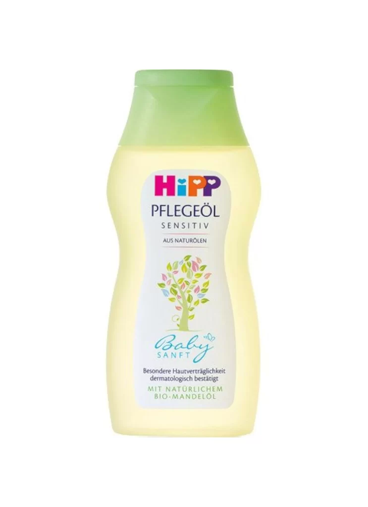
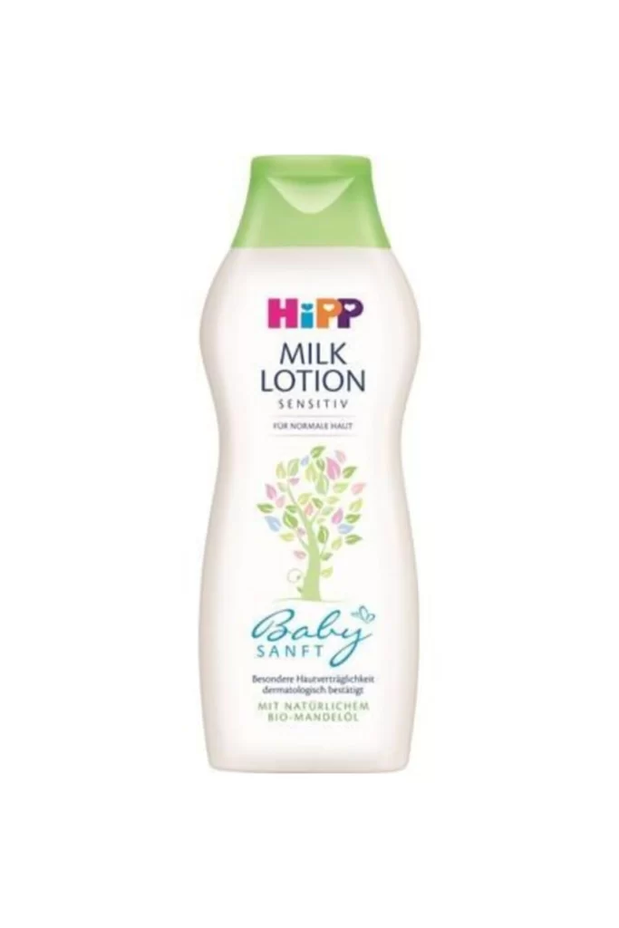
The HiPP bottle features an ergonomic, curved silhouette topped with a vibrant lime-green flip-top cap, its main body presenting a clean off-white surface that displays the brand's colorful logo above 'MILK LOTION' in bold black sans-serif type. Below the text sits a delicate illustration of a tree rendered in pastel green and pink leaves on a white background.
Visual interest is generated through the clever contrast between the clinical precision of the uppercase product information and the whimsical, hand-drawn quality of the botanical graphic. The color palette is intentionally restrained yet effective, using the bright green accent to draw the eye upward while the pastel tree provides a gentle focal point in the center. This specific version of the packaging emphasizes a ‘Sensitiv’ and natural identity through its minimalist layout and the prominent placement of organic certification text.
Product photographers might study this composition to understand how to highlight translucent plastic materials without creating distracting glare. Brand strategists could analyze the hierarchy of information to see how medical-grade trust signals are balanced with emotional, child-friendly imagery. Furthermore, 3D modelers looking to recreate consumer goods for virtual environments would find the subtle gradients on the bottle’s curves and the specific texture of the matte finish particularly useful for achieving realism.