HiPP First Infant Milk Baby Formula Packaging
Topics
Details
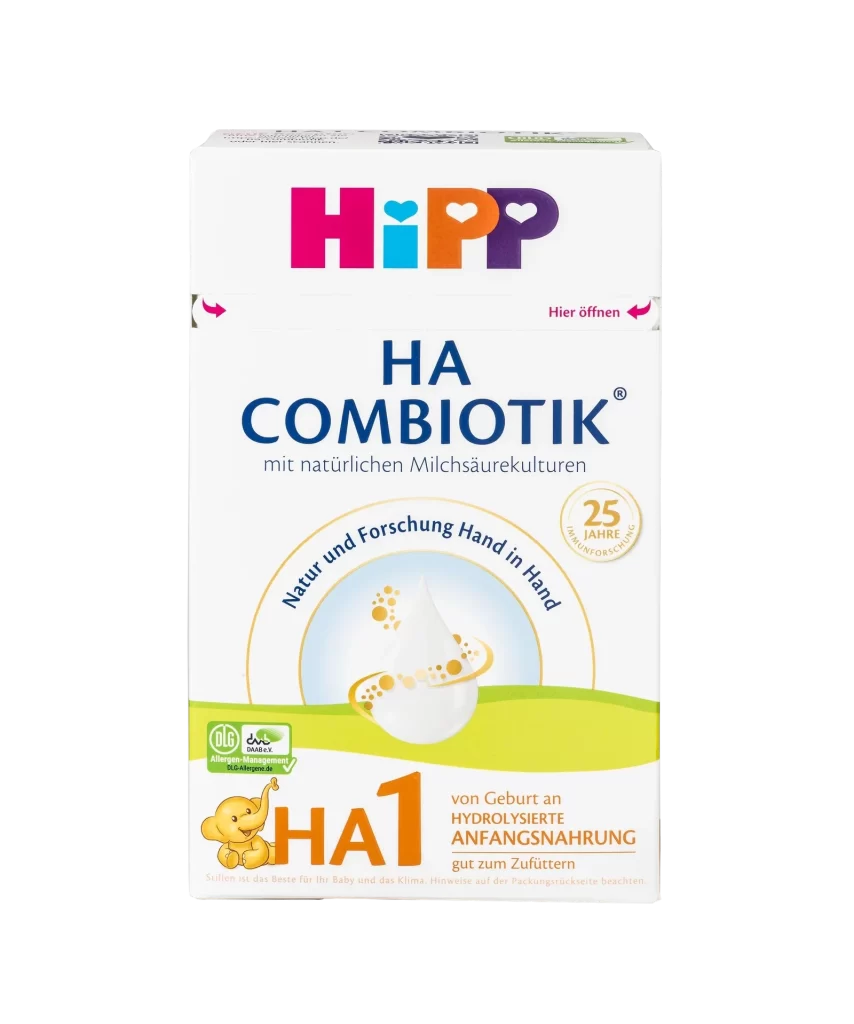
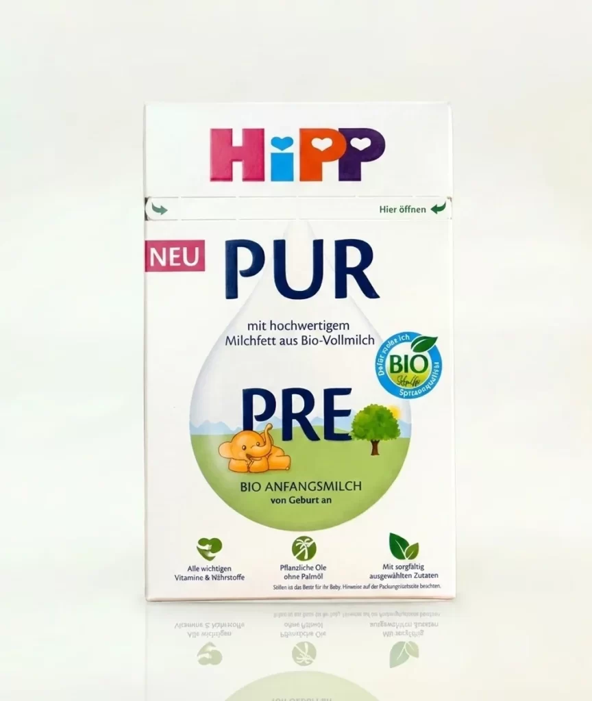
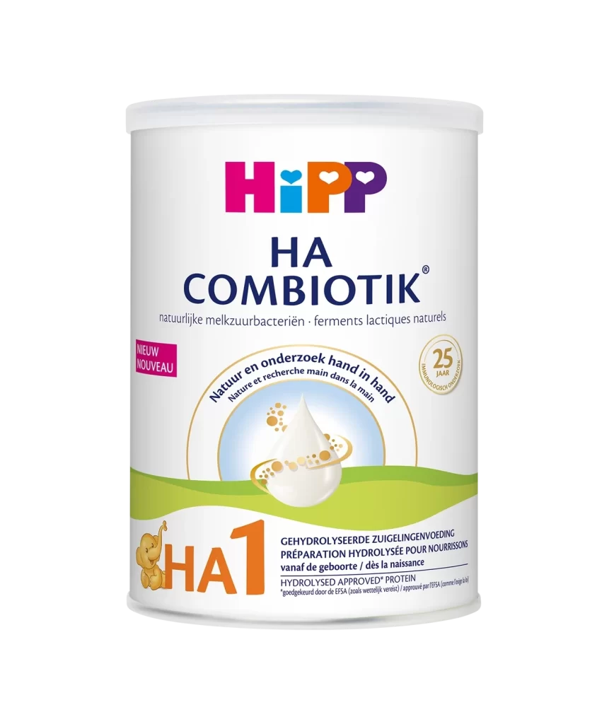
A rectangular white carton of HiPP Organic Combiotic First Infant Milk stands front-facing, its surface illuminated by soft, even lighting that minimizes shadows. The packaging displays the iconic HiPP logo in vibrant magenta, cyan, orange, and purple above the word 'organic' rendered in deep forest green serif typeface, with the number 1 prominently featured in matching green to the right. Below the branding text, a pastoral illustration of rolling green hills, leafy trees, and three white ducks occupies the lower portion against the white background.
Visual distinction arises from the strategic use of the combiotic® trademark and specific nutritional callouts like DHA, which are presented in a clear typographic hierarchy that guides the eye from brand identity to product specifics. The inclusion of the ‘Open here’ instructional arrows near the top seal adds a functional graphic element that breaks up the vertical space, while the circular organic certification badge provides a trusted visual anchor in the lower right quadrant. Such a layout effectively balances commercial branding with reassuring natural imagery to appeal to health-conscious consumers.
Brand strategists might utilize this composition to analyze how color psychology is applied within the organic baby food sector, specifically noting how greens and earth tones are paired with playful primary colors. Packaging engineers could study the placement of functional text versus decorative elements to optimize user experience on similar retail boxes. Illustrators seeking to understand the market standards for children’s product art would find the stylized landscape and animal motifs particularly instructive for their own projects.