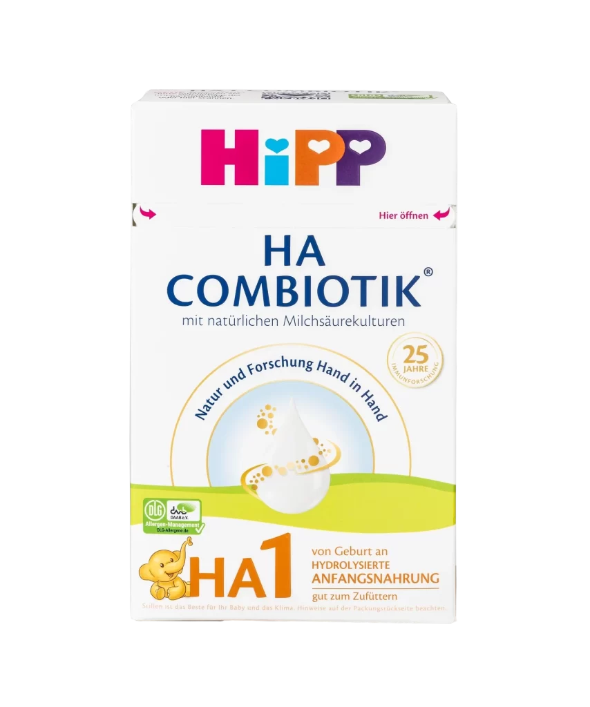
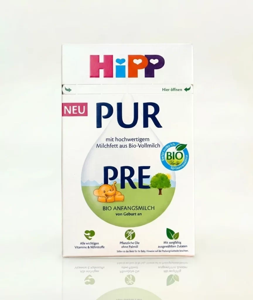
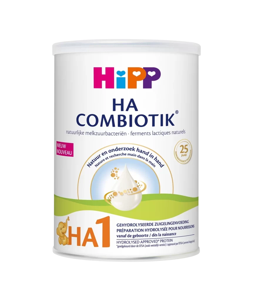
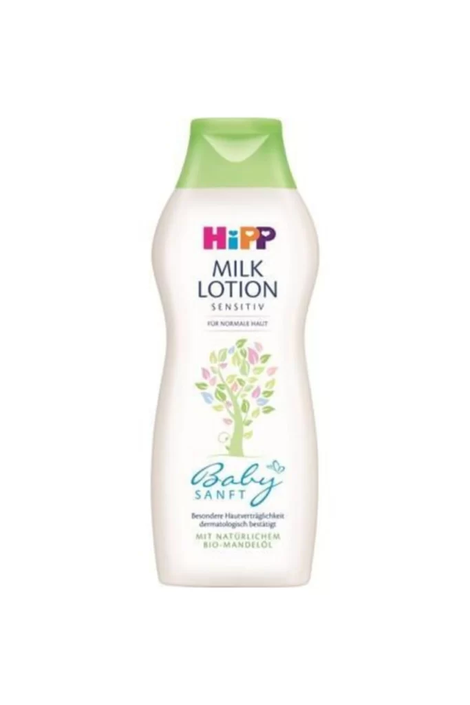
HiPP Comfort Milk Baby Food Packaging
Topics
Details
A cylindrical tin of HiPP Comfort Milk presents a direct, frontal view that eliminates all shadows, set on a white surface. The packaging features the brand's signature logo in bold magenta, cyan, orange, and violet, positioned above an idyllic pastoral illustration of rolling green hills, grazing cows, and a solitary tree under a pale blue sky. Key textual elements, including '60+ Years of Experience' and 'COMFORT MILK FROM BIRTH,' appear below the scenic graphic alongside icons highlighting reduced lactose for colic support.
Visual interest is generated through the deliberate contrast between the clinical white substrate and the vibrant, almost toy-like color palette used for the branding and landscape art. The composition balances corporate trustworthiness with gentle, organic imagery, utilizing the heart-shaped motifs within the lettering to soften the medical positioning of the product. By integrating the ‘New Easy to Use Pack’ callout into a cloud graphic, the designers successfully merge functional information with the overall whimsical aesthetic without cluttering the visual field.
Marketing teams analyzing infant nutrition branding will find this layout useful for studying how to convey medical efficacy alongside emotional warmth. Packaging engineers can examine the spatial distribution of mandatory regulatory text versus marketing copy on a curved surface. Furthermore, illustrators looking to master the style of modern commercial landscapes can deconstruct the layering techniques used in the background scenery to achieve a sense of depth and tranquility.