HiPP BIO Combiotik Baby Food Variant 2 Packaging
Topics
Details
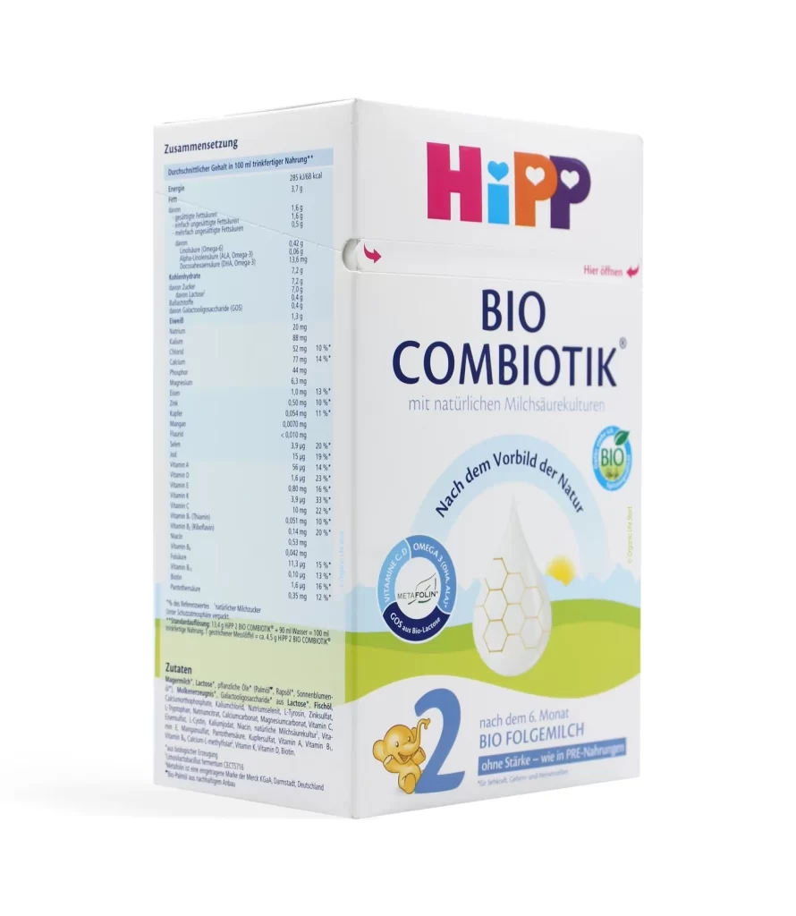
A cylindrical white tin of HiPP BIO Combiotik infant formula stands upright on a white surface, viewed from a straight-on perspective that emphasizes its symmetrical layout. The packaging displays the brand's signature logo in vibrant magenta, cyan, orange, and purple above bold navy blue typography spelling out the product name, while a pastoral illustration with green hills and a honeycomb-patterned droplet occupies the lower portion.
Visual hierarchy is established through a strategic mix of sans-serif fonts and colorful badges that draw the eye to key selling points like ‘Metafolin’ and organic certification. The inclusion of dual-language text in Dutch and French suggests a market-specific design approach, while the soft, natural imagery contrasts with the clinical precision of the nutritional information. Such a layout effectively balances regulatory requirements with an approachable, wholesome aesthetic that appeals to health-conscious parents.
Brand strategists might analyze this composition to understand how color psychology is applied in the infant nutrition sector, particularly the use of greens and blues to signal safety and nature. Packaging engineers could study the spatial arrangement of mandatory legal text versus marketing graphics to optimize their own label designs. Additionally, illustrators looking to create similar pastoral scenes for food products would find the layering of vector elements and photographic textures a useful case study in modern commercial art.