HiPP Multi Grain with Buckwheat Baby Cereal Packaging
Topics
Details
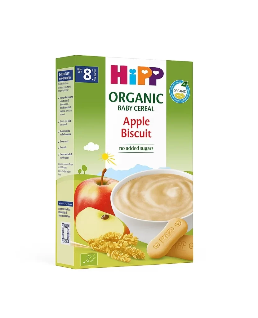
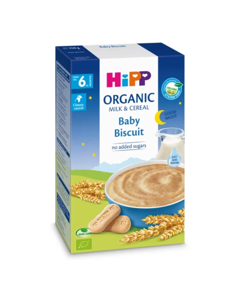
The rectangular HiPP Organic Baby Cereal box features a vibrant lime green and white color scheme, accented by the brand's signature multi-colored logo. Photographed from a slight three-quarter angle on a white surface, the packaging reveals both the front marketing panel displaying 'Multi Grain with Buckwheat' and the right-side nutritional information. A white ceramic bowl filled with creamy cereal dominates the lower center of the design, surrounded by illustrations of corn, buckwheat grains, and wheat stalks.
Visual hierarchy is established through bold, dark green serif typography for the product name, which contrasts sharply with the playful, rounded sans-serif of the primary brand mark. A distinct red diagonal banner in the upper left corner draws immediate attention to the ‘NEW RECIPE’ update, while circular organic certification seals on the upper right reinforce the eco-friendly positioning. The overall aesthetic balances professional medical-grade clarity with approachable, child-friendly imagery, utilizing ample negative space to prevent visual clutter despite the density of required regulatory text.
Brand strategists analyzing competitive packaging in the organic infant nutrition sector would find this layout useful for studying color-coded age-appropriate signaling. Illustrators tasked with creating food photography compositions can examine how raw ingredients are artfully arranged around prepared dishes to suggest natural wholesomeness. Furthermore, regulatory compliance teams might utilize this example to understand how mandatory nutritional data and allergen warnings are integrated into consumer-facing designs without compromising the shelf appeal.