HiPP BIO Combiotik Baby Food Packaging
Topics
Details
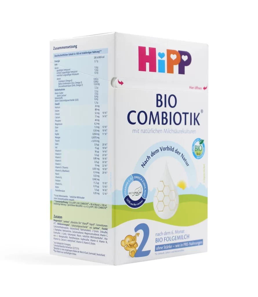
The HiPP BIO Combiotik baby formula box presents a clean white cardboard surface photographed from a three-quarter angle that reveals both the front branding and the left-side nutritional information panel. The packaging displays the brand's signature multi-colored logo in magenta, cyan, orange, and purple positioned above bold navy-blue typography spelling 'BIO COMBIOTIK', with a large number '2' and a small orange elephant mascot visible at the bottom indicating the follow-on milk stage for infants six months and older.
Visual hierarchy is established through the strategic use of scale and color contrast, particularly between the heavy sans-serif product name and the delicate, curved tagline ‘Nach dem Vorbild der Natur’ arching over the central graphic element. The integration of circular certification seals—specifically the organic BIO mark and the Omega-3 badge—adds layers of technical credibility without cluttering the primary message. Notable is the side panel’s dense typographic grid, which balances legibility with information density through careful weight and size differentiation.
Packaging designers analyzing infant nutrition markets will find this composition useful for studying how to organize complex regulatory information alongside emotional brand storytelling. Art directors tasked with creating eco-conscious product identities can examine the specific palette choices that signal organic purity while maintaining shelf appeal. Furthermore, 3D modelers requiring accurate surface textures and print finish references for consumer goods can utilize this as a benchmark for matte coating effects and foil stamping placement on cardboard substrates.