HiPP BIO Folgemilch Baby Formula Packaging
Topics
Details
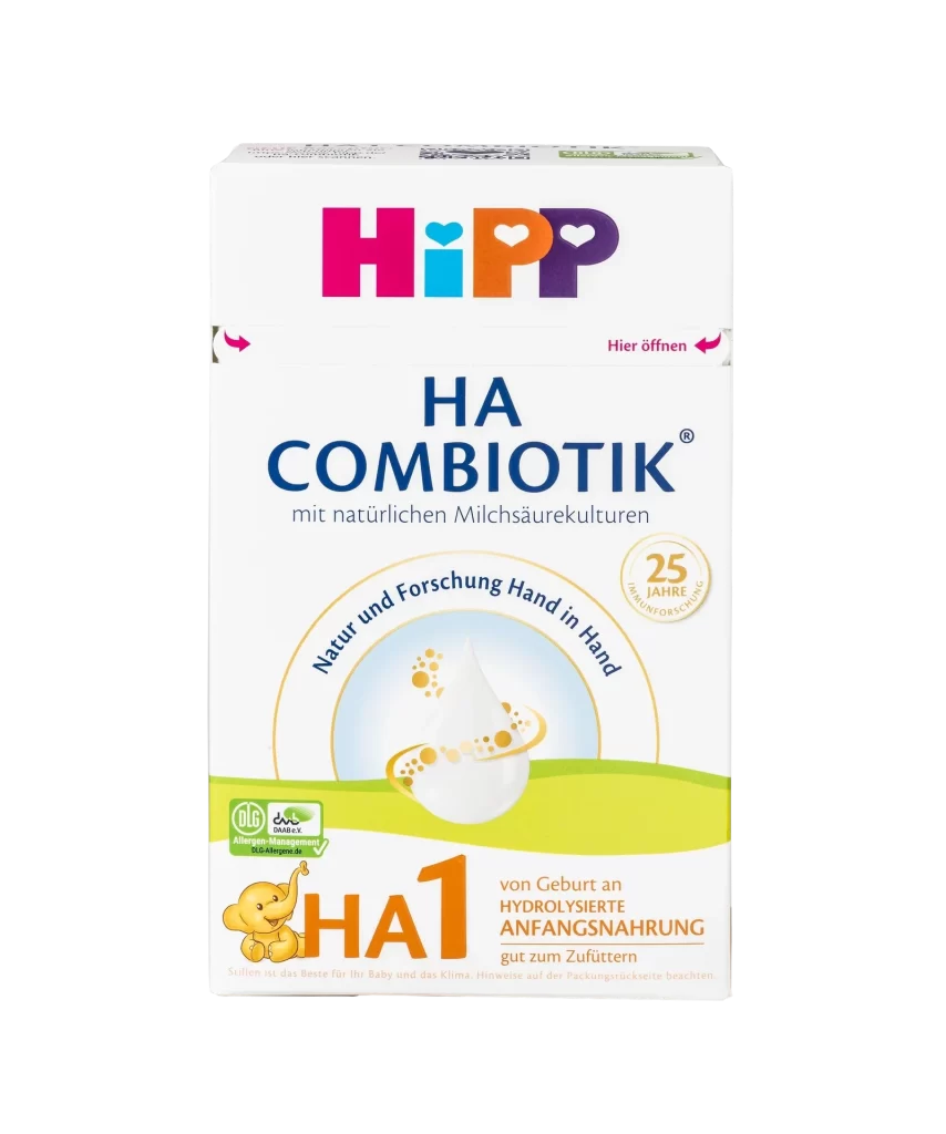
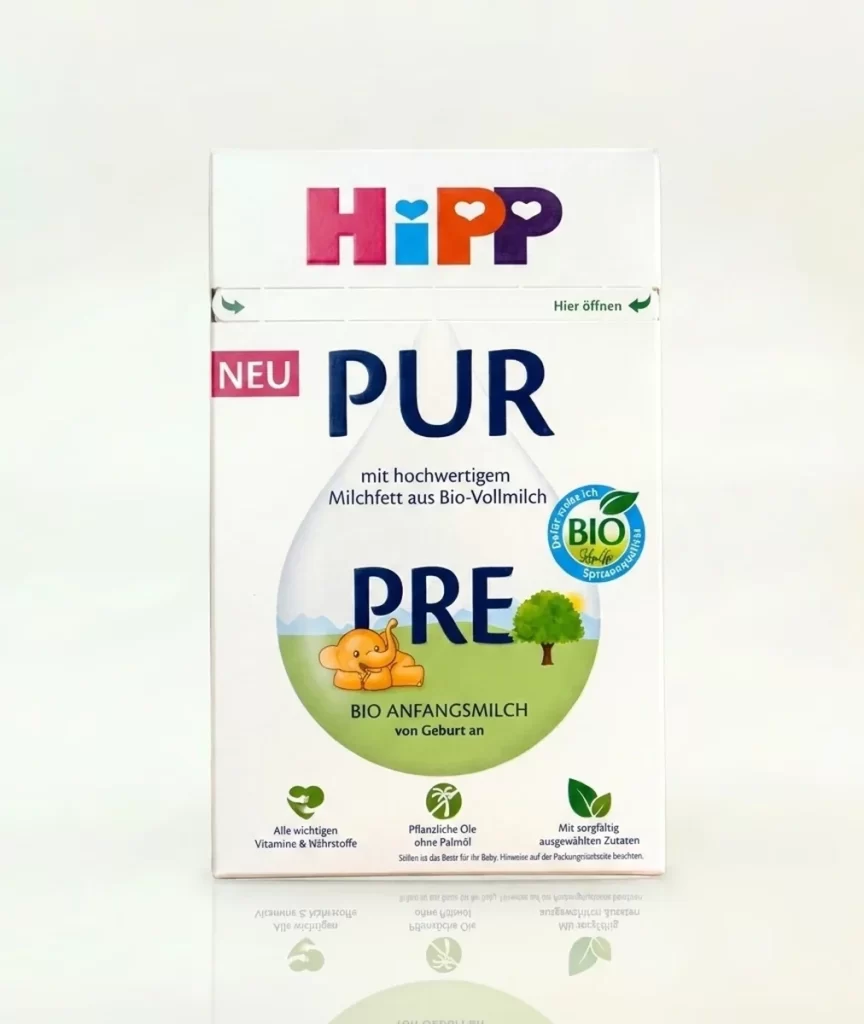
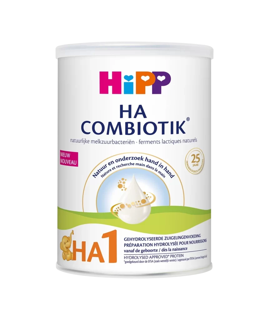
A clean white rectangular package dominates the frame, featuring the HiPP logo in vibrant magenta, cyan, orange, and purple at the top. Below the brand name, a bright pink 'NEU' tag sits to the left of the large, dark blue 'PUR' text. The central visual element is a large, translucent teardrop-shaped graphic containing a light green landscape, a cartoon elephant, a tree, and a bold number 2, all set against a plain white background with even, shadowless lighting.
The packaging design relies on a clear visual hierarchy that guides the eye from the colorful brand identity down to the specific product stage. By enclosing the stage number and animal mascot within a soft, organic shape, the layout creates a friendly focal point that contrasts with the sharp geometric typography above. This combination of playful illustration and structured information creates an approachable yet professional aesthetic typical of premium organic infant nutrition.
Brand managers analyzing competitive packaging in the organic baby food sector would find this layout useful for studying color-coded staging systems. Packaging engineers could reference the placement of certification badges and nutritional icons when planning label real estate for similar dairy products. Marketing teams might also examine how the 'PUR' sub-brand is visually differentiated from standard product lines through its specific typographic weight and color choices.