HiPP PUR PRE Baby Formula Packaging
Topics
Details
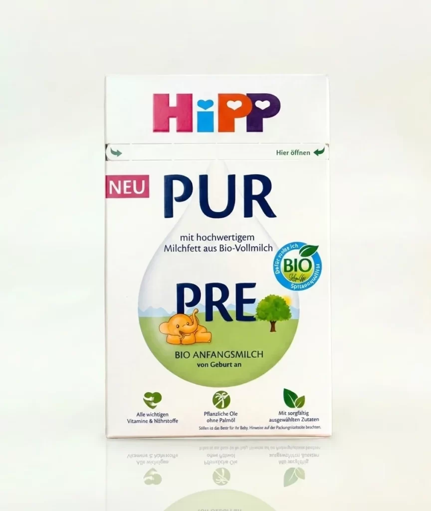
A rectangular HiPP PUR PRE infant formula carton stands upright, displaying the brand's signature multicolored logo in magenta, cyan, orange, and purple at the top. Bold navy typography spells 'PUR' above 'PRE' within a large translucent droplet graphic that contains a green landscape illustration with a cartoon elephant and tree. The packaging features additional German text including 'NEU', 'mit hochwertigem Milchfett aus Bio-Vollmilch', and a circular blue BIO certification seal, all set against a soft white background.
Visual hierarchy is established through the strategic interplay of scale and color, where the oversized water-drop silhouette organizes textual and illustrative elements into a cohesive focal point. The organic certification seal, rendered in blue and green with a leaf motif, reinforces the product’s ecological positioning while balancing the composition’s right side. Notable typographic contrast exists between the heavy sans-serif weight of the main product name and the lighter, smaller subtext describing milk fat content and age suitability.
Brand strategists analyzing competitive packaging in the organic infant nutrition sector would examine this artifact to understand current visual language conventions for premium European formulas. Packaging engineers might reference the structural layout when developing similar carton formats requiring clear nutritional communication alongside playful character elements. Marketing teams could study the color-coded icon system to evaluate how complex ingredient information is distilled into digestible visual cues for caregivers.