HiPP Anti-Reflux White Baby Formula Packaging
Topics
Details
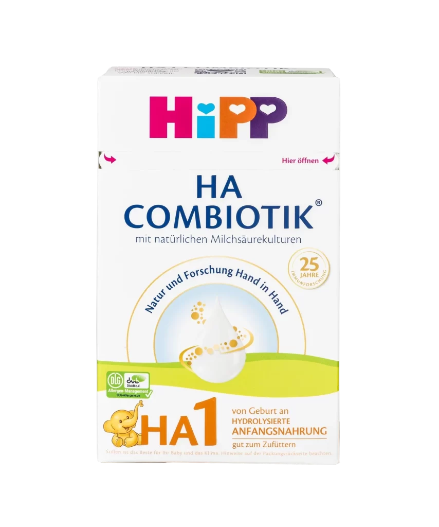
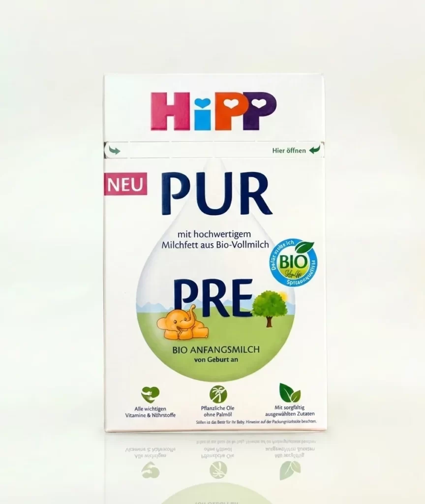
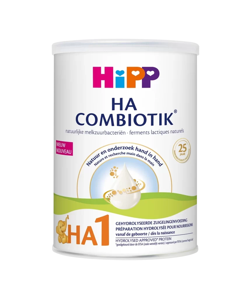
The HiPP Anti-Reflux packaging features a playful, multi-colored sans-serif logo in magenta, cyan, orange, and purple hues across the upper third, where each letter contains a small heart cutout. Bold navy blue typography announces the product name below the brand mark on a clean white surface. A green arc labeled 'Spezialnahrung' curves over descriptive text regarding reflux symptoms, while a yellow elephant mascot rests above large green 'AR' initials near the bottom.
Visual hierarchy is established through a sophisticated interplay of geometric color blocking and organic illustration, specifically the stylized green arc labeled ‘Spezialnahrung’ which frames the central medical indication. The lower portion transitions into a pastoral landscape featuring rolling lime-green hills and a pale blue sky, anchored by a friendly, simplified orange elephant mascot resting near large green initials ‘AR’. This juxtaposition of clinical information—such as the specific mention of increased spitting up—with whimsical graphic elements creates a distinctive aesthetic that balances parental reassurance with professional medical branding.
Brand strategists analyzing infant nutrition markets would utilize this layout to study how trust signals are integrated into consumer-facing packaging without overwhelming the visual field. Packaging engineers might examine the spatial distribution of mandatory regulatory text versus marketing copy to optimize their own label designs for similar specialized dietary products. Furthermore, illustrators working on children’s health brands could reference the specific color palette and character styling to ensure their own mascots convey the same sense of gentle reliability and safety.