HiPP Milk Lotion Sensitive Baby Lotion Packaging
Topics
Details
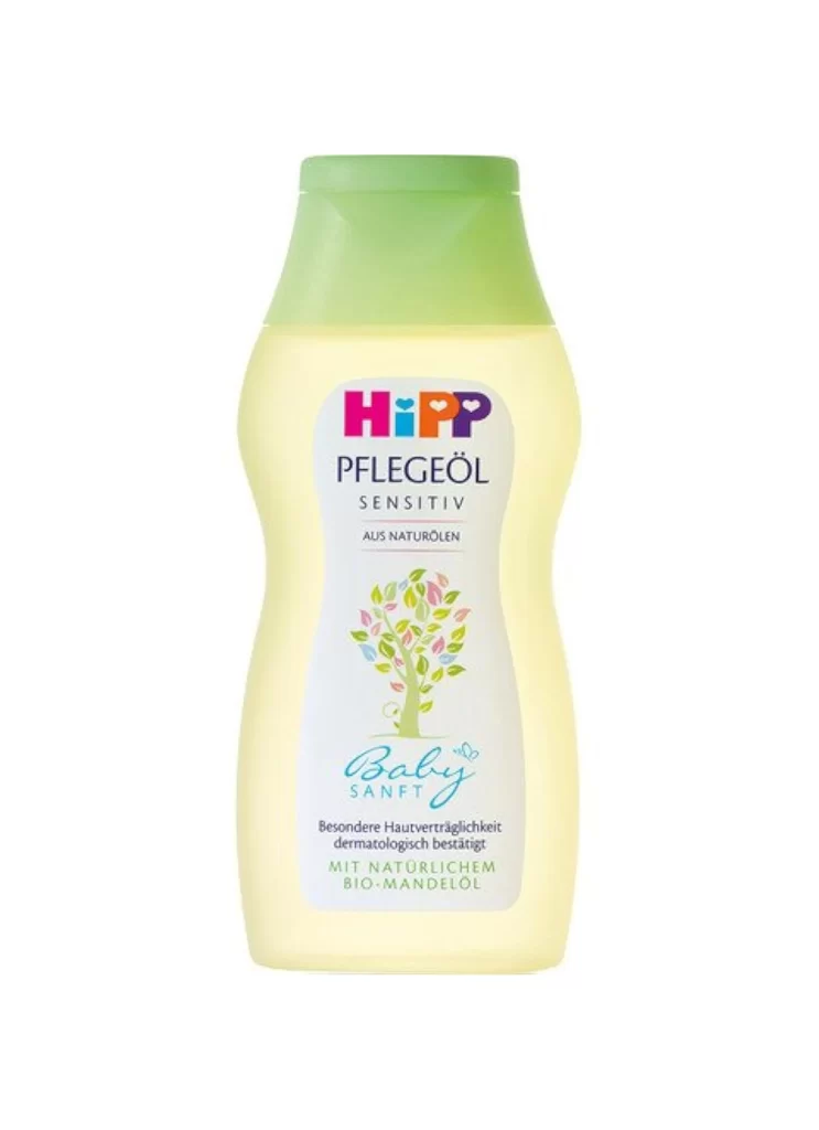
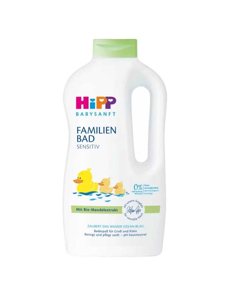
An ergonomic white bottle with a gently curved silhouette widens at the base before tapering toward the shoulder, topped by a pale sage-green flip-top cap that provides the primary color contrast. The HiPP logotype appears in vibrant magenta and orange above the teal 'BABYSANFT' sub-brand, while dark purple text identifies the product as 'MILK LOTION SENSITIV' beneath a small tree illustration with multicolored leaves. A blue 'NEU noch sanfter' badge, a green bar noting 'Mit Bio-Mandelöl', and a circular seal reading 'All unsere Sorgfalt für sensible Haut' complete the label design, which sits on a white surface.
Visual interest emerges from the strategic deployment of color blocking and organic iconography that signals gentleness without overwhelming the viewer. The muted green cap immediately suggests botanical ingredients or natural formulations, while the multicolored leaf motif introduces a playful yet sophisticated element typical of premium infant care aesthetics. A circular seal containing handwritten script adds a human touch to the otherwise geometric layout, creating a focal point that draws the eye downward through the information architecture.
Brand strategists analyzing the baby care market would examine this artifact to understand how established players balance clinical trust with emotional warmth in their visual identities. Packaging engineers might reference the specific proportions of the cap-to-body ratio when developing containers for similar viscosity liquids. Students of commercial photography could study the even, shadowless lighting setup required to eliminate glare on curved plastic surfaces while maintaining legibility across multiple text weights.