HiPP Apple Banana with Baby Biscuit Baby Food Packaging
Topics
Details
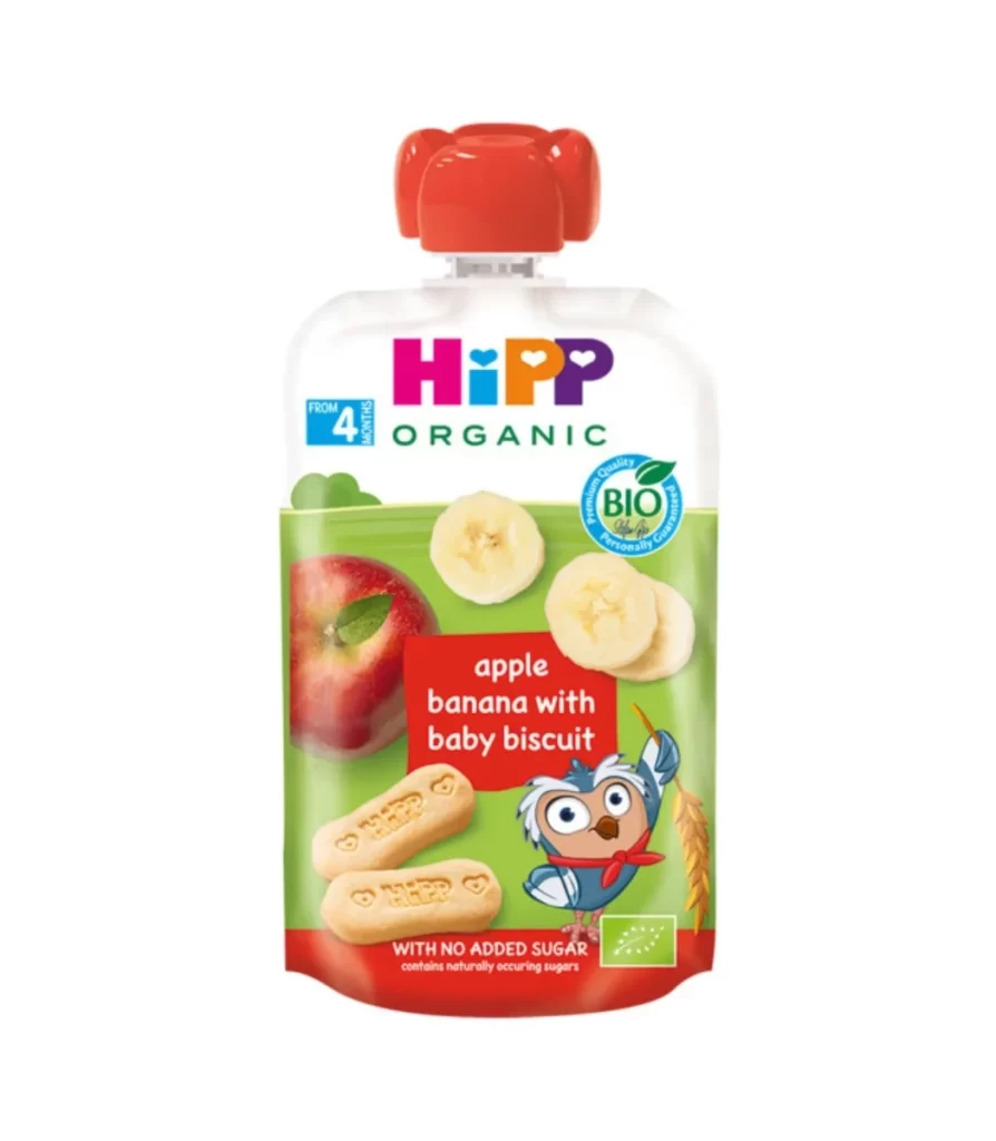
The HiPP organic baby food pouch stands upright with a red screw cap visible at the top, set on a white background. A vibrant green lower section transitions into white near the cap, displaying realistic images of a red apple, sliced bananas, and two oval biscuits. Bold multicolored letters spell out 'HiPP' above the word 'ORGANIC'.
Visual interest stems from the playful yet informative layering of elements, where the cartoon owl mascot holding wheat adds personality without overwhelming the product photography. The red rectangular label containing the flavor description creates a strong focal point against the green backdrop, effectively balancing nutritional information with appetizing visuals. Color coding helps parents quickly identify the organic nature and age appropriateness through distinct iconography placement.
Brand managers analyzing competitor packaging strategies in the infant nutrition sector would find this useful for studying color psychology and information hierarchy. Packaging engineers could examine how the pouch shape accommodates both standing display and easy squeezing functionality. Marketing teams developing visual guidelines for organic food products might reference this to understand effective integration of certification badges with character branding elements.