HiPP Junior Combiotik Baby Formula Packaging
Topics
Details
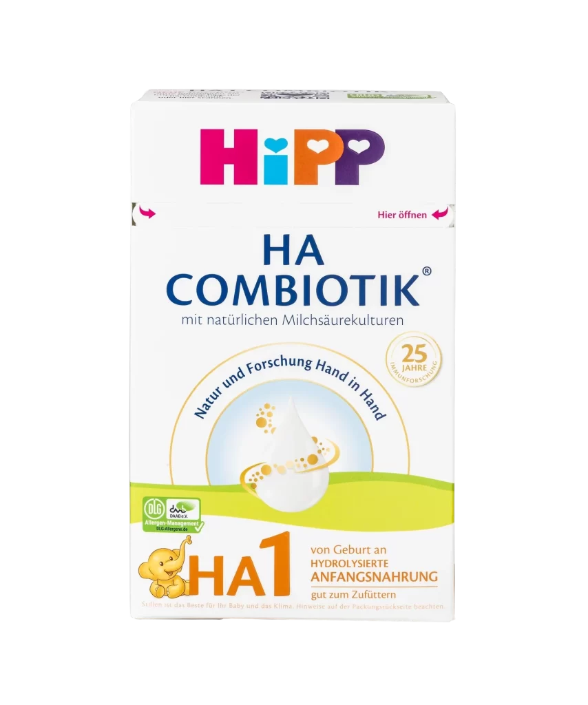
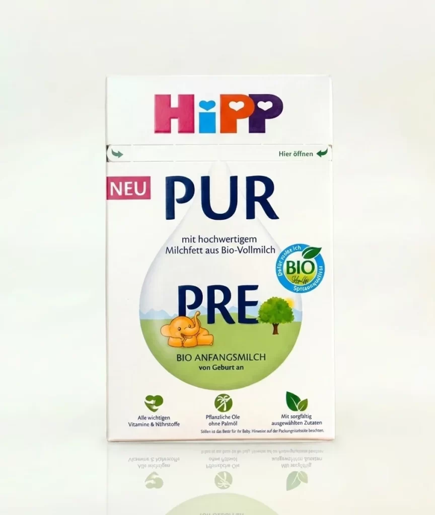
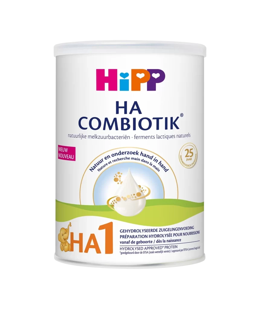
A cylindrical tin of HiPP Junior Combiotik formula stands on a white surface, viewed from a direct, eye-level angle. The packaging displays the brand's signature magenta and orange logo at the top, followed by 'JUNIOR COMBIOTIK' in bold blue and black typography. A large, translucent droplet containing a golden honeycomb pattern dominates the lower half of the design.
Visual hierarchy on this container relies heavily on color-coded informational zones to guide the consumer’s eye from brand identity to product specifics. The integration of the honeycomb motif within the liquid drop serves as a clever visual metaphor for the natural milk cultures mentioned in the text. Furthermore, the use of a bright pink badge for the ‘Metafolin’ formula update creates an immediate focal point that distinguishes this iteration from previous versions.
Brand managers analyzing competitive infant nutrition packaging will find the typographic weight distribution particularly useful for layout studies. Illustrators tasked with creating friendly mascots for children’s products can examine how the elephant character balances professional medical aesthetics with playful elements. Additionally, packaging engineers might reference the specific placement of multilingual nutritional claims to optimize label space on similar cylindrical containers.