HiPP Sensitiv Baby Shampoo Packaging
Topics
Details
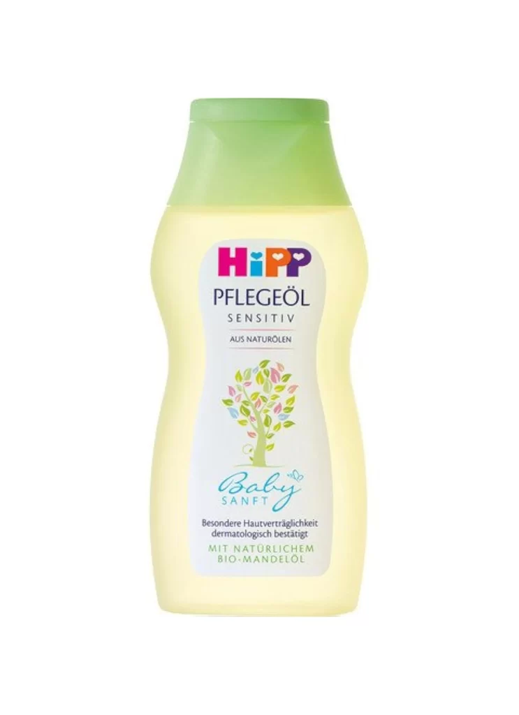
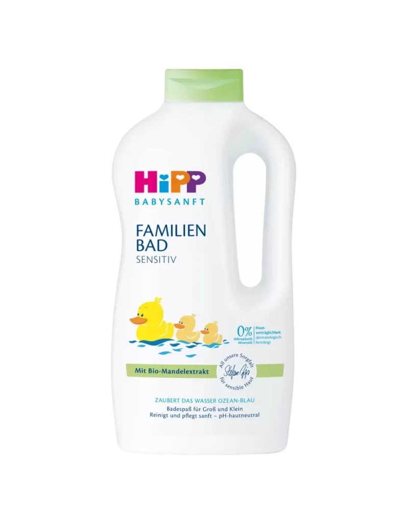
HiPP's Babysanft shampoo bottle pairs a softly curved white body with a matte green flip-cap, captured straight-on in a shadow-free product shot. Circular 'Sehr gut' quality seals and tear-free claims sit on the front face in the brand's soft blue-green palette. Subtle molded contours at the waist suggest an easy grip for small hands during bath time.
Visual hierarchy is established through the strategic use of color blocking and iconography that signals gentleness and natural ingredients. The contrast between the clinical white plastic and the organic green accents immediately communicates the product’s sensitive-skin purpose without requiring text comprehension. Furthermore, the inclusion of the circular ‘Sehr gut’ quality seal and the specific claim of being tear-free from day one provides immediate visual trust signals for caregivers examining the shelf.
Brand managers analyzing competitor packaging in the European baby-care market will find the typographic weight and color palette particularly instructive for their own line extensions. Industrial designers tasked with creating ergonomic dispensers can study how the bottle’s curvature suggests ease of handling during bath time. Additionally, marketing teams focusing on eco-conscious labeling will benefit from dissecting how the bio-extract callout is integrated into the overall layout without cluttering the design.