HiPP Organic Infant Milk Baby Formula Packaging
Topics
Details
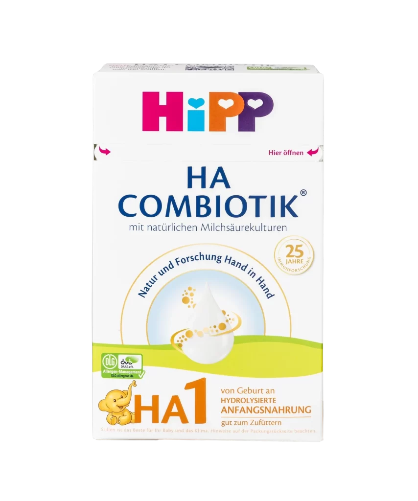
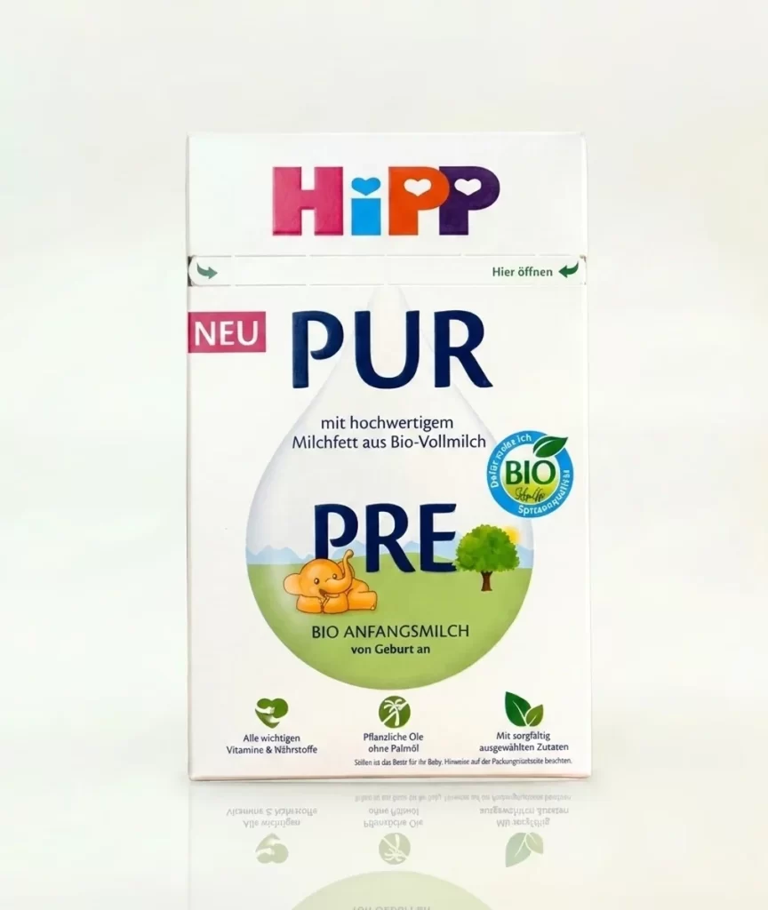
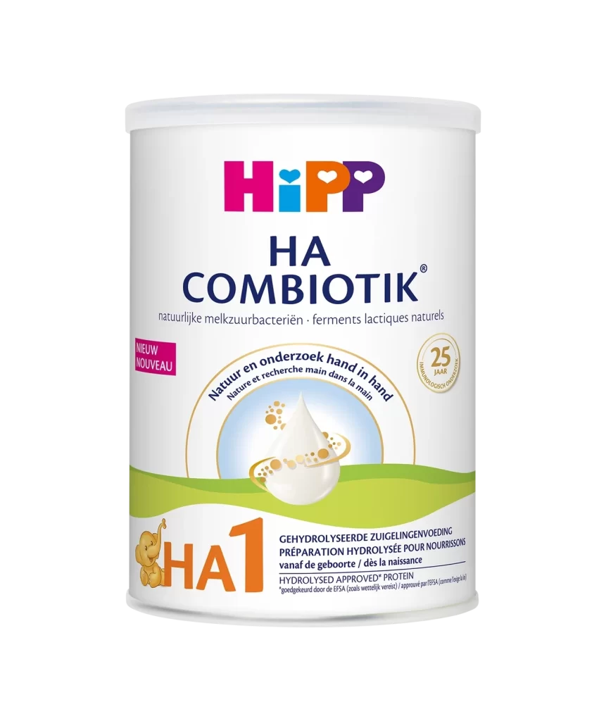
Two HiPP Organic Infant Milk packages overlap slightly on a white studio surface, showcasing the brand's signature multicolored logo above their respective product lines. The left carton features 'PURE' in bold navy lettering over a large teardrop graphic containing a cartoon elephant and tree, while the right package displays 'ORGANIC COMBIOTIC' in dark blue text beside a honeycomb-patterned droplet illustration. Both boxes indicate they are Stage 1 formulas suitable from birth, with the right package additionally noting natural lactic acid cultures and a 'Please open here' instruction at the top corner.
Visual interest here lies in the contrast between the two packaging philosophies: one emphasizes pastoral simplicity with its green landscape and animal mascot, while the other leans into scientific imagery with circular diagrams explaining lactic acid cultures. The consistent use of organic certification badges and the recurring number ‘1’ creates a cohesive family look despite the differing graphic approaches. Designers will note how the color palette balances clinical trustworthiness with playful, child-friendly elements through the strategic use of rounded typography and nature-inspired motifs.
Brand strategists analyzing competitive packaging in the baby-care sector would find this comparison useful for understanding visual hierarchy in premium organic products. Illustrators tasked with creating mascot characters for children’s goods could study how the elephant figure is integrated into the overall layout without overwhelming the essential nutritional information. Marketing teams planning product line extensions might examine how subtle differences in iconography help consumers distinguish between formula variants while maintaining strong brand recognition across the shelf.