HiPP HA Combiotik Baby Food Variant 2 Packaging
Topics
Details
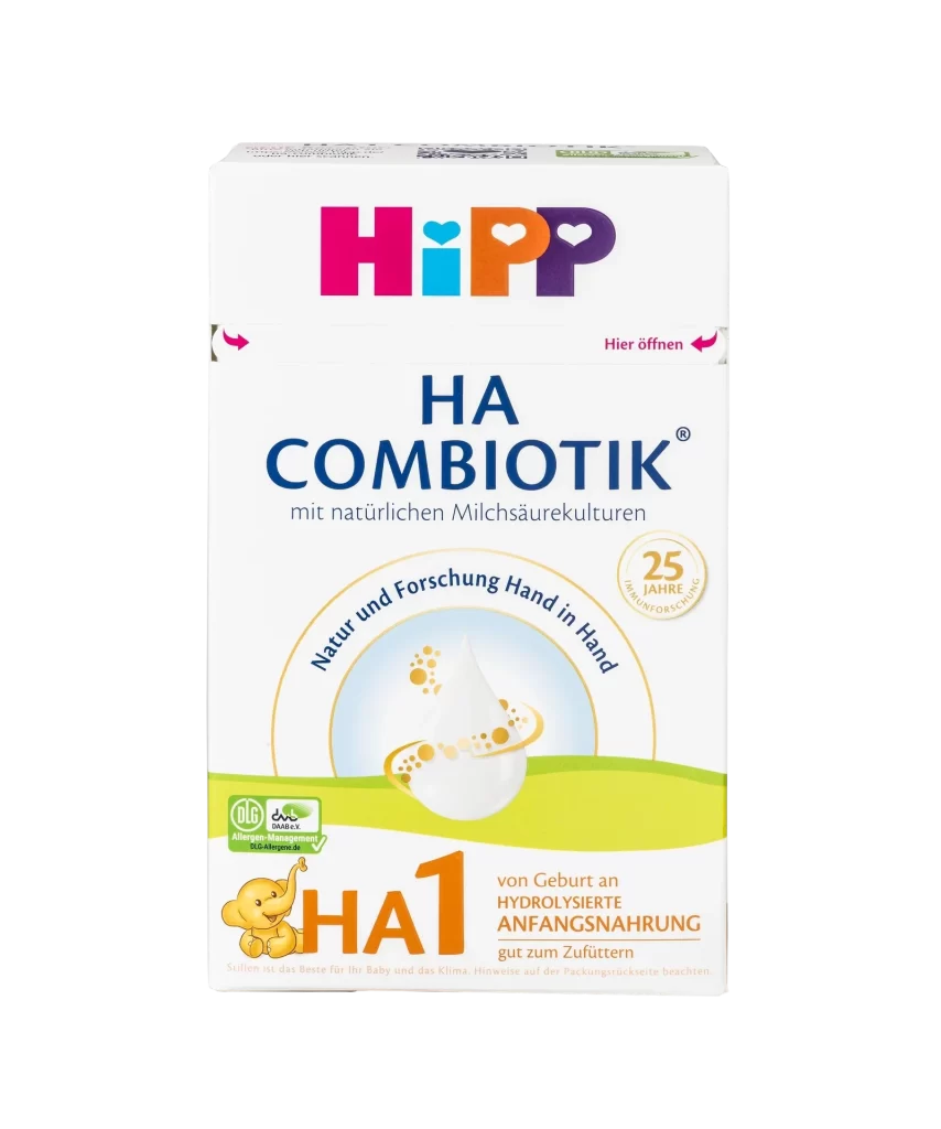
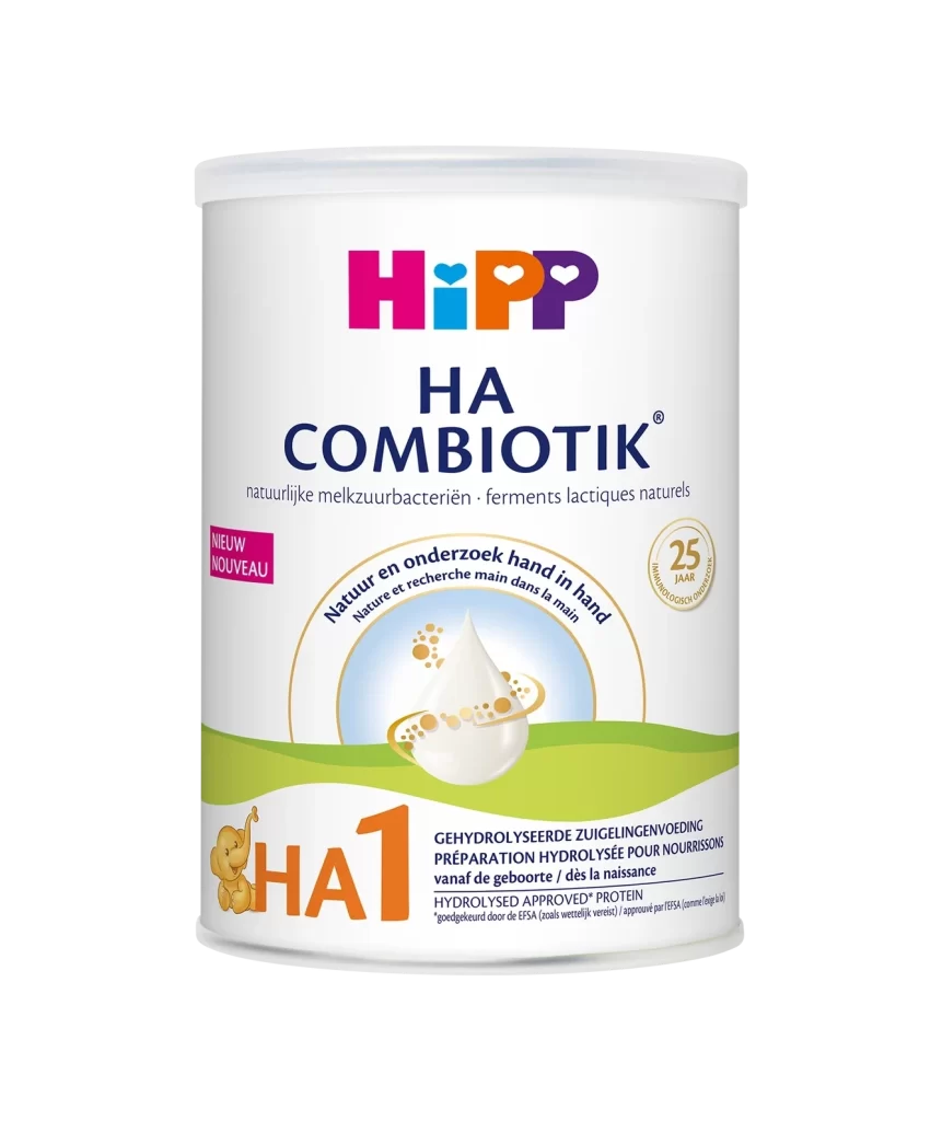
A cylindrical white tin displays the HiPP HA Combiotik baby formula packaging, featuring the brand name in bold magenta, cyan, and violet lettering with heart-shaped accents above the product designation 'HA COMBIOTIK' rendered in deep navy serif type. The container's surface incorporates a green wave graphic at the base, a central illustration of a milk droplet encircled by golden particles within an arc bearing Dutch and French text about nature and research, along with a prominent orange 'HA1' label accompanied by a small elephant icon on the lower left.
Visual hierarchy is established through the clever use of scale and color contrast, drawing the eye immediately to the medical necessity of the hypoallergenic formula while maintaining a soft, approachable tone. The integration of the ‘Natuur en onderzoek hand in hand’ slogan within the circular motif creates a focal point that bridges the gap between scientific research and natural ingredients. Furthermore, the inclusion of the ’25 jaar’ anniversary seal adds a layer of heritage and trust without cluttering the minimalist layout, making the packaging stand out in a crowded retail environment.
Brand strategists analyzing the infant nutrition sector will find this composition useful for studying how to communicate complex dietary benefits through simplified iconography. Packaging engineers can examine the spatial distribution of mandatory legal text versus marketing copy to optimize their own label designs for similar cylindrical containers. Additionally, color theorists might reference the specific saturation levels used here to evoke both safety and vitality in products intended for vulnerable consumers.